

andsem/iStock via Getty Images
This monthly article series shows a dashboard with aggregate subsector metrics in industrials. It is also a review of sector ETFs like the Industrial Select Sector SPDR ETF (XLI) and the Vanguard Industrials ETF (NYSEARCA:VIS), whose largest holdings are used to calculate these metrics.
Shortcut
The next two paragraphs in italic describe the dashboard methodology. They are necessary for new readers to understand the metrics. If you are used to this series or if you are short of time, you can skip them and go to the charts.
Base Metrics
I calculate the median value of five fundamental ratios for each subsector: Earnings Yield (“EY”), Sales Yield (“SY”), Free Cash Flow Yield (“FY”), Return on Equity (“ROE”), Gross Margin (“GM”). The reference universe includes large companies in the U.S. stock market. The five base metrics are calculated on trailing 12 months. For all of them, higher is better. EY, SY and FY are medians of the inverse of Price/Earnings, Price/Sales and Price/Free Cash Flow. They are better for statistical studies than price-to-something ratios, which are unusable or non available when the “something” is close to zero or negative (for example, companies with negative earnings). I also look at two momentum metrics for each group: the median monthly return (RetM) and the median annual return (RetY).
I prefer medians to averages because a median splits a set in a good half and a bad half. A capital-weighted average is skewed by extreme values and the largest companies. My metrics are designed for stock-picking rather than index investing.
Value and Quality Scores
I calculate historical baselines for all metrics. They are noted respectively EYh, SYh, FYh, ROEh, GMh, and they are calculated as the averages on a look-back period of 11 years. For example, the value of EYh for transportation in the table below is the 11-year average of the median Earnings Yield in transportation companies. The Value Score (“VS”) is defined as the average difference in % between the three valuation ratios (EY, SY, FY) and their baselines (EYh, SYh, FYh). The same way, the Quality Score (“QS”) is the average difference between the two quality ratios (ROE, GM) and their baselines (ROEh, GMh).
The scores are in percentage points. VS may be interpreted as the percentage of undervaluation or overvaluation relative to the baseline (positive is good, negative is bad). This interpretation must be taken with caution: the baseline is an arbitrary reference, not a supposed fair value. The formula assumes that the three valuation metrics are of equal importance.
Current data
The next table shows the metrics and scores as of last week’s closing. Columns stand for all the data named and defined above.
|
VS |
QS |
EY |
SY |
FY |
ROE |
GM |
EYh |
SYh |
FYh |
ROEh |
GMh |
RetM |
RetY |
|
|
Aerospace+Defense |
-32.21 |
-11.41 |
0.0411 |
0.5708 |
0.0224 |
17.89 |
19.86 |
0.0554 |
0.7939 |
0.0391 |
20.46 |
22.14 |
-6.31% |
6.87% |
|
Building+Equipment |
-53.56 |
24.60 |
0.0285 |
0.2885 |
0.0086 |
12.23 |
31.58 |
0.0424 |
0.8354 |
0.0229 |
9.62 |
25.86 |
-9.69% |
-7.48% |
|
Machinery+Conglomerates |
-34.18 |
4.21 |
0.0382 |
0.3902 |
0.0153 |
20.87 |
37.70 |
0.0496 |
0.5514 |
0.0308 |
19.27 |
37.65 |
-7.18% |
-11.35% |
|
Services+Distribution |
-33.04 |
24.48 |
0.0343 |
0.2628 |
0.0181 |
34.04 |
48.99 |
0.0405 |
0.4756 |
0.0297 |
22.80 |
49.15 |
-8.51% |
-5.18% |
|
Transportation |
23.50 |
4.66 |
0.0483 |
0.9853 |
0.0290 |
29.66 |
21.75 |
0.0542 |
0.7042 |
0.0205 |
23.22 |
26.66 |
-7.41% |
-11.04% |
Value and Quality chart
The next chart plots the Value and Quality Scores by subsector (higher is better).
Value and quality in industrials (Chart: author; data: Portfolio123)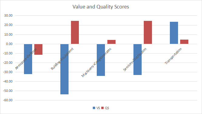
Evolution since last month
Value scores went up in all subsectors, the most in transportation.
Variations in value and quality (Chart: author; data: Portfolio123)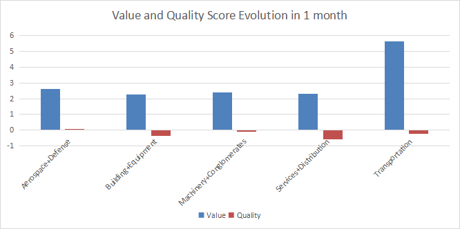
Momentum
The next chart plots momentum data.
Momentum in industrials (Chart: author; data: Portfolio123)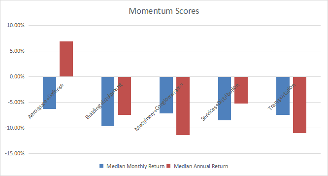
Interpretation
Transportation is undervalued by about 23% relative to 11-year averages, and its quality score is close to the historical baseline. Building and construction equipment is the most overpriced subsector. Its quality score is good, but not high enough to justify such overvaluation. Other sectors are overvalued by 32% to 34%, which may be partly justified by quality metrics for one of them: services and distribution. Aerospace/defense has both value and quality scores below the baseline.
Focus on VIS
The Vanguard Industrials ETF (VIS) has been tracking the MSCI US IMI Consumer Industrials 25/50 Index since 09/23/2004. It has a total expense ratio of 0.10%, the same as XLI, and a bit more expensive than FIDU (0.08%).
As of writing, the fund has 364 holdings. The next table shows the top 10 names with some fundamental ratios. Their aggregate weight is about 30%.
|
Ticker |
Name |
Weight |
EPS growth %TTM |
P/E TTM |
P/E fwd |
Yield% |
|
United Parcel Service, Inc. |
3.91% |
77.45 |
15.34 |
14.83 |
3.18 |
|
|
Union Pacific Corp. |
3.86% |
22.17 |
20.30 |
18.68 |
2.39 |
|
|
Raytheon Technologies Corp. |
3.65% |
106.65 |
28.98 |
18.40 |
2.55 |
|
|
Honeywell International, Inc. |
3.52% |
4.10 |
24.55 |
20.75 |
2.18 |
|
|
Deere & Co. |
2.90% |
15.95 |
18.04 |
15.77 |
1.25 |
|
|
Lockheed Martin Corp. |
2.75% |
-32.26 |
24.11 |
19.15 |
2.69 |
|
|
Caterpillar Inc. |
2.69% |
56.70 |
14.77 |
14.71 |
2.60 |
|
|
The Boeing Co. |
2.46% |
41.81 |
N/A |
N/A |
0 |
|
|
General Electric Co. |
2.21% |
34.20 |
N/A |
25.51 |
0.46 |
|
|
3M Co. |
1.94% |
-29.65 |
16.44 |
11.31 |
5.07 |
The heaviest industries in the fund are machinery (19.8%) and aerospace/defense (17.1%)). VIS has much more holdings than XLI (364 large to small caps vs. 74 large and mid caps). However, their performance and behavior since VIS inception are almost identical.
VIS vs. XLI (Portfolio123)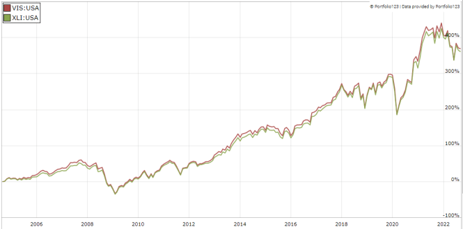
In summary, VIS is a good product with cheap management fees for investors seeking capital-weighted exposure in industrials. No holding weighs more than 4% of asset value, so risks related to individual stocks are moderate. VIS or XLI are equivalents for buy-and-hold investors. However, XLI has a much higher liquidity, making it a better choice for trading and tactical allocation. Investors willing less concentration in the top holdings may prefer the Invesco S&P 500® Equal Weight Industrials ETF (RGI), whose largest holding weighs about 1.8%.
Dashboard List
I use the first table to calculate value and quality scores. It may also be used in a stock-picking process to check how companies stand among their peers. For example, the EY column tells us that a transportation company with an Earnings Yield above 0.0483 (or price/earnings below 20.70) is in the better half of the subsector regarding this metric. A Dashboard List is sent every month to Quantitative Risk & Value subscribers with the most profitable companies standing in the better half among their peers regarding the three valuation metrics at the same time. The list below was sent to subscribers several weeks ago based on data available at this time.
|
Robert Half International Inc. |
|
|
The Brink’s Co. |
|
|
Matson, Inc. |
|
|
Builders FirstSource, Inc. |
|
|
Boise Cascade Co. |
|
|
Encore Wire Corp. (Delaware) |
|
|
ArcBest Corp. |
|
|
Titan International, Inc. |
|
|
Sturm, Ruger & Co., Inc. |
|
|
Vontier Corp. |
It is a rotating list with a statistical bias toward excess returns on the long term, not the result of an analysis of each stock.
Be the first to comment