

Ralf Geithe/iStock via Getty Images
If, as Lawrence Summers once said, high yield bonds are “equity in drag”, utilities might be thought of as “bonds in drag”. Although utilities returns have been low relative to the broader equity market over the last century, they have provided a relatively consistent return in the form of dividends over much of that period. Since last year, I have been arguing that we are likely on the brink of a secular bear market in equities generally (led by tech), and since January, I have been going sector by sector and industry by industry looking at what their histories suggest about their respective future performances both absolutely and relative to equities as a whole and bonds. In this article, I am going to consider prospective utility returns within the context of the broader market, with a particular eye to how utilities perform in bear markets. I conclude that, as with all other sectors, utility returns are likely to be flat to negative through the rest of the decade and – while they may provide some protection against a cyclical downturn (as has been the case year-to-date) – are unlikely to produce much in the way of relative outperformance against stocks or Treasuries between now and 2030.
The reasons for this generally negative outlook on the utilities sector is based on (a) the long-term correlation utilities have with equities as a whole, (b) their relatively poor performance in long-term, deflationary bear markets (better known as depressions), (c) their low dividend yield, and (d) the negative spread between the utilities dividend yield and Treasury yields. As with all of these long-term sector- and industry-specific studies, I will be leaning almost exclusively on the data provided in the Fama-French database which goes back to 1926.
XLU Construction
The Fama-French database is arranged by SIC code rather than the more modern GICS categorization used to construct most current sector and industry indexes, such as the Utilities Select Sector SPDR ETF (XLU). In order to be sure that the Fama-French utilities index is likely to match the XLU, I take all of the 29 holdings in XLU, check their SIC codes (which can be found on the SEC’s website), and then cross-reference them with the Fama-French designations. By my calculation, 98% of the XLU’s holdings are classified as utilities by Fama-French (using either the Fama-French 12-sector index or the 49-industry index), so it is a pretty good fit. The following table shows the top 15 holdings of XLU, comprising 75% of the index, alongside the GICS industrial classification and the Fama-French 12 classification.
|
The Utilities Select Sector SPDR® Fund holdings as of 31-Mar-2022 |
||||
|
Name |
Ticker |
Weight |
GICS Industry |
FF12 |
|
NextEra Energy Inc. |
15.8 |
Electric Utilities |
Utilities |
|
|
Duke Energy Corporation |
8.2 |
Electric Utilities |
Utilities |
|
|
Southern Company |
7.3 |
Electric Utilities |
Utilities |
|
|
Dominion Energy Inc |
6.6 |
Multi-Utilities |
Utilities |
|
|
Sempra Energy |
5.1 |
Multi-Utilities |
Utilities |
|
|
American Electric Power Company Inc. |
4.8 |
Electric Utilities |
Utilities |
|
|
Exelon Corporation |
4.4 |
Electric Utilities |
Utilities |
|
|
Xcel Energy Inc. |
3.7 |
Electric Utilities |
Utilities |
|
|
Public Service Enterprise Group Inc |
3.4 |
Multi-Utilities |
Utilities |
|
|
Consolidated Edison Inc. |
3.2 |
Multi-Utilities |
Utilities |
|
|
WEC Energy Group Inc |
3.0 |
Multi-Utilities |
Utilities |
|
|
Eversource Energy |
2.9 |
Electric Utilities |
Utilities |
|
|
American Water Works Company Inc. |
2.9 |
Water Utilities |
Utilities |
|
|
Edison International |
2.5 |
Electric Utilities |
Utilities |
|
|
FirstEnergy Corp. |
2.5 |
Electric Utilities |
Utilities |
|
The GICS system is more granular than Fama-French, dividing the sector into industries and subindustries. Descriptions of the subindustry level can be found here. The following chart from S&P Global shows a basic schematic of the sector.
Chart A. Utilities are divided into five industries. (S&P Global)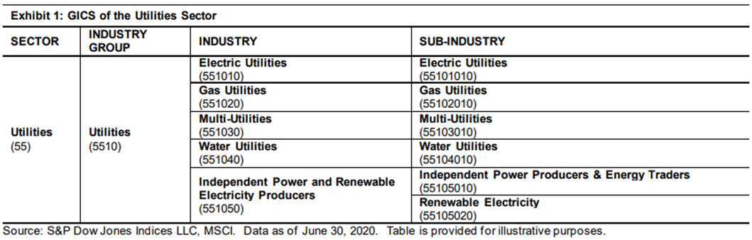
The next chart, also from S&P Global, suggests that electric utilities have dominated the sector rather consistently.
Chart B. The XLU is typically dominated by electric utilities. (S&P Global)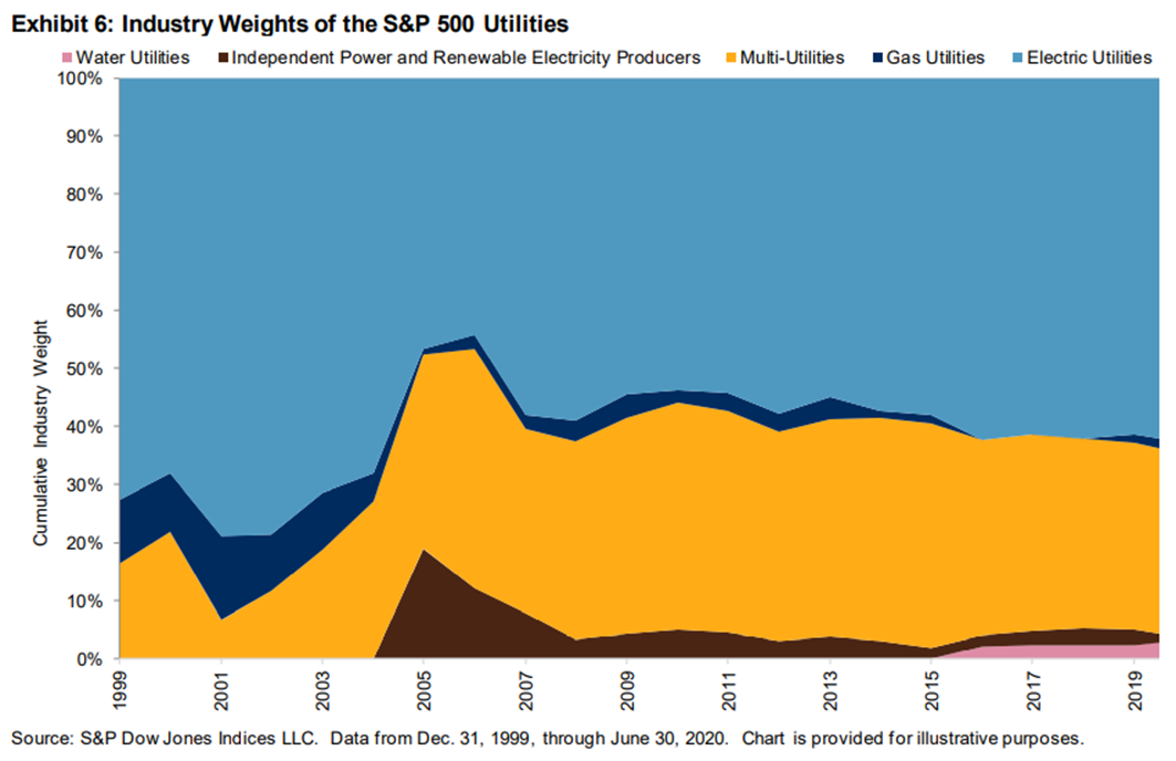
And, at least over the course of the 2010s, utilities have been among the most internally correlated among the sectors. As S&P Global puts it, the high correlation figures in the following chart mean that “sector choice was more important than stock selection, while the low dispersion meant there was relatively low benefit to stock selection.” That does not necessarily mean that these correlations hold at an industry level, though. That is, the dispersion and correlation figures could be skewed to some degree by the degree to which a given sector is dominated by a single industry.
The most conservative interpretation would seem to be that, among electric utilities (including at least some of the “multi-utilities” highly concentrated in the production of electricity), there has been relatively little benefit to stock selection. Technological disruption could conceivably change that, but in the 2010s, internal cross-correlation appears to have been high. Figures updated for the 12 months up to March 31, 2022 show that this has continued to be the case for utilities, especially relative to other sectors.
Chart C. Dispersion and correlation data suggests utility stocks are highly correlated with one another. (S&P Global)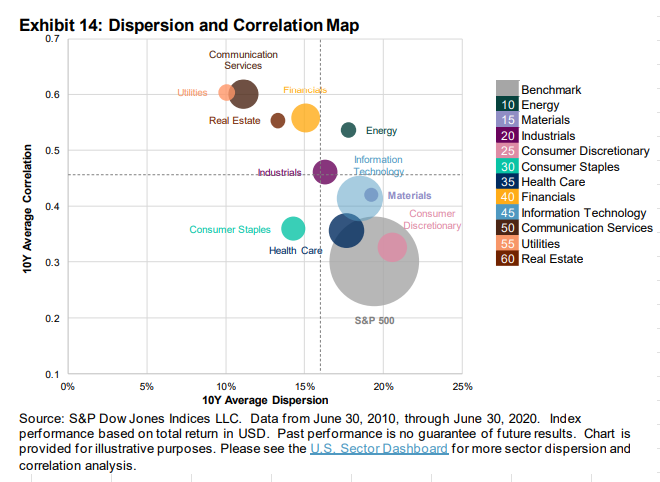
If there is little in the way of dispersion within the sector, let’s take a look at how utilities have compared to the broader market historically.
The utilities sector tends to follow the market
A brief survey of the long-term performance of utilities suggests that, although they have underperformed almost every other sector over the last century, over shorter intervals, utilities have tended to be highly correlated with the broader market.
The following chart shows a total return cap-weighted index for Fama-French utilities stocks (in orange) alongside seven-year log changes of that index (in blue), and the ratio of that index to an equal-weighted index of all of the cap-weighted Fama-French 12-sector series (in grey), somewhat comparable to the ALPS Equal Sector Weight ETF (EQL).
Chart D. Total returns for cap-weighted utilities index. (Fama-French)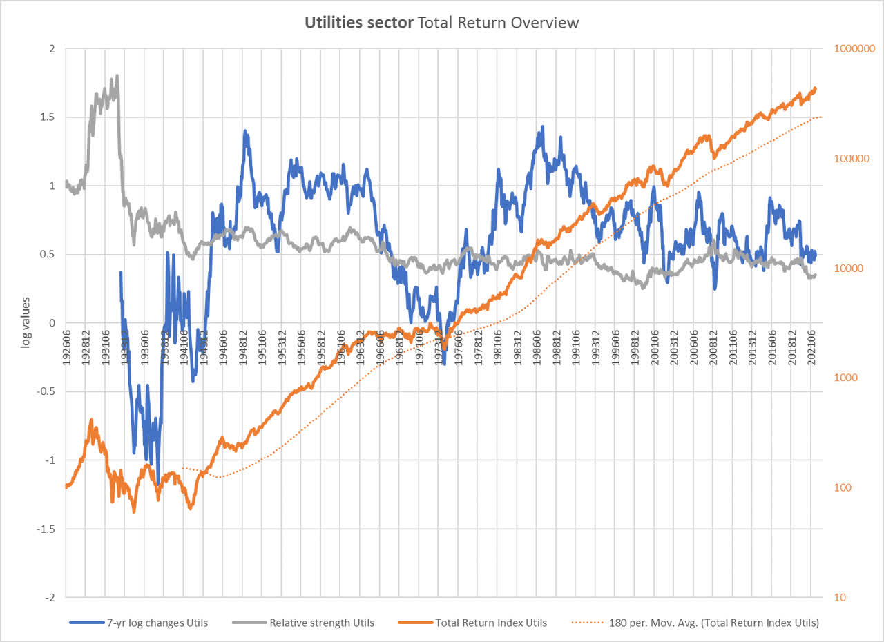
Based on this chart, we can say that utilities have only undergone two secular bear markets over the last century, say from 1929-1942 and 1965-1974. Note that, compared to the 12-sector index, utilities outperformed throughout the worse part of the Depression, but most of the relative gain in utilities occurred in the final twelve months of the Roaring Twenties bull market. Some have argued that a collapse in the utilities mania is what led to the 1929 crash, but the outperformance of the sector until the end of 1932 seems to argue against that somewhat.
In any case, since 1942, what utilities have lost in romance, they have gained in stability. Except for the period ending in 1974, utilities have not seen negative total nominal returns over any seven-year period since the Depression ended.
The following chart shows seven-year changes in total returns for each of the Fama-French sectors, including utilities (in dark red), and price returns for the S&P Composite. If it is hard to pick utilities out, that is because rates of change among sectors tend to move in unison. As I have discussed elsewhere, tech and energy stocks violate this rule to some degree.
Chart E. Typically, large-cap sector indexes have highly correlated rates of change. (Fama-French, Robert Shiller)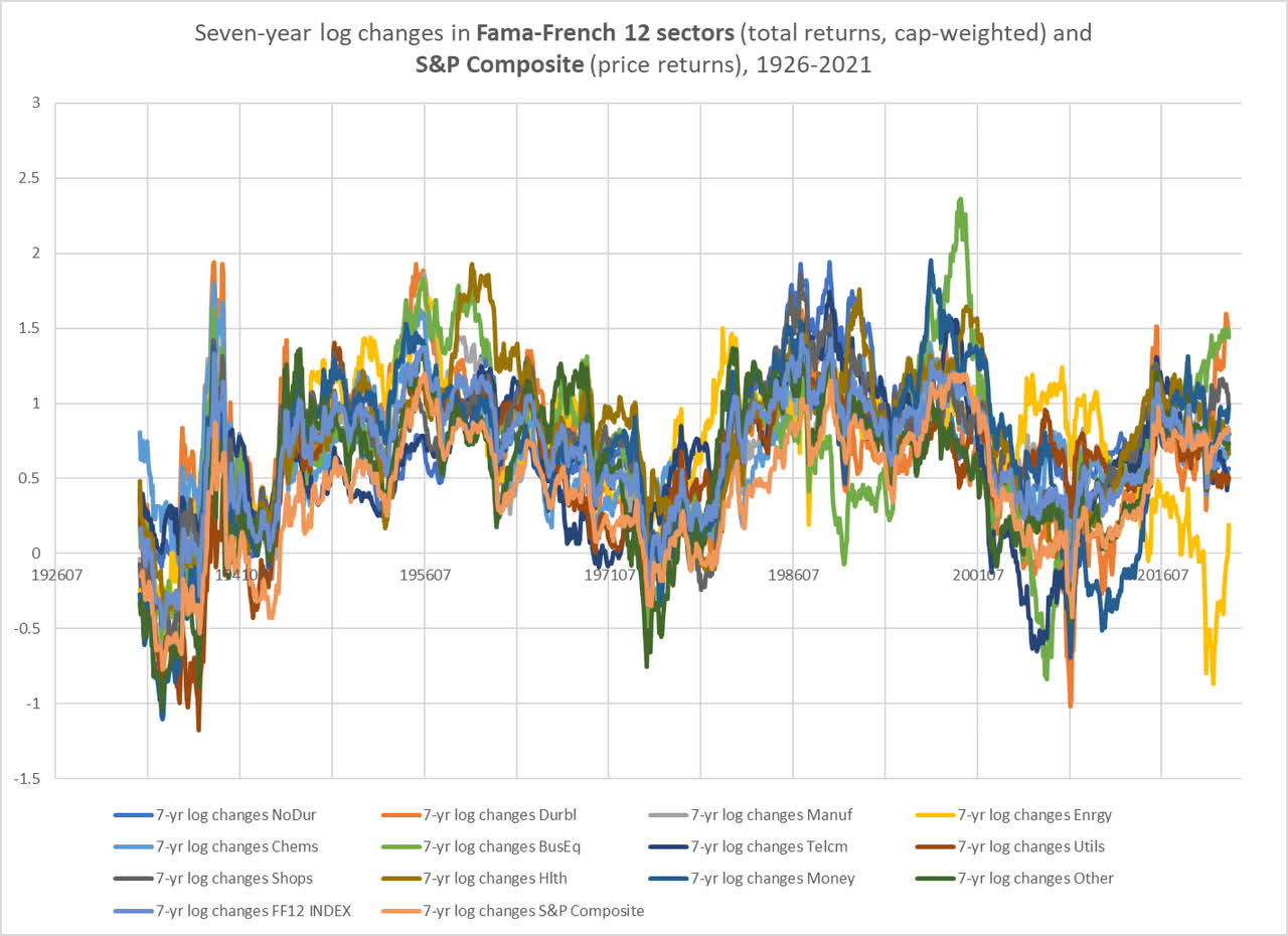
If you look at seven-year rates of change in relative strength, as in the following chart, inevitably you will produce greater variation, but utilities rarely stand out.
Chart F. Utilities typically do not make much of a splash. (Fama-French)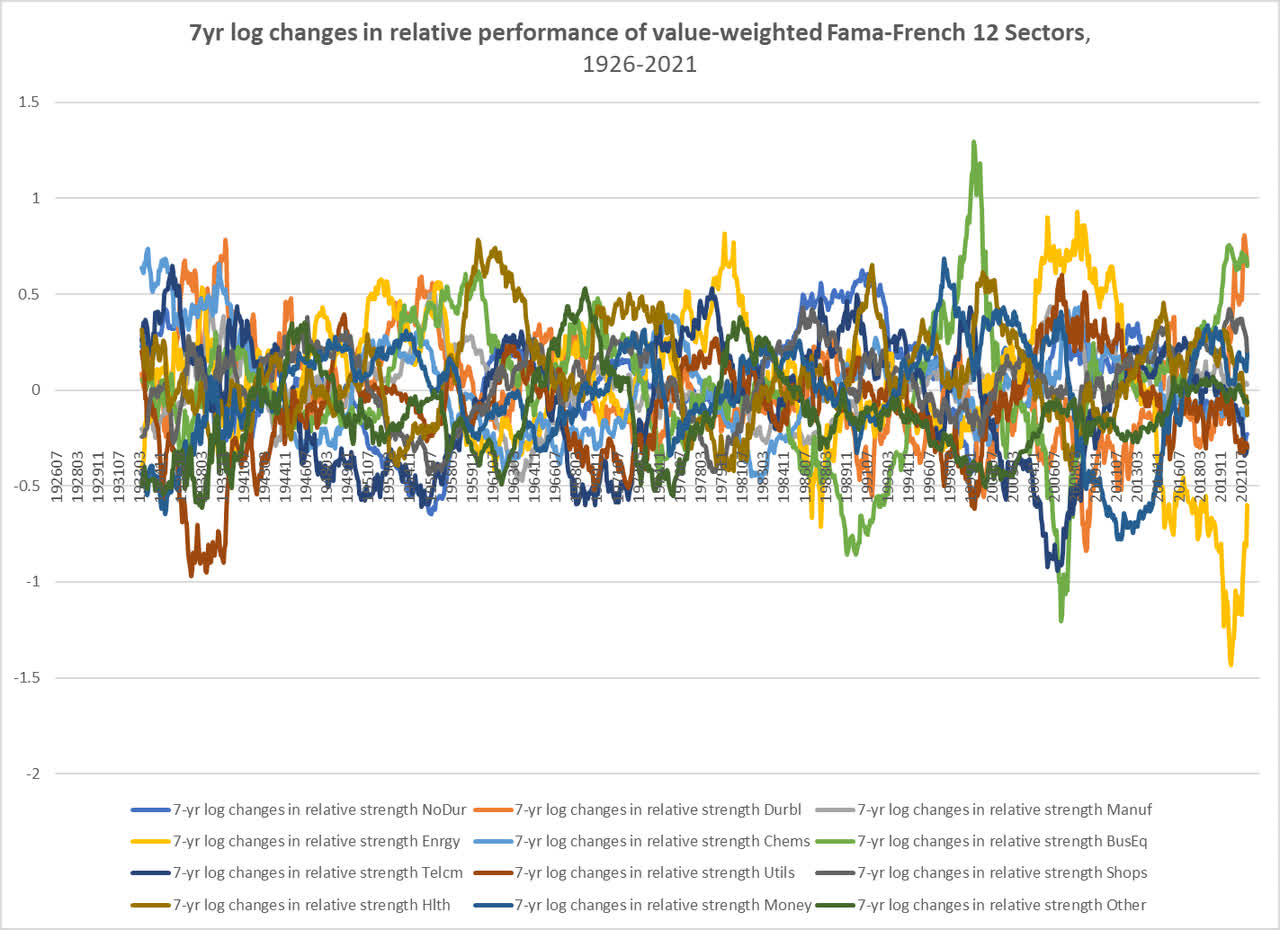
Relative to an equal-weighted index of all sectors, utilities has a beta of 1.0 over seven-year rates of change since 1926.
The point is, whatever your point of view on the long-term (let’s say seven years) performance of the market as a whole, history suggests that this view ought to dominate your long-term outlook for utilities. Since World War II, utilities have shown a greater tendency to correlate with energy stocks (with a correlation of 0.3 since 1926), so that might color our outlook for the relative performance of utilities to some degree, but what is unclear is how utilities would perform under a depression-style scenario.
Utilities in secular bear markets
As I have shown before, energy stocks have outperformed in virtually every secular bear market, whether deflationary or inflationary, since 1926. But as the charts above show, utilities were the worst-performing sector during the Great Depression over long-term intervals. Perhaps that was an artefact of the utilities mania of the late 1920s, but the persistence of the utilities bearishness all the way up until the early 1940s makes it difficult to be sure. Therefore, it is possible that utilities are more vulnerable to a “secular” disinflationary bear market than the energy sector is. A disinflationary bull market (as we had in the 2010s) would likely be better for utilities than energy.
With only three “secular” bear markets over the last century (by my count), it is difficult to make generalizations about the utilities sector (due to that odd protuberance in utilities stocks in the late 1920s), but it appears utilities are most vulnerable to a deflationary bear market.
In the absence of a clearly defined disruption in the utilities sector (e.g., new ways of producing energy, new ways of storing it, and new ways of using it, and how those three factors interact) and how it translates into equity returns, my base case would be for utilities performance to conform to historical precedent.
The following chart shows long-term changes in the price performance utilities, the S&P Composite, and commodities. The gaps in the late 1990s and early 2020s appear to have been driven by tech booms.
Chart G. Utilities tend to track the S&P 500, despite their persistent weakness. (Fama-French, Shiller, World Bank, St Louis Fed, Warren & Pearson)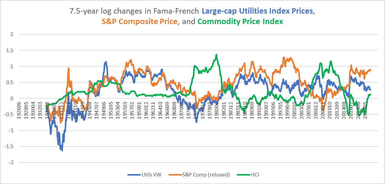
The following chart shows the ratio of total returns in large- and small-cap utilities relative to the S&P Composite, and this largely confirms the patterns we saw in the grey line in Chart D, which showed utilities performance relative to an equal-weighted index of cap-weighted sectors.
Chart H. Large-cap utilities have underperformed the S&P since the end of the Depression. (Fama-French, Shiller)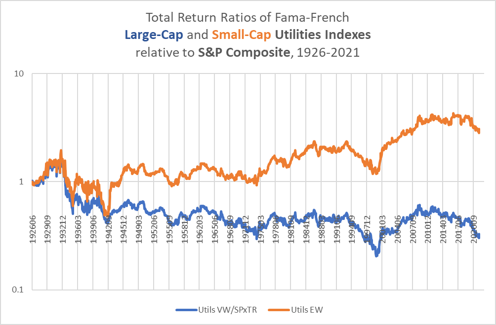
With tech making up such a large portion of the S&P 500’s market cap, a poor performance in the tech sector over the course of the remainder of the decade suggests that utilities might have a fair chance of outperforming the S&P 500 over that period, even if it only puts in a middling performance relative to an equal-weighted index of sectors. In other words, in the wake of an unbalanced boom such as we have had over the last decade, an equal-weighted sectoral index would likely outperform a cap-weighted index like the S&P 500, and that would suggest that a sector like utilities-more closely linked to an equal-weighted index than a cap-weighted index-would also have a chance of beating the S&P.
The real importance of tech in this context is what it has to say about the market as a whole. As I have pointed out in previous articles (one of which is linked to in the first paragraph), tech booms tend to occur at the conclusion of secular bull markets, especially when they coincide with energy sector weakness. Once a short-term energy shock occurs, the sectoral hierarchy reverses over the next seven years or so. This reversion also tends to coincide with a “secular” bear market in equities generally. With the energy shock that began last year, this process is likely already underway, and that suggests that we will see a flat to negative performance in equities until the end of the decade. That case is strengthened by the historical tendency of periods with both high PEs and high long-term earnings growth rates to be followed by earnings shocks and “secular” bear markets. The utilities sector’s tendency to go where it is told by the broader market points to a greater likelihood of low returns in the sector. Perhaps the tech sector will drag the wider index down, raising the likelihood that utilities will outperform, or a deflationary shock could cause enough damage to utilities to make them underperform the market anyway and particularly cyclical sectors (like energy) that have thrived (on a relative basis) during “secular” bear markets.
A predictor more specific to the utilities sector is the dividend yield.
The dividend yield and absolute returns
I calculate historical dividends for utilities by contrasting total returns with price returns. The resulting dividend yield, displayed in blue below, has a 0.6 correlation with subsequent 7.5-year total returns in utilities.
Chart I. Subsequent returns are correlated with the dividend yield. (Fama-French)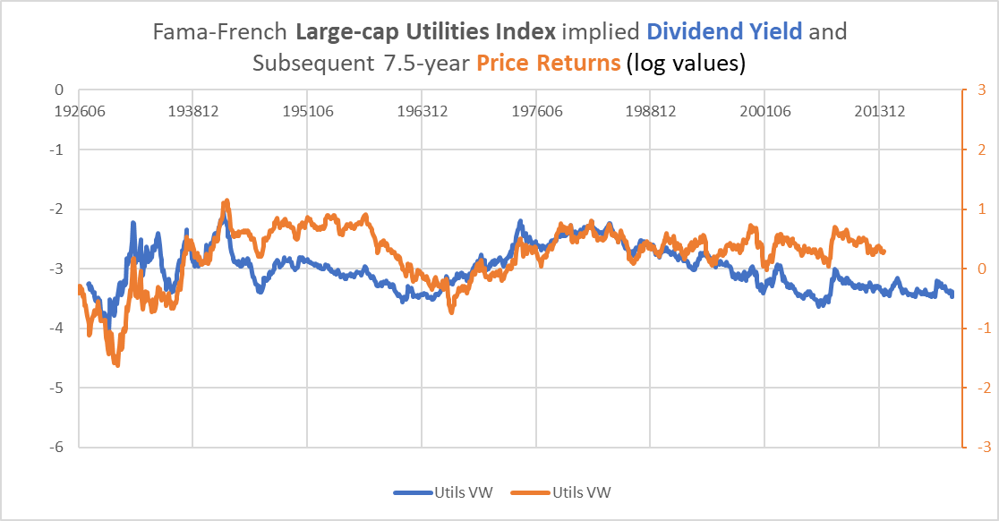
In some sectors (e.g., information tech), the dividend yield has a weak correlation with returns but a strong negative correlation with dividend growth. In utilities, there is no clear link between the dividend yield and subsequent dividend growth (a correlation with subsequent dividend growth of -0.02), as shown in the following chart.
Chart J. The dividend yield does not predicted dividend growth. (Fama-French)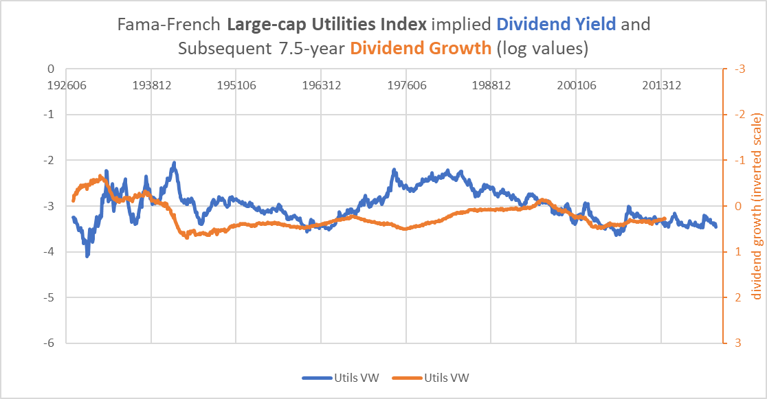
The most interesting thing about dividend growth in utilities is that it has only experienced long-term decline on two occasions, that is, throughout the 1930s and 1940s and then in the late 1990s to early 2000s. This is illustrated by the blue line in the chart below, alongside S&P earnings growth.
Chart K. Dividend growth in utilities has been steady since World War II. (Fama-French, Shiller)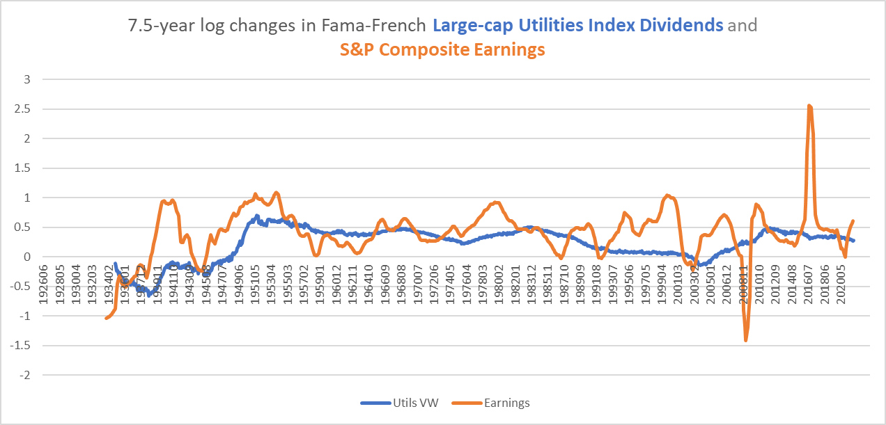
Since the end of World War II, then, dividend growth has been steady and reliable, but one has to wonder if a structural, deflationary earnings shock as occurred during the Depression would jeopardize utilities dividends. That, I simply cannot answer, but history does suggest that where Treasury yields exceed the dividend yields in utilities, returns are likely to favor Treasury holders. We will come to that next.
But, to recap the argument thus far, due to my long-term negative outlook for the market as a whole (for reasons briefly recounted in the “Utilities in secular bear markets” section above and in a host of previous articles) and the tendency for utilities to move more or less in unison with the broader market, utilities do not have a promising outlook. If we combine that with the relatively low level of the dividend yield for utilities and its modest correlation with subsequent returns, that suggests low returns going forward.
Chart L. The dividend yield on utilities is low for utilities. (Fama-French, Shiller)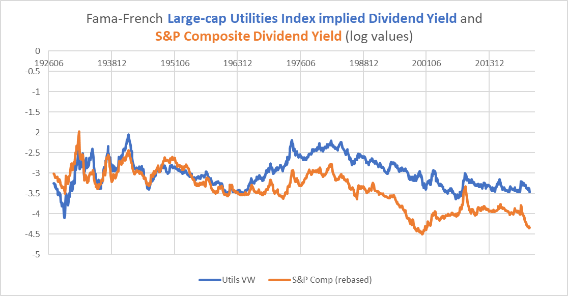
Let’s now turn to the relative performance of utilities and Treasuries.
Treasuries are likely to beat utilities
I suspect, especially as pessimism about markets and the economy spreads, many investors are looking to utilities as a Goldilocks medium between equities and bonds. History suggests, however that utilities are likely to underperform against long-term Treasuries.
The following chart shows the performance of the utilities sector relative to returns on long-term Treasuries.
Chart M. Since the end of the Depression, utilities have generally outperformed Treasuries. (Fama-French, Shiller, St Louis Fed)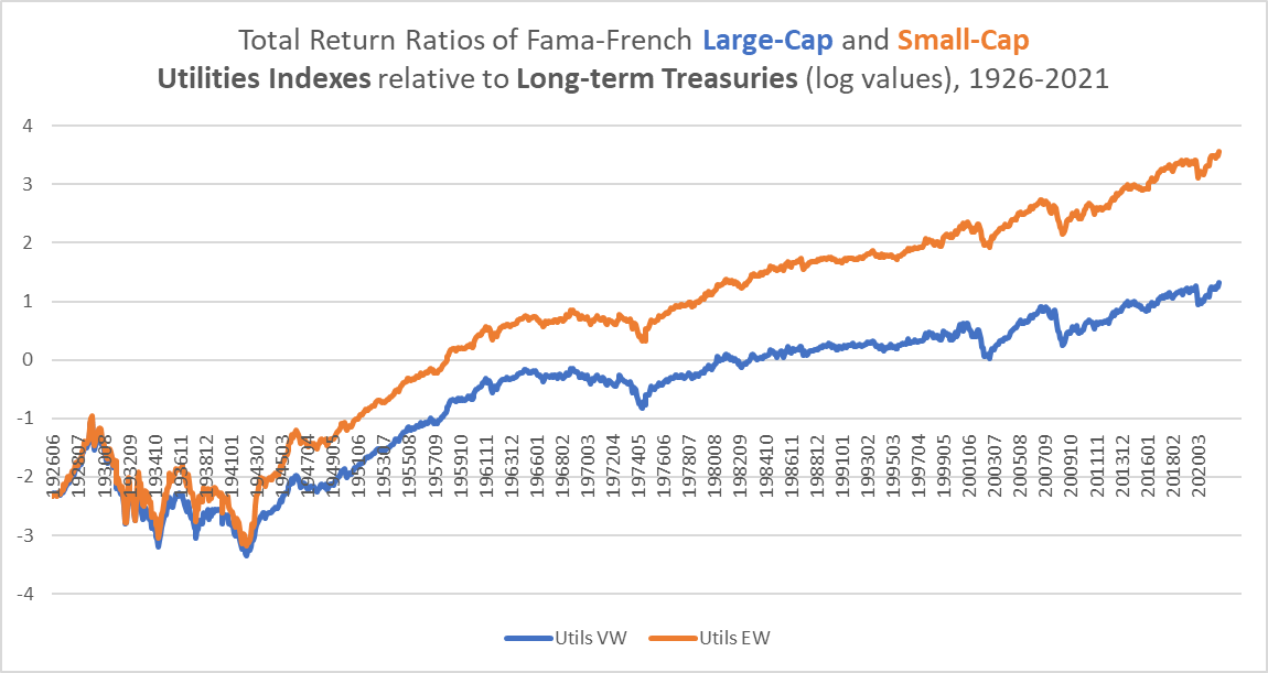
The patterns here are nearly identical to the absolute total return index we looked at in Chart D, with two clear periods of underperformance by utilities, 1929-1942 and 1965-1974. We might add 2001-2012, as well, which saw largely flat returns (relative to Treasuries) mixed with some volatility. These three periods roughly coincide with the general equity bear markets of the 1930s, 1970s, and 2000s.
The chart below shows the historical relationship between the long-term bond yield and the dividend yield for the utilities sector. Spikes in the dividend yield above the Treasury yield have tended to coincide with bottoms in the utilities/bond ratio.
Chart N. Since the early 1960s, utilities yields and Treasury yields have tended to track one another. (Fama-French, Shiller, St Louis Fed)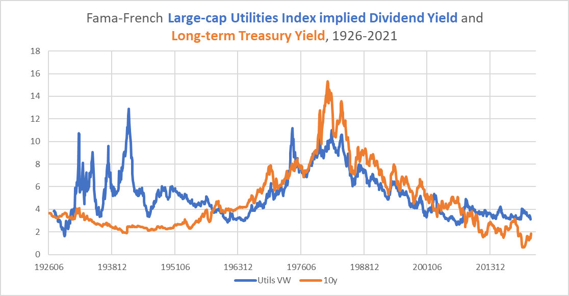
This is illustrated in the following chart, which shows the ratio of the utilities dividend yield to the long-term bond yield (in blue) alongside subsequent relative returns in utilities and Treasuries (in orange). This chart uses log values, so where the ratio is higher than 0, the dividend yield on utilities exceeds the yield on long-term Treasuries.
Chart O. The ratio of the utilities dividend yield to Treasury yield has anticipated subsequent relative returns. (Fama-French, Shiller, St Louis Fed)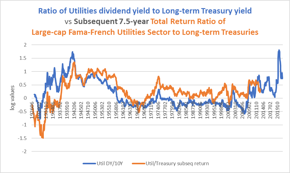
The correlation between the yield ratio and subsequent relative returns is 0.55. It has to be pointed out that even as the dividend yield remained consistently below the ten-year yield throughout the 1980s and 1990s, utilities outperformed Treasuries, so the chart does not say that when the Treasury yield is higher than the utilities dividend yield that utilities tend to underperform Treasuries. Rather, it says that as the utilities/Treasury yield spread has gone negative, utilities outperformance has been relatively small and the chance of outright underperformance has risen.
The chart above only goes up to December 2021. Since then, both yields have moved dramatically due to the collapse in bonds (meaning rising yields) and the surge in utilities prices (meaning lower yields).
According to Seeking Alpha, the current yield on XLU is 2.61%.
Chart P. The dividend yield for utilities has fallen in recent weeks. (Seeking Alpha)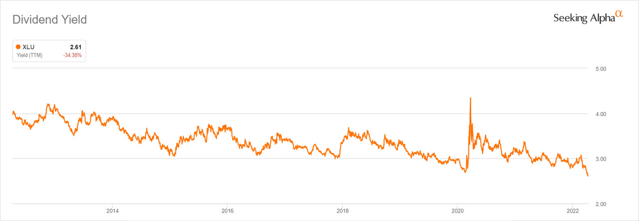
Stockcharts.com shows long-term yields all in excess of that level, with the 10-year yield at 2.72% and the 20-year yield at 2.94%.
Chart Q. Treasury yields have spiked this year. (Stockcharts.com)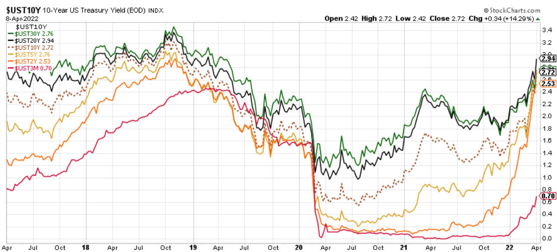
Most of the action is happening on the Treasury side. Every surge in bond yields, therefore, is likely to raise the likelihood of a long-term underperformance in utilities.
Short-term performance of utilities
Over the short-term, however, we may continue to see outperformance in utilities. In the following chart, I measure 36-month drawdowns in the respective ratios of utilities and the S&P relative to Treasuries.
Chart R. Utilities have performed relatively well since World War II during downturns. (Fama-French, Shiller, St Louis Fed)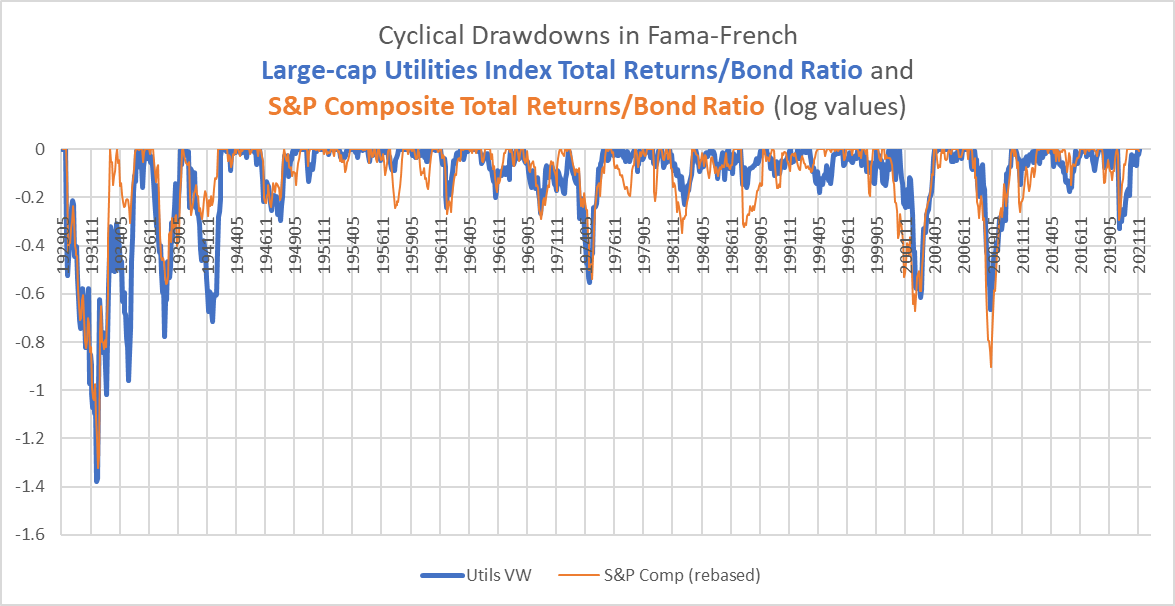
There are many instances in which utilities do not fall as much relative to the S&P (for example, the 1987 crash) or the crash is delayed in utilities (the 2000 peak), but there are other instances in which the fall in utilities is earlier and deeper than in the S&P (the 1973-1974 crash). Since World War II, these drawdowns have been shallower in utilities than in the S&P, but if we include the twenty years prior to the conclusion of the war, that advantage is eliminated.
If we are, in fact, in the opening stages of a long-term bear market in equities, the point is likely already academic, since utilities have been stomping the broader market into the ground over the last five months.
Chart S. Utilities have outperformed the S&P 500 as Treasury yields rise. (Stockcharts.com)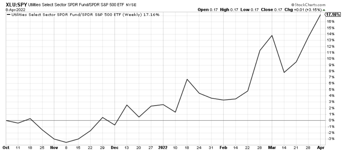
I suspect that as long as interest rates keep on rising, there will be incentive for investors to take refuge in utilities, but once Treasury yields find their terminal values (no sign of that as of yet), even utilities will begin to lose their electric shine.
Conclusion
In the brief discussion of the crash of 1929, I linked to an article by the late Eugene White entitled “The Stock Market Boom and the Crash of 1929 Revisited”.
Both [Charles Amos] Dice and [Irving] Fisher believed that earnings and dividends would continue to grow rapidly because of great economic improvements they saw in the economy. These changes-the systematic application of science to industry, the development of modern management techniques, and mergers that gained economies of scale and scope-are the same ones that economic historians have emphasized to explain growth in the ’20s.
Many such passages from this 1990 article are reminiscent of the arguments made today in favor of not only a continued stock market boom but a continued tech boom specifically. As I have tried to argue, these tech booms have typically stopped when the long-term trajectory of energy prices changes, and this trajectory typically begins with an energy shock (with the 1999-2000 shock being the most obvious case).
Tech-related sectors (Information Technology, Communication Services, and Consumer Discretionary stocks) are likely the sectors to be punished most severely. It would not be unreasonable to expect XLU to outperform them, but history suggests that utilities will likely be pulled down with the broader market. This has nothing to do with the merits of current or prospective technological developments. Or rather, it is possible that the technological developments are so disruptive that they undermine the market as a whole. As I have argued before, much in the vein of Schumpeter, it appears that the penetration of technological goods into the market is correlated more with long waves in disinflationary forces (which are highly correlated with market PE ratios) than they are with tech returns.
Thus, although the 1930s were one of the most technologically progressive decades ever, they were consumed by deflation and tech stock underperformance. I discussed this relationship between tech returns and technological development in CARZ Electric Vehicle ETF Is Effectively In A Bubble.
These technological booms have kept inflation low and PEs high, whether they had to use high stock prices (as in the 1920s) or low earnings (as in the 1930s) to get the job done. Again, what has followed these periods of simultaneously high PEs and high growth rates is an earnings shock, which is what happened in 1929-1932. The utilities sector has an unusual history that fits neither the patterns seen in tech stocks nor cyclical stocks like energy, industrials, or basic materials. Its terrible performance in the only period in which an earnings shock has come so early in a “secular” disinflation may be a statistical accident related to the unusual rise of utilities in 1928-1929.
What does seem to be clear is that “secular” tech boom/energy bust has historically been followed by “secular” tech bust/market bear, and utilities typically follow the market. If we layer on top of that the historical relationship between the utilities dividend yield and subsequent returns, we are given another bearish indicator. And, if we look at the spread between the dividend yield on utilities and long-term Treasury yields, that suggests utilities will be lucky to beat Treasuries between now and the end of the decade. Utilities may see continued upside relative to Treasuries over the very short-term (weeks to months, I suspect) so long as yields rise, but once they peak, that raises the likelihood of a long-term halt in the recent utilities rally.
Be the first to comment