


bymuratdeniz/E+ via Getty Images
The purpose of this article is to examine the USA sectoral flows for May 2022 and assess the likely impact on markets as we advance into June. This is pertinent, as a change in the fiscal flow rate has an approximately one-month lagged impact on asset markets and is a useful investment forecasting tool. There are other macro-fiscal flows that can point to events many months ahead.
The table below shows the sectoral balances for the USA and is produced from the national accounts.
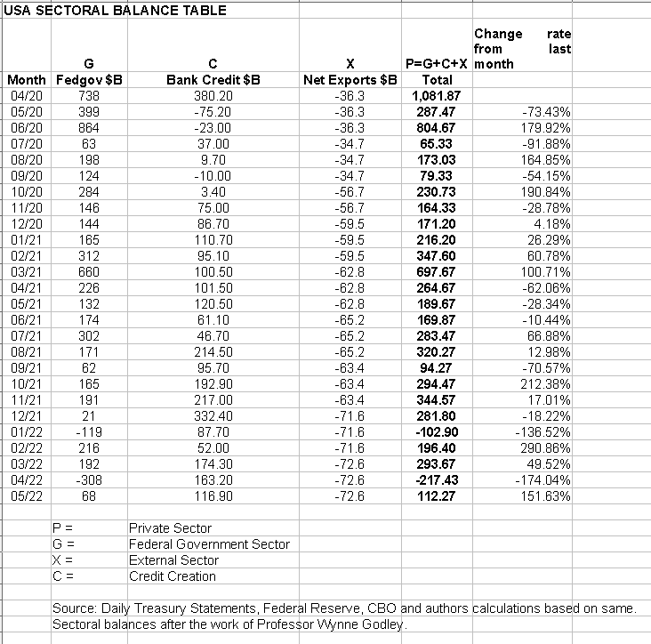
From the sectoral balances table above, we see that for May 2022, we have a positive nominal flow of $112B into the private sector and a positive change rate month over month. For markets, the change rate tends to be more important than the headline number, and in this case, both are positive and this is supportive for asset markets.
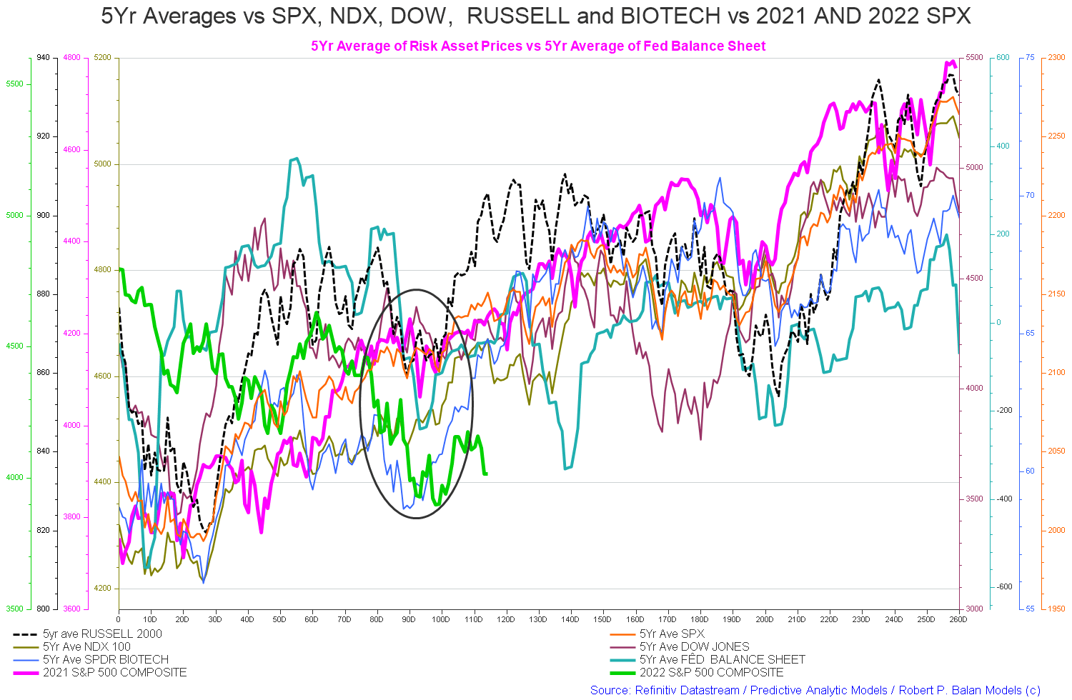
The current market plunge is part of a seasonal pattern that occurs at this time caused by the institutionalized spending and taxing pattern and made much worse by the year-on-year fiscal contraction and the feds tighter monetary stance.
The chart below shows the five-year average of the seasonal stock market patterns for the SPX (SPX), NDX (NDX), Dow (DIA), Russell 2000 (RTY), and Biotech (IBB) market indexes. The black circle shows roughly where we are [trading day 116 at the time of writing and the end of the green line on the chart below] and the general seasonal pattern now is for markets to rise into September after the middle of June federal tax collection event is over.
It is this tight sequence of federal tax collections at this time of year that gives credence to the “Sell in May and go Away” stock market axiom.
Robert P Balan
The -$112 billion is made up of a $68+ billion injection of funds from the federal government, plus an impressive $116+ billion of credit creation from commercial banks and less the -$72+ billion that flowed to foreign bank accounts at the Fed in return for imported goods and services.
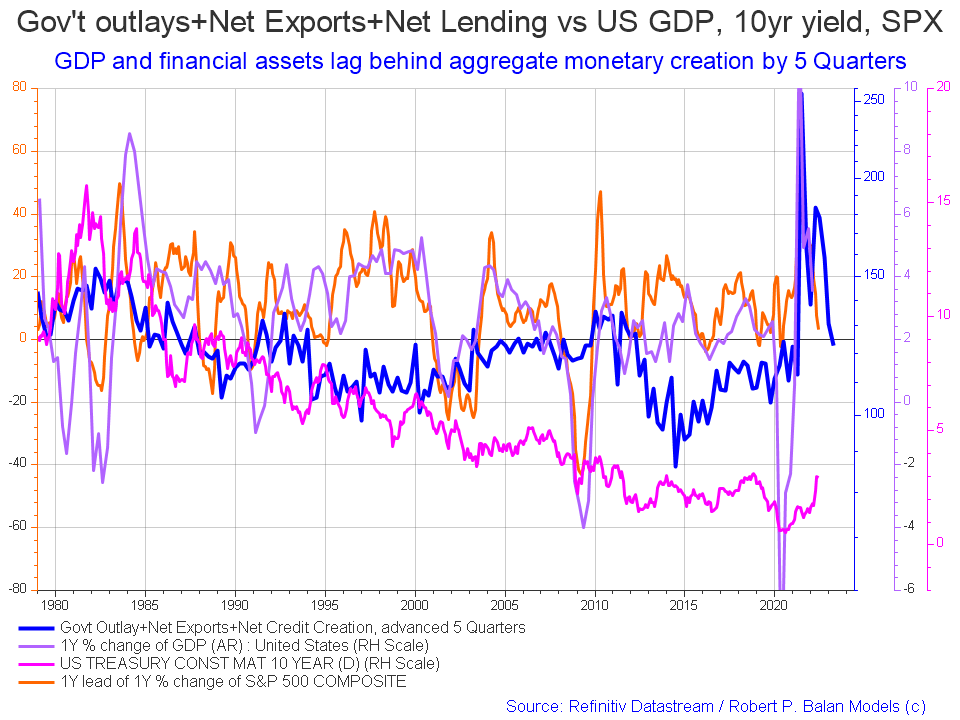
The following chart emerges when one graphs the change rate of the information in the USA sectoral balances table above and adjusts for impact time lags.
Robert P Balan
The blue line is the crucial factor and leads by about five quarters and points to a recovery in the next quarter that is now overdue. The end of the orange line is where we are now. One would expect a movement of markets back upwards following the blue line into the rest of the year in the near future. This model is not granular enough to say exactly when that will occur.
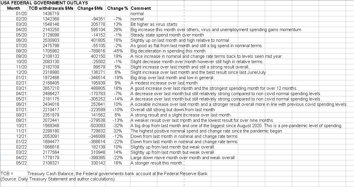
The table below shows that the overall federal expenditures were larger than last month and a 16% increase from last month.
US Treasury
The change rate in both tables is upward, and this points to stronger markets over the next month, but this is tempered by the year-on-year fiscal contraction that we are going through at the moment.
The chart below compares the last few years of federal deficit spending, and one can see the massive difference between 2022 and 2021.
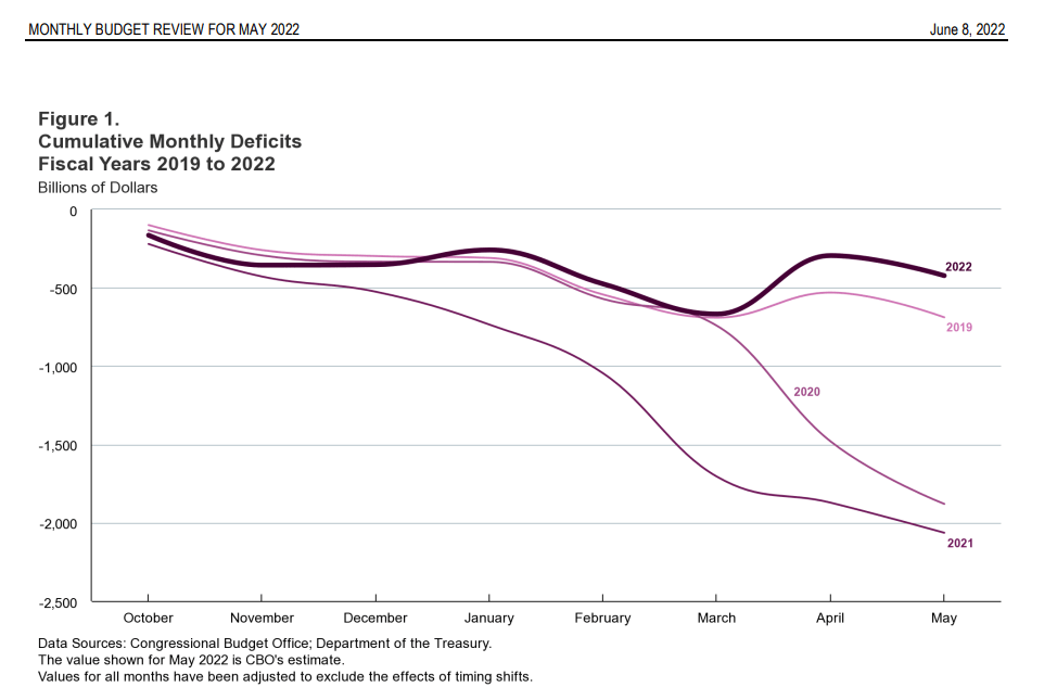
Congressional Budget Office
The fiscal contraction is so large that Professor William Mitchell had this to say in his daily economics blog that highlights the situation well.
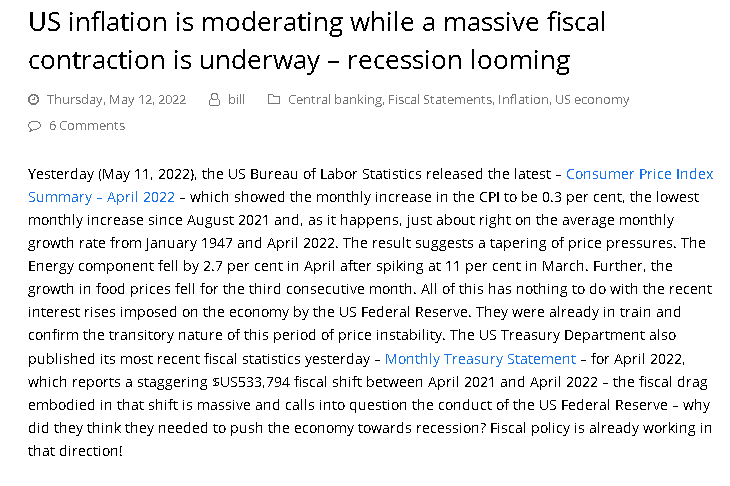
Professor William Mitchell
Asset markets have found this advice far from good and inflation was falling on its own as the chart below shows.
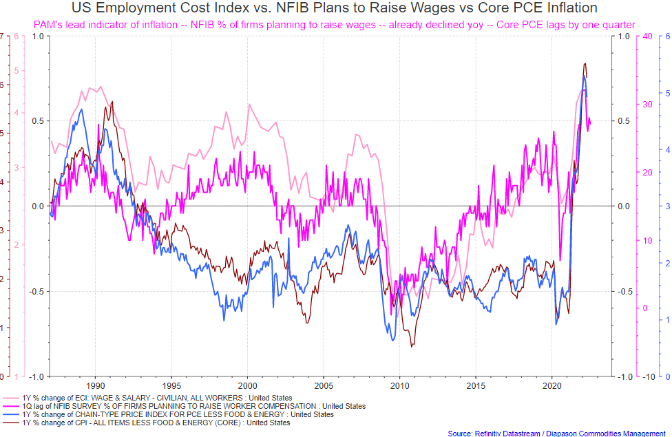
Robert P Balan
The percentage of firms planning to raise wages has fallen and Core PCE has already rolled over and this is all before any of the Feds actions could have had time to take effect. More patience was required.
Supply shock inflation is not solved with interest rate rises but rather a resumption of supply via the end of covid lock downs and adjustments to cater for a lack of supply out of Ukraine and a now heavily sanctioned and embargoed Russia. Monetary policy can do none of those things.
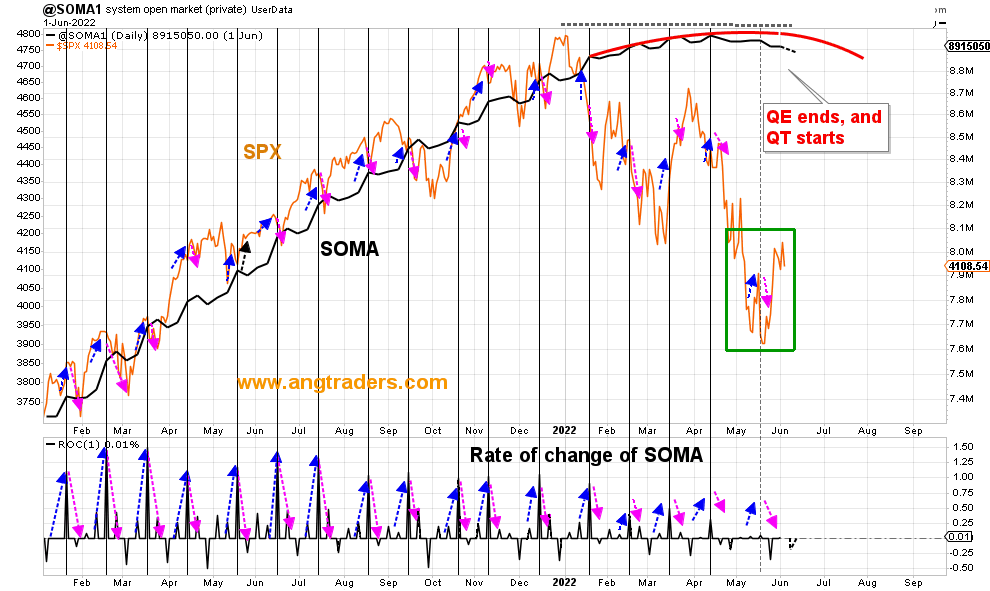
The chart below shows graphically the relationship between the federal government (currency creator) and the private sector (currency user) and is from ANG Traders of the Away from the Herd SA Marketplace service. The bottom panel highlights in red and green the financial relationship between the currency creator and currency users.
The daily average net-transfer is +$9.3B/day. The Treasury account balance has $758B that needs to be spent into existence which should mitigate the Fed’s SOMA balance sheet reduction by maintaining the positive net-transfers to the private sector (chart below).
(Source: Mr. Nick Gomez, ANG Traders, Away from the Herd SA Market Service Weekly report).
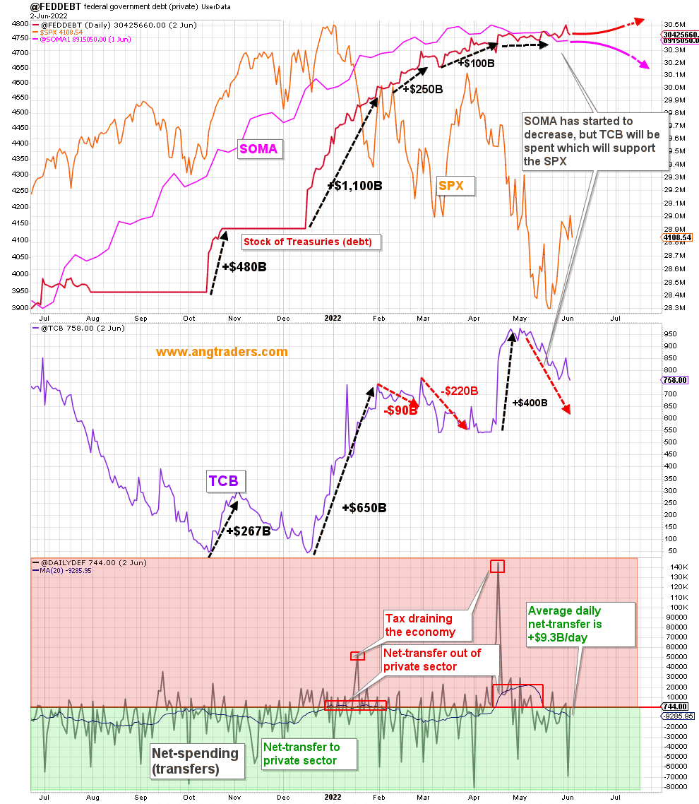
ANG Traders
The above chart shows the stock of treasuries, red line, (AKA national debt) flattening off as liquidity overall dries up. Remember that for all practical purposes the stock of treasuries is the money supply, and a growing economy needs a growing money supply to enable all the transactions that take place within it and to grow financial assets. On the bottom panel, note the red boxes where the private sector went into deficit. The fiscal stance is now moving back into the green area where a private sector surplus can occur.
There is a major federal tax collection in mid-June, and this will send the fiscal balance back into the red danger zone. The good news is that this is the last one until mid-September and in this fiscal space the private sector surplus can increase, and asset markets can grow.
At the White House, there have been no fiscal events worth noting that have any market moving ability. In fact, the recent year over year cut to fiscal spending is still being celebrated as a great event.
The Fed ends QE this month and QT starts in earnest. The Fed raised the interest rate by 50 basis point at its last meeting and looks to be about to do the same as the next meeting as well. There is an FOMC meeting in mid-June that times with another major federal tax collection month when it is expected that both a rate rise and further QT will be announced. These are not market friendly events.
ANG Traders
The chart above shows the Fed balance sheet juxtaposed with the SPX. The black line shows the end of QE and the red line shows the projected trajectory of the QT that follows it. Note also the falling rate of change of SOMA on the bottom panel. None of these trends are good for markets. Together with the reduced federal spending and large federal tax collections, the actions of the federal government and Fed have combined to undermine both the asset markets and the economy since before last Christmas.
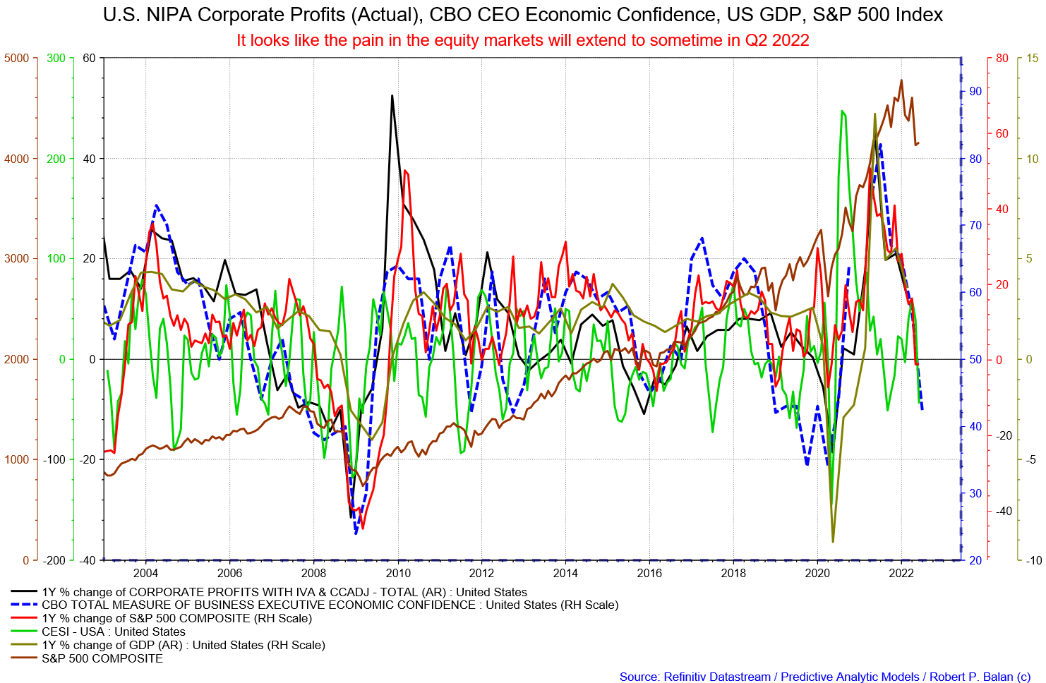
Another factor that points to continuing weak markets going forward are NIPA profits, as shown in the chart below.
Robert P Balan
NIPA corporate profits are falling, and this feeds back directly into stock market asset valuations. One cannot expect markets to rise until NIPA profits rise to reflect higher stock market asset prices looking into the future.
NIPA profits are highly correlated with the Equity Bond/Price Ratio and logically therefore with the S&P 500 Index itself. The basic relationship: cash flow drives profits and profits drive equity prices.
NIPA profits need to flip back up before equity markets take their lead and also move back up. This strategic turn has yet to happen.
Total corporate cash flows come from total spending and with the massive year-on-year cut to federal fiscal spending, discussed above, these have fallen and taken corporate profits down with them.
On the world stage, the chart below shows the expected likely path of asset markets based on the flow of funds at the macro world level.
The chart below comes from Mr. Robert P. Balan of Predictive Analytic Models and is part of his SA Marketplace service information for subscribers. The chart shows the level of money creation by the top five world central banks in a change rate format, along with a host of other indexes.
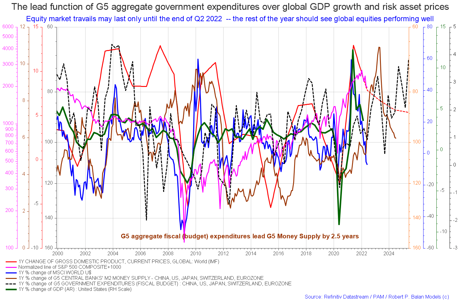
Robert P Balan
One good takeaway from the above chart is that generally at a very macro level the one-year percentage change of total worldwide federal government spending is rising and will do so until at least 2026 as the dotted black line shows.
Robert P Balan
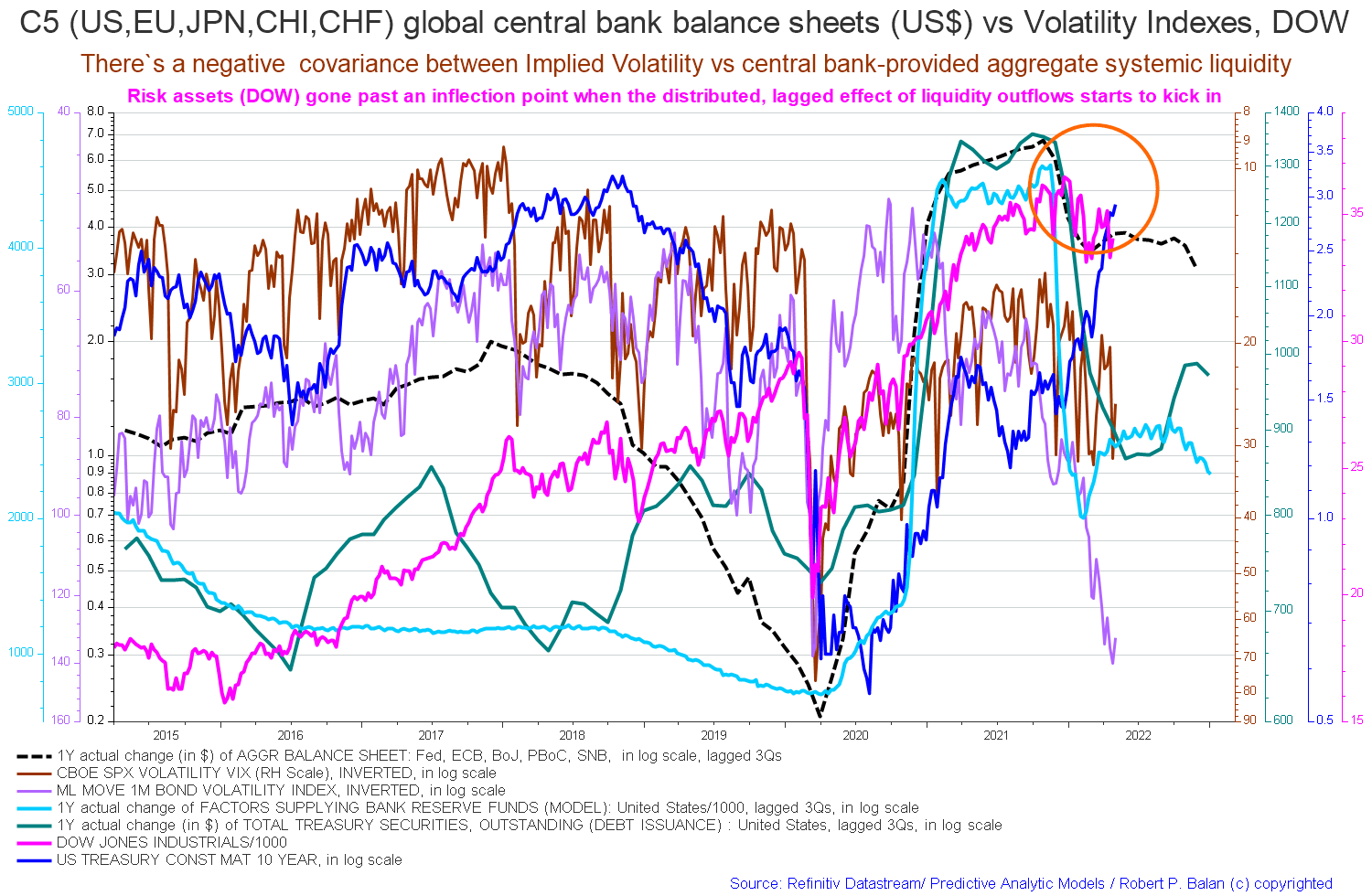
The Liquidity models still point to another market low in mid-June, but these models are better at forecasting dates rather than the price move extent. So we are not even sure now if we get to see new lows, given the change in equity markets fundamentals — the recent rally providing a good positive feedback loop, on top of inflation peaking, Fed QT expectations abating, yields falling, Shanghai lock down ending, China’s promise to do what it takes to kick-start the economy, recession fears diminishing.
(Source: Mr Robert P Balan, PAM chat, June 2022)
The chart above shows the one-year actual change of liquidity of the major wide economies, and in this format allows one to get a feel for the amplitude of the change. One can see that in this instance the amplitude is much less than it has been in the recent past, so one cannot expect the bumper stock market results of last year. Bumper stock markets ended with bumper federal spending.
Be the first to comment