

Richard Drury
By Rob Isbitts
Two Words: “Trendline Resistance”
You don’t have to be a technician since your teen years like I have to appreciate the simple message the stock and bond markets are screaming at investors right now. In fact, the message has been the same throughout 2022. That message, to quote from the classic movie Monty Python And The Holy Grail, “none shall pass!” The most popular stock and bond market benchmarks, as well as several of their underlings, are flashing the same signal. They have been marking the proverbial line in the sand all year. And until that wall, defined by price levels I show you below, is broken through, the bear market is here to stay.
Oh, there will be rallies. We’ve seen them all year. But there’s a difference between a bounce and a bull market. Trendline resistance can be a great aid in helping investors distinguish between a bullish trade in a broader bear market, and a true “long-term,” sustainable upward move in stock, bonds, or other assets.
Now, with that preamble and those definitions out of the way, let’s spend the rest of this space looking at some of the best evidence I’ve seen in four decades of looking at organized lines on a page. The evidence points to some straightforward conclusions. And, whether you think charting is the only way to invest, you think it is complete voodoo and horse hockey, or somewhere in between, I hope this adds some perspective to your ongoing analysis.
Those silly technical analysts? Not anymore.
Because while technicians used to be the folks shuffled to the back corner of the investing party, modern market entities such as algorithms, hedge funds, high-frequency traders and a host of other big money market-movers use them. So at the very least, I think it helps to know what’s going on, especially when the proverbial and literal lines are drawn so clearly. Among the infinite number of complex analyses we chartists drum up, one of the most basic appears to be the key to price movement right now. This is not only the case for stocks, but for bonds as well. Let’s take a look.
S&P 500: declining trendline at a key point
S&P 500 (TC2000)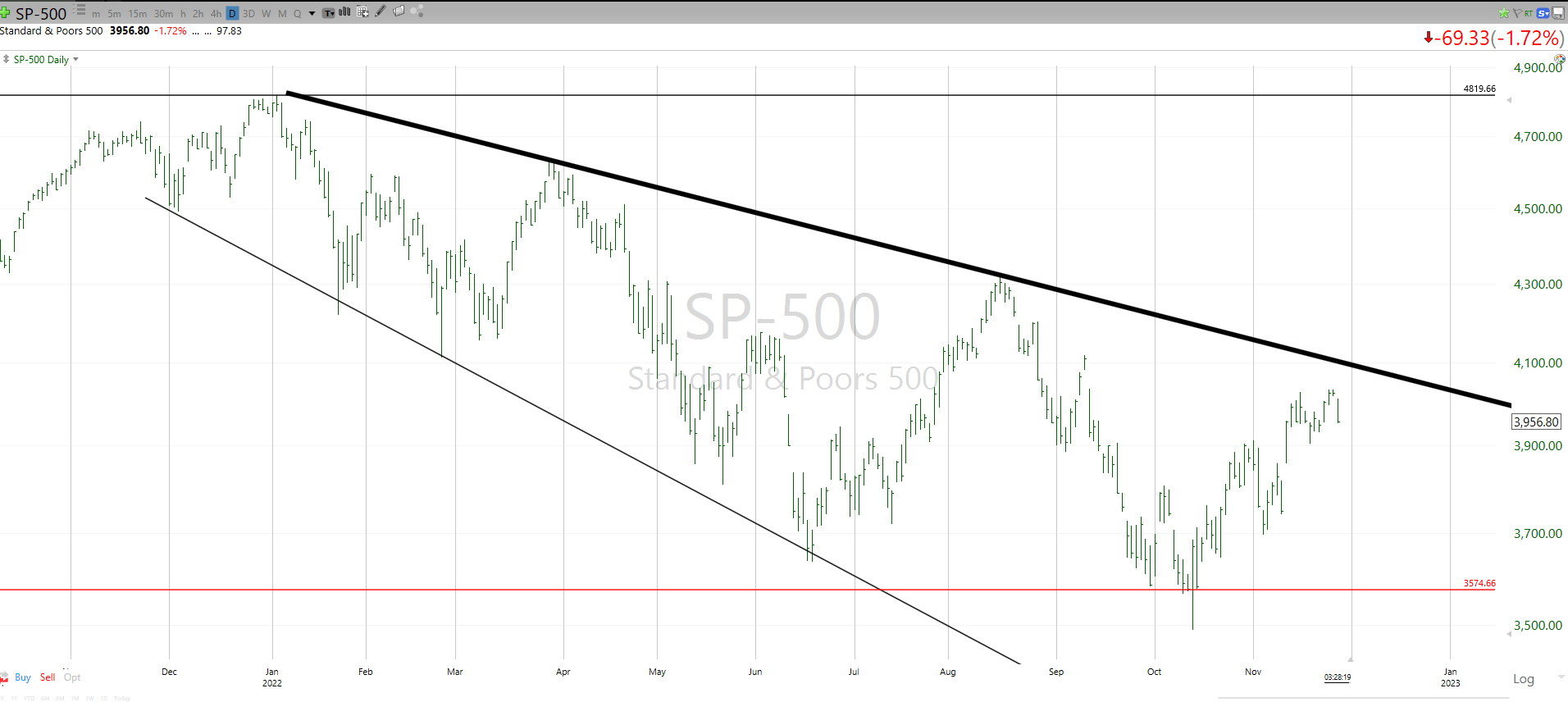
Above, I’ve charted the S&P 500. Since the start of 2022, it has carved out a very clear pattern, which is marked with the thick black line. This is what we call “trendline resistance.” In English, that means a series of price points that can be connected by a straight line to create a trend.
Think of it this way: the S&P 500 has been trying all year to jump above that line. Every time it gets there, it fails. Since the highs keep getting lower, the longer it goes without breaking through, the lower the “bar” keeps setting for the stock market. This is what a stock bear market looks like.
Where does it go? No one knows for sure, but with so much attention paid to technical levels these days, I’ll highlight a few key levels to watch. One is the current resistance level, which I estimate to be in the 4,075 area. The problem is that there’s increasing signs that the S&P 500 is already peeling back from “testing” that thick line, even before it reaches it. What’s even tougher for bulls these days is that 2022 has shown a large number of false breakouts. So even a quick burst to, say 4,100-4,200 is more likely than in the past to be a “fakeout-breakout.”
If the market does finally succeed to the upside, there’s good news. The old highs of 4,800-ish would be in play, albeit with some intermediate hurdles at the two previous highs, set back in March and August. Finally, and more likely the way it is shaping up, if the market breaks down through that thin red line, this year’s lows (3,500 area), it’s “look out below.” More on that if/when it happens.
What do you do with this information? Make the S&P 500 prove that it is not simply rolling downhill. Don’t get overzealous on every little bear market rally. Because that’s what they are until proven otherwise.
TLT: same thing, different market
TLT (TC2000)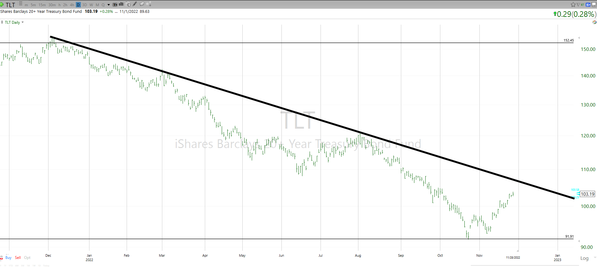
If you need some visual evidence that the market for long-term U.S. Treasury Bonds has spent most of 2022 following the S&P 500 lower, here it is. Same concept as above, just with the iShares 20+ Year Treasury Bond ETF (TLT) shown instead. I see some investors getting excited about a huge reversal of this dramatic 40% decline in the price of TLT since late 2021. I say nothing is “on” for the long-bond until it decisively breaks out and stays above that thick black line. If it gains another few percentage points, we’ll get a good clue.
When I pour through hundreds of charts (ETFs and stocks) each week, I’ve seen a similar pattern in many of them all year: downward trend line, clear trendline resistance, tested but not broken. Conclusion: bulls have a lot of proving to do. Otherwise, keep thinking “bear market rally.”
10-Year Treasury Bond Rate: OMG
Finally, here is perhaps the most disheartening chart for those who think the benchmark 10-Year U.S. Treasury Bond Rate is all set to reverse and head lower, making all of those threats of higher rates and inflation go away like it was just a bad dream. Sorry, Dorothy from the Wizard of Oz. We’re not there yet.
10-Year US Treasury Bond (TC2000)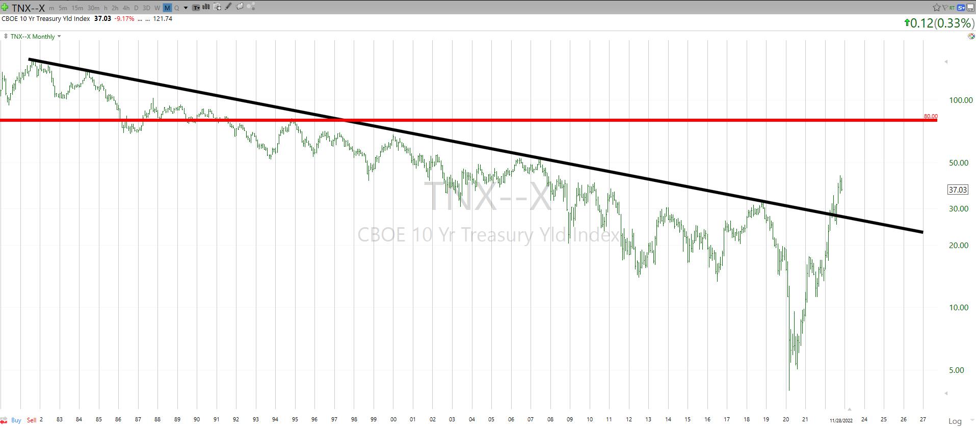
Above you see a chart of the 10-Year. Note that the scale on the right is the yield multiplied by 10, such that 50.00 equals a yield of 5.0%. This is a very, very long-term chart. It goes back to 1980. So, it shows the entire bond bull market, that lasted for four decades. That era may or may not be over. Unless you are prepared for some very unfamiliar territory in bond yields, you had better hope it is over.
Because what I see here is a possibility…repeat, a possibility…that the recent breakout in the 10-Year Treasury Bond that occurred two months ago, could go much higher. How much higher? Well, it is sitting around 3.7% as I write this. One previous high level to target is around 5%. Another beyond that is 8%, marked as the thick red line. Either of those would add insult to injury for bond investors, and the threat of this type of move is why I tell anyone who will listen that simply buying long-term bonds of any kind and assuming they are free from risk is, well, very risky.
The last level, if things get really out of hand, is one you should probably take small children out of the room for. I’ll wait.
OK, with the room clear, I can now tell you that the top of the range you see in the chart translates to a 10-Year Treasury Rate of 15%. Am I calling for that? No. Am I expecting it? No. Am I allowing for it as one possible terminal point for the first bond bear market since my childhood? Yes. Because back in the 1970s, I’m quite confident that no one expected odd-even gas line days, hyper-inflation and the other aspects of a post-boom economy that are long since forgotten.
Trendline resistance: good to know
Trendline resistance is a simple concept. And today, given the state of market conditions, in a year where long bonds fell 40% in price and the Nasdaq fell more than 30% at one point, can we really say that these are just silly pictures with no basis in reality? After 42 years of charting, and having seen these patterns developing in their early stages last year and early in 2022, I say this: allow for many possible outcomes, and ignore historical patterns at your peril.
Be the first to comment