

RiverNorthPhotography/iStock Unreleased via Getty Images
Investment thesis: While the company is rock-solid, the charts are soft.
T. Rowe Price (NASDAQ:TROW) is an investment manager:
T. Rowe Price Group, Inc. is a publicly owned investment manager. The firm provides its services to individuals, institutional investors, retirement plans, financial intermediaries, and institutions. It launches and manages equity and fixed income mutual funds. The firm invests in the public equity and fixed income markets across the globe. It employs fundamental and quantitative analysis with a bottom-up approach. The firm utilizes in-house and external research to make its investments. It employs socially responsible investing with a focus on environmental, social, and governance issues. It makes investment in late-stage venture capital transactions and usually invests between $3 million and $5 million.
It is the 7th largest company in this sector, out of 204.
It is also a dividend aristocrat – a stock that has increased its dividend for at least 25 years. The stock is currently yielding 3.14% and has increased its dividend for 36 consecutive years.
My standard method for analyzing a company is to first look at the macroeconomic backdrop, followed by an analysis of the company’s financials, and, finally, the stock charts.
Last week, I wrote an article on the DIA that included an in-depth look at the economy using the long-leading, leading, and coincidental indicator analytical method. That data is still viable. I concluded:
The non-financial data is still positive. But there are signs of concern in the financial data. This is usually what happens before a recession: the credit markets tighten, and the yield curve inverts. And this is before we add in the tightening Fed variable, which is also bearish.
The biggest economic challenge now is the Federal Reserve, which has set out on a course of rate hikes. The central bank’s biggest challenge is finding the neutral rate – the one that is neither stimulative nor regressive. That is a very difficult challenge and has only been achieved once since the end of WWII.
The problem for (TROW) is that a growing economy is far more beneficial for investment managers. A strong economy causes a rising stock market which attracts investors. A recession has an obviously negative impact. In short, the economic pictures could be better.
Now, let’s turn to the company’s financials, starting with gross revenue:
T. Rowe Price, gross revenue (Seeking Alpha)
Considering the competition in this economic sector and T. Rowe’s size, the above data is impressive. Gross revenue has increased in each of the last 10 years.
T. Rowe Price income statement percentages (Seeking Alpha)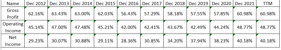
The gross, operating, and net margins are impressively consistent. This is what I refer to as a self-running company: Internal controls are obviously very strong, giving the company rock-solid consistency.
T. Rowe Price Dividend safety (Seeking Alpha)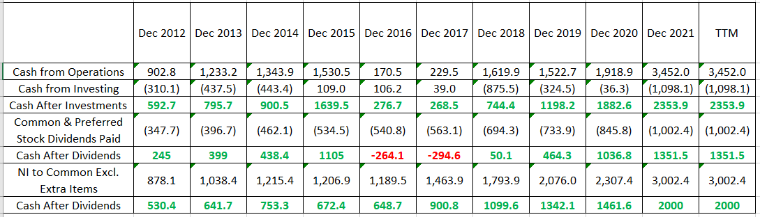
Dividend investors will want to know about the safety of (TROW)’s dividend. It is very safe. The third row above shows the amount of money remaining after the company pays for investments. That number has been positive in all time frames, meaning the company generates sufficient cash to self-fund growth. The fifth row shows that in all but two of the last 10 years, the company has had positive cash flow after paying its dividend. This is hardly fatal, as the company could have sufficient cash to make up the shortfall or it could use financing. But the bottom row shows the difference between net income and the dividend payment. This calculation assumes a more traditional analysis, one where the company pays its dividend after determining net income. This number has been positive in all years. And, it shows ample room for the company to continue raising dividends.
And that brings us to the charts:
T. Rowe Price Weekly and Daily Chart (StockCharts)
The chart printed a double-top last summer. It sold off sharply at the beginning of this year. Prices bounced off the 200-week EMA on the weekly chart (left). They have fallen sharply through the 200-day EMA on the right but have rebounded above all the shorter EMAs.
Here’s what I don’t like: There is no clear bottom on this sell-off. It’s possible that the daily chart has formed a “descending bottom” – which is just a sharp move lower on high volume followed by a rebound. It’s also possible to argue it’s a reverse head and shoulders, but that’s a very broad stretch. I’ve never been a big fan of the descending formation because it’s also just as likely a reverse counter-rally. And the head and shoulders argument is very soft.
The fact that this is a stable company with a long history of dividend increases means it’s going to attract attention. But the combination of a rate-hiking environment combined with no clear bottom on the chart makes this a hold.
Be the first to comment