

Adam Gault
Since October of 2021, I have managed to publish probably somewhere between 600 and 900 pages on Seeking Alpha, the vast majority of which were focused on how and why we are probably entering a long-term bear market that would punish tech the most and energy the least. This article is my submission to a contest Seeking Alpha is putting on to see who can best anticipate the price of the S&P 500 index at the close of 2023. In my first attempt explaining my rationale for why I thought 2685 might be the likeliest value for that moment in time, I found it very difficult to hold the piece to under 50 pages. So, what follows will be a brutal, unnuanced, unapologetic presentation of how I came up with my numbers.
|
Year-end 2023 Predictions |
||
|
S&P 500 |
2685 |
|
|
EPS |
128 |
|
|
PE |
21 |
|
|
Sales |
1750 |
|
|
Margin |
7.2% |
|
|
Inflation |
2% |
|
Perhaps the best way to begin is to query the structure of the contest itself. Here are the primary requirements, which I have edited for brevity:
1. Qualitative discussion of the U.S. economy, inflation/interest rates, corporate sales growth, and profit margins.
2. Contributors should arrive at a 2023 profit forecast for the S&P 500 Index, supported by the research and analysis presented in the article.
2a. Contributors should arrive at a corresponding valuation-multiple estimate.
3. A stated closing S&P 500 prediction for the end of 2023 should be calculated, based on the S&P 500 profit forecast and valuation multiple.
If I had to put this into a formula, it would probably look like this:
[Real Sales] X [Inflation] X [Profit Margin] X [P/E]⇨ [Price]
Or,
[Point 1 + Point 2a] X [Point 2b] = [Point 3]
I do not have a beef with the equation per se. What I question is whether we ought to start on the lefthand side of the equation and then work our way to the right, or from the righthand side of the equation to the left.
Let me put this another way.
The Big Picture
For the last 50 years or so, real GDP in the US has grown about 3% per year. Corporate profits have grown about 6% a year. Both have experienced periodic shocks and have been running a bit below trend since the 2008 crisis, but they both continue to see fairly steady growth. This permits us to start making some first approximations.
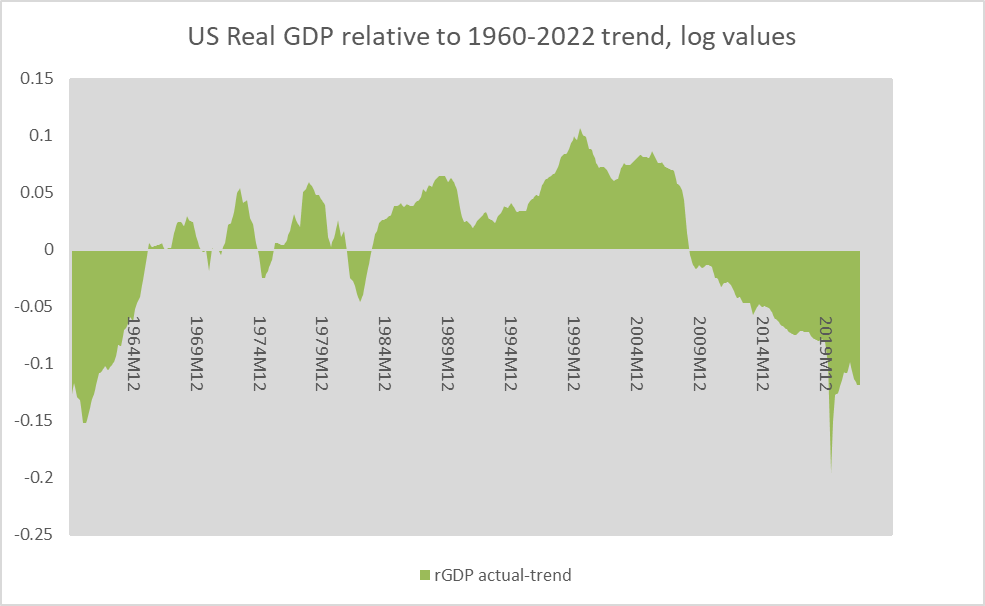
Chart A. US GDP has fallen below trend since 2009 (Data: St Louis Fed)
If S&P 500 sales, adjusted for inflation, are roughly in line with US GDP, then we can start with an assumption that real S&P 500 sales will grow at roughly 3% and that profits (in nominal terms) will grow 6%. The two questions left to us might be, what will inflation look like and what are the probabilities of a shock?
Actually, if we can pencil in an assumption about earnings growth, we can skip all of the attempts to estimate margins, real sales, and inflation. We would just be left with having to produce a PE estimate, and we would be done.
So, can we anticipate earnings shocks, and can we anticipate PE ratios? There is a fair amount of overlap between earnings shocks and recessions, so we might be able to lump them together to some degree. But, what about PE ratios?
Some seem to argue that PE ratios are effectively irrational; they represent expectations about the future, and expectations have shown themselves to be rooted more in emotion than rationality. Others seem to argue that the earnings yield (the inverse of the PE ratio) is the sum of a risk premium and the risk-free rate of return. The two paradigms are not mutually exclusive. They effectively assume that prices are subjectively determined and, as economic phenomena go, relatively free of fundamental considerations.
The notion that PE ratios represent a kind of anticipation of future earnings has some justification. For example, there is a strong correlation between earnings growth (when adjusted for the initial PE ratio) and price returns, as shown in the chart below. That is, over long enough timeframes, stock returns rise and fall to the degree that the PE ratio over- or underestimates future earnings. The r-square here is 59%.

Chart B. The realized PEG ratio anticipates long-term price returns. (Data: Robert Shiller, S&P Global)
But, as the time horizon is brought closer in, the correlation declines quite a bit. If looking only a year ahead, the PEG ratio can only be said to explain 12% of the change in price.
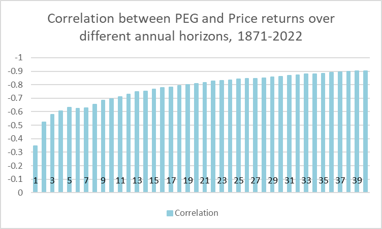
Chart C. The PEG ratio anticipates returns the farther into the future one looks. (Data: Shiller, S&P Global)
If one wants to do something as difficult as predicting price returns over such a short period, you have to nail both the earnings estimate and the PE, or you have to get both wrong in just the right proportions to offset the errors in each estimate. (The person who nails earnings but overestimates PE by 25% will be beat by the person who overestimated earnings by 25% and underestimated PE by 25%).
In other words, you can do a lot of homework calculating inflation, real sales, and profit margins to perfectly anticipate earnings, but you would only be brought inches closer towards developing a rational estimate for the way the price index will behave over the course of the subsequent year.
In my opinion, the best shot one has of getting a short-term prediction correct is understanding the way short-term behavior is influenced by the supercyclical mode the market is in. Whether it is strictly correct or not, it is better to think of “secular” bull or bear markets as modes in which not only overall returns are relatively high or low but in which markets, and indeed the world, behave differently across the board. If such an approximation is correct, then it allows us not only to anticipate short-term moves but use short-term phenomena as confirmations of our “secular” expectations.
From 2009 to 2021, we were in a “secular” bull market, but I believe history suggests that the transitions from bull to bear occur under relatively similar conditions, most notably the emergence of multiple, near simultaneous extreme conditions or imbalances.
When sectoral performances diverge too far, particularly when the long-term divergence between tech and energy is the greatest, the market is coming to the end of a “secular” bull market, and typically what follows is an inversion of the previous sectoral hierarchy. Tech burns while energy surges. This is partially illustrated below.
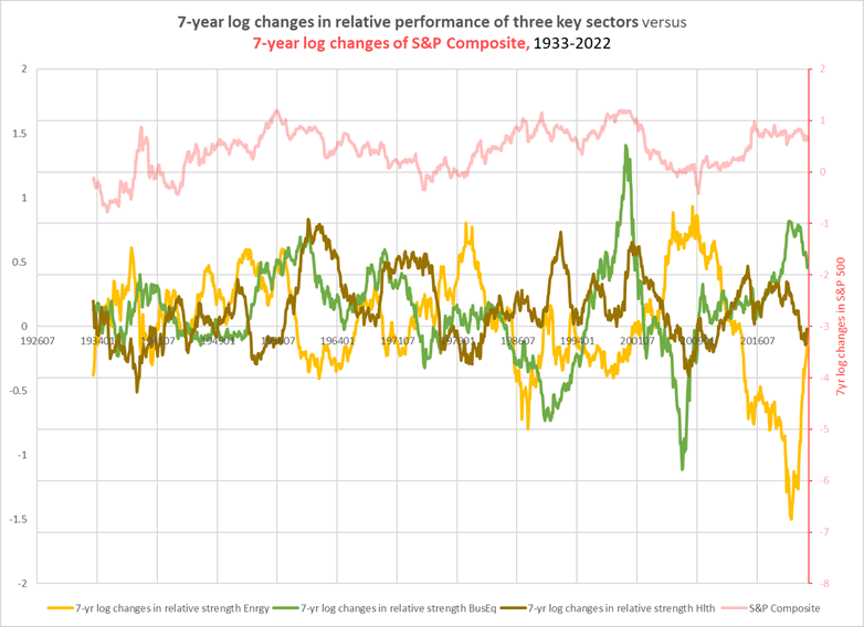
Chart D. Relative strength in energy has been bad for markets; tech is typically strongest at the conclusion of bull markets. (Data: Fama-French 12-industry returns without dividends)
When high-beta sectors like tech and healthcare are outperforming, the market does well, and when low-beta sectors like energy does well, the market does poorly. Extreme imbalances between these two sectors in particular tend to be followed by extreme changes up and down the market. I argued this in greater detail in 2021, when it appeared to me that this condition had been triggered.
The signal that this imbalance is coming to an end is typically confirmed by the sudden emergence of an energy shock. For whatever reason, virtually every major transition in the momentum of the energy sector and in the state of the market is preceded by a sudden spike in energy prices. I have attempted to illustrate that in the following chart, which takes a measure of long-term sectoral divergences (the standard deviation of the long-term returns) and places alongside it the year-over-year change in WTI crude oil prices.

Chart E. Oil “shocks” typically occur late in periods of extreme sectoral divergence. (Data: Fama-French, St Louis Fed)
And, the following chart shows that where sectoral imbalances have been elevated, there is a somewhat greater tendency for markets to experience cyclical crashes.

Chart F. The stock market begins to crash as sectoral divergences peak. (Data: Fama-French, Shiller)
In short, there appears to be a process whereby sectoral imbalances grow, an energy shock emerges, and then the imbalances begin to unwind, not with a gentle shift in market preferences, but often within the storm of an overall market decline.
The most severe market crashes, as the chart above may illustrate somewhat, tend to be clustered. That is, they do not appear to occur at random intervals. The following chart contrasts the Shiller P/E10, or CAPE, ratio with a cyclical rate of change in the S&P. The biggest declines in stocks occur in bursts during long-term declines in the CAPE ratio.
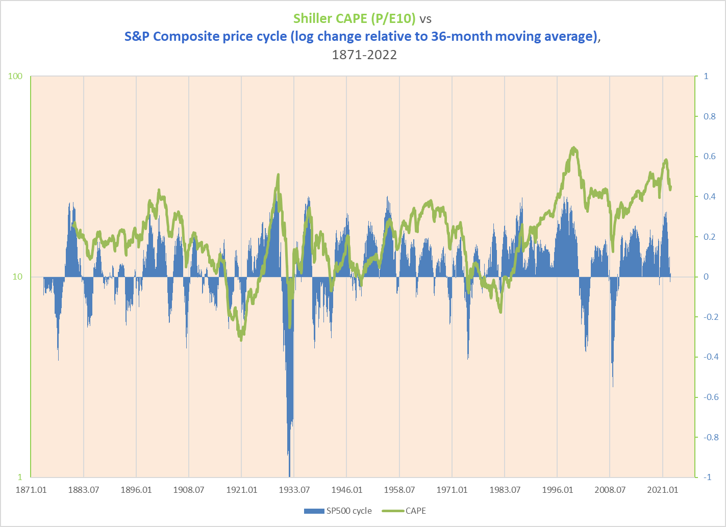
Chart G. “Secular” bear markets are composed of multiple cyclical bear markets. (Data: Shiller, S&P Global)
The CAPE ratio’s major peaks have occurred not only at periods of extreme sectoral imbalance, but often at periods of imbalance within the composition of the ratio.
To oversimplify somewhat, the CAPE ratio can be decomposed as follows:
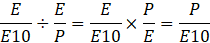
Author
This is illustrated below. Note that peaks in the CAPE have typically been driven by two factors: an elevated PE ratio combined with a surge in earnings growth.
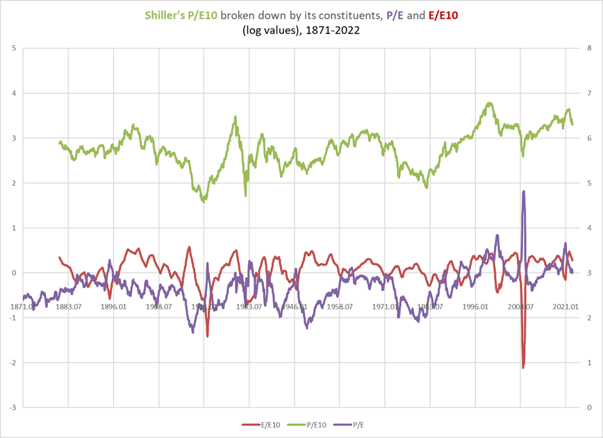
Chart H. Shiller’s CAPE ratio is mathematically comprised of the PE ratio (TTM) and a medium-term earnings growth rate. (Data: Shiller, S&P Global)
This surge often coincides with a peak in the PE ratio, even though the typical relationship between earnings growth and the PE ratio is one of negative correlation. In fact, I found that the periods in which the correlation between earnings growth and the PE are positively correlated occur primarily in the years near market peaks. This is illustrated in the following chart in which I look at the correlation (in blue) between earnings growth and the earnings yield (the inverse of the PE ratio) alongside the CAPE ratio (in green).

Chart I. The CAPE ratio has generally peaked when earnings growth no longer conforms to the earnings yield. (Data: Shiller, S&P Global)
Not only does the CAPE ratio tend to peak roughly around the period when earnings growth is shooting up, but it tends not to find its bottom until the correlation has moved well into positive territory, which typically takes something like a decade.
The following chart contrasts the ability of the CAPE to anticipate returns over multiple horizons with the ability of the correlation between earnings growth and the earnings yield to predict those same returns. (The blue line shows the correlation between CAPE and subsequent returns from 1881-2022 for each annual horizon from 1 to 40 years. The red bars show the correlation between a rolling correlation between the 7.5-year rate of earnings growth and the earnings yield from 1878-2022 and those same return horizons.)
Chart J. The correlation between earnings growth and the earnings yield generally anticipates returns better than the CAPE ratio. (Data: Shiller, S&P Global)
The following chart illustrates the connection between earnings growth and the earnings yield on the one side (in blue) and subsequent 10-year price returns on the other (in red).
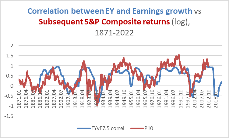
Chart K. The rolling correlation between growth and yield has been strongly correlated with subsequent long-term returns. (Data: Shiller; S&P Global)
The question here is not of causation but rather of the conditions that precede a “secular” bear market, and as the CAPE charts show, a secular bear market is driven, over the long-term, primarily by PE contraction. But, the (typically) positive correlation between earnings growth and the earnings yield suggests that the mechanism of that contraction is somewhat complex: sharp declines in the PE ratio are often made up for by the rate of earnings growth.
In other words, there is a chance that wherever one attempts to anticipate the multiple and the rate of earnings growth, if the final estimate of the price is correct, it is likely because the PE multiple tends to move in just the proportion necessary to offset the error one made in estimating earnings. It is better to know the “secular” mode of the market than to try to determine the outcome bottom-up.
I want to be clear that I think there is something fundamental going on here. The S&P price index is highly correlated with earnings times consumer prices divided by commodity prices.
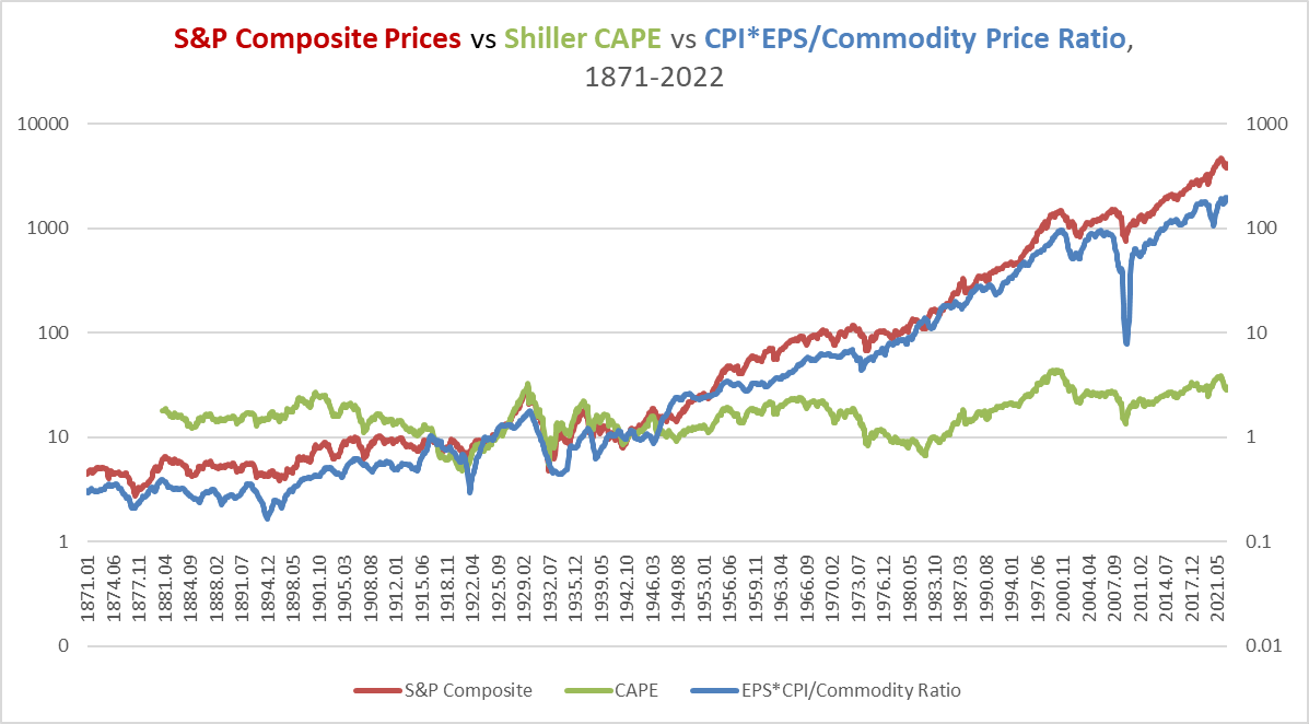
Chart L. Stock prices track earnings times consumer prices divided by commodity prices. (Data: Shiller, S&P Global, St Louis Fed, World Bank, Warren & Pearson)
The chart below shows the correlations between annual rates of change in the S&P and the CPI*EPS/Commodity (CEC) price ratio.

Chart M. The relationship between stock prices and the consumer inflation/earnings/commodity mix has been consistent. (Data: Shiller, S&P Global, St Louis Fed, World Bank, Warren & Pearson)
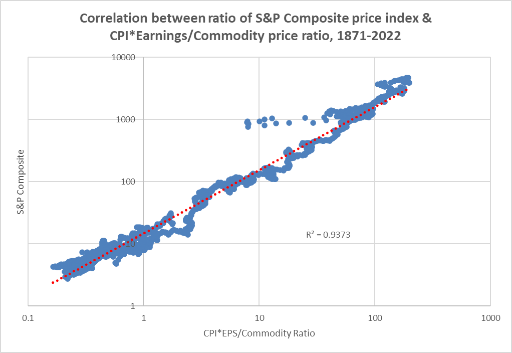
Chart N. The S&P Composite is tightly correlated with this inflation/earnings/commodity mix. (Data: Shiller, S&P Global, St Louis Fed, World Bank, Warren & Pearson)
I reject, therefore, the notion that stock prices are best explained by excess or deficiency in “exuberance” or the “risk premium”, as intuitively satisfying as these concepts may be.
The PE—or, more precisely, the earnings yield—is deeply connected with inflation, almost certainly more so than interest rates.
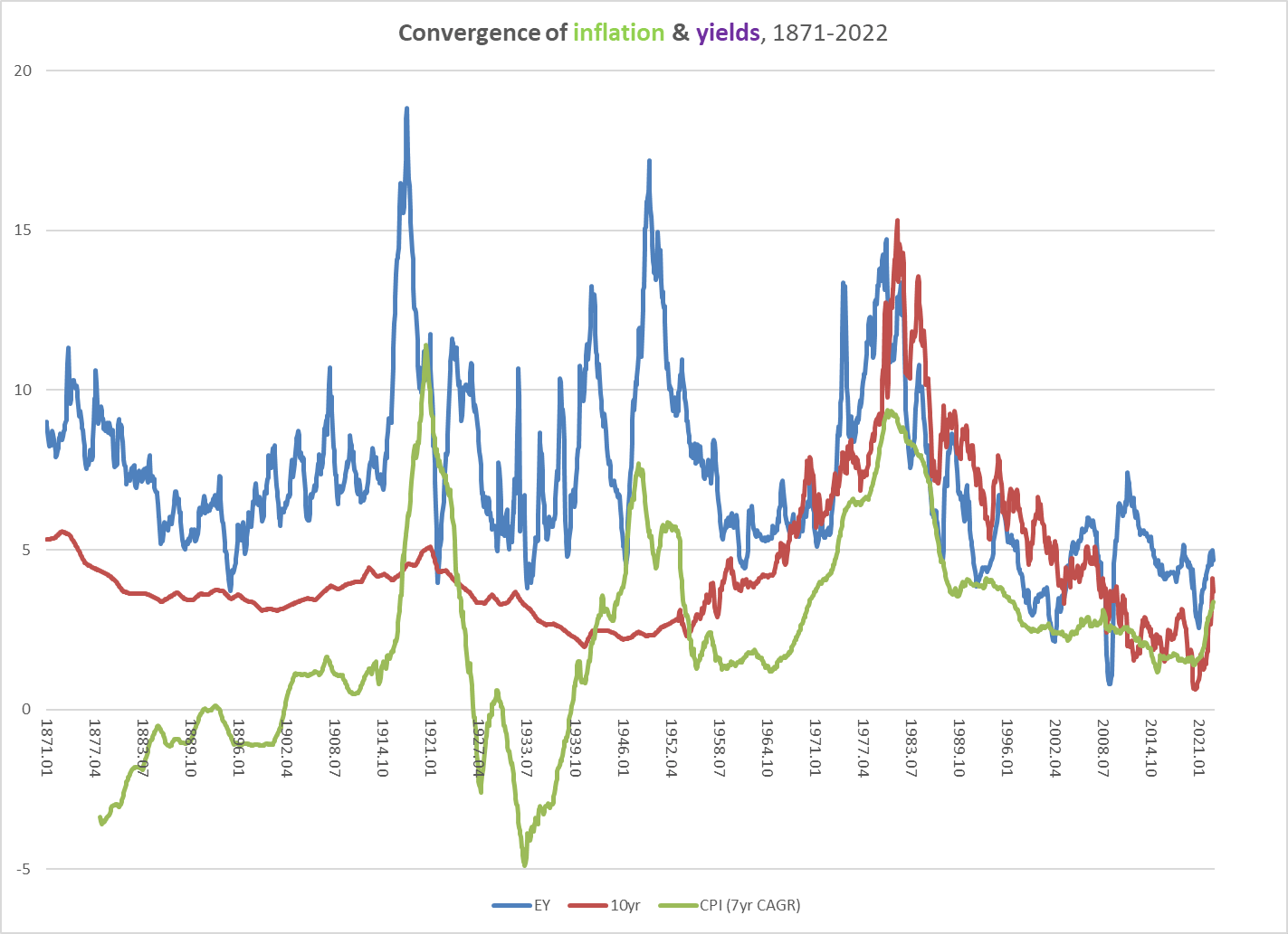
Chart O. Consumer inflation is more closely aligned to the earnings yield than to interest rates. (Data: Shiller, S&P Global, St Louis Fed, University of Michigan)
What is more, just as consumer inflation appears to be “afraid” to break above the level of the earnings yield, so does the rate of earnings growth. Where it has done so, it has generally occurred at periods when the market is about to peak (as illustrated in our decomposition of the P/E10 ratio).
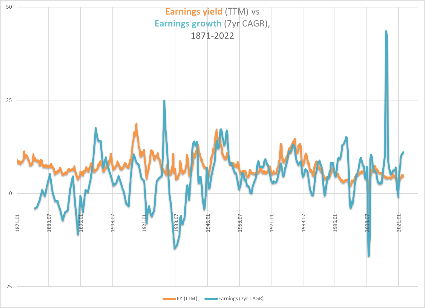
Chart P. Earnings growth tends to ‘breach’ the earnings yield near the conclusion of bull markets. (Data: Shiller, S&P Global)
This gradual compression in the gap between yield and growth has had an impact on returns. Early on in this article, we saw the close relationship between the realized PEG ratio and price returns, but the equilibrium level shifted sometime in the 1990s and has remained shifted ever since.
The chart below, for example, shows the relationship between a PEG ratio and subsequent 10-year returns. Fair value for the PEG is set for 2.7 (in log terms), roughly the pre-1980 equilibrium value, but after the 1980s, the green line (price returns) is higher than the PEG ratio values.
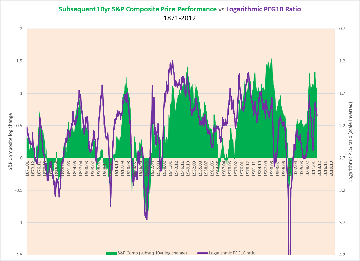
Chart Q. The relationship between PEG ratios and subsequent returns shows that there was an equilibrium shift from sometime in the 1980s. (Data: Shiller, S&P Global)
Again, this represents a significant shift in the equilibrium value, and it has meant that stock prices no longer fall as far as history suggests they ought to have when earnings collapse (as in 2008-2009). One of the questions that I set out to answer at the beginning of the year was whether or not there was a “natural” equilibrium value and why that value might shift over time. My intuition—that the earnings yield constitutes a kind of cap on inflation and growth—points to there being something like a “natural” equilibrium value that will eventually reassert itself via a trend towards significantly lower PE ratios.
But, why would the equilibrium level shift from its “natural” level in the first place? I think I have some idea why and some idea about the timing.
First, I took the pre-1980 equilibrium value and modeled S&P returns from 1871-today and then did the same with the post-1980 equilibrium. In the chart below, the modeled returns are in red and blue. The actual market performance is in green.
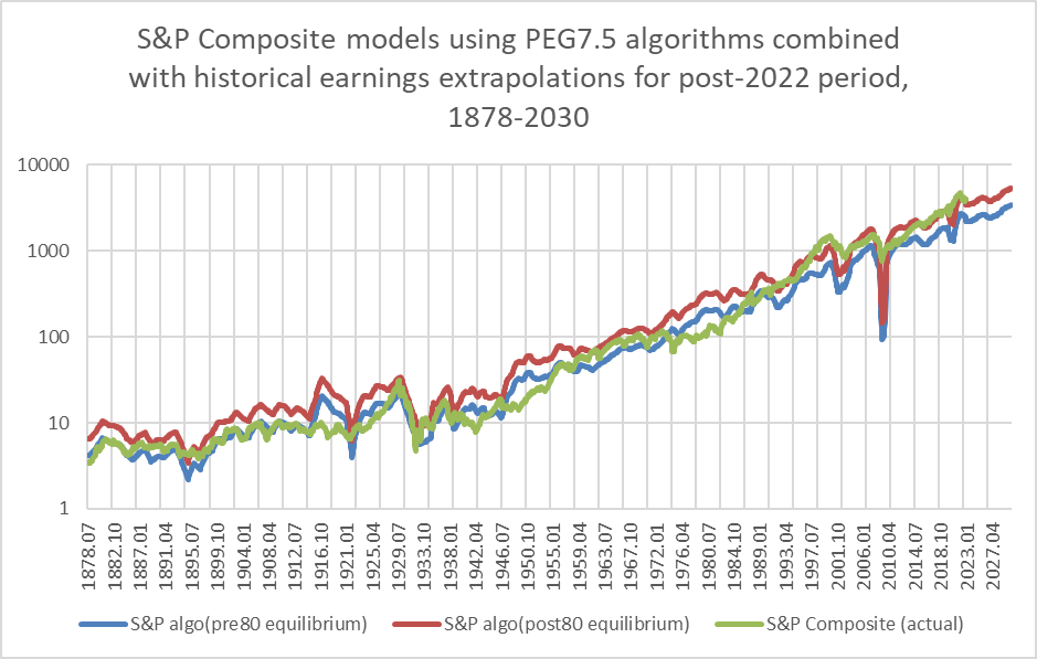
Chart R. The S&P Composite tended to follow one PEG equilibrium prior to 1980, and then shifted to a more generous one afterwards. (Data: Shiller, S&P Global)
Incidentally, I plugged in earnings for the 2023-2030 period that are extrapolations from the post-War rate of growth. In any case, you can see how the actual values for the S&P generally stayed closer to the pre-1980s equilibrium up until the 1980s and then shifted towards the post-1980 equilibrium, but there were occasions in both regimes in which the actual values approached the equilibrium that was out of favor. For example, in 1929, the actual value was near the post-1980 equilibrium, while in 2010, it was near the pre-1980 equilibrium.
This is illustrated more clearly below. Whichever line is closest to ‘0’ indicates which regime was “in charge”.
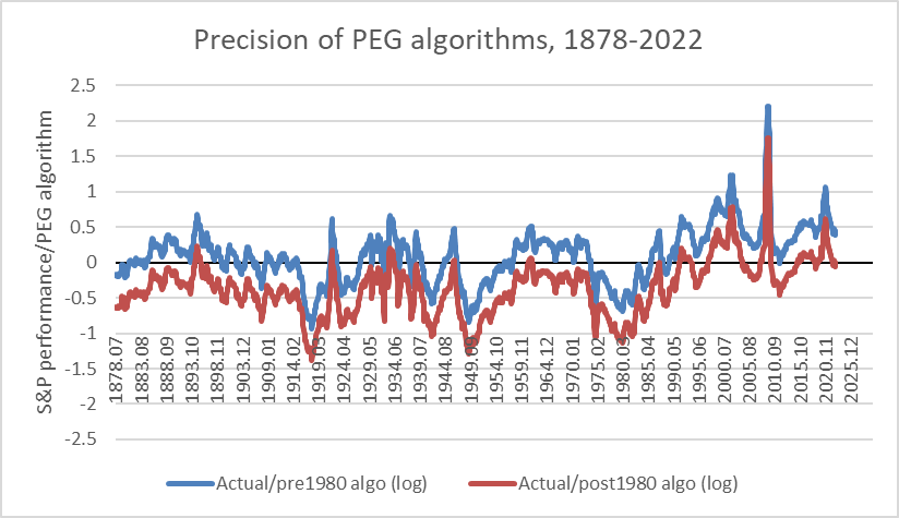
Chart S. Prior to 1980, the index only jumped to the post-1980 equilibrium during peaks in the PE ratio. (Data: Shiller, S&P Global)
Again, up until the 1980s, one regime reigned nearly uninterrupted, and after the 1980s, another, higher-return one reigned. What accounts for this? In the chart below, I overlay the relative performance of tech and energy.
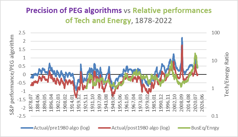
Chart T. The tendency of the PEG equilibrium to shift higher or lower has been correlated with the tech/energy ratio. (Data: Shiller, S&P Global, Fama-French)
There has been a tendency for the market to adhere to the post-1980 regime when tech has been strong relative to energy, as in the 1920s, 1960s, 1990s, and 2010s.
Part of the reason the regime has appeared to have experienced a permanent shift is because we have had two technology booms in relatively short order—two powerful tech booms with only a ten-year gap (the 2000s). But, should we expect the tech/energy balance to reverse to such an extent that a low-return regime will return? I think so.
One reason is the supercyclicality of socioeconomic phenomena. The earnings yield, commodity prices, consumer inflation, and global disorder (measured as battle deaths) have been correlated with one another for the last two centuries and perhaps longer. The ebb and flow of these measures have moved in step historically with the gestation and diffusion of disruptive innovations, which I attempted to demonstrate in my series, “ Conjunction and Disruption”, largely confirming and updating the observations of Kondratiev and Schumpeter a century ago. But, a few key elements changed just as their claims were getting some notoriety. The frequency of the supercycles doubled (from 50-60 years to 30 years), and the disruptive innovations shifted from industrial technologies like railroads and telegraphs to consumer durables like cars, TVs, computers, and smartphones. Yields, commodity prices, inflation, and global disorder tend to rise while the next disruptive innovation is gestating, and then the innovation wave shifts towards mass diffusion as yields, inflation, and disorder decrease.
Since the 1910s, “secular” declines in the earnings yield have come primarily through a rise in stock prices. Thus, stock market booms tend to be associated with the diffusion stage of disruptive innovations, and since, as we have seen already, tech stocks tend to really boom during the late stage of a “secular” stock market boom, tech stocks tend to do well at the point the disruptive innovation has already achieved mass adoption. Tech stocks then collapse as the next wave starts to build (just as the dot-com bust coincided with the emergence of the first, rudimentary smartphones).
If this supercyclicality were to hold out, then that would suggest that the 2030s are likely to be a period of very high inflation, high degrees of global disorder, and a rising earnings yield. A rising earnings yield does not necessarily mean a bear market (for example, if it is more re flationary than in flationary), but generally during such periods, returns have been very low relative to their previous highs. All else being equal, a rising earnings yield is bad for equities. This is, or has been, a period unfavorable to tech stocks but friendly to energy. (The best challenge to my argument is the 1940s, when the Business Equipment sector was nearly 300% up from its Depression lows. But, it was still 67% down from its Roaring Twenties highs). If the supercyclical pattern persists, it would be reasonable to expect tech to be doing poorly in the 2030s, especially relative to energy.
But, I have been arguing that tech likely peaked in 2021 and would not generally be expected to regain its footing until the end of the decade. If that is the case, then we are looking at the possibility of a double-decade’s worth of tech underperformance. This has not occurred since the Depression/WW II era, when it took tech stocks 25 years to regain its 1929 levels (energy needed 17 years, as its losses were less egregious).
In short, especially when we consider the unusual clustering of tech booms we have experienced in the last thirty years, it is likely we are going to see the opposite phenomenon over the next twenty years: depressed tech stocks driving down overall market returns. A reversion to pre-1980s equilibria. Thus, not only can we expect earnings to not live up to the expectations implied in the PE ratio, but stocks will tend to be more depressed than we have been accustomed to since the 1990s.
If PE is to expand in 2023, which, because it rarely moves in a straight line, is possible, it is unlikely it will expand enough to offset a decline in earnings. Using many of the conditions described in this article, I came up with the following scenario for a “hard reversion” to historical norms in January of this year.
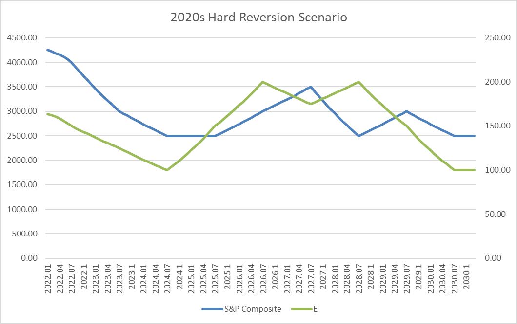
Chart U. One year ago, how a hard reversion to historical norms in the 2020s appeared to me. (Author)
This put the S&P 500 at 3500 at the end of 2022, with EPS just under 150. As I said then, this is intended neither as a short-term forecast nor a worst-case scenario. It is one way in which historical conditions involving the earnings yield, earnings growth, and the PEG equilibrium might behave if we were to revert to pre-1980s conditions.
The following chart is an updated version. It is largely the same, except that it assumes a somewhat lower PE ratio and higher rate of earnings growth for the decade. The end of 2023 value for the S&P 500 would be 2685, with EPS at 128, and a PE of 21.
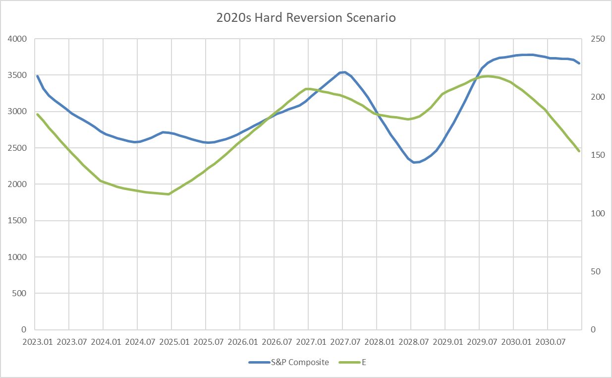
Chart V. Updated hard-reversion scenario. (Author)
The Little Picture
What are the chances that earnings will decline 33% over the next 12 months? Not bad, I think.
The earnings cycle is led by the precious metals cycle, matched by the industrial metals cycle, and trailed by the energy cycle. When energy has spiked, the earnings cycle is probably on its way down, along with the GDP cycle, and consumer inflation not far behind. Commodities generally are currently in cyclical decline, and I think there is little reason to expect any change in momentum for the next 12 months.
What is more, there is a tendency for earnings to decline at this point in the decade. As bizarre as it may seem, there is a tendency for the earnings cycle to trough in years ending with ‘2’, ‘3’, ‘7’, and ‘8’. The following shows the earnings cycle, with the value for years ending in those numbers marked in red.
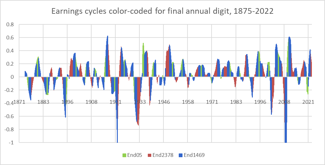
Chart W. Earnings have tended to experience shocks every 5 and 12.5 years. (Data: Shiller, S&P Global)
The next chart shows twenty-year moving averages of the cyclical values. Years ending in ‘0’ or ‘5’ have tended to see higher earnings growth than years ending in ‘2’, ‘3’, ‘7’, or ‘8’. This appears to have begun in the 1910s or 1920s.
The cyclical nature of the earnings yield, commodity prices, consumer inflation, global disorder, innovation supercycles, and both supercyclical and cyclical rates of earnings growth (earnings shocks have occurred with almost clockwork regularity every 12.5 years), insofar as they not only appear to have standard lengths but appear to adjust for when they have missed a beat, is disconcerting. But, I cannot avoid noticing it, and it seems to have become especially distinct since the establishment of the Fed.
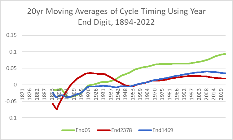
Chart X. Years ending in ‘2, ‘3’, ‘7’, and ‘8’ have seen a greater likelihood of experiencing low growth. (Data: Shiller, S&P Global)
What does all of this imply for inflation, sales, and margins?
Inflation has historically moved with the earnings yield, as illustrated earlier. Since 1980, consumer inflation has typically run about 2% below the earnings yield, as can be seen in the following chart.
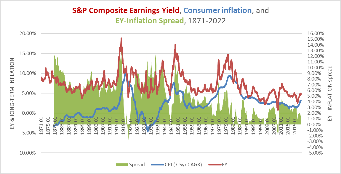
Chart Y. Since 1980, long-term inflation has averaged about 2% below the earnings yield. (Data: Shiller, St Louis Fed, University of Michigan, S&P Global)
If we assume that the earnings yield at the end of 2023 is going to be about 5% and then we subtract two percentage points, we are left with a value of 3% for inflation. But, in order for this long-term rate of inflation to come down to 3% by the end of 2023, the year-on-year rate of inflation for 2023 would have to be 0%, which seems unlikely. Long-term inflation looks as if it may be peaking this year at about 3.2%. If it were to plateau at that level for the next year, that would imply that the annual rate of inflation at the end of 2023 would still only be 1%.
If inflation were to stay at its current level for the next year (about 7.5%), which is also unlikely, then that would leave the long-term rate of inflation at 4% per annum (one percentage point below the earnings yield), which is higher than average but easily within historical range.
Ultimately, as with nearly everything else thus far, translating long-term trends and tendencies into short-term events is very difficult. On the whole, inflation is likely to soften during 2023, but it is not easy to say by how much. Since World War II, sudden spikes in annual consumer inflation, as represented in the chart below, have typically been followed by sudden drops in the rate of inflation, roughly five percentage points lower than it had been 12 months after the rate of inflation had flattened (i.e., falling to the 0.0% level in the chart below).
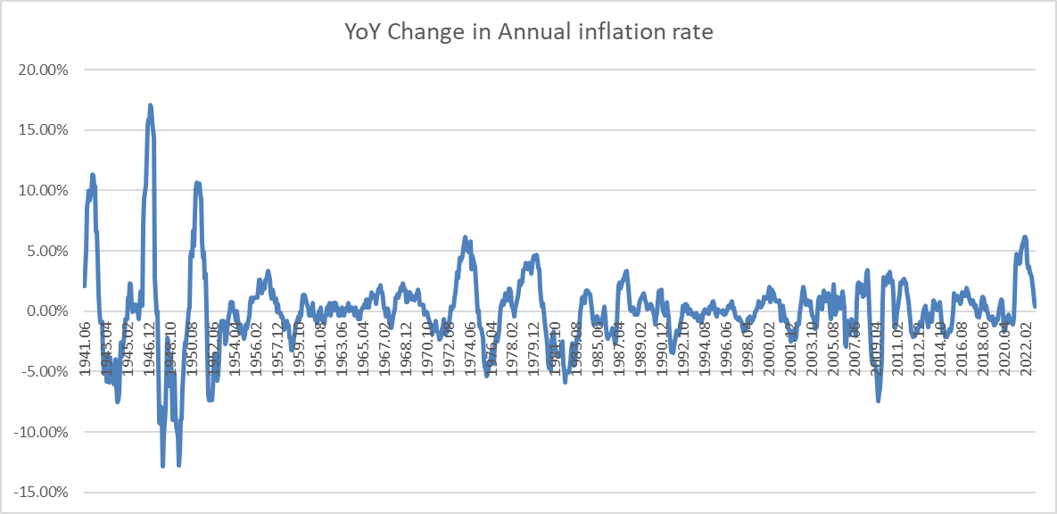
Chart Z. Big year-on-year jumps in the rate of inflation have typically been followed by big collapses. (Data: St Louis Fed)
Inflation is roughly where it was 12 months ago, and it would not be unusual for it to be at 2% by year’s end, and that is where I will put my estimate.
Now, on to margins and sales. I have not been able to find much in the way of historical revenue data for the S&P. The only data set I have found goes back to 2000. Others seem to use a data set that goes back to about 1992.
Using US GDP data as a proxy presents some problems. S&P 500 revenue is more exposed to the goods sectors and the global economy than is the US’s services-oriented economy. Even so, over the long term, the sales/GDP figure seems to stay within the 50%-65% range.
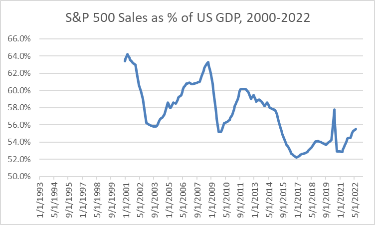
Chart AA. S&P 500 sales appear to loosely track GDP. (Data: S&P Global, St Louis Fed)
The sharpest moves in the ratio appear to occur during periods of economic duress (e.g., the dot-com bust, the GFC, and the Covid outbreak). Sales often seem to pop up relative to GDP during the early stages of crises and then dive dramatically. For a 12-month forecast, that introduces an unwelcome degree of unpredictability.
But, ultimately, the variability in earnings really dwarfs all other considerations.
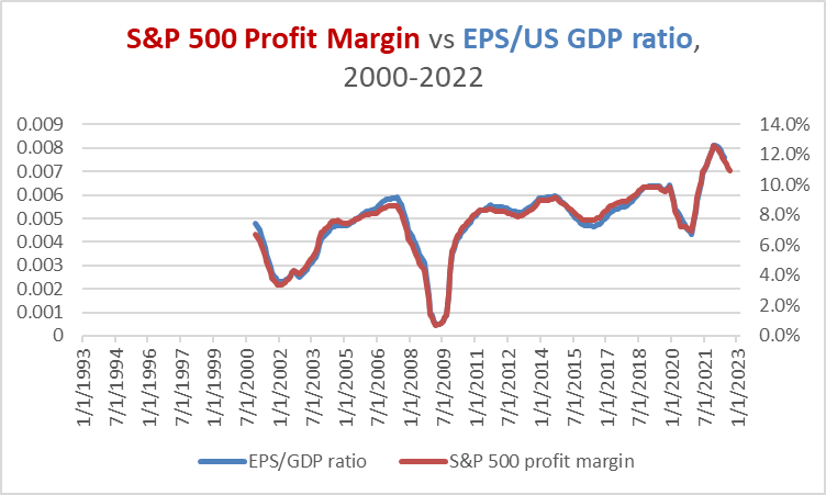
Chart AB. Earnings volatility dwarfs volatility in GDP and sales numbers. (Data: Shiller, S&P Global, St Louis Fed)
If we look at similar measurements of historical profit margins, as in the chart below, we can see that they have generally been rangebound since World War II, although these numbers are much less volatile than the S&P’s numbers shown above. Recessions have historically been bad for margins, meaning that earnings will almost certainly be hit harder than sales or GDP figures, if an official recession does materialize next year.
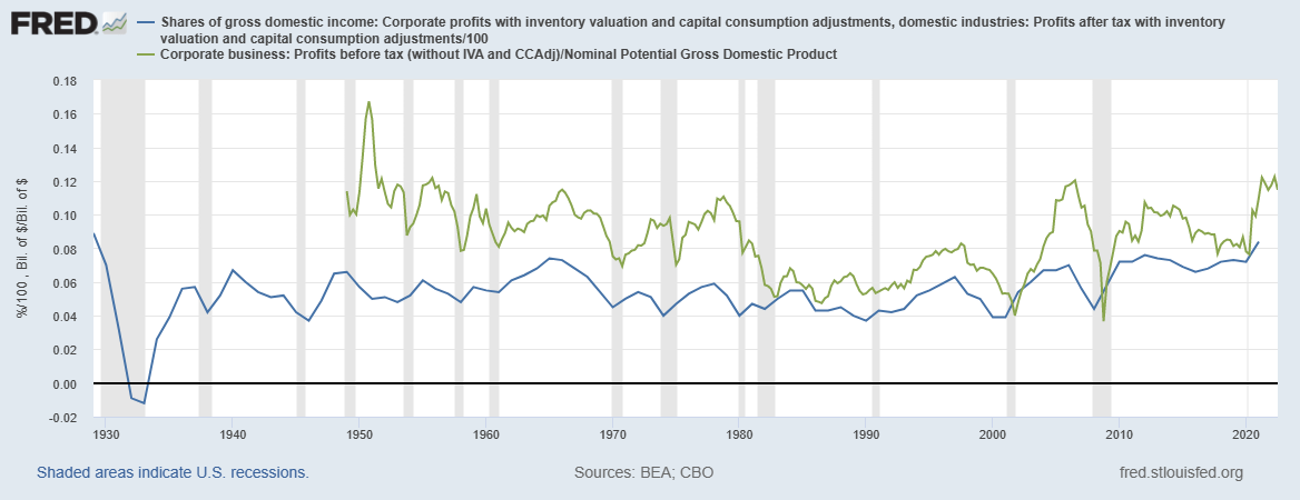
Chart AC. Profit margins have historically been rangebound since the Depression ended. (St Louis Fed)
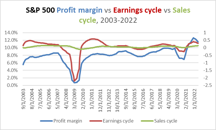
Chart AD. Profit margins tend to track momentum in earnings. (Data: Shiller, S&P Global)
In any case, we ought to expect margins to continue to contract in 2023. In the chart below, I attempted to extrapolate a profit margin for the S&P 500 back to 1960 by using the PCE nondurables indexes as a proxy for S&P 500 sales. The margins appear to have tended to move with the momentum in the earnings cycle.

Chart AE. It appears that momentum in earnings has always been closely aligned with margins. (Data: Shiller, S&P Global, St Louis Fed)
As the economy moves towards recession in the wake of numerous long-term and short-term imbalances and extremes, real GDP, sales, profits, and margins should be expected to contract.
My rough estimate for S&P 500 sales at the end of 2023 is $1750 per share (about 2% higher than Q3 of this year) alongside a 7.3% margin. This is essentially flat sales in real terms (assuming a 2% rate of inflation as of year-end) relative to Q3.
Risks to outlook
The risks are, of course, legion. Investing always involves a kind of groping around in the dark, but trying to pinpoint precise conditions at a specific moment in time is like trying to draw a floorplan of a house you are visiting for the first time while wearing a blindfold. You will be lucky if you can avoid breaking your neck falling down the stairs, never mind producing anything of value.
The primary risks, I think, are to the upside, even though I think markets are more likely to undershoot these levels than to beat them. That is, markets have historically shown a predilection to rise over the long term, and they like to rip upwards when they have really decided that they have had enough bearishness. The risk is less from the probabilities of over/undershooting than from the consequences of being blindsided.
This is apart from ‘event risk’—a Fed pivot, a radical reversal in the hostilities in Eastern Europe and Asia, China reopening, and all the other sorts of things that history likes to throw up. I do not allow much space to event risk, since I see events as themselves characters in a play scripted by long-term historical forces too large to grasp.
In other words, the greatest risk is that I have misread the long-term trends and failed to model enough of the elements that will prove decisive.
Apart from the general bull-risk is probably inflation. I have been in the disinflationary camp since at least late 2021, and I have repeatedly underestimated the strength of consumer inflation. If consumer inflation proves to be more intractable than I have suggested here, then that will likely boost sales and earnings numbers, but it will also suggest that PE ratios will be under pressure. Therefore, I generally expect a miss on one side (e.g., EPS) to be offset to a fair degree by a reciprocal miss on the other (namely, PE).
Conclusion
As far as I am aware, there is no correct way of predicting returns. The trick to surviving these kinds of games is to not be too unconventional while erring. Even though there is no correct way, there are blasphemous ways, so to speak — for example, starting with price returns and working backwards through PE, earnings, margins, inflation, and sales. Here, I have been about as blasphemous as possible without actually engaging in astrology or reading chicken entrails. If this jalopy of an argument is wrong, it will be no surprise to any rational mind; if it is correct, it will probably have been pure dumb luck.
Editor’s Note: This article was submitted as part of Seeking Alpha’s 2023 Market Prediction contest. Do you have a conviction view for the S&P 500 next year? If so, click here to find out more and submit your article today!
Be the first to comment