

duoogle
The Legend
Striving to be our personal best is a timeless aspiration; often associated with ambition and motivation, fueled by encouragement and inspiration. But striving to be perfect might be a sign of the times, fueled by unrealistic expectations, leading to often disastrous consequences.
How The Pursuit Of Perfection Is A Dangerous Desire Wendy L. Patrick, JD, PhD, Psychology Today
It is obvious that Leveraged ETFs don’t work perfectly, so it makes sense that a lot of analysis focuses on their imperfections.
In order to address the problem intelligently, the only idea is to create a perfect return data stream for a given LETF and compare it to the actual one. It’s not simple to deal with a single data stream, so the introduction of a second introduces serious complexity into the exercise.
Once that issue is addressed, the difference between perfect and actual can be quantified.
JIFriedman.com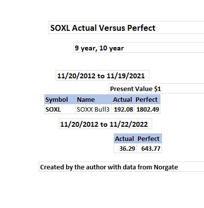
This is not about nickels and dimes. The investor who bought SOXL in late 2012 and held through 2021 did alright, making 190 times the initial investment, but the perfect data stream is almost 10 times larger. Holding for an additional year was costly. Still, if an investor can’t find true happiness by making 36 times an initial investment in 10 years, what is the right number?
There seems to be at least two different market forces responsible for the differences between actual and perfect:
- Structural slippage, including quantifiable costs; and
- Volatility decay, probably due to range behavior.
Structural slippage can occur when LETFs are rebalanced after the close. In addition, a multitude of other concrete factors also contribute to the slippage phenomena. Volatility decay can be seen as the difference between actual and perfect data streams after all the other relevant factors have been subtracted.
Personally, I’m not attracted to this type of cornflake counting because:
- It’s a lot of work and I’ll probably mess it up, and
- Why an adjustment makes things better is unclear.
My approach to market analysis is from an information theory instead of a mathematical perspective. Recent design improvements to the combinatoric framework introduced in Beat The Market With Combinatoric Kabbalah have made an information theory based approach to the volatility decay problem possible.
A combinatoric methodology provides a simple way to build, manage and analyze perfect LETF data streams. Integrating perfect streams into the multidimensional combinatoric structure leads to more sophisticated insight. Combinatoric methodology resolves information complexity issues that a purely mathematical approach fails to even address.
I hope that analysts and investors who have avoided looking at the LETF volatility decay problem because of the perceived obscurity and complexity, may find the subject more approachable.
Leveraged Bull/Bear Pairs
Leveraged ETF analysis is sort of a country cousin to options theory. Beat The Market With Delta Force was an earlier attempt to explain this.
Options theory is more or less based on delta neutral analysis. In the case of LETFs, a delta neutral position can be established by buying equal dollar amounts of a leveraged Bull and Bear pair.
JIFriedman.com JIFriedman.com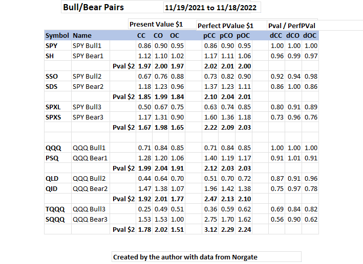
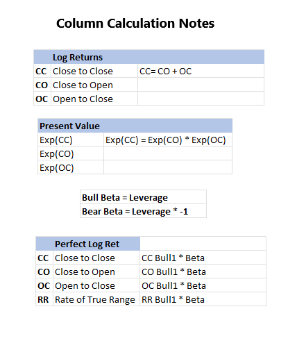
Present value of $1 invested at the start of a time segment seems like the best way to do Perfect vs Actual return analysis. My original idea was to do this analysis using my usual MO of natural log returns.
That technique turns out to be dubious, presumably because returns from multiple stocks from the same time segment aren’t additive. If log returns are used for Bull/Bear pairs, perfect always breaks even, but present value shows that isn’t quite so.
At the end of the period, a neutral hedge investor has the modest ambition to recoup the initial $2 investment.
Perfect returns are shown in the middle. Perfect returns are defined as the LETFs working as advertised. This naïve view is analytically very useful.
The rightmost 3 columns divide actual by perfect returns. The higher the ratio, the more perfect the actual number.
Remarkably, the perfect bull and bear pairs hedges, consistently make positive returns. Real returns were worse than perfect, but returns during the CO period are noticeably more stable than OC.
Observed CO stability makes the traditional view of the importance of structural slippage questionable. Overnight (CO) rebalancing appears to have a minimal effect on return as, it is difficult to explain how structural slippage would not be resolved before the next day’s open. The OC period is more dangerous.
JIFriedman.com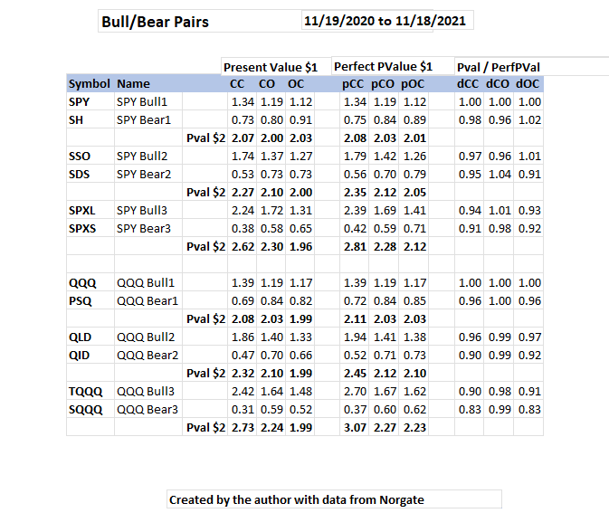
2021, and the living was easy in a less volatile environment.
Obviously, the discrepancies between actual and perfect are more pronounced as volatility/leverage increases. One dimension of this is 3X LETFs have 3 times the standard deviation (volatility) of 1X by definition. Another dimension, is that the market as a whole has been more volatile.
Bull/Bear pairs seem to have relatively insignificant perfect/actual return discrepancies for RLETF (Reputable LETF) groups. The real drama is associated with changing the dimensionality of the analytical view.
Long Term Bull/Bear Volatility Decay
RLETF Groups have price history going back to 2010.
JIFriedman.com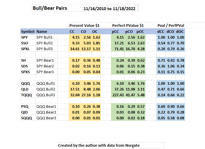
The long term view divides the bulls and bears. Looks like the right idea was to be long over this time period. The Actual/Perfect ratio is much worse over the long term, than it has been for the past two years. The extra stability of 2X Bulls CO versus 3X Bulls is notable. It’s not a bad idea to be long 3X Bulls CO and Long 2X Bulls OC. Obviously the current high volatility environment is not exactly propitious for doing that now.
With the recent lamentable market weakness, 3X long term bull returns are now only spectacular instead of obscene. Of course, the big psychological problem of playing these things is that the heat is hard to put up with. Stress interferes with rational decision making. It goes without saying that position sizing is of critical importance when playing these.
The Blurry Traditional View
A traditional volatility decay analyst will know CC (Buy and Hold) and pCC (Perfect Buy and Hold) numbers; only two of the six measurements shown on the studies. The critical CO and OC finite state returns are invisible.
Suppression of information makes analysis and decision making more difficult and error prone. Finance seems to be the only academic discipline that didn’t get the memo.. My guess is that avoiding additional information is simply because the typical analyst does not know how to generate and manage it.
During my working career, I was disappointed with the artistic merit of my algorithmic solutions for multiple return streams, so I resolved to go through the logic more carefully when I retired. The combinatoric structure explained below is a relatively simple solution to the data stream management and control problem.
RLETF Group Definition
The Group Definition and Matrix are designed to manage the complexity of handling multiple, interchangeable data streams. The structure can handle any group of stocks, but it is especially useful for RLETF analysis because of the multidimensional nature of those instruments.
Combinatoric Kabbalah discussed the RLETF group definition in depth. The group definition determines the horizontal sequence of price history data on the matrix, in addition to resolving processing and addressing issues during the information analysis phase.
JIFriedman.com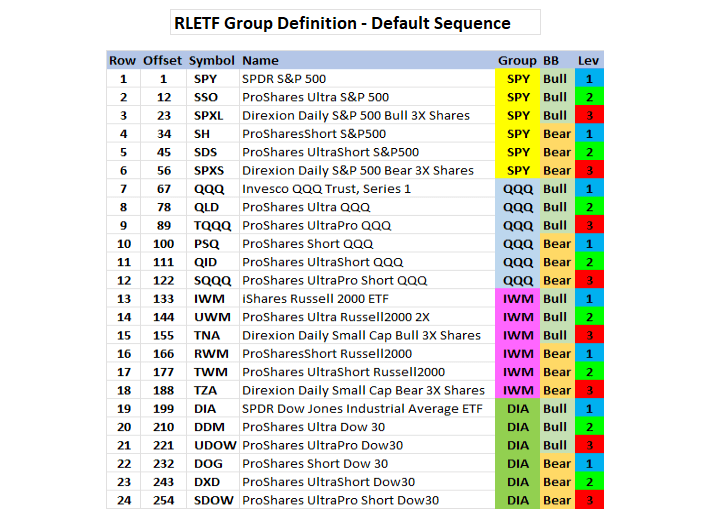
All four RLETF groups are represented: SPY, QQQ, IWM, and DIA.
Offset + 1 = the starting matrix column of the given symbol.
The total number of columns in the matrix worksheet is 254 + 11 = 265. 254 is the Offset for SDOW, on row 24, and there are 11 detail columns per ETF. Just say no to column letters.
The Matrix
The matrix is built on demand from price history data. Each row represents an historical trade date. It is easy to add or remove columns, based on changing analytical packages. A partial transposed view of 11 column matrix detail from a single row is shown below:
JIFriedman.com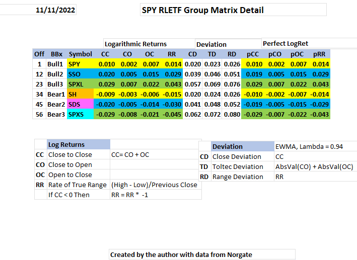
The first three columns are from the Group Definition and don’t appear in the matrix. The EWMA deviation calculations are straightforward and simple, they are described in detail in Use 3D Volatility Ratios For Investment Decision Making.
Adding the detail column number (1 through 11 in this case) to the offset gives the analytical algorithm the exact matrix address of any information element for any stock. That makes the analytical algorithms very easy to code.
A reasonable discussion can be had about the suitability of using Bull1 versus the actual index, or whatever. Personally, I think Bull1 wins that debate, but the fact that Bull1 data is already available makes the decision a no brainer. Bull1 is not perfect, here we are pretending it is.
Dealing With Increasing Information Complexity
The idea behind the group definition and matrix is to automate all the routine tasks required to prepare the data for analysis. Minimizing the trauma of adding and removing data columns from an analytical package is also an important design goal.
Combinatoric Kabbalah used only two matrix detail columns for each ETF. Here, detail columns are expanded to eleven. Thoughtful design allows additional analytical complexity without the usual associated problems.
Applied Combinatoric Kabbalah – Single Stock
… at the mouth of two witnesses, or at the mouth of three witnesses, shall a matter be established.
Deuteronomy 19:15
The analyst is responsible for combining the data streams, computer assistance should increase the analyst’s intelligence. A clear, intelligent methodology produces better analysis.
The simplest case is data streams for a single ETF. Over a time segment, any of the 11 matrix detail columns represents a data stream that can be displayed on a line chart. A chart can have either two data streams or three data streams (witnesses). The analyst has to choose reasonable ways to combine the data streams.
JIFriedman.com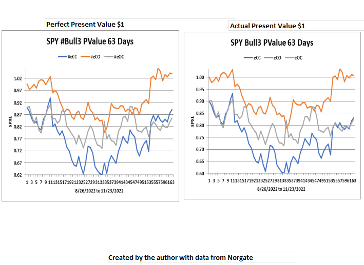
There is very little difference between the perfect and actual SPXL charts. The 63 day time segment shows quite decent bottoming formations for all three data streams and a currently healthy intermediate strength rally. It is encouraging to see CO back in front, CO should normally follow the major trend.
Perfect Versus Actual
JIFriedman.com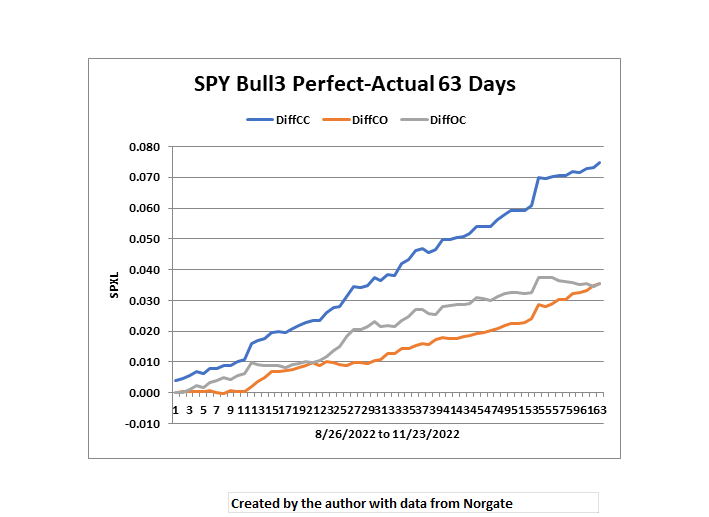
Present value of Perfect – Present value of Actual creates three new return streams. DiffCC = DiffCO + DiffOC.
The DiffCC spike at point 55 is notable. That is Nov 10, the day after the day after the midterms. The initial reaction after the midterms was down, but that move was decisively rejected the next day. The spike can also be seen in both DiffCO and DiffOC. The spike was quite bullish.
Looking at a running totals is the best way to visualize LETF volatility decay. A math guy will tend to not put that extra quality into the analysis, because it won’t seem to make much difference.
JIFriedman.com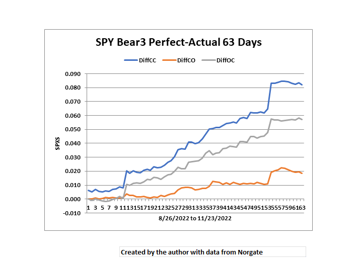
The spike is way more noticeable and serious on SPY Bear3 (SPXS). The bears are intrinsically inferior to the bulls. Someday, I hope to understand why.
Deviation and Return
There are 3 deviation streams that can be combined with 3 return streams (leaving out RR). 3 * 3 = 9 possible ways to create two data stream deviation return charts.
JIFriedman.com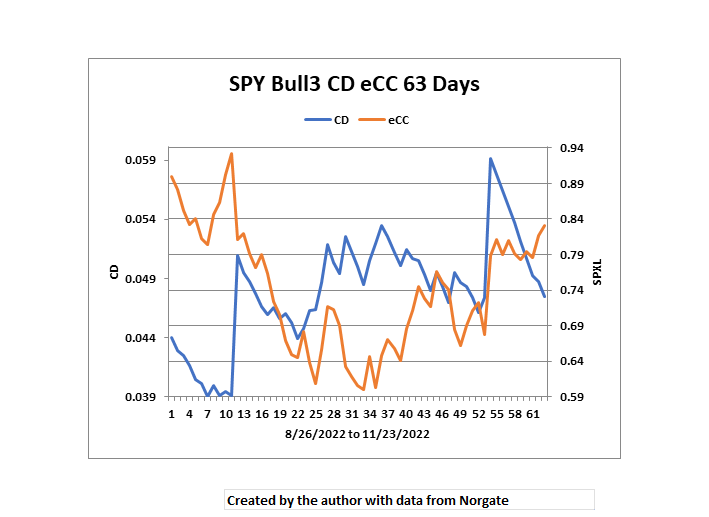
CD is the daily EWMA logarithmic deviation. The rejection of the summer rally high in mid August was accompanied by a rise in CD. SPXL bottomed in late September through early October while CD topped. The sharp rise in CD during early to mid November was an example of favorable volatility, The seasonality is playing so well this year one has to be optimistic about December.
JIFriedman.com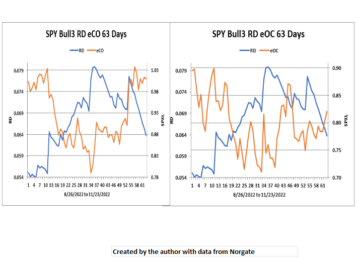
Volatility decay is most likely caused by daily range issues. Looking at RD versus daily finite state (CO and OC) returns is easy to do. eCO bottomed when RD peaked. The two charts show the relative strength of the CO rally. This makes the current intermediate rally more promising than the prior failed countermoves this year.
Multiple Stock Combinatorics
… life for life, eye for eye, tooth for tooth, hand for hand, foot for foot. Deuteronomy 19:21
The verse tells us how to assemble multidimensional data streams with multiple stocks. For example, analyzing Bull2 CO and Bull3 CO makes sense. However, Bull2 CC and Bull3 OC doesn’t.
Combinatoric Kabbalah showed how the group definition can be sorted to give the analyst a clear visual understanding of what is happening. The major technical issue is how many group definition reads are done in a processing cycle.
JIFriedman.com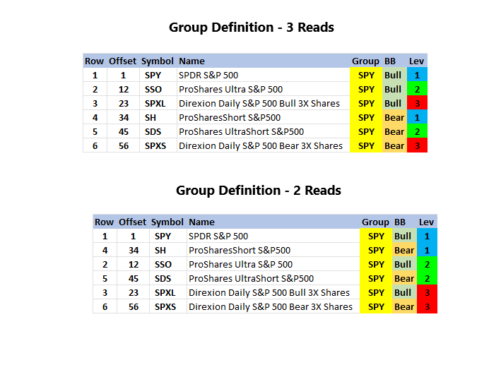
Since there is a limit of three data streams, either two or three reads are necessary for multiple security analysis.
JIFriedman.com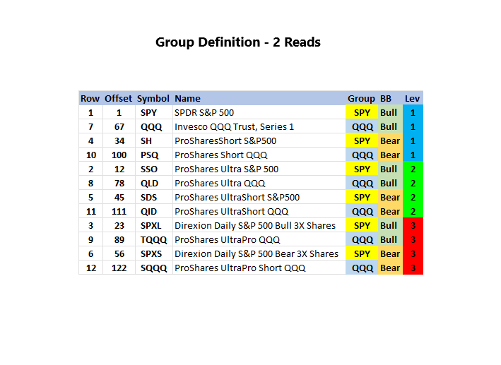
Multiple groups can also be included. Without having a visual aid like the sorted group definition it is difficult to keep track of what you’re doing. This technique enhances the analyst’s intelligence.
Once the read logic is understood the general chart design rules are:
- There is always a time segment.
- Return data streams (CC/CO/OC/RR) are always running totals.
- Volatility data streams (CD/TD/RD) are not running totals.
Perfect versus Actual Present Value Distance
It is possible to combine data streams to analyze the difference between perfect and actual returns.
JIFriedman.com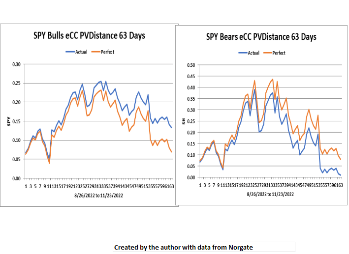
PV Distance measures the difference between the high and low returning Bull or Bear over the period by present value. The measurement isn’t sensitive to the particular order of the individual bulls or bears or whether they have positive or negative returns. For bulls, actual distances are greater than perfect. Of course, the opposite is true for bears.
In the current 63 day view PV Distance is narrowing quickly for both bulls and bears. With perfect data streams, PV Distance will be 0 at return 0. With actual data streams, not so much.
If the current intermediate trend stays bullish, both the bulls and bears return streams will flip, so that Bear1 will be the best performing bear and Bull3 will be the best performing bull.
The perfect bears are about to flip, but the perfect bulls have a ways to go.
Present Value Distance On Different Timeframes
JIFriedman.com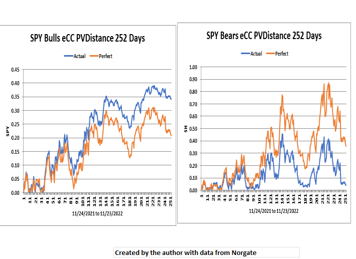
The 252 day view highlights the essential crappiness of the Bears.
JIFriedman.com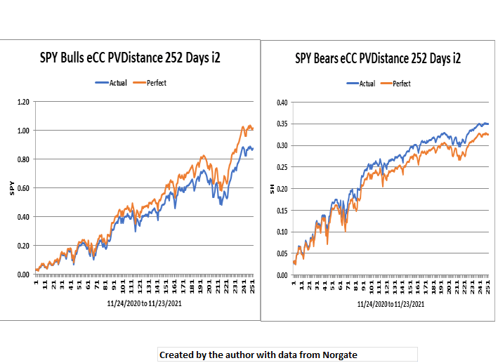
Looking at the same study from 2021 (iteration 2), the effect of low volatility keeps the perfect/actual numbers much more in line.
Conclusion
When the final showdown came at last, a [law] math book was no good.
The Man Who Shot Liberty Valance, Gene Pitney
Perfect vs Actual LETF analysis is a very process analytical tool for understanding broad market behavior.
Be the first to comment