


ipuwadol/iStock via Getty Images
Introduction
The major problem I had in the past was having a simple method to determine daily price changes to yearly historic price. I’m not the type of person to sit at a computer watching daily price changes all day. I have better things to do with my time. The problem I had was never being sure which stock is oversold or overbought in my portfolio of stocks.
I can research past financial results and pick good stocks. The final results always come down to the price I pay for the investment. I have recently solved this conundrum with software to automatically determine the psychology of the market and stocks I currently own.
In this article I present June 16, 2022, market decline where most of my stocks went into oversold territory. I received Email alerts during that day and took advantage of multiple purchases. Since that day the market has recovered, including my holdings.
The trade signals are based on the RSI (momentum indicator) and price Z-score (standard deviation), see Appendix-A for more information. Both indicators are calculated from a year’s worth of price data.
Market Perception
It’s not easy to change the perception of price gains as being good, and price declines as being bad. The way I got around this perception is from the dividends hitting my account each month. We are programmed to expect price gains as the only method of success, but I’m here to tell everyone there is another way to evaluate market performance.
Receiving something from a purchase is how we shop for food, utilities, cars, homes, wants and needs. We know how to do this value hunting and the stock market is no different!
We need to stop thinking the stock market is some kind of magical entity only professional investors play in. Price declines are no more than getting more dividend shares at a lower cost. June 16th was a great day to increase my yearly dividends.
Current Holdings
BDC (Business Development Company)
(FDUS), (GBDC), (GSBD), (TSLX), (HTGC), (TPVG), (CSWC), (OCSL), (ARCC)
mREIT (mortgage Real Estate Investment Trust)
(BXMT), (BRMK), (ABR), (PMT), (STWD)
CEF (Closed-End Funds)
(RCS), (PDI), (PTY), (PFL), (GOF), (ECC),
All companies listed above are RIC (Regulated Investment Company) stocks.
They are pass-through companies that avoid double taxation. The income tax is passed to shareholders as ordinary income most suitable in a tax shelter. When using these types of investments in IRA/ROTH accounts the portfolio will grow very fast over time.
Portfolio Alerts, June 16th
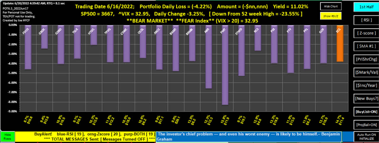
Figure-1
Author
Figure-1 shows the chart display of my current portfolio with a yield of 11%. On June 16th there were 19 of 20 holdings indicating oversold status. The purple bars indicate both RSI and Z-score entered the buy zone. The one orange bar indicates the Z-score was triggered, but not the RSI.
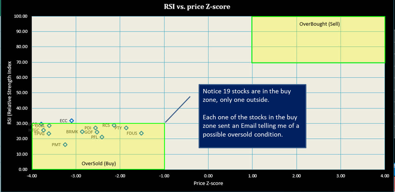
Figure-2
Author
Figure-2 is a new chart I can tell where any of my stocks reside in the over-sold and over-bought range.
I received many oversold alerts June 16th and took advantage of three ABR, BRMX and PMT. I also added ECC (very close to full buy alert). All four are under allocated in my portfolio, I went shopping for value.
Profitable Trade Email Alert
The transcript for PMT (PennyMac Mortgage Investment Trust) reaffirmed their dividend for the rest of the 2022 year, but the book value declined because of an accounting change this year. See the following quote from the latest transcript.
Our forecast for PMT’s taxable income and liquidity continues to support the common dividend at its current level of $0.47 per share through the remainder of 2022.
…book value decreased at $17.87 from $19.05 at the end of the prior quarter. The decline in book value per share is outsized relative to PMT’s performance this quarter as a recent accounting change beginning in 2022 required us to reclassify the portion of PMT senior notes that are exchangeable for PMT common shares…
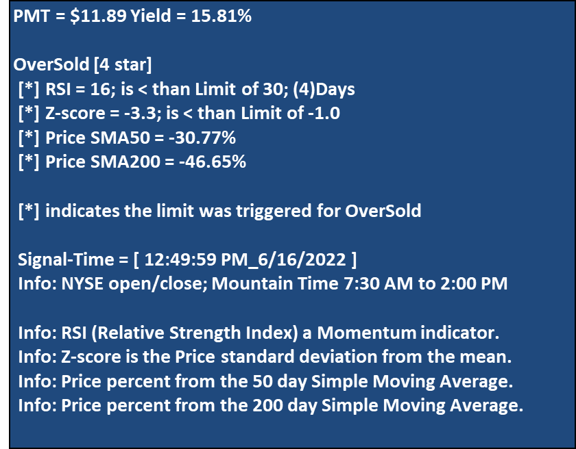
The PMT stock moved decisively into the Over-Sold zone with an RSI of 16 well below my 30-limit. I received an E-mail indicating this event during the day, see Figure-3 below for the actual Email I received.
Figure-3
Author
Figure-3 shows the Email I received at 12:49 PM mountain time to purchase PMT. Notice in the Email the RSI was below 30 four days in a row. I purchased shares at $11.99 that day.
The price Z-score is negative 3 standard deviations below its mean. This is an extreme measurement along with the RSI at 16 well below the 30-trigger level.
I don’t guess at price but instead wait until I see massive selling. This type of action always happens, the criterion for this method requires patience and time to take advantage. We will see more market declines the remainder of the year.
In the portfolio listing below, notice how high the stock yields are. Look at ABR with a price standard deviation of -5.4 and RSI at 15. This was a time to pick up some shares.
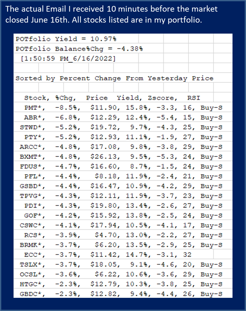
Figure-4
Author
Figure-4 is my actual portfolio sent 10 minutes before the market closed, June 16th. PMT is down over 8%, second column, price of $11.90 third column, Yield of 15.8% forth column, price Z-score -3.3 fifth column, RSI of 16 in the sixth column.
The last column with the “Buy-S” indicates a strong-buy because both the RSI and Z-score have exceeded their trigger levels.
During that day I was not home watching price for PMT, but instead was notified by Email of this event while running errands. I’ll continue to use this method to add income shares for the rest of the year.
Figure-5
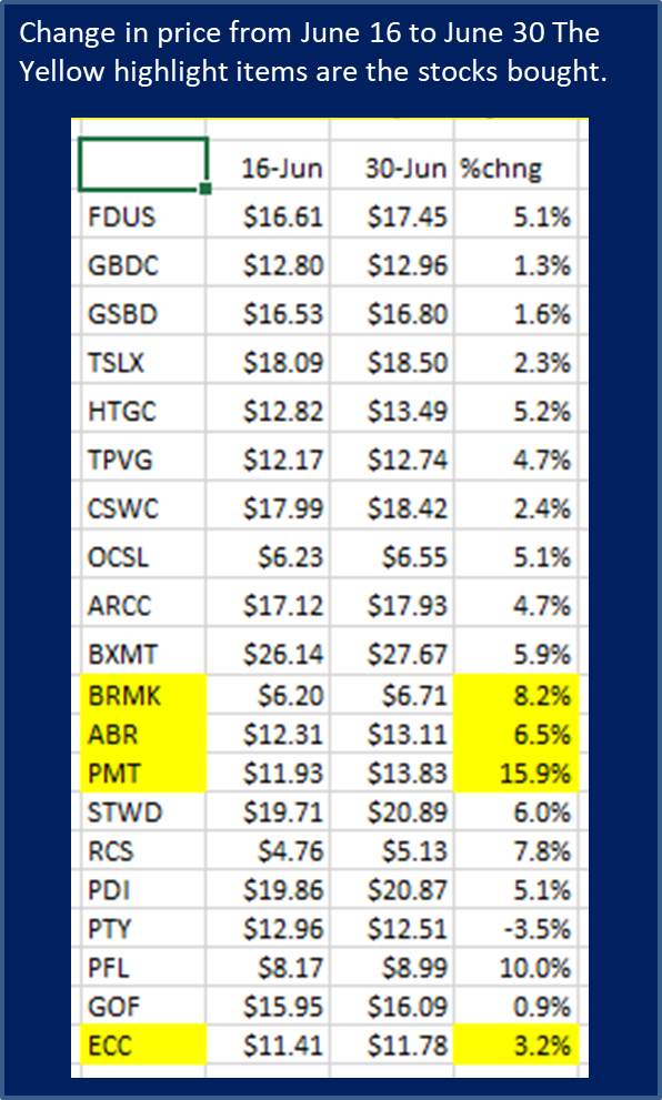
Author
The yellow cells were the stocks purchased June 16, 2022 and added to my portfolio. The table above illustrates the importance in purchasing stocks based on technical analysis when investors are racing to the exit. Just the RSI and price Z-score is all I need to indicate possible good entry points. In just 8 days you can see the price gains in 19 out of 20 stocks.
Conclusion
The S&P 500 declined 3.2% Thursday June 16, 2022, and PMT declined 8%, because investors were raising cash. As a matter of fact, my purchase price was $11.99 June 16th and on Thursday June 30th the price was $13.83, a 15% gain in 8 trading days. Using indicators to buy stock provides a margin of safety that will improve total return along with dividend income.
It must be noted this year will be challenging with high inflation taking a bite out of many stocks and the stocks in my portfolio will move lower. I’ll be ready to add more shares when this happens. Good luck to income investors.
Joe HYCF.
Appendix – A, POT Indicators Explained
I have outlined the following Buy-Signals used by the TEA/POT software I currently use to enhance my trading experience.
RSI (Relative Strength Index)
The RSI number goes from 0 to 100 indicating oversold and overbought conditions. Every price quote taken during the day re-calculates the RSI level and notifies the investor of any meaningful change.
A good definition is from Investopedia: “The relative strength index (RSI) is a momentum indicator used in technical analysis that measures the magnitude of recent price changes to evaluate overbought or oversold conditions in the price of a stock or other asset. The RSI is displayed as an oscillator (a line graph that moves between two extremes) and can have a reading from 0 to 100.”
Oversold and Overbought trigger points are user selectable in the POT application and initiate an email notification.
An RSI of less than or equal to 30 is suggested as oversold. This provides a quick evaluation of a possible purchase.
An RSI over 70 indicates the stock may be overbought and a possible trimming is in order.
Z-score, Price Standard Deviation
The diagram in Figure-1 demonstrates a normal distribution of data values. They can represent any dataset sorted from minimum to maximum. For the Z-score calculation I use one year’s worth of price data.
The percentage in Figure-1 is a range, based on the dataset of prices for each individual stock. To interpret a normal distribution in Figure-1 the stock’s price will remain in the blue shaded area 68.2% of the time within +-1 standard deviation. Visually you can see that when the Z-score becomes more negative, the price is entering an oversold condition.
Figure-1; bell curve
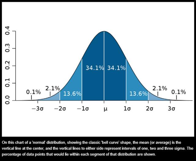
MIT News
It must be noted the data representing price is not an absolute normal distribution, because price is very volatile. We can still use price representing a normal distribution that allows comparative results with other stocks. A single daily stock quote gives a good indication where price fits on the bell curve range.
When looking at the bell curve Figure-1 diagram, the center value is the price mean. The calculated Z-score can vary above and below the mean to tell us how far away from the mean price has moved when receiving a quote. For my trigger point I use “-1” to signal an alert telling me the price has deviated from the mean. The larger the negative value, the greater the chances for a possible purchase after examining the rest of the technical parameters.
50 SMA and 200 SMA (Simple Moving Average)
An explanation is outlined by Investopedia, using Moving averages to detect directional changes:
“Another strategy is to apply two moving averages to a chart: one longer and one shorter. When the shorter-term MA crosses above the longer-term MA, it’s a buy signal, as it indicates that the trend is shifting up. This is known as a “ golden cross.” Right arrow in the chart.
“Meanwhile, when the shorter-term MA crosses below the longer-term MA, it’s a sell signal, as it indicates that the trend is shifting down. This is known as a “dead/death cross.” Left arrow in the chart.
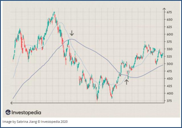
Investopedia
Left arrow indicates the 50-day SMA just went below the 200-day SMA, (death cross). Right arrow indicates the 50-day SMA went above the 200-day SMA (golden cross).
Both signals indicate a change in direction.
Be the first to comment