


Dacia Doroff/iStock via Getty Images
This article is based on a far longer piece that was published yesterday to subscribers of both Wheel of Fortune (“WoF”) and Macro Trading Factory (“MTF”).
We named the original piece “Some Dance To Remember, Some Dance To Forget,” using one of the lines that is part of the “Hotel California” lyrics, with a reference/wink to proper risk management that usually leads to better (risk adjusted) returns.
History in the Making
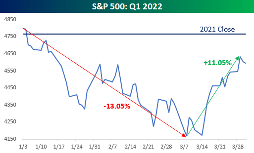
Q1/2022 was one for the history books.
It was only the 12th quarter since World War II that saw the S&P 500 fall 10%-plus from a closing high and rally back 10%-plus from its intra-quarter low.
Bespoke Investment Group
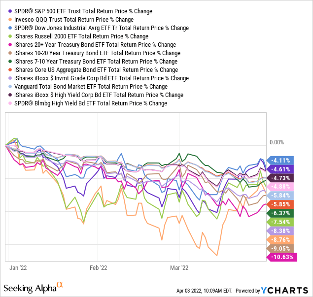
No matter when or where or who, all asset-classes have shared one thing in common in Q1: Pain.
Stocks, US Treasuries (“USTs”), IG bonds, HY bonds, even Chris Rock – they all got slapped this past quarter.
YCharts
This quarter was different.
Bloomberg
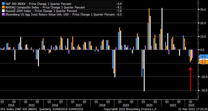
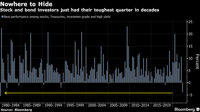
Q1 was the worst-ever quarter in decades for both Stocks (S&P 500 -4.9%) and Bonds (USTs -5.6%).
We have to go back 50 years (!) in order to find a year where the best return among these four leading categories had been as bad as it was in Q1/2022.
Bloomberg
Commodi-Par-ties
Truth is, it wasn’t equally painful to everybody.
As a matter of fact, some assets, and some investors, have managed to escape the carnage.
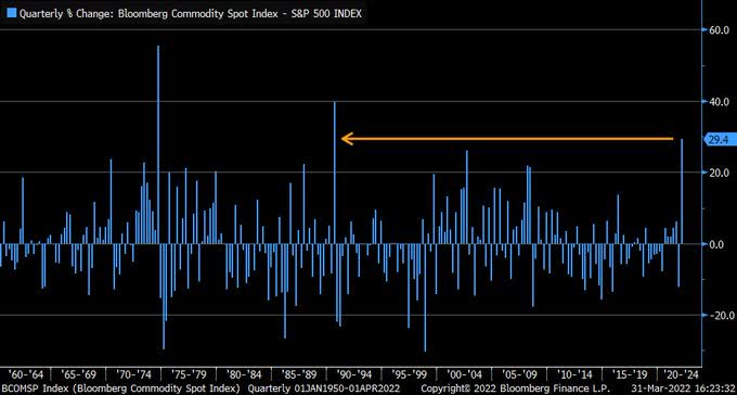
Q1 was the best-ever quarter in decades for Commodities.
Bloomberg Commodity Spot Index just had its strongest quarter since 1990, and the third best ever, relative to the S&P 500.
Bloomberg
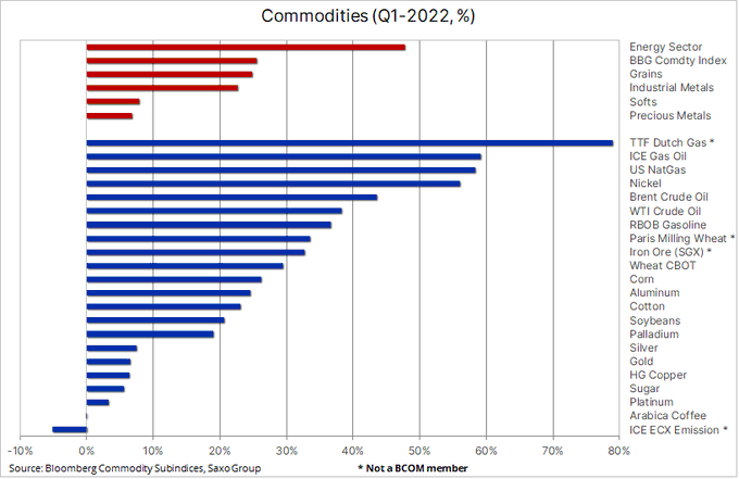
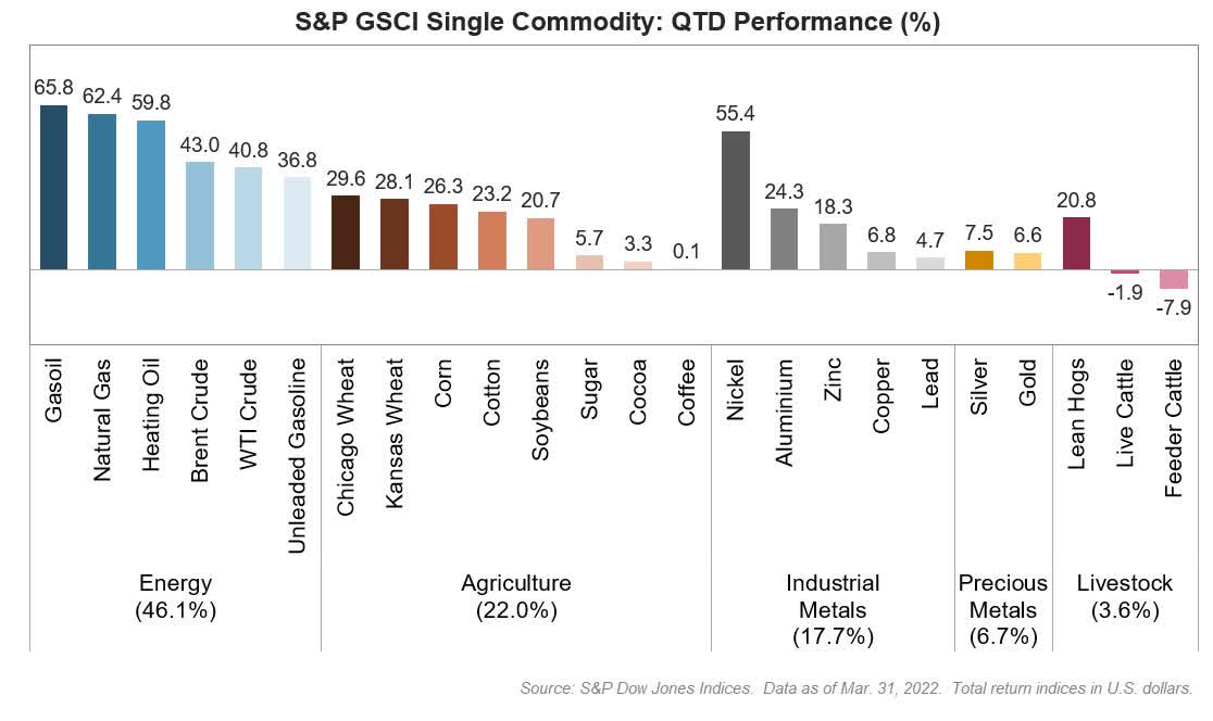
Anything that you can think of – energy (from oil to gas), agriculture (from grains to softs), or metals (from Industrial to Precious) have performed very well, with energy (mostly) and food prices leading the way.
Bloomberg, Saxo Group
S&P Dow Jones Indices
An In-House Party Too!
Between the two services that we run on Seeking Alpha, we offer three portfolios in total.
Recall that all three portfolios aim at outperforming SPDR S&P 500 Trust ETF (SPY) on a risk-adjusted basis.
Here’s are the YTD results (up to, and including, April 1st) of the three portfolios we offer:
| FMP¹ | RIG² | SOP³ | |
| Type of securities held [M=Mainly, O=Only] | Funds [O] | Stocks [M] | Stocks [O] |
| Max. No. of positions | 50 | 100 | 24 |
| Current, Actual, No. of positions | 24 | 85 | 19 |
| Weighted Average TTM Dividend Yield | 2.45% | 4.23% | 3.43% |
| Featured on (Service) | WoF, MTF | MTF | WoF |
| Inception Date | Dec 31, ’20 | Nov 19, ’21 | Dec 31, ’21 |
| YTD correlation between portfolio to SPY | 0.5108 | 0.7122 | 0.8802 |
| Portfolio YTD Return | 13.25% | 7.97% | 1.08% |
| SPY YTD Return | (4.35%) | (4.35%) | (4.35%) |
| Over/Under-performance YTD Return | 17.60% | 12.32% | 5.43% |
| Portfolio YTD SD | 1.12% | 0.71% | 1.19% |
| SPY YTD Return | 1.34% | 1.34% | 1.34% |
| Over/Under-performance YTD SD | (0.22%)⁴ | (0.63%)⁴ | (0.15%)⁴ |
¹ Up to 50 ETFs a/o CEFs (only funds!). Predominantly Long. Short possible.
² Up to 100 single securities (stocks, preferred shares, bonds). Long only.
³ Up to 24 single securities (stocks). Long only.
⁴ Negative number = SPY more risky
YTD, all three portfolios have delivered better returns and been less volatile than the SPY, resulting in a significant risk-adjusted outperformance across the board.
Europe Is Getting Squeezed
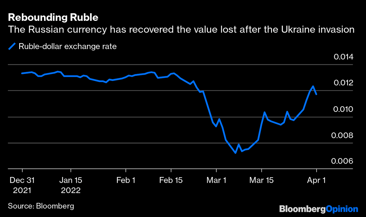
Meanwhile, Putin is demanding buyers of Russian gas to start paying for it in Rubles. Putting geopolitics aside, this is a genius move from two aspects:
1) It reduces the pressure of the sanctions and de-facto creates a by-pass that those who impose the sanctions will have to breach (if they wish to keep getting the Russian energy supply smoothly).
2) It stabilizes the Ruble, which is already back to levels it traded at prior to the start of the Ukraine war.
Bloomberg
Europeans aren’t suffering from energy shortage as of yet, but they’re paying record-high prices to Putin in order to keep their houses warm and/or kitchens functional.
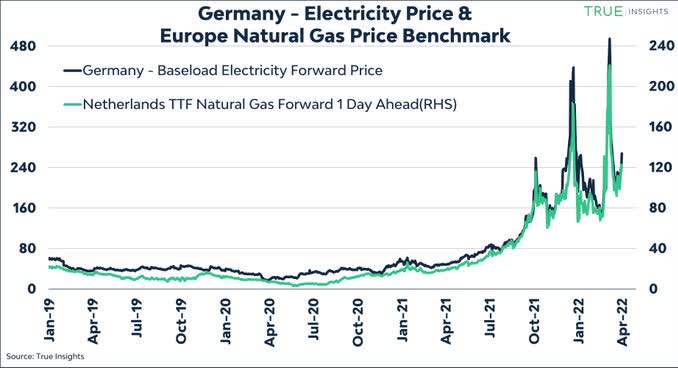
True Insights
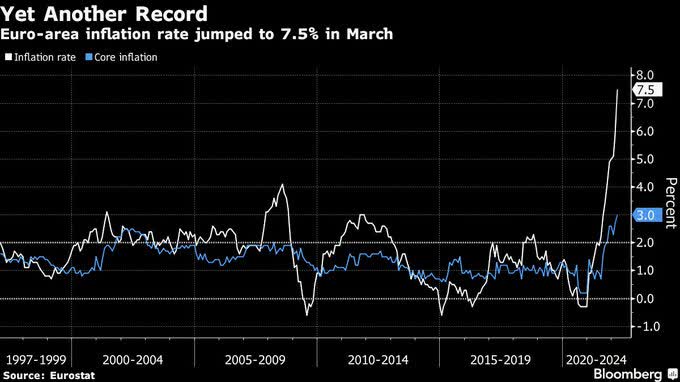
That’s of course also reflected in the Eurozone inflation that has spiked to another all-time high.
Consumer prices jumped in March 7.5% Y/Y vs 6.7% expected, mostly “thanks” to overshooting in Spain, Netherlands, and Germany.
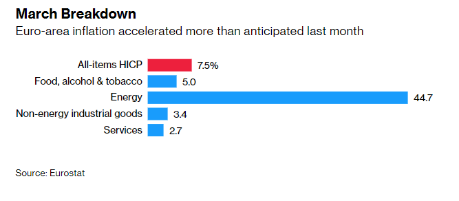
Eurostat
Euro area core inflation is now higher than the official 2% target by 50%.
Although bets on rate-hike are soaring too, Lagarde/ECB maintains the exact same (mistaken) tone that Powell/Fed sounded a year ago.
We guess it was only natural/appropriate for the data (and following remarks) to get published on April 1.
Bloomberg
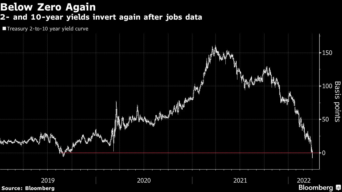
US Yield-Curve
The US yield-curve is now inverted, with the 10-2 spread (inverted for the fourth time since 2000) at -7.35bps and the 5-30 spread (inverted last week for the first time since 2006) at -13bps.
Bloomberg
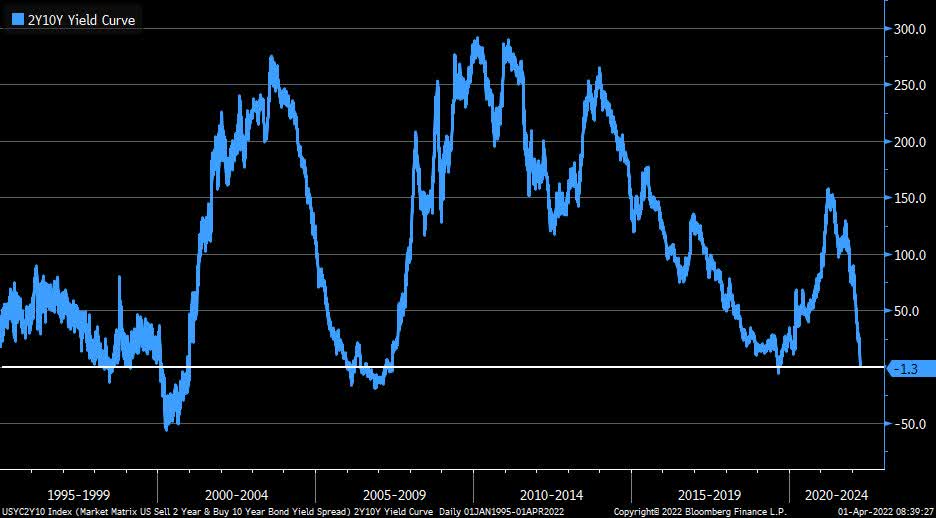
Bloomberg
The yield curve almost always inverts before recessions.
In the past six economic cycles, the 10-2 spread initially inverted about 18 months (on average) before the economy peaked.
The range was from as little as 5 months to as many as 33 months.
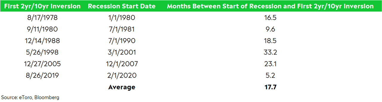
eToro, Bloomberg
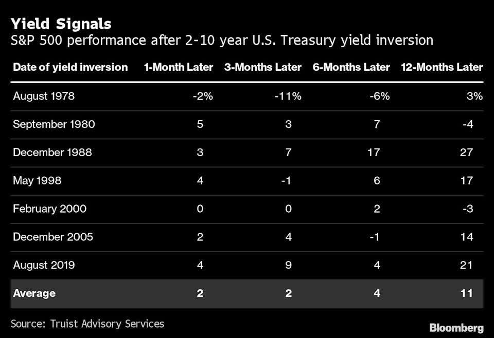
Many investors point to the following data, suggesting that inversion is perhaps an early signal for an upcoming recession, but not necessarily a negative omen for stocks.
Truist, Bloomberg
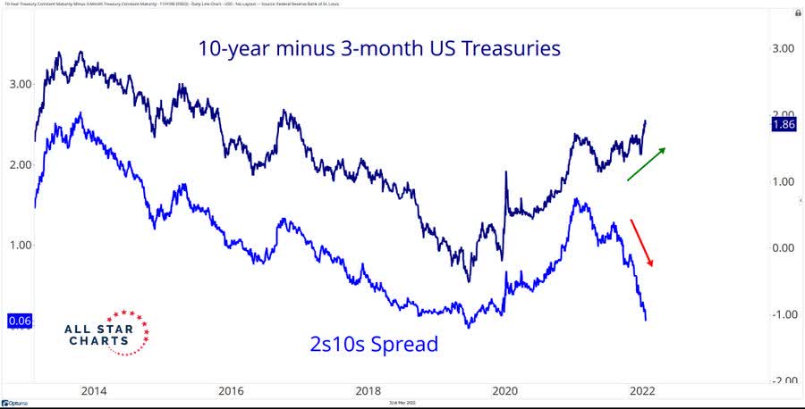
Furthermore, while the 10-2 spread has inverted, the spread between the 3-month and 10-year yield hasn’t.
The 3-month/10-year spread has also turned negative before each of the past six recessions.
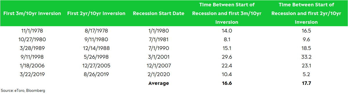
eToro, Bloomberg
As a matter of fact, at 1.86% it’s telling a completely different story.
At the end of the day, this comes down to the question: Which one do you trust more – the 10-2 and/or 30-5 spreads that are already negative, or the 10-year/3-month spread which is still deep in positive territory?
All Star Charts
Thing is, this time is different.
Not only is inflation running like nothing we’ve seen before (aside from the early 1980s)…
Not only does the yield curve still have room to invert even more than it already has…
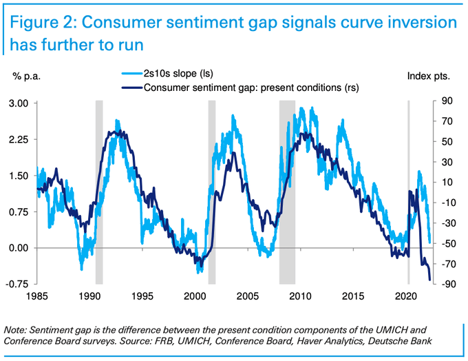
Deutsche Bank
… but we’re only at the very beginning of a tightening monetary policy cycle.
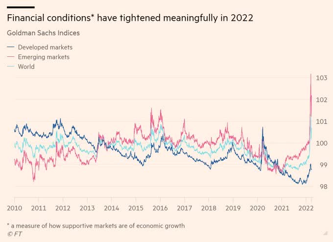
FT
How Much Time Do We Have?
None of the previous four inversions – 1998, 2000, 2005, and 2019 – happened as early as the current inversion relative to the time that has passed since the first rate hike.
The average time it took for the 10-2 spread to invert since the first rate hike was slightly over 2.5 years, or nearly two years if we take 1998 out.
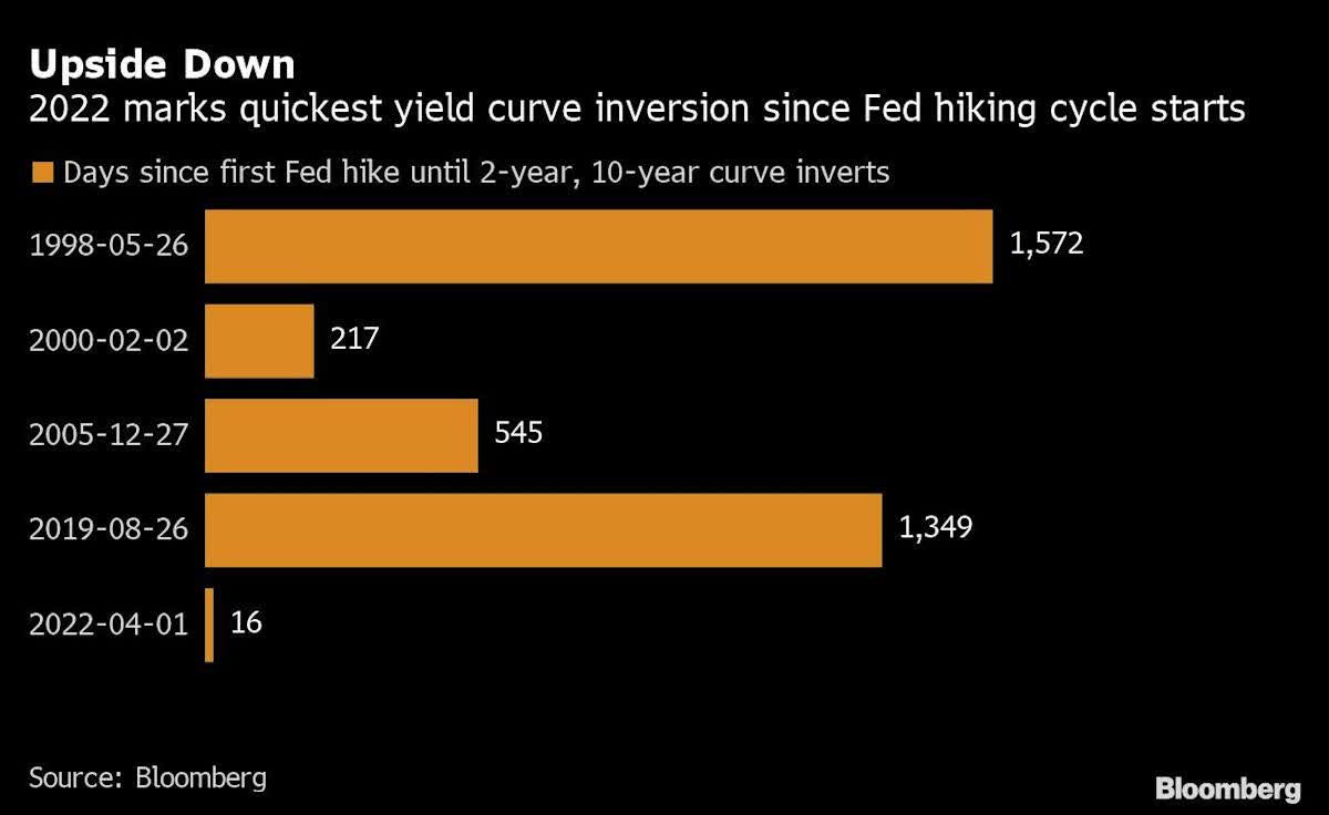
Bloomberg
In other words, we claim that even if the average time between inversion to a market peak is 17 months, the speed of the inversion (since the first rate hike) is reducing, perhaps even eliminating, the normal time-gap.
Sure, stocks can keep climbing the wall of worry – after all, they always do – but to assume that we automatically/certainly have 17-20 months ahead of us (before the market peaks) is something we’re willing to build our investment strategy around!
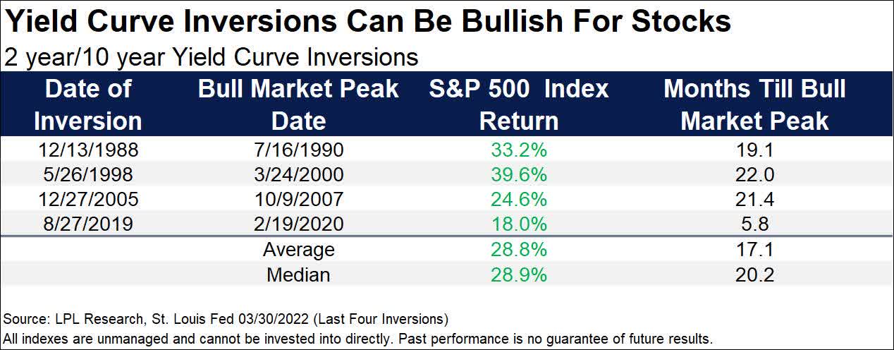
LPL Research
April: Starting Fool, Ending Green
Whether you look at the last 20, 50, or 100 years, April has historically been a very good month for stock investors.
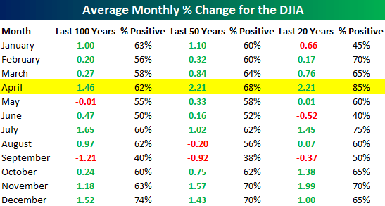
Bespoke Investment Group
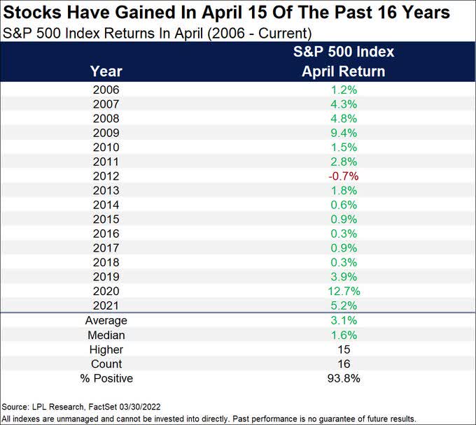
Moreover, the S&P 500 finished higher during April in 15 out of the last 16 years.
That’s a “green rate” of nearly 94%!
LPL Research
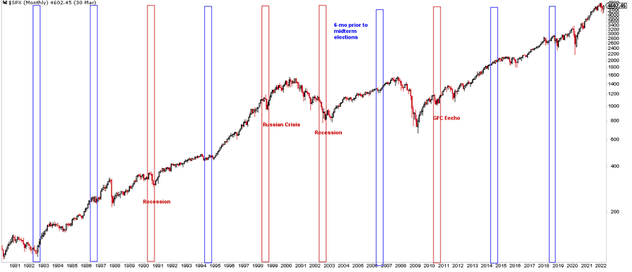
Pay Close Attention to Midterms Election
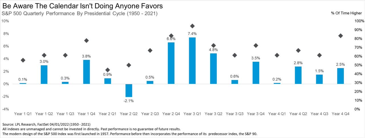
The bad news is that historically, the second (particularly) and third quarters of a mid-term year tend to be weak for stocks, with an average return of -2.1% and +0.5%, respectively.
The good news is that the best quarters along the four-year presidential term are coming up next: Last quarter of the second year (+6.6%), first (+7.4%) and second (+4.8%) quarters of the third year.
LPL Research
It’s funny (that investors might need to wish for something bad to happen) but if a crisis comes along (Can Russia invade Ukraine again?…) it may have the power to change the expected seasonality weakness.
Source: @TheFortuneTell5
Otherwise, the below chart (showing the past 40 years) is anything but encouraging, to say the least, when it comes to what investors may expect out of the coming months.
Bloomberg
Yet, Some Bullish Sings
Interestingly, traders have sold their stocks relentlessly since the February bottom.
Not only do we count five straight weeks of selling, but the total (as a percentage of market cap) is one of the biggest ever, to the extent that a short squeeze is definitely in the cards.
Past similar setups (mid-2009, late 2011, early 2019, early 2020) did lead to some significant rallies, though that wasn’t always the case (early 2007).
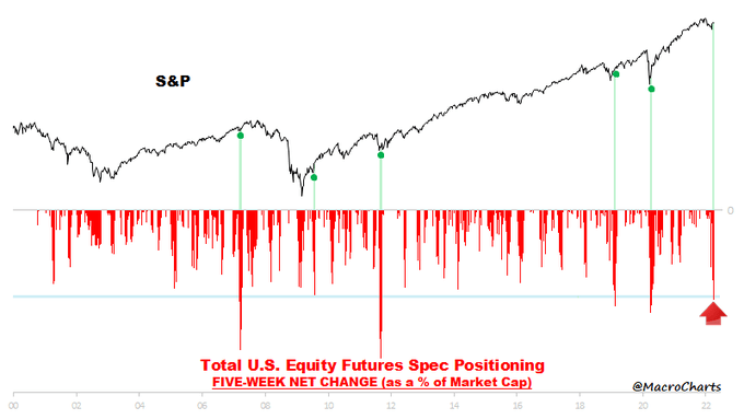
Macro Charts
Why don’t we “buy” this? Because in all past cases, no exception, this setup occurred after the market tanked hard. In the single occurrence when that wasn’t the case (market was on the way up in early 2007) there was no subsequent rally.
In a very rare display, the so-called “smart money” (commercial hedgers) are now net long futures contracts across all four major indices (S&P 500, Nasdaq 100, Dow Jones, Russell 2000).
Holding a net long worth more than $53B of contracts is a record high, exceeding the previous record of $48B which was set in May 2020.
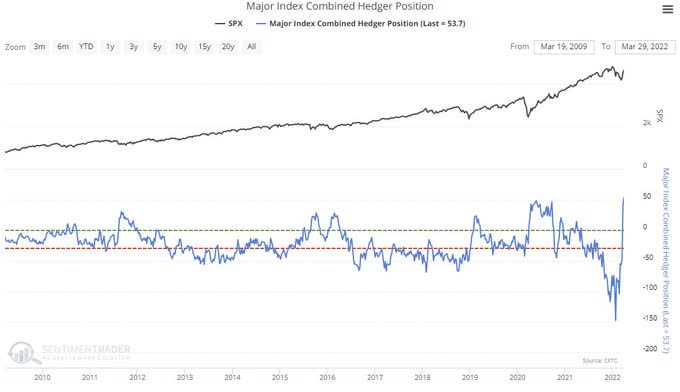
SentimentTrader
Why don’t we “buy” this either? Because when we look at past records (2011, 2015, 2016, 2019, 2020) they quickly faded out. Furthermore, the higher the record – the quicker the fading out tenor was.
This new record is unlikely to last for too long and we would be surprised if we won’t see a near-term, fast and furious retreat.
In more simple words, we look at rear-mirror data, and the time to take action was five weeks ago, not on April Fool’s Day…
No More Wars (?)
Invasion? What invasion!?
The S&P 500 is now up about 8% since Russia invaded Ukraine.
If this is how stocks react to wars, should investors aspire for more of these?
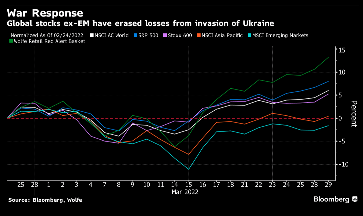
Bloomberg
Yield-curve inversion is the ultimate method through which investors suggest the Fed will need to choose between soft landing and getting inflation down to target.
They will either have to tighten less aggressively than expected and allow inflation to run hotter than their target for longer, or they have to exacerbate a weakening in growth beyond this year to the point of “inviting” a recession.
While the 10-2 spread indicates ~25%-30% (even more than that, according to Goldman) probability for a recession over the next 12 months, the 10 year/3 month spread suggests only 5% probability.
Consumer Free Cash Flow (“CFCF”) is already signaling slower economic activity ahead.
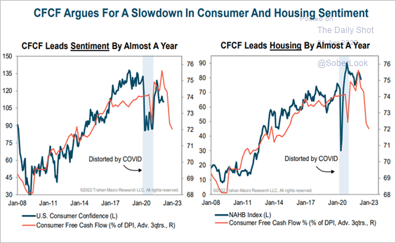
SoberLook
So while everybody seems to be focused on the supply side, it’s the demand side that is likely to weaken over the next couple of months.
A sub-50 reading, i.e. contraction, is certainly on the cards in the foreseeable future.
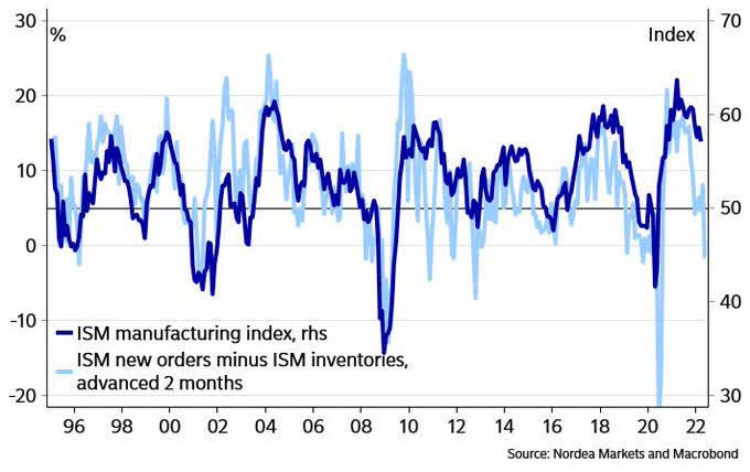
Nordea
Interestingly, bond inflows – especially into USTs – have been very strong lately suggesting that:
- Investors very much fear a recession, positioning accordingly.
- Long-term yields have already completed most of their run-up.
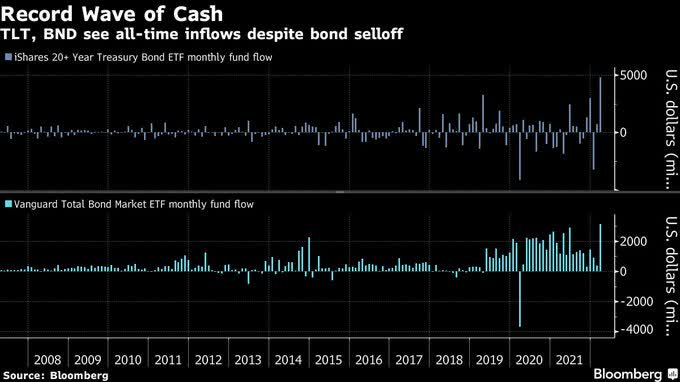
Bloomberg
No More Bloodshed (?)
It’s important to remember that expectations create reality. If consumers think that a recession is upon us, the Pygmalion effect is likely to lead to an economic slowdown at best, and to a recession at worst.
If everything goes according to “plan,” a 16-month from inversion to recession means that the US may enter a recession sometime toward the end of Q2/2023.
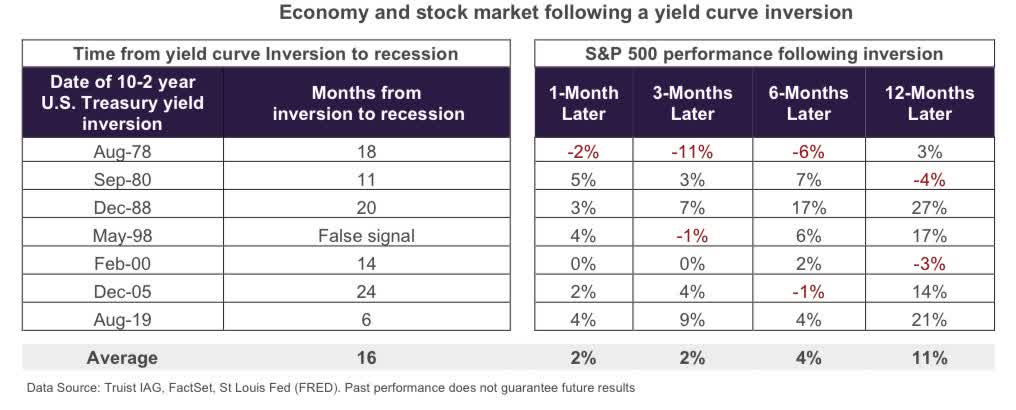
Truist
Thing is, aside from record inflation, record living (food and energy) costs, and the early days of a tightening cycle, there’s one thing that most everybody is ignoring: “Thanks” to the Russia-Ukraine war, Europe is heading fast into a recession.
With every day that goes by and this war is still on, the probability for a recession in Europe is rising.
And with every day that the probability for a recession in Europe is rising – so is the probability for a recession in the US too.
Investors now expect nine 0.25% rate hikes (or 2.25% in total) in 2022.
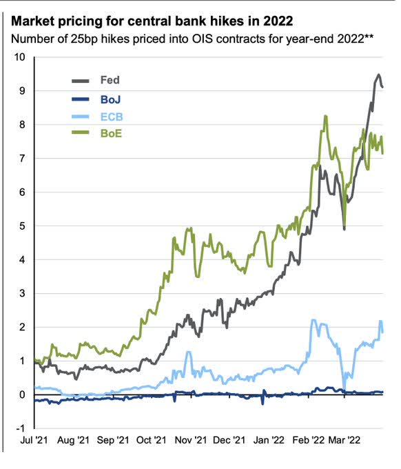
Bloomberg
The implied forecast is for the policy rate to peak at ~3% in 2023 and decline in 2024 as higher rates take their economic toll.
Essentially, it all comes down to the question: Is it worth selling in 2022 due to the rate hikes, or is it better to keep sailing as is in light of the expected 2024 rate cuts!?
Should we trade based on (actual/current) tightening fear or (theoretical/future) QE hope?
On a dark desert highway, cool wind in my hair
Warm smell of colitas, rising up through the air
Up ahead in the distance, I saw shimmering light
My head grew heavy and my sight grew dim
I had to stop for the night
(Source: “Hotel California“)
Be the first to comment