

As I noted when I relaunched this series, active investment largely underperforms the market. As a result, a core portfolio of ETFs that provide a broad range of market coverage will suffice for some investors. For others, these can comprise a core portfolio that represents a large percentage of a portfolio (say 50% or more) with the remainder of the assets being used for strategic allocations.
The purpose of the Passive-Aggressive investor is to provide the reader with a series of core ETF portfolios whose market coverage is broad and whose portfolio composition is largely static. Think of them as “set it and forget it” portfolios, where the allocation will only change a few times during a market cycle. The reader can use these portfolios in their accounts or compare them with the overall performance of other investment vehicles (such as mutual funds).
Investment thesis: The US core portfolio is still very attractive across multiple time frames. International ETFs are still underperforming domestic ETFs, which means US portfolios should still be preferred. Income portfolios performed in a more acceptable manner this week due to Fed backstopping the credit markets.
Let’s start by looking at the performance of the core ETFs, beginning with equity ETFs:
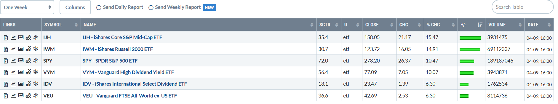 All the ETFs were higher last week; the only difference was the degree of the rally. Globally, markets caught a bid as investors cheered the first week of good news on the pandemic front. The only other key piece of data is that US markets outperformed global indexes.
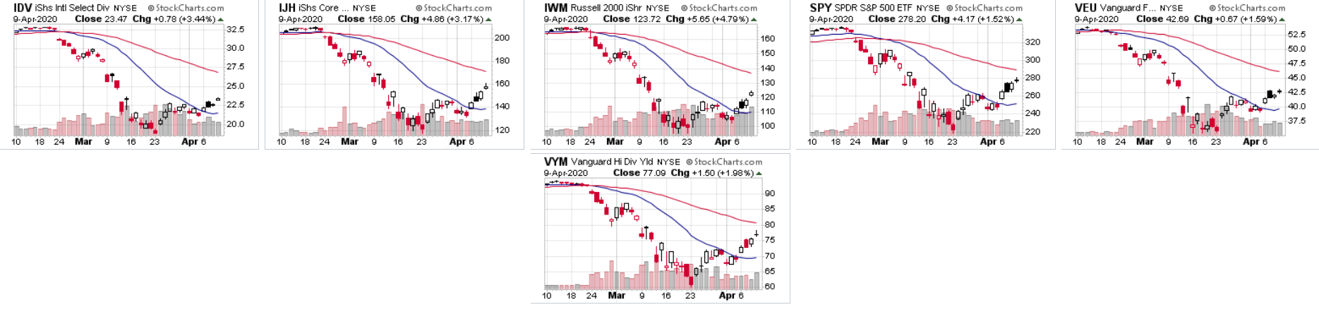 The charts show the beginning of a true counter-rally. Prices bottomed in late march, moved modestly higher, then fell back but to higher levels than the late-March low. Prices are now in the middle of a second wave higher. All the indexes have also crossed about the 20-day EMA.
Next up are the income ETFs: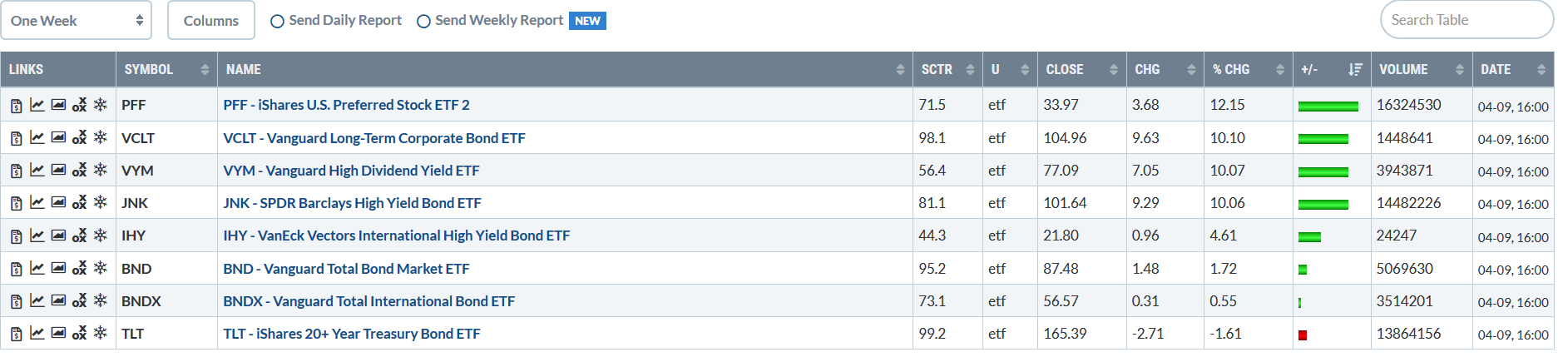 The higher-yielding ETFs caught a stronger bid this week. The fact that some of these ETFs are equity explains some of the rally. The Fed stepping in the back-stop a large percentage of the credit market also helped.
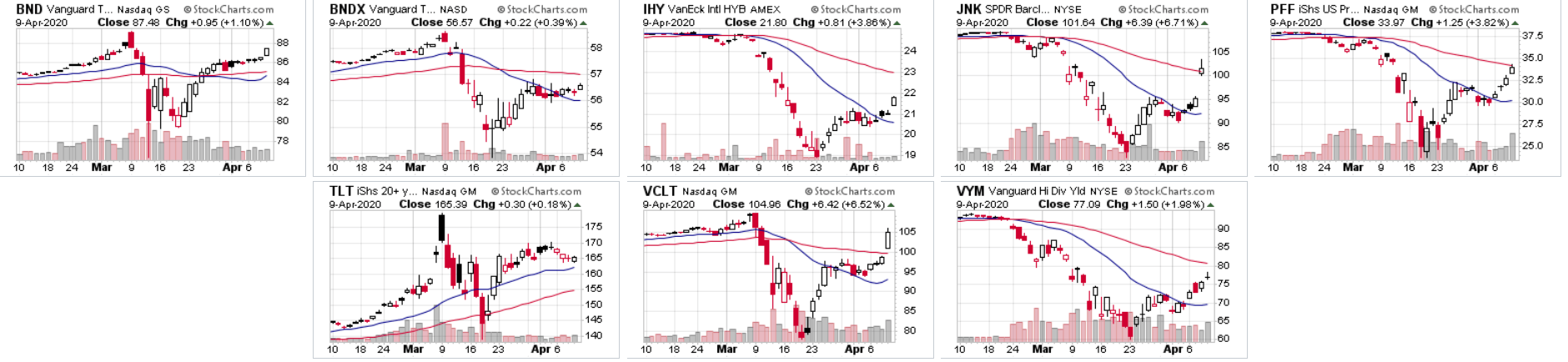 Notice the depth of the sell-off that occurred in March; it affected bond and equity market ETFs alike. These charts show the breadth of the problems faced by the markets. Some ETFs are making strong comebacks; note the JNK ETF (upper row, second from right) and long-term corporate bond ETF (VCLT) (bottom middle).
Let’s take a look at how the core portfolios performed: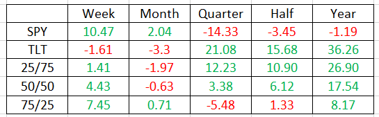 Data from stockcharts.com; author’s calculations. Green means an increase, while red means a decrease. The first number in the left column is the SPY/VEU percentage, while the second number is the TLT/BNDX percentage. If you’re more conservative, opt for the higher TLT/BNDX percentage portfolio. If you’re aggressive, reverse the process.
After about six weeks of high volatility caused by the pandemic, the 50/50 portfolios looks very impressive. It’s up 17.54% over the last year. Over the last month it’s off marginally and last week it benefited from the sharp increase in the equity market. The 27/75 portfolio is very strong due to the TLT’s outperformance over the last year.
Next, let’s look at the international counter-part: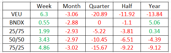 Compare the BNDX with the TLT: the former fluctuated around 0% for all time periods except the last year while the latter had an impressive rally. That explains why the broad international portfolio lags the US core portfolio.
Finally, here’s the 25×4 portfolio, that’s composed 25% each of broad domestic and international ETFs: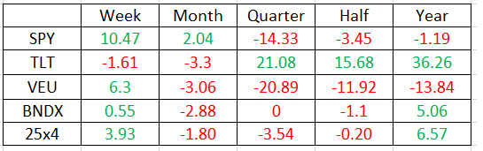 Here the diversification really helps to mitigate the volatility. But it’s the US components that are responsible for the gains that have kept this portfolio competitive.
Here’s a graph the compares the performance of these three portfolios: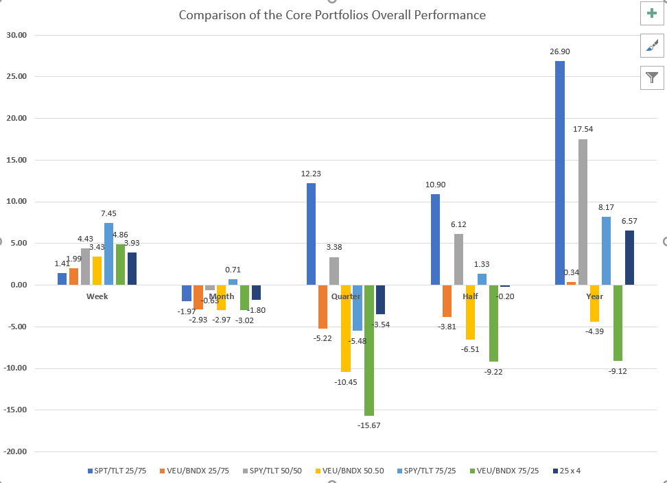 The first pair of columns (blue and orange) shows the 25/75 portfolio; the second pair (grey and yellow) shows the 50/50; the third pair (light blue and green) shows the 75/25. The last column of each series (the dark blue) is the 25×4 portfolio. The first column of each pair shows the SPY/TLT combination’s performance; the second pair shows the VEU/BNDX combination’s performance.
The performance for the last week and month is returning to a more acceptable range. The more conservative US portfolios (in blue and gray) are giving very strong performance over all time frames; the international portfolio (orange, yellow, and green) is still underperforming significantly over the longer time frames.
Finally, let’s take a look at the three income portfolios: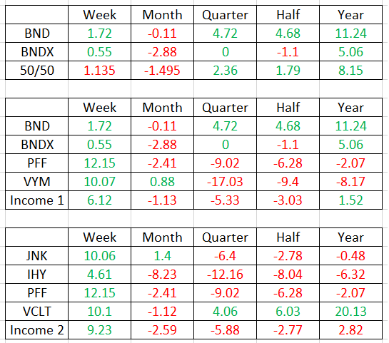 These three portfolios are arranged from most conservative to most aggressive. Last week, the performance of all three returned to more “normal” levels. This is due to the rally not only in fixed-income markets, but also in the equity markets. According to data from Finviz.com, the yields for these portfolios is 2.92%, 3.43%, and 4.43%, top to bottom.
Finally, here’s a graph of the income portfolios’ performance: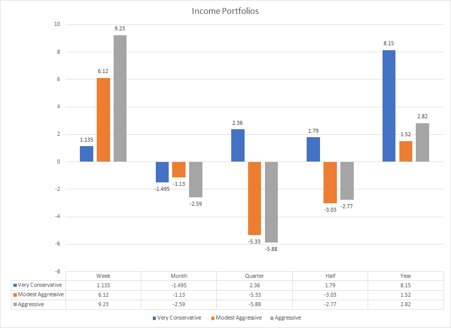 The performance over the week and month time frames is much in line with what you’d expect of income-focused portfolios. Remember that the more aggressive portfolios have larger concentrations of higher-risk income assets, which explains their respective higher levels of volatility.
Disclaimer: I do not have a relationship with any reader. This is not specific investment advice anyone. Read people who disagree with my conclusions. In other words: buyer beware.
Disclosure: I/we have no positions in any stocks mentioned, and no plans to initiate any positions within the next 72 hours. I wrote this article myself, and it expresses my own opinions. I am not receiving compensation for it (other than from Seeking Alpha). I have no business relationship with any company whose stock is mentioned in this article.
Be the first to comment