

lindsay_imagery
Thesis
In this article, we will analyze whether equities are continuing to create a base forming pattern. What does the data tell us about equities in general and specifically for S&P 500 Index (SP500, SPX)? Have equities factored into their valuation higher inflation, lower growth and possibly lower earnings for the coming quarters?
Technical Analysis
We will review a lot of weekly charts to understand if downtrend is going to continue or if there is some sort of base developing.
S&P 500
Weekly chart of S&P 500 is creating a base as long as S&P 500 stays between 3750 and 4150. An uptrend does not begin until S&P 500 has multiple closes above 4350 and any pullback stays above 4200.
S&P 500 Weekly Chart (Author)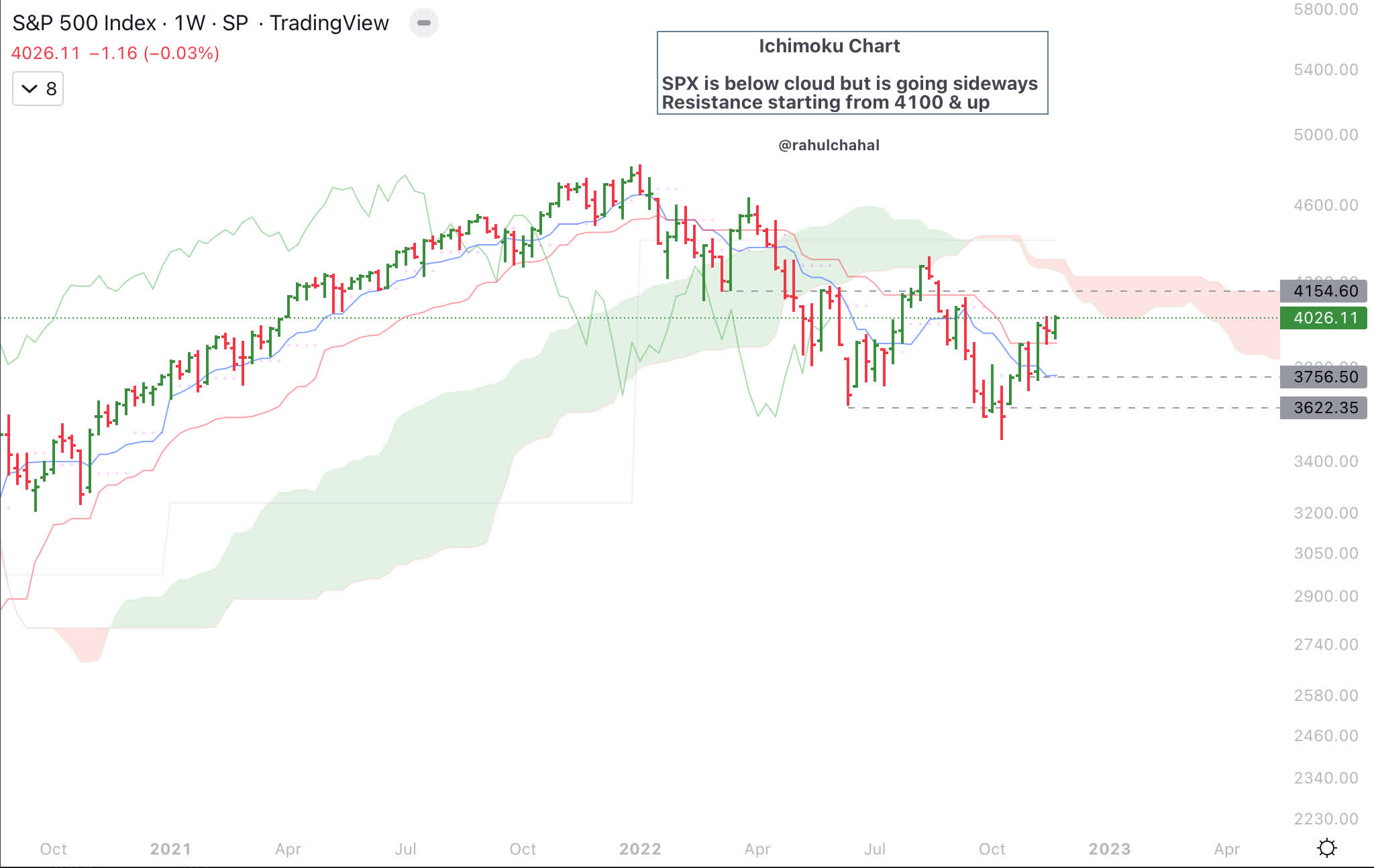
High Yield and S&P 500
S&P 500 and High Yield (HYG) charts in fact look fairly similar. This is supportive for equities.
S&P 500 and High Yield Chart (Author)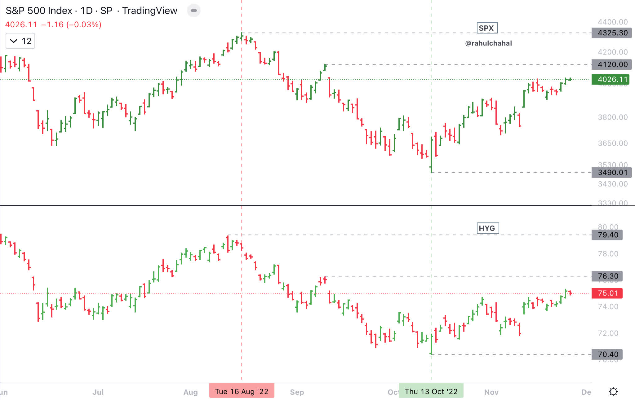
Ratio equally weighted discretionary to staples
In the next chart we will compare ratio of equally weighted discretionary (RCD) to equally weighted staples (RHS) chart and chart of S&P 500. Based on my analysis going back in time the ratio of equally weighted discretionary to equally weighted staples in most cases will lead S&P 500 in uptrends and downtrends. Until this ratio break down below the June 2022 lows it is likely that equities are forming a base.
Equal weighted Discretionary to Staples and S&P 500 (Author)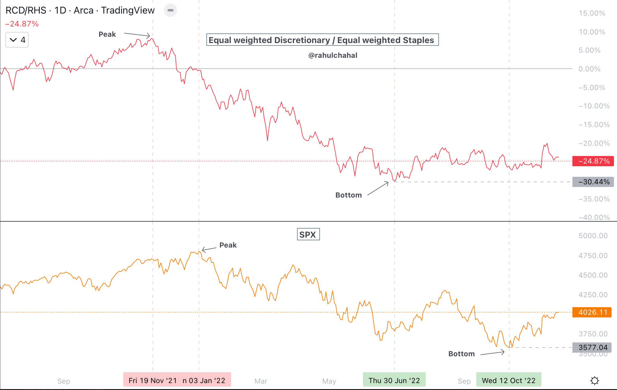
VIX
While S&P 500 has made a lower low in October 2022 compared to June 2022, volatility of S&P 500 as measured by VIX did not make a higher high and VIX has moved down to just above 20. Break below 19.5 and multiple closes below 19.5 on the VIX would be fairly bullish for the stock market.
VIX and S&P 500 Chart (Author)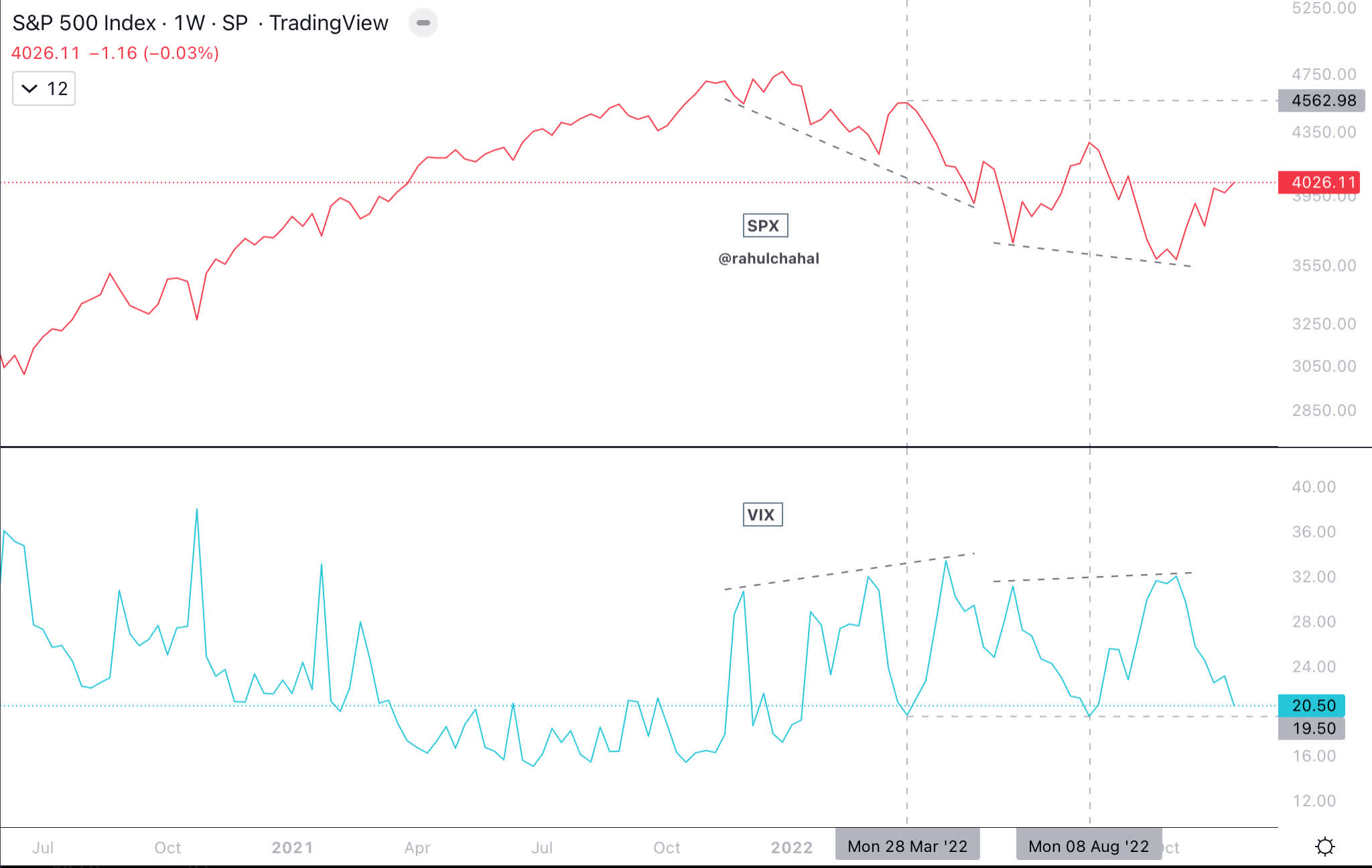
VIX term structure is in contango though at higher VIX level.
VIX term structure (VIX Central)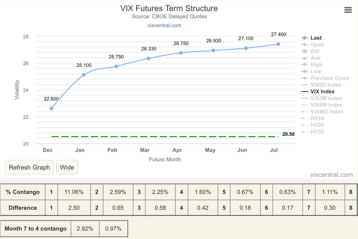
Transports
Dow transports (DJT) continues to lead and that remains supportive for stock market consolidation and possibly a new uptrend.
S&P 500 and Dow Transport Chart (Author)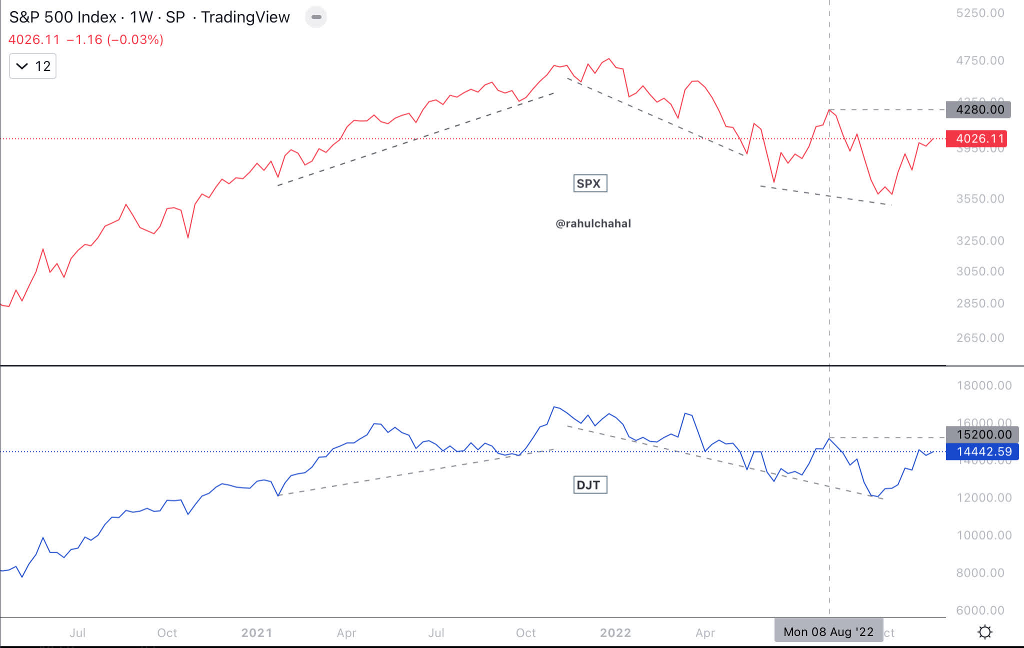
Net New Highs
Net new highs which is New Highs minus New Lows (shown below in the form of moving average to minimize noise) are trending in the right direction.
S&P 500 Net New Highs (Author)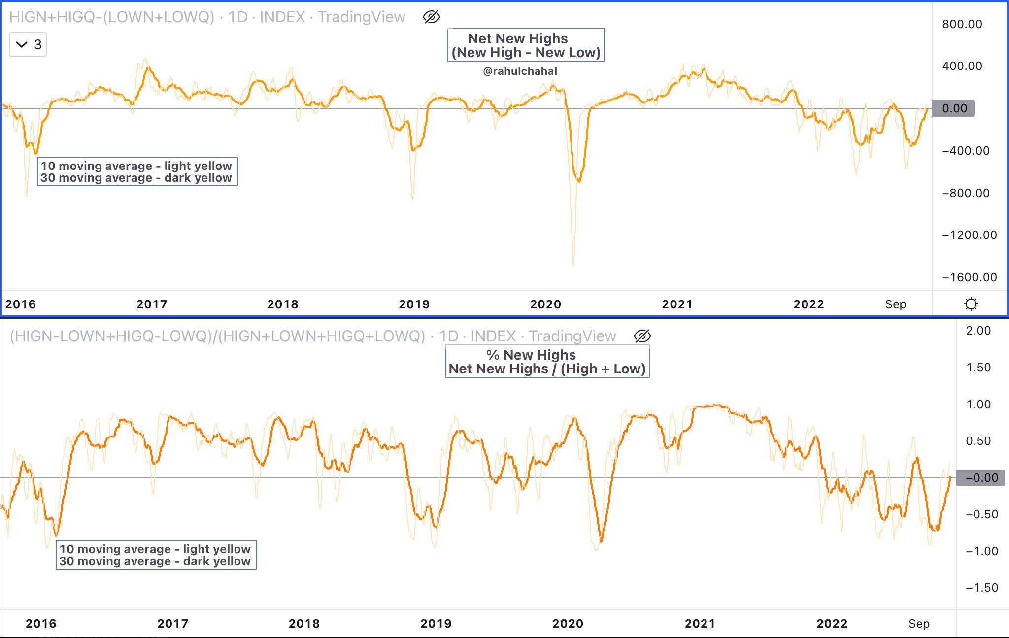
Percent above 50 and 200 day moving average
Percentage of stocks in the S&P 500 that are above 50 day moving average and 200 day moving average are trending up and creating a broad base.
S&P 500 Percent above 200 and 50 day moving average (Author)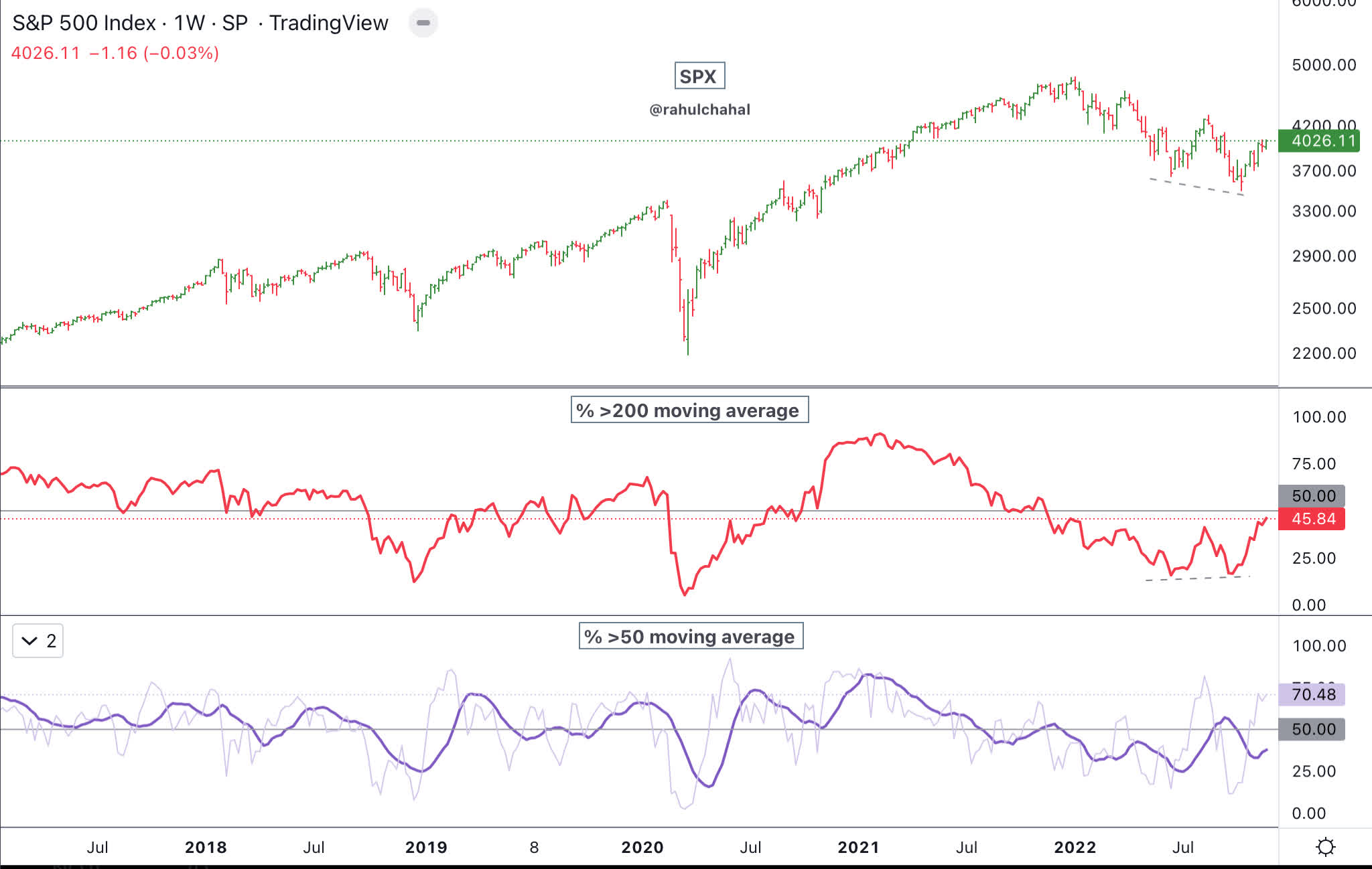
Corporate Bond Index
The corporate bond index has been trending in the right direction and in fact if it can break below August 2022 then it would be positive for equities. However, if the corporate bond index breaks above June 2022 highs, then it would mean the downtrend in equities is likely to continue.
Corporate Bonds Index and S&P 500 Chart (Author)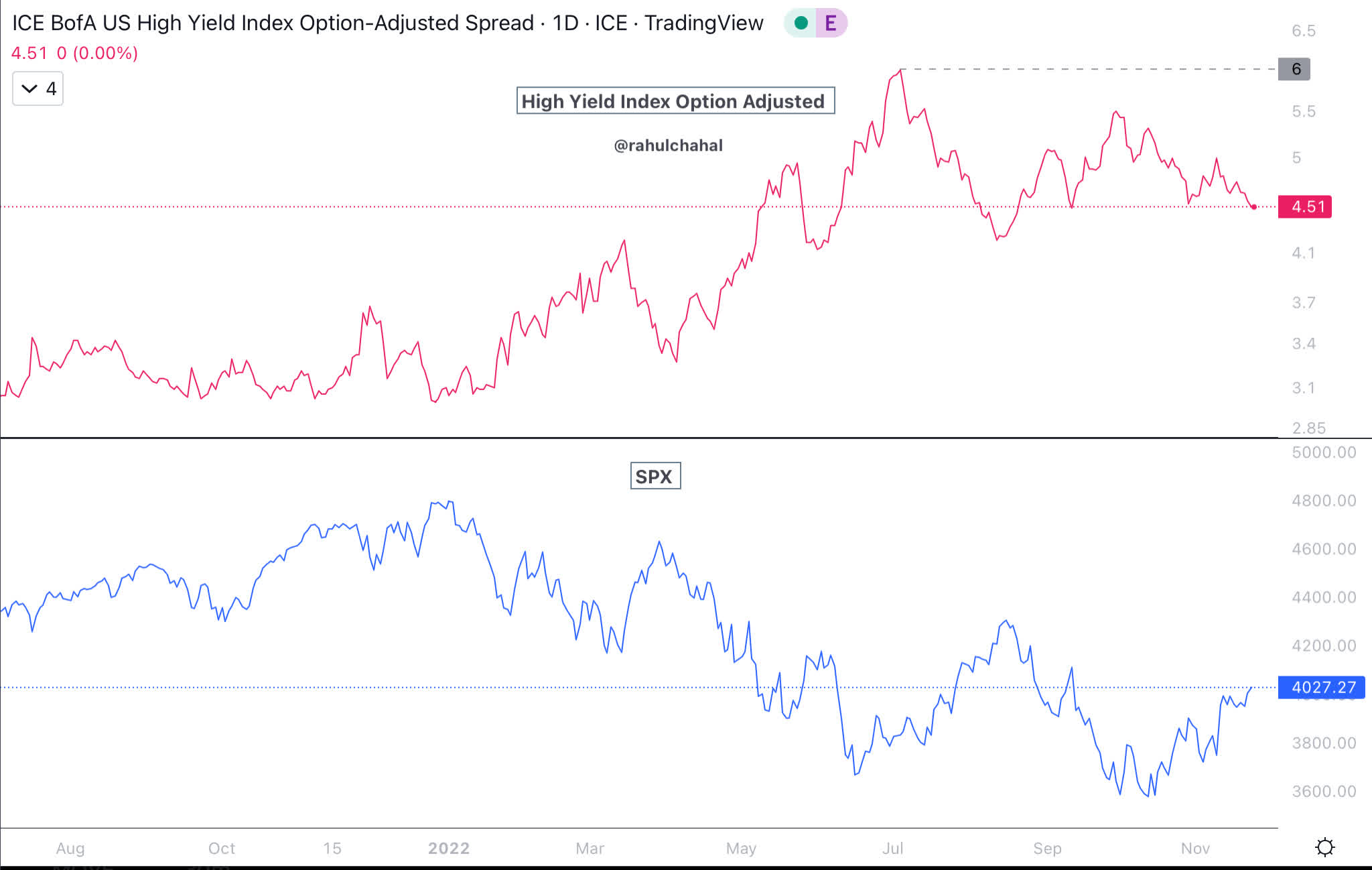
US Dollar
The US Dollar index (DXY) has come down which is also positive for equities. Break below 105 would be supportive for equities but break above 108 would be bearish and could go as high as 120.
US Dollar Index Chart (Author)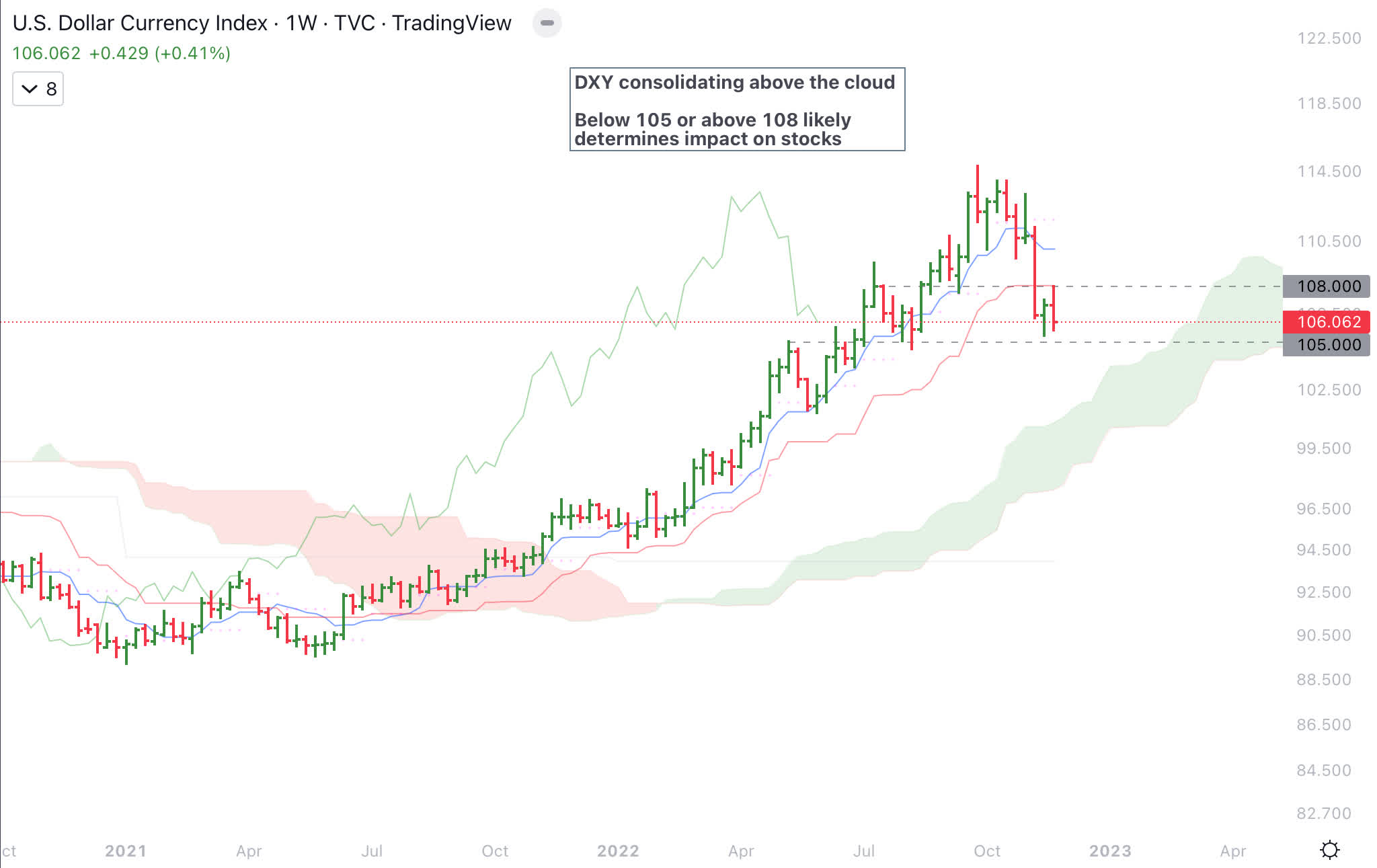
Sentiment and exposure
Sentiment as measured by American Association of Individual Investors (AAII) is neutral though those bullish are much below average which could provide fuel for a new uptrend.
AAII Sentiment (AAII)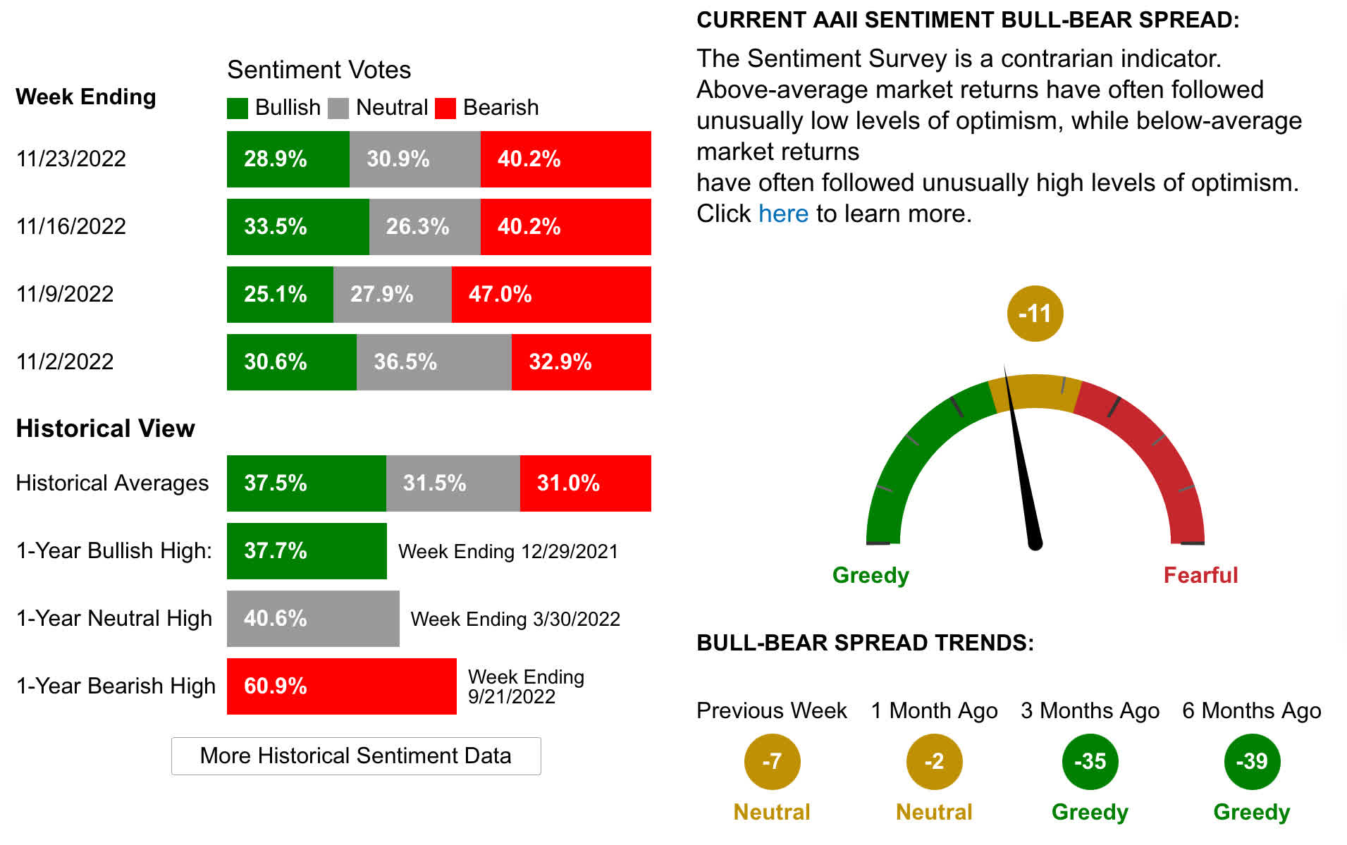
Exposure as measured by National Association of Active Investment Managers (NAAIM) has come off the low levels from October 2022 but still remains in downtrend. Below is the chart of NAAIM and S&P 500.
NAAIM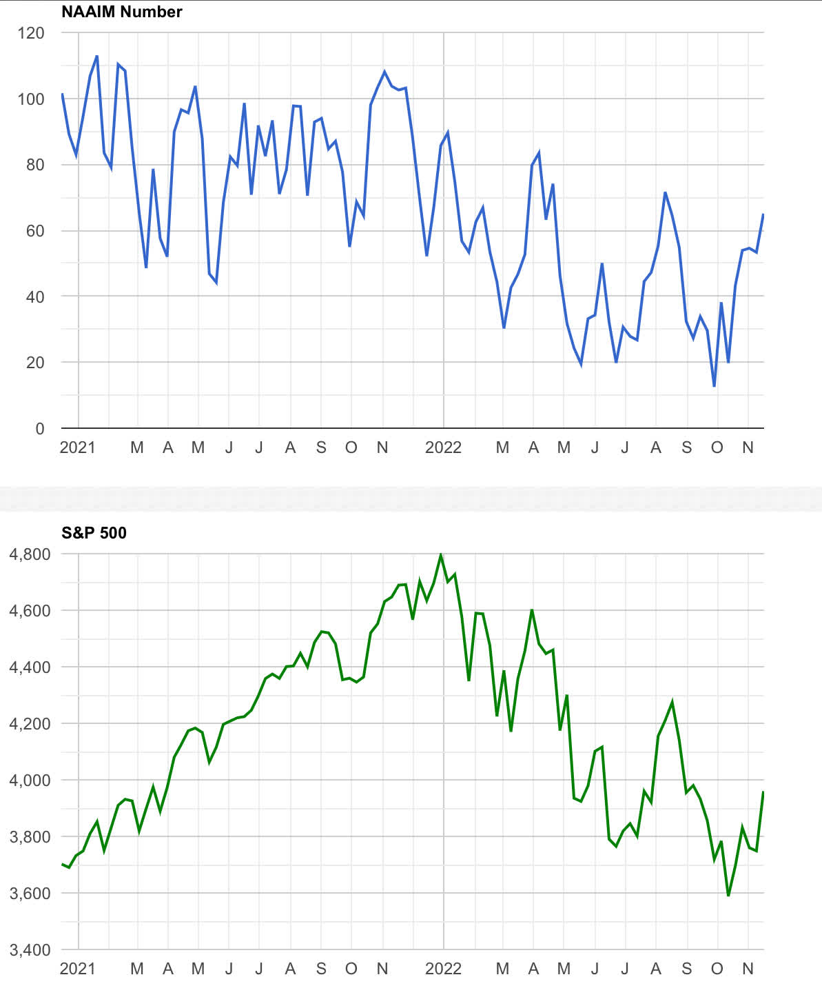
Equally weighted S&P 500
Equally weighted S&P 500 (RSP) is doing better than S&P 500 and about to break out above the cloud. This is constructive for S&P 500.
Equally weighted S&P 500 (Author)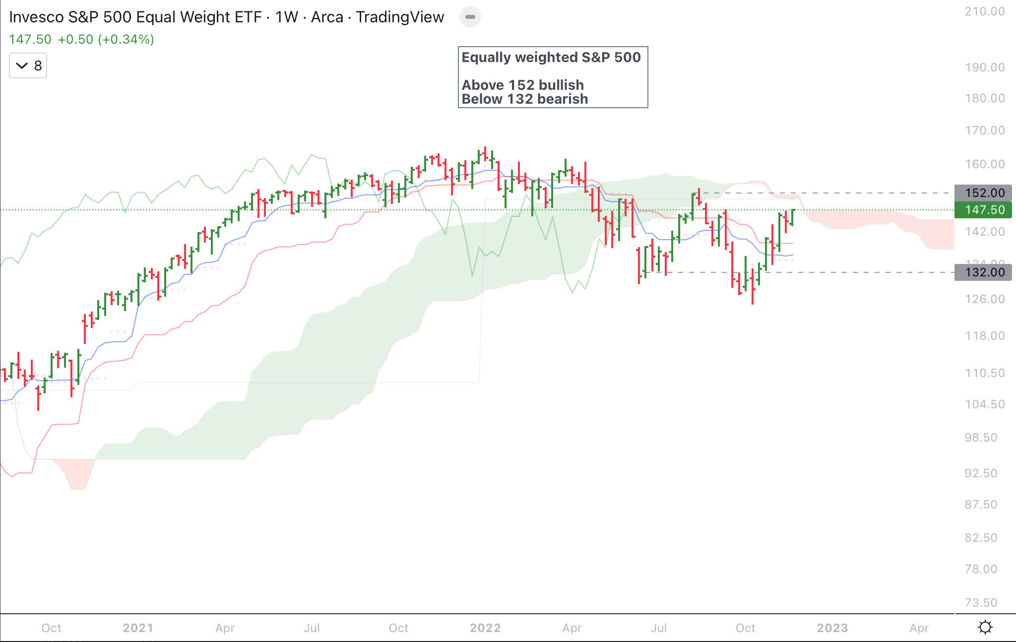
NASDAQ 100
NASDAQ 100 (NDX) is the drag on equities as higher interest rates have deflated fast growing but expensive tech stocks much more than the rest of the equity market. It would be a negative for S&P 500 if NDX closes below October 2022 lows.
NASDAQ 100 Chart (Author)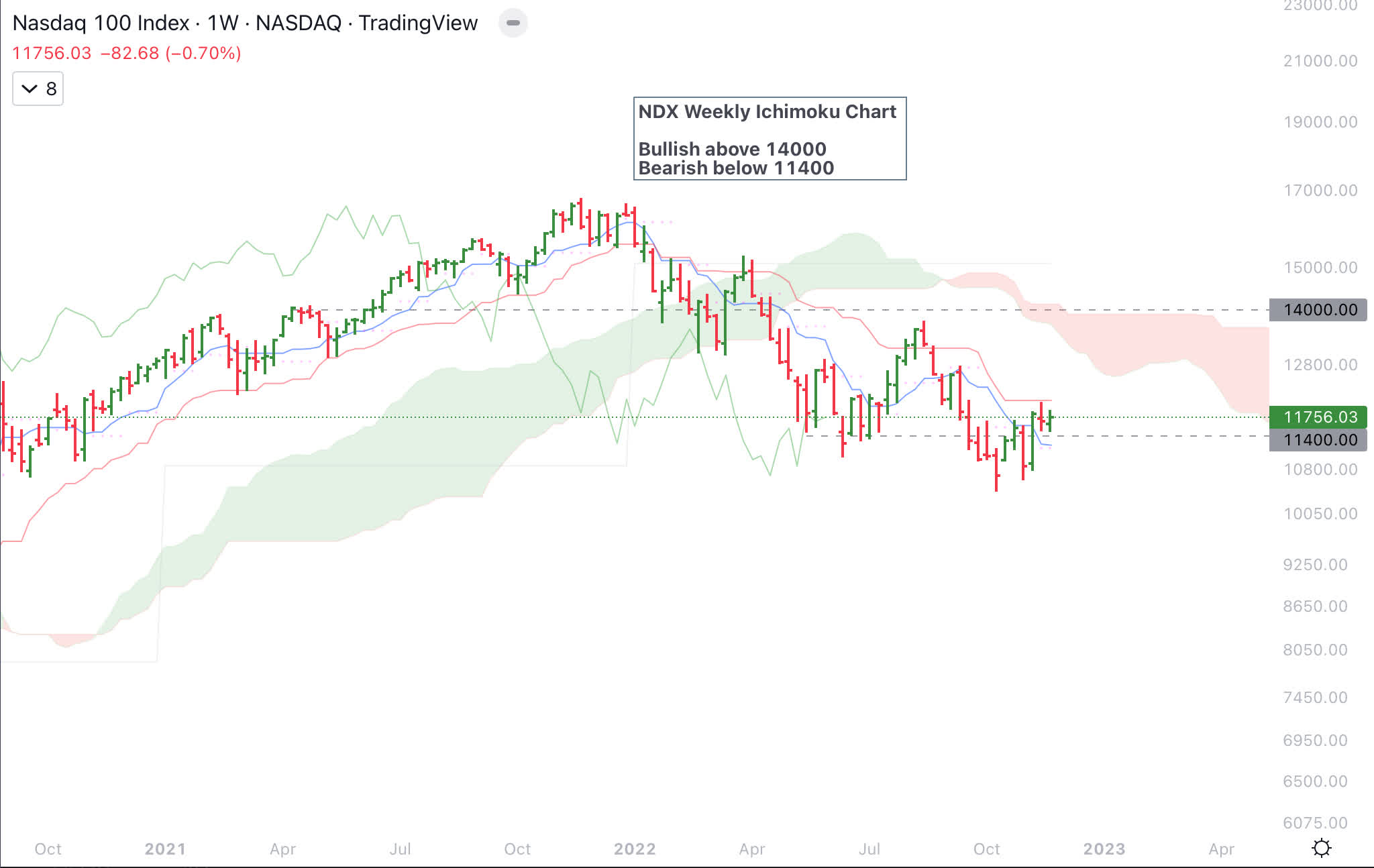
Put Call Ratio
Put Call Equities only Ratio (PCCE) remains high and this could be fuel for equities to move higher when it starts to come down. Below is the chart of PCCE shown as 21 day moving average to minimize noise.
Put Call Ratio and S&P 500 Chart (Author)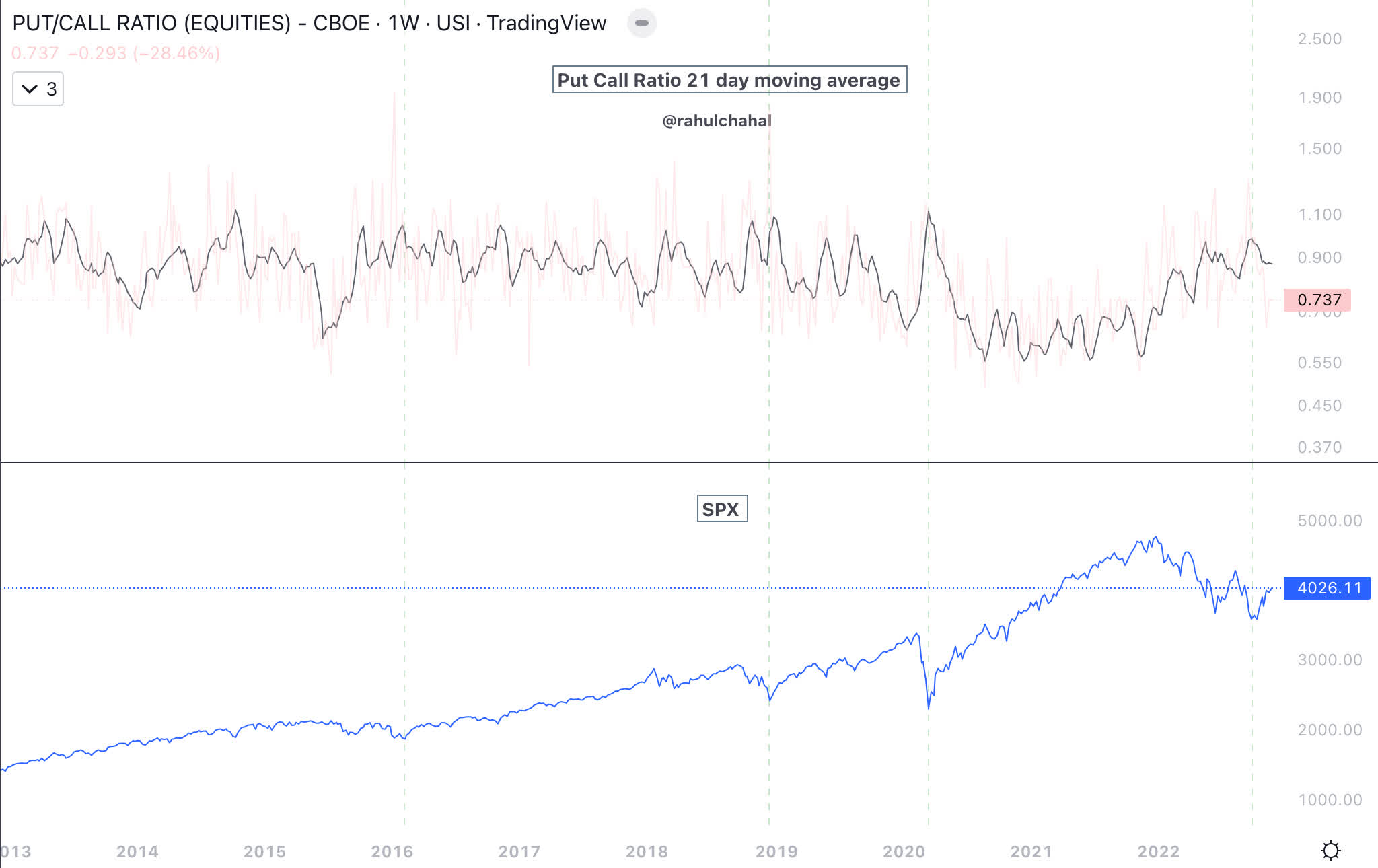
Treasury and Inversion
US 10 year treasury chart still remains a headwind and break above 4% would be negative for equities.
US 10 year chart (Author)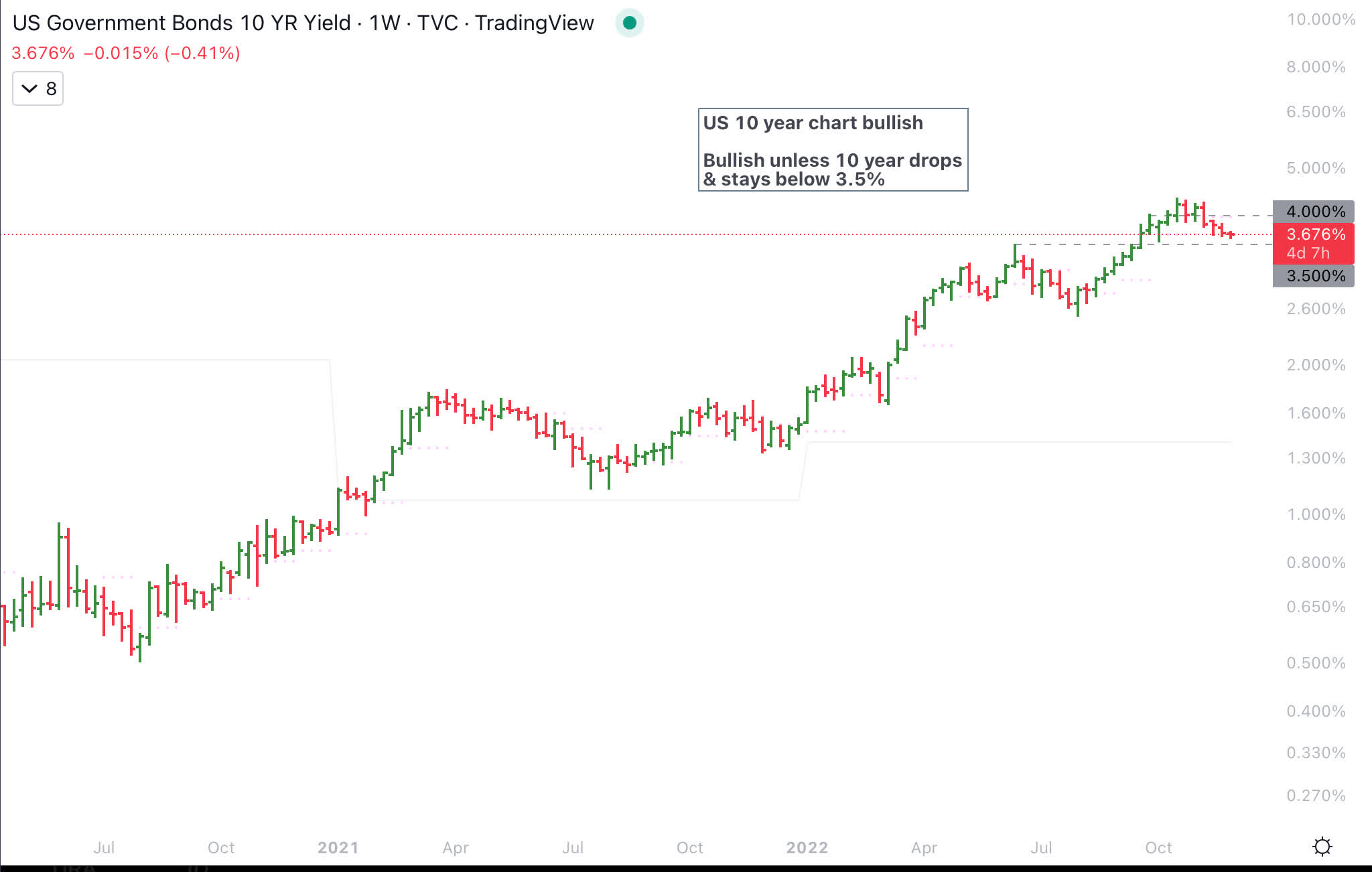
While US 10-year breaking below 3.5% would be viewed positively, however, the Yield curve is inverted. The two inversion that are closely followed are 10 year minus 2 year and the 10-year minus 3-month. Below is the chart of 10-year minus 2-year which is deeply inverted.
US 10 year minus 2 year (St Louis Fed)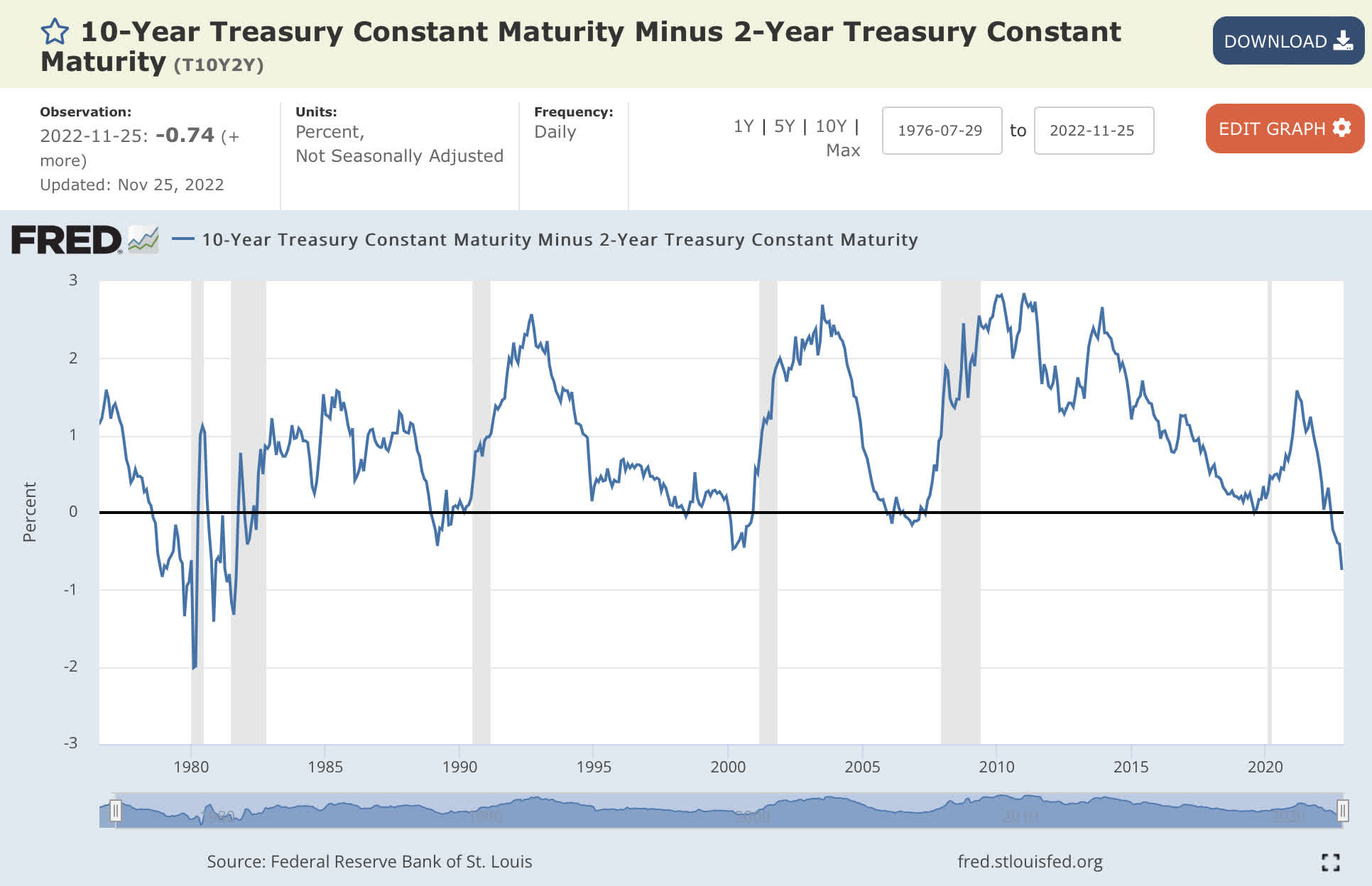
US 10 year minus 3 month just inverted. Inversion across the yield curve especially the 10 year minus 3 month and 10 year minus 2 year, has preceded past recessions.
US10 year minus US 3 month Chart (St Louis Federal Reserve)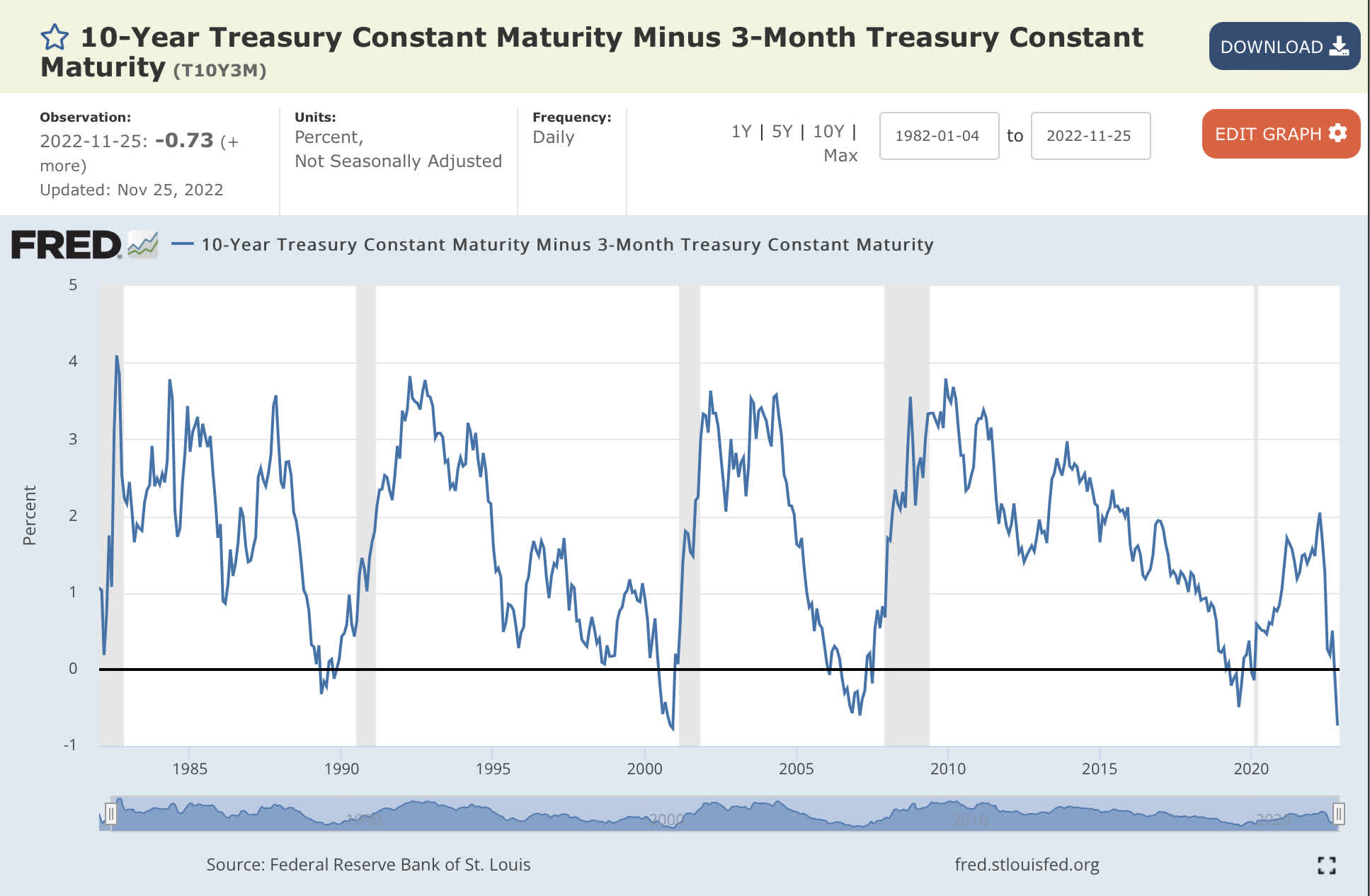
Yield Curve
Chart below shows yield curve inverted for 2022.
Yield Curve (GuruFocus)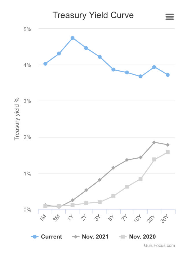
Money Supply
Money supply as measured by M2 has been going down since Federal Reserve started quantitative tightening which is a headwind for equities.
M2 Chart (St Louis Fed)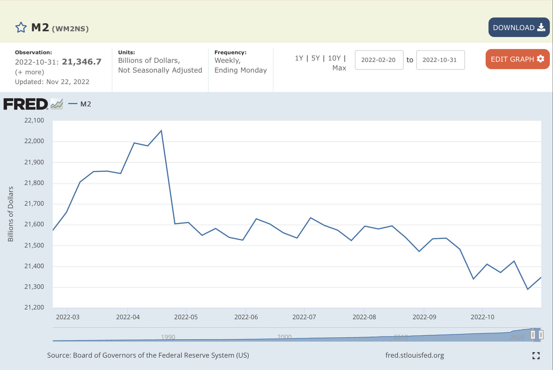
Fed and financial conditions
Until the Federal Reserve stops hiking rates, “Don’t fight the Fed” is reason enough to be cautious. Fed is fighting inflation and they do not want financial conditions to tighten. If equities go up, it eases financial conditions which is not what the Fed wants.
Equities have factored in economic weakness, higher interest rates, lower revenue and earnings. For the stock market to break to lower prices below October 2022 lows would require far worse information like inflation not continuing to go down or new information that is not factored in by equities.
Be the first to comment