

Pgiam/iStock via Getty Images
This is a follow-up article to an article written on August 1st titled: Massive Buying In SQQQ Indicates A Bear Market Bottom. There is no doubt the timing of the article was bad since the S&P 500 has fallen 11.6% since publication and the price of SQQQ has gone from $39.89 to $59.07 up 48%. A short-term trader would have clearly benefitted by going opposite the recommendation. That said, we still believe current metrics in SQQQ indicate we are in the area of bear market lows. I want to reiterate that we are using SQQQ metrics to help determine long-term market trends, not short-term trading.
Let’s go over the basic numbers to see what they currently show.
The Price Action Of SQQQ
NAV of SQQQ (Michael McDonald)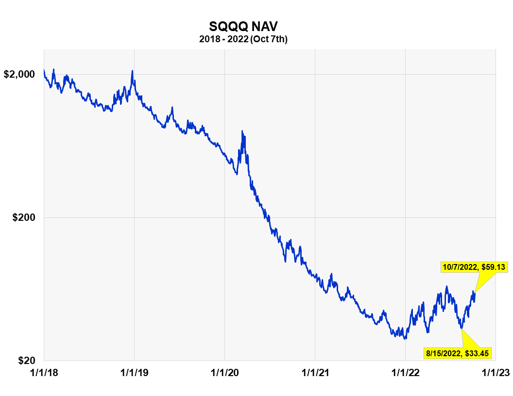
It is clear from this five-year chart that SQQQ is for short-term traders, it is not for long-term investors. Since 2018, the fund is down 97%. The 3X leverage of the fund is what produces the large, short-term price changes that some short-term traders desire.
SQQQ Shares Outstanding
SQQQ Shares Outstanding vs the SPY (Michael McDonald)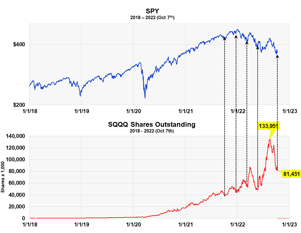
Plotting shares outstanding of SQQQ against the S&P 500 shows rather good timing by short-term traders who use this ETF. It shows, on a relative basis, the greatest number of shares outstanding occurring at short-term market tops and fewer outstanding shares at short-term bottoms, after prices have fallen.
This means that more people are entering the fund than leaving it as prices reach highs, then, after prices have fallen, more traders are leaving the fund than entering it. This fact is pointed to by the five black line arrows, and it was not clear at the time of the first article.
The recent large drop from 133,951,000 shares outstanding on August 18th to 81,451,000 shares last Friday – a decline of 39% (indicated by the last arrow on the right) – appears to suggest there is a high probability we are at an intermediate term market low.
Market Low Confirmed By The Ratio Of Assets In ProShares Bull And Bear Funds
Proshare Bull-Bear Asset Ratio (Michael McDonald)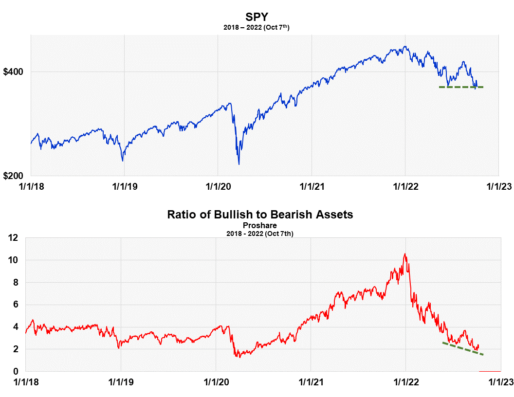
The ProShares “bull to bear” asset ratio is another way we measure investor sentiment. It takes the dollar value in all the ProShares bull funds and divides it by the dollar value of all the bear funds. At the market top in December there was over 10 times more money in bullish ProShares ETFs than bear market ETFs. It is now down to a little over two.
It’s a contrary opinion indicator. For example, it clearly shows the surge of money into ProShares bull funds from September to December of last year, right before the start of the bear market. The ratio went from 6.5 to 10.5. Extremely bad timing.
What’s important now is that the asset ratio went to new lows as the S&P returned to the price lows of May. Notice the broken green lines in the graph. It’s flat for stocks and slanted lower for the asset ratio. This means that even more ProShares investors believe the market’s headed lower than at the May low. This again is what you want to see if you’re a contrarian. It suggests stock prices should move higher over at least the intermediate term.
An Important Caveat
While I’m not so worried about the American economy dragging down the stock market, I am worried about the risk of a global financial crisis doing it, triggered by the actions of narrow-minded central bankers focused on just their own economy. While central banks are looking after their own economies, no agency is looking after the well-being of the entire global financial system. This is a serious issue, which I explain in the Article I just wrote on the Puts and Calls ratio.
Be the first to comment