

allanswart
Jerome Powell delivered an unusually brief and stern message to the markets in his annual Jackson Hole speech. The following paraphrase of the speech covers the key points. For those interested, I have provided a link to the full 8:33 statement.
Today my focus is narrower… my message more direct… the overarching focus of the Fed is to get inflation back down to 2%… this will require using our tools forcefully.
In reaction to Powell’s words, the S&P 500 (NYSEARCA:SPY) fell 3.38% and the Nasdaq 100 (QQQ) fell over 4% on Friday. Given such a violent reaction, the question becomes where do we go from here?
Primary Trend
The stock market has been in a confirmed primary downtrend since my March market outlook report, “SPY: The death cross and what you need to know,“ and is now in month eight of a bear market. Given the violent reaction to the Fed’s Jackson Hole comments, it is timely to review what may or may not be priced into various segments of the market today.
For example, which segments of the market are more likely to be at risk of higher interest rates? Conversely, which segments of the market are less at risk having already priced in higher rates? Given the advanced nature of the downtrend in many sectors of the market, the above questions hold the key to answering the primary question: where do we go from here?
The Bond Market
The negative reaction to the Fed’s comments beckons a review of the various segments of the bond market. In the following table, I compare the current risk-free yield curves to those in place at the time of my last market update on June 9, 2022. The data was compiled from Bloomberg. I have highlighted in yellow the US 2-year Treasury bond yield and the difference between the 10-year and 2-year Treasury bond yields. The latter serves as a benchmark measure for the US yield curve.
Source: Bloomberg. Created by Brian Kapp, stoxdox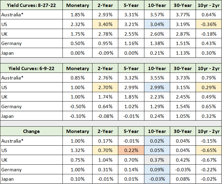
Please note that the US 10-year yield is highlighted in blue throughout the table as is the change in 10-year yields for each market since the June update (the lower section). The key takeaway from the risk-free yield curves since the last market update is that short term rates are rising (the 2-year yield) while longer-term rates remain unchanged.
Notice in the lower section of the table that the US 2-year bond yield rose 0.70% since June 9, while the US 10-year bond yield rose only 0.05%. This difference has caused the US yield curve to invert once again with the 2-year yield now higher than the 10-year by 0.36%. Recessionary conditions are near or in effect for many sectors of the economy.
I have highlighted in orange the change in the US 5-year yield, which rose 0.22% since the last update. This is a good measure for the change in intermediate risk-free rates and serves as a measuring stick when viewing the change in corporate bond yields. Meaning, if corporate yields rose materially more than risk-free rates, or 0.22%, the market would be sending a decidedly negative signal on the fundamental health of the US economy.
Corporate Bond Yields
It is the corporate bond market that sends signals about the state of the underlying economy, while risk-free yields carry pure inflation and interest rate signals. We know from above that the risk-free bond market is raising rates at the short end of the yield curve in response to central bank policies, while yields at the longer end are unchanged.
In the following table, I display the change in yield across the major segments of the corporate bond market since the market update report in early June. I have highlighted in yellow the yield change in the higher-quality segments of the corporate bond market. The rate changes in the lower-quality segments of the market are highlighted in blue. The data was compiled from the Wall Street Journal.
Source: The Wall Street Journal. Created by Brian Kapp, stoxdox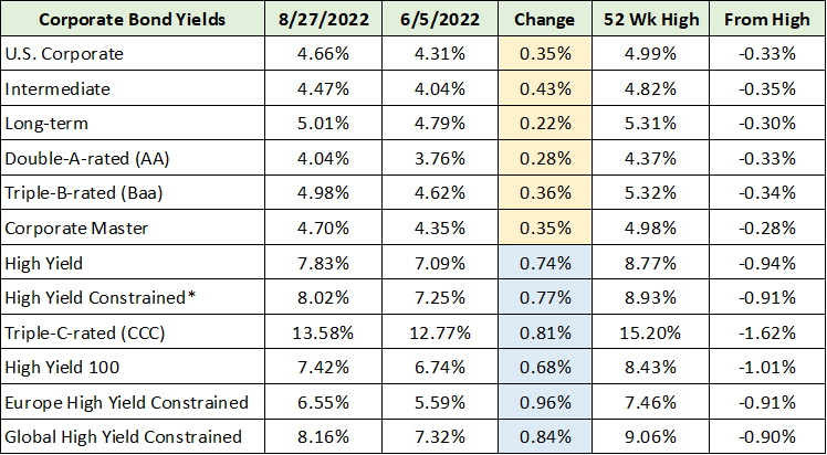
Importantly, yields across the higher-quality segments of the corporate bond market have risen between 0.28% to 0.43%, with 0.35% being the midpoint of the yield increase. Compared to the 0.22% rise in the 5-year US risk-free rate, the additional rise of 0.13% in the higher-quality end of the corporate bond market is largely a rounding error. As a result, there are no materially negative economic signals coming from the investment-grade end of the bond market.
Yields at the lower-quality end of the bond market have risen between 0.68% to 0.96%. With 0.82% being the midpoint of the rate rise. The lower quality or junk bond market is sending a mild economic warning in relation to the 0.22% risk-free interest rate increase. That said, yields in the junk bond market remain roughly 1% below their recent highs (the “From High” column above).
In the following table, I have highlighted four of the bond market indices which encapsulate the various tiers of the corporate bond market. I have highlighted in blue the current yield and the yield change since the 52-week low. The 52-week low yield is highlighted in yellow for ease of comparison.
Source: The Wall Street Journal. Created by Brian Kapp, stoxdox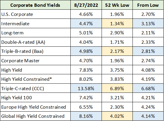
Note that since the 52-week low in rates, the corporate bond market has raised interest rates between 3% to 7% over the past year. Importantly, rates bottomed roughly two years ago. In essence, incredible yield increases have already occurred. Given the lack of movement in risk-free 10-year bond yields since the June market update, the question becomes which segments of the market remain most at risk to further rate increases?
Interest Rates: Historical Yields
To answer this question, the following charts, courtesy of the St. Louis Federal Reserve, provide historical yields for three segments of the bond market: junk bonds, triple-B-rated bonds, and the 10-year US treasury yield. I will begin with the lower-quality or junk bond market in the following chart.
Source: St. Louis Federal Reserve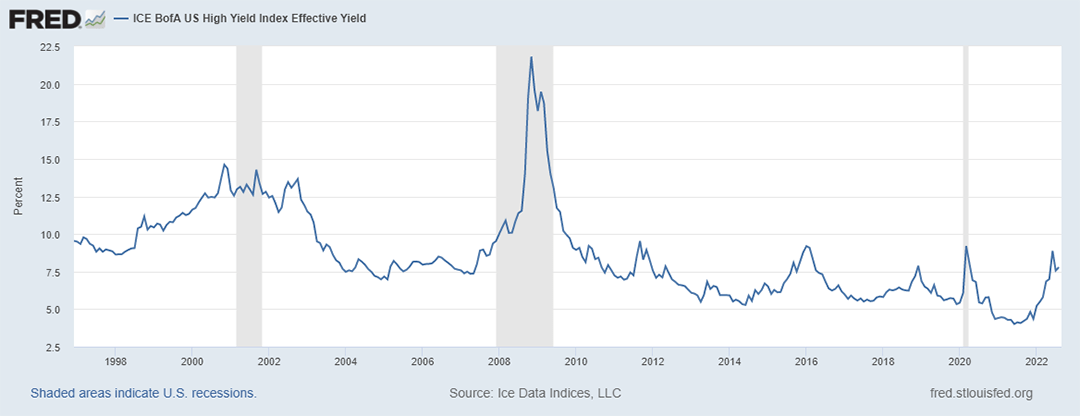
Notice that junk bond yields are already back to what can only be called normal levels over the past twenty-five years, excluding the extreme events of the 2000 bubble and the 2008 financial crisis. As a result, the low-quality end of the corporate bond market has largely normalized with little upside interest rate risk left except for panic spikes. The next chart provides historical context for the triple-B-rated or investment grade portion of the corporate bond market.
Source: St. Louis Federal Reserve. 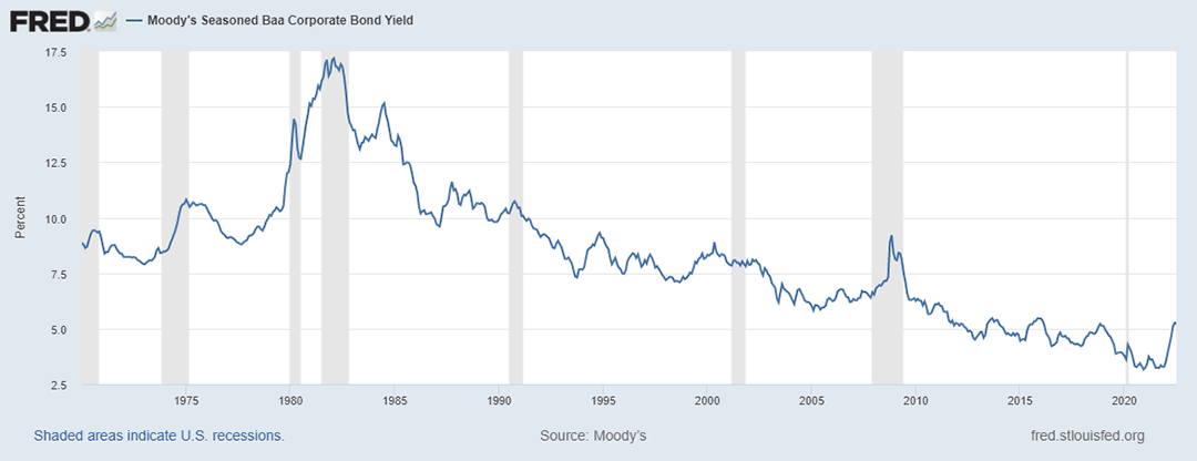
Here, we can see that interest rates remain well below historical norms suggesting that there remains a material risk of higher rates for investment grade corporate bonds. This interpretation is supported by the risk-free 10-year US treasury chart below.
Source: St. Louis Federal Reserve
The higher-quality segments of the bond market, the 10-year Treasury and triple-B-rated charts above, continue to face material interest rate risk. Conversely, the lower-quality sectors appear to have largely priced in the current rate hike cycle (the junk bond chart above).
Interpreting The Fed’s Message
As a result, my interpretation of the Fed’s stern Jackson Hole message is that the Fed views the mild inversion of the risk-free yield curve to be out of sync with inflation trends over the intermediate term. Meaning, a 3% yield on the 10-year plus end of the bond curve is viewed as being too low.
A second interpretation of the Fed’s message is that there remains excessive risk taking in the leveraged finance sector generally and the shadow banking system in particular. Excesses are on display in the shadow banking system with the ongoing cryptocurrency implosions. On the leveraged finance front, the derivatives market remains a systemic risk as excessive leverage here is often not visible until funding markets become stressed.
The Federal Reserve signaling its willingness to take short term rates toward 4% and keep them there for some time, thereby further inverting the risk-free yield curve, speaks directly to the excesses the Fed is targeting. If this approach is taken, it would have the effect of causing stress in the short-term funding markets for highly-leveraged financial products and operators.
In summary, the Fed looks to be walking longer-term interest rates higher while attempting to cap the excesses in leveraged finance generally and the shadow banking system in particular. One thing the Fed is not trying to do is create a systemic event by destroying asset values broadly. That would take them back to the zero-interest rate and QE quagmire, which I view as a worst-case scenario that they are likely to avoid as best they can.
Interest Rates: Historical Yield Curve
The approach of raising short-term rates above long-term rates to mitigate the risks of inflation and excessive speculation has historical precedent in the late 1970s and early 1980s. The following chart from the St. Louis Fed displays the history of the US yield curve as defined by the difference between the 10-year and 2-year treasury yields.
Source: St. Louis Federal Reserve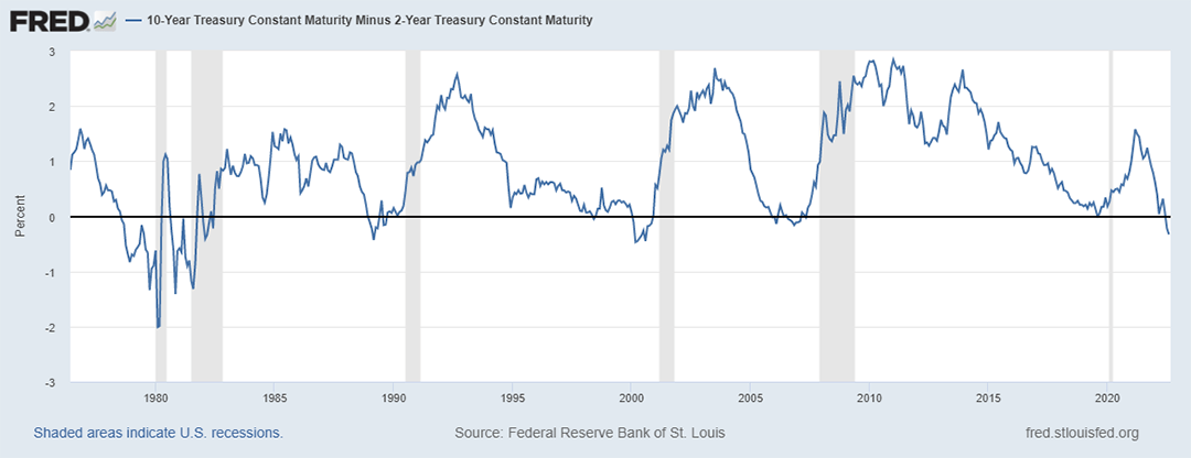
Notice the yield curve volatility in the late 1970s and 1980s compared to that which followed. While this type of volatility is a risk going forward, I view the market taking longer-term rates higher to accommodate central bank policy as the more likely pathway over the intermediate term.
It should be noted that there are supply and demand realities at the long end of the US risk-free yield curve that have the effect of distorting pure interest rate and inflation information. The relatively low supply of longer-term Treasury bonds has the effect of pushing down longer-term interest rates thus distorting pure market signals. If one substitutes AA-rated bonds for the 10-year treasury bond, with a yield over 4%, the US yield curve is not inverted (ignoring the longer end).
Fundamentals
With interest-rate risk present in the higher quality segments of the bond market, equity prices should continue to be pressured as interest rates feed directly into stock valuations. The following table was compiled from the Wall Street Journal and displays the current valuation of the major US stock market indices. I have highlighted in yellow those indices that remain at historically elevated valuations and in blue those that remain at historically extreme valuations.
Source: The Wall Street Journal. Created by Brian Kapp, stoxdox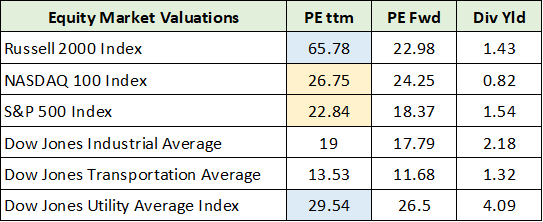
Converting the PE ratios above into earnings yields, the S&P 500 and Nasdaq 100 are yielding 4.4% and 3.7%, respectively. The earnings yield on the Russell 2000 (NYSE:IWM) (small caps) and on the Dow Jones Utility Average are 1.5% and 3.3%, respectively. With corporate bond yields in the range of 4% to 14%, there remains material multiple-contraction risk in the broad US equity markets. This will be compounded if forward earnings estimates are too high.
Technicals
With the risk of valuation multiple contraction front and center, the price action of the S&P 500 offers context for estimating the general risk to equity values. Here, it is helpful to revisit the technical updates from the prior March and June market outlook reports.
The following SPY 5-year weekly chart from my March update sets the stage for understanding the path that we are on. Notice that the short, upward-sloping orange line represented a potential head and shoulders top as of the March report which was later confirmed.
SPY 5-year weekly chart (Created by Brian Kapp using a chart from Barchart.com)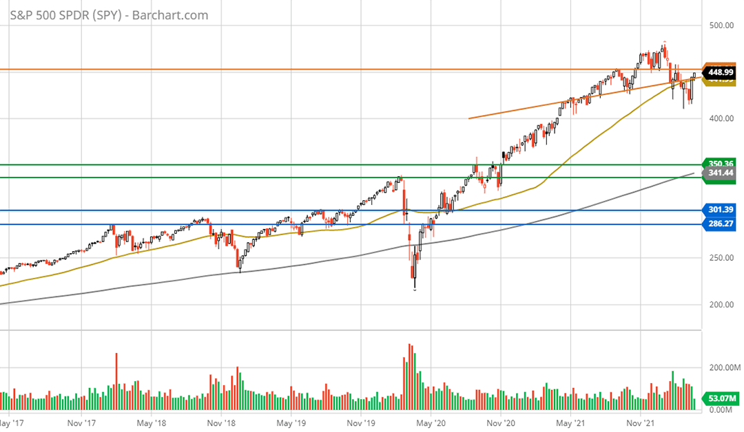
In late March, as can be seen in the above chart, the S&P 500 index was testing its two primary resistance levels denoted by the orange lines. The diagonal orange line is the head and shoulders neckline, and the horizontal line is broken support from the topping pattern in late 2021.
The next chart carries over the same resistance (the orange lines) and support levels (the green and blue lines) and updates the price action as of my market update on June 9. I have used a 3-year weekly chart instead of a 5-year chart for a closer look at the action at that time.
SPY 3-year weekly chart (Created by Brian Kapp using a chart from Barchart.com)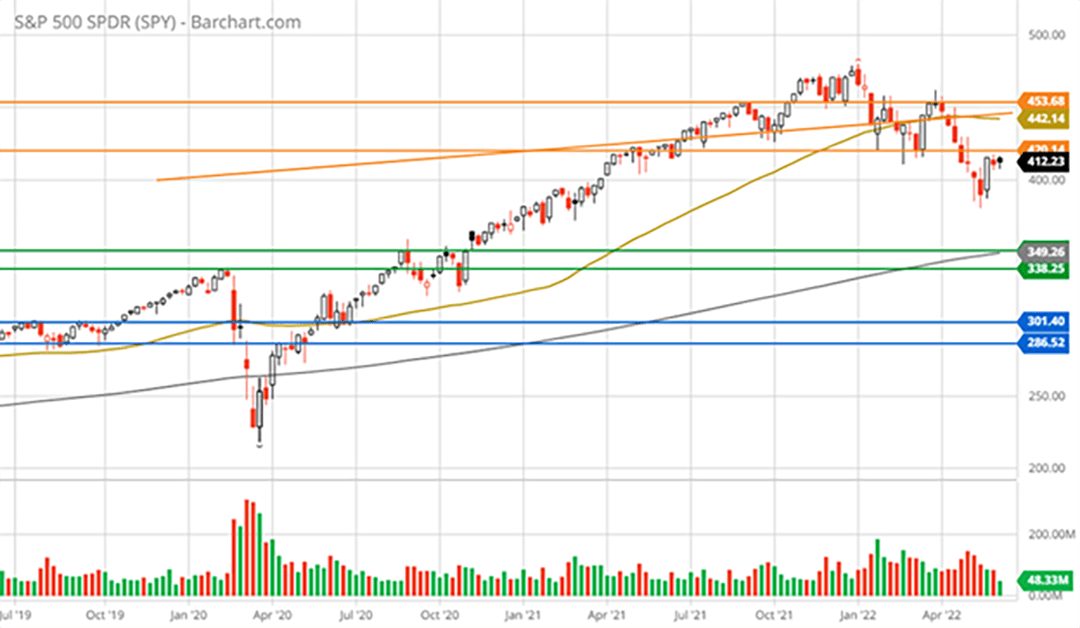
Notice that the S&P 500 was rejected precisely at the upper orange line. This occurred the week following the March market update, with the peak occurring two days after the report. The market then went on a seven-week losing streak, the first such streak since 2002. Please note that the third orange resistance line (the lowest orange line) was added as the 7-week decline into the June report took out a prior support level which has now become additional resistance.
The next 5-year weekly chart below carries over the same support and resistance lines and updates the price action through August 28, 2022. Notice how the S&P 500 was rejected at the lowest orange line immediately following the June market update. This is also the level where the S&P 500 was rejected following Jerome Powell’s Jackson Hole comments on August 26, 2022.
SPY 5-year weekly chart (Created by Brian Kapp using a chart from Barchart.com)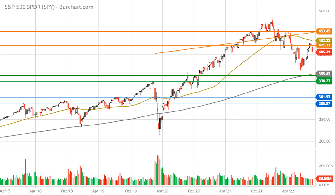
The following 1-year daily chart provides a closer look at the two rejections at the lower resistance level (the lowest orange line). Please note that the 200-day moving average is denoted by the grey trendline and the 50-day moving average is represented by the gold trendline.
SPY 1-year daily chart (Created by Brian Kapp using a chart from Barchart.com)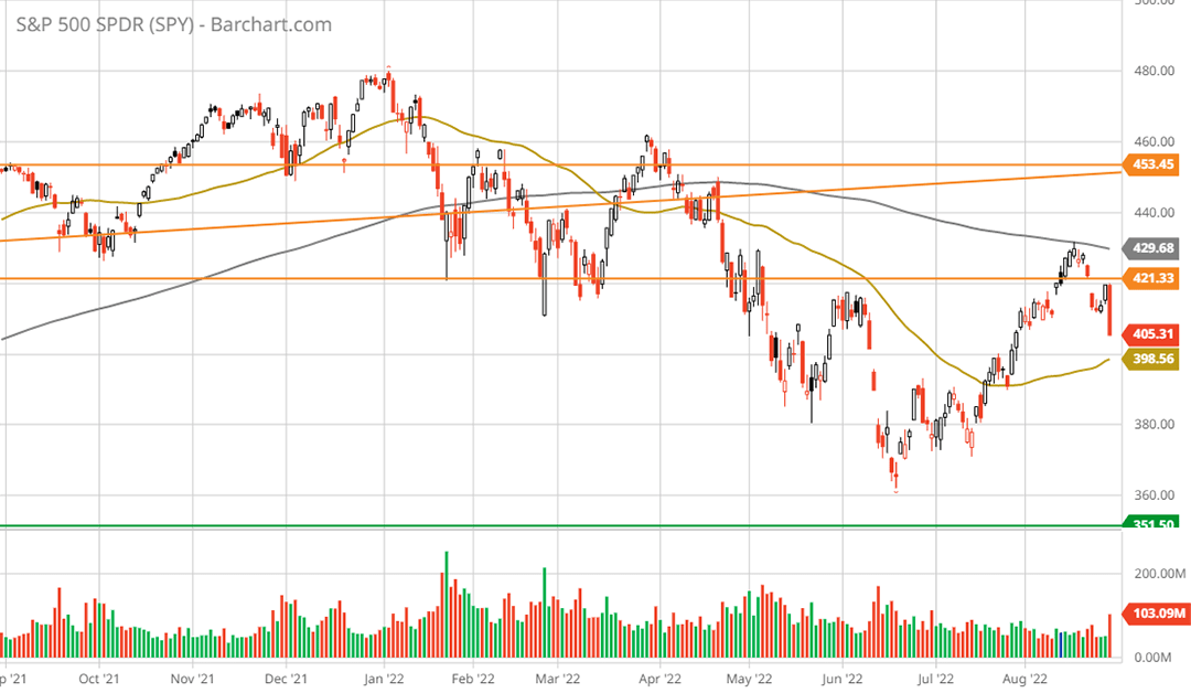
The recent rejection occurred just above the first resistance level and coincided precisely with the 200-day moving average. This price behavior, and the performance since the peak in early January 2022, is textbook bear market action for which we are now in month eight.
Notice that we have experienced two primary moves lower which have been followed by two counter trend rallies, one in late March and the recent one from July through August. It is highly likely that a third wave lower is in the cards over the near term.
The following 20-year monthly chart provides a bird’s eye view of the primary support levels which are defined by the green and blue lines. The support levels serve as downside targets for the current bear market.
SPY 20-year monthly chart (Created by Brian Kapp using a chart from Barchart.com)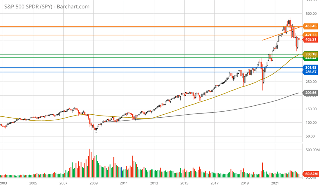
The first support zone is in the $338 to $351 area and is represented by the green lines. During the wave lower in June, the S&P 500 briefly tested near the upper end of the first support zone. This is a high probability target area and represents -13% to -17% downside potential. Such a price move would bring the S&P 500 PE multiple into the 19x area which currently is in line with that of the Dow Jones Industrial Average.
While 19x is not extreme for the S&P 500, it does assume that earnings remain at the current level. With earnings estimates being generally revised lower, this support zone may not hold and will be dependent on how much earnings downside materializes. As a result, the zone defined by the blue lines between $285 and $300 cannot be ruled out. If this area is tested, it would likely offer exceptionally strong support. The downside potential to the blue support zone is -26% to -30%.
Opportunities
There is a high probability that the bear market in US equities carries lower into the fourth quarter of 2022, with a test of the green support zone and downside risk potential to the blue support area. That said, as covered in the bond market section, there are segments of the market which are more advanced in their declines (or normalization) than are the popular equity indices.
For example, real estate is one of the more interest rate sensitive sectors. As highlighted by my recent dox it! reports on Macerich (NYSE:MAC), JELD-WEN (NYSE:JELD), and Toll Brothers (NYSE:TOL), many real estate companies are probing lows last reached during the financial crisis of 2008 and the COVID panic of 2020. Additionally, many real estate related companies are trading at deep discounts to the generally elevated market valuations.
While the real estate sector is in a well-defined downtrend, it is advanced in leading the market lower with opportunity materializing for those looking through the valley. Unlike real estate, the energy sector is healthier than it has been since the early 2000s offering upward momentum at still reasonable valuations. Schlumberger (NYSE:SLB) for example has entered what looks to be an exceptional upcycle through mid-decade.
Finally, the nuclear technology industry appears to be on the verge of a secular renaissance. A company like BWX Technologies (NYSE:BWXT) offers exceptional growth opportunities at a reasonable price. It may even be a top recession stock as it serves the defense industry from behind a wide moat. Geopolitical trends offer a catalyst for the core defense business while macroeconomic headwinds have little to no negative effects.
Summary
The opportunity examples above are intended to highlight the most important fact of the equity markets, which I have had to be reminded of over my career. As the saying goes, “it’s a market of stocks not a stock market.”
It’s such a simple statement of fact that it can be forgotten or easily overlooked in a marketplace dominated by index funds and passive investing. The indices are a simulacra of what lies beneath them. This reminder takes on added importance during periods of heightened emotions and bold predictions as to the likely direction of “the stock market.” Though one can passively invest in someone else’s idea of what represents “the stock market,” there remains no such thing.
The downtrend looks likely to persist for the broad US equity indices. With the increasing dominance of index funds and passive investing in the markets, one would expect market inefficiencies to increase thus expanding the opportunity set long term.
Be the first to comment