

S&P 500, Nasdaq 100 Talking Points:
Quite the difference that a day can make, huh?
While markets showed extreme relief on the back of the Fed talking down prospects of a 75 basis point hike in June, matters have shifted quickly and dramatically in the 24 hours since. And, really, that shift began to show even before US markets had opened for the day as the US equities started to pullback around the Euro open with another shot-lower showing up right around the US open.
But, throughout today’s session, as bond yields have continued to climb, equity prices have continued to drop. And while yesterday’s relief has yielded to today’s fear, there’s more data on the calendar for this week that can keep markets on the move.
Tomorrow brings Non-farm Payrolls out of the US and given how active markets have already been on the back of Central Bank themes, this can lead in to a very busy Friday.
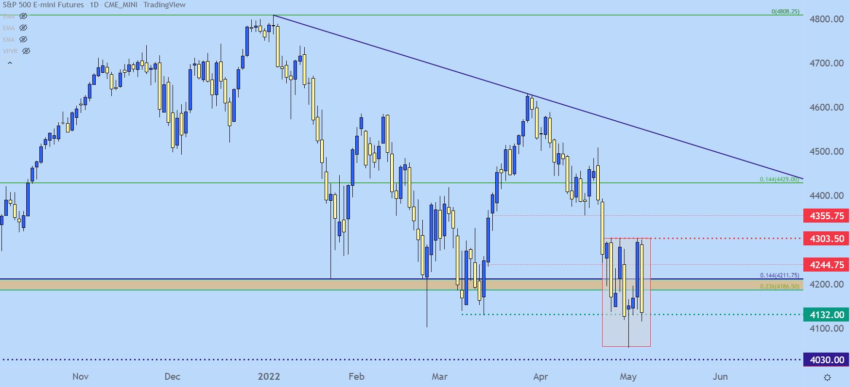
From a price perspective, the S&P 500 has moved down to a somewhat dangerous area on the chart. From the daily chart below, we can see the extreme volatility that’s played-in over the past nine trading days, and we’re pretty much near the support level that’s been in-play through most of this mess.
Below that, there’s one more swing low before the 4k psychological level is exposed.
S&P 500 Daily Price Chart
Chart prepared by James Stanley; S&P 500 on Tradingview
Taking a step back to the weekly chart helps to give some context as to why I called this area ‘dangerous.’
That swing-low earlier this week marked a fresh 11-month-low for the S&P 500. This likely helped to play-in to yesterday’s rebound – market participants were so bearish and the 50 basis point hike was so well telegraphed that, well, the Fed failed to surprise. And then when a wave of strength compelled short-covering, a strong rally developed thereafter that allowed for the strongest daily move in the index in almost two years.
The fact that bulls couldn’t hold that move is very bearish and this further exposes the bearish potential that remains in US equities. The next major spot of yet-untested support in the S&P 500 is the 4k psychological level. After that, we have the confluent zone between Fibonacci levels plotted at around the 3800 level. If the S&P moves down to that zone, we have a technical bear market.
But, it’s important to realize that in situations such as this, volatility can work both ways, much as we saw yesterday with that massive rip after a half-point rate hike. Increasing volatility also increases the range of possible outcomes, so caution needs to be warranted.
S&P 500 Weekly Price Chart
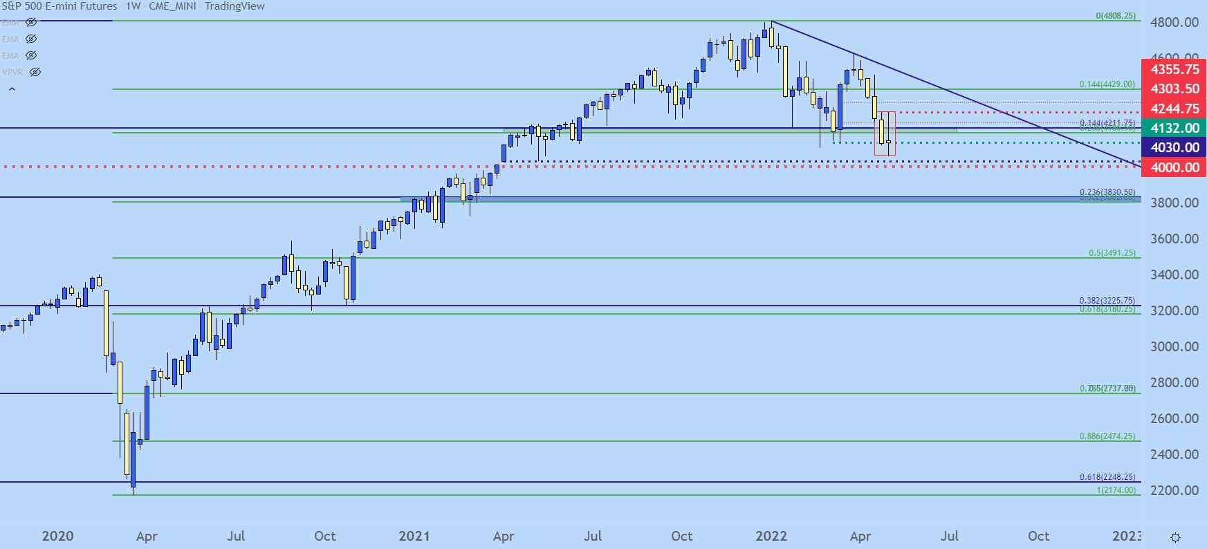
Chart prepared by James Stanley; S&P 500 on Tradingview
Nasdaq 100
While the Fed looks to be in a poor position, the Nasdaq 100 is in an even worse spot. Prices are very near the recently-established yearly low and this is below the neckline of a double top formation.
And, if we are seeing a rate-fueled sell-off, then arguably the potential for bearish moves is greater in the tech-heavy, high-beta Nasdaq 100. The next spot of support here on my chart is a wide zone, spanning from 12,207-12,465. Below that is another spot of interest around 11,700.
But, bigger picture, it’s the zone around 10,500-10,751 that remains of interest, tracking a projected move from the fill of that double top formation.
Nasdaq 100 Weekly Price Chart

Chart prepared by James Stanley; Nasdaq 100 on Tradingview
Treasury Yields
This is one of the key drivers of this theme and that’s a near-parabolic run for Treasury yields. Yesterday, around the Fed, the 10-year turned from resistance at the 3% level. But, this morning was marked by an aggressive jump back-above that marker and, already prices are making a run at the 3.25% mark.
This is the current decade-high for the 10-year, and its also the spot that caused full-scale selling back in Q4 of 2018. Will a repeat episode occur? That’s impossible to tell, but, given the pressure that’s already shown in markets, logically speaking, this is something taking a toll on the risk trade and foreseeably, there’s no indication yet that this theme is ready to roll over in either bonds or stocks.
US 10 Year Treasury Yields
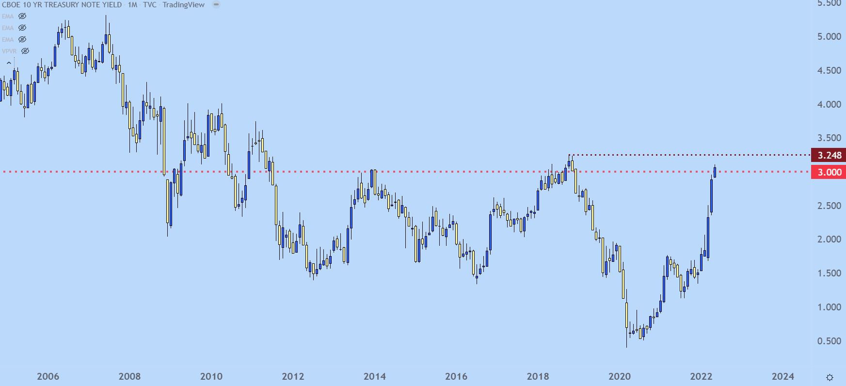
Chart prepared by James Stanley; TNX on Tradingview
— Written by James Stanley, Senior Strategist for DailyFX.com
Contact and follow James on Twitter: @JStanleyFX
Be the first to comment