


RomoloTavani/iStock via Getty Images
Thesis
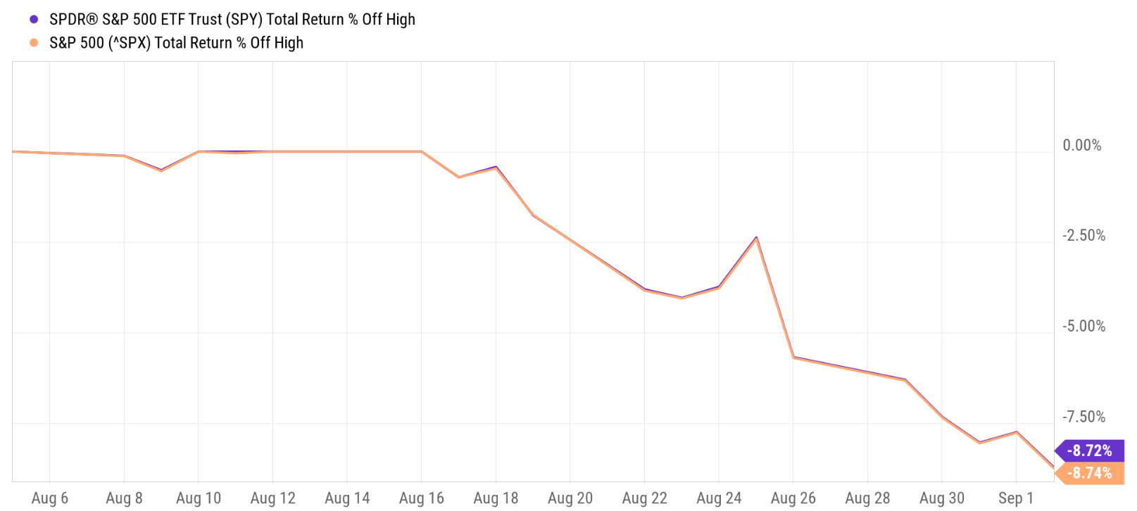
Lately, a frequently asked question in our Marketplace service involves the possibility of a recession. Our members are concerned about such a possibility, rightfully so, given the macroeconomic signals that appeared recently such as the inverted yield curve and GDP contraction. To add to the panic, the stock market has been sliding almost nonstop for three weeks as of this writing, with the S&P 500 losing about 9% from three weeks ago.
Source: Seeking Alpha
And therefore, I feel the need to share my thoughts on these popular signals, especially to point out their limitations, so that investors can make informed decisions suited to their individual risks profile. The main limitations to me are:
- The GDP contraction signal is more ambiguous and arbitrary and hence even less useful in my mind. For example, there’s a distinction between Gross Domestic Product (“GDP”) and Gross Domestic Income (“GDI”). And there has been an ongoing debate on which is a better representation of the overall economy. The debate is a moot point most of the time as they are usually close. But it becomes crucial when they are different, like what we’re experiencing now. To confuse things even more, the GDP and GDI data are currently not only different quantitatively but also directionally as you will see later.
- The inverted yield curve signal does not always work. There had been both false positives and false negatives from historical data as we will detail in a later section.
- And finally, even if the inverted yield curve or contracting GDP signals are reliable, they’re not too helpful for investment decisions because they are binary signals. As investors, it’s purely irrational to go out of equity when GDP contracted by 0.1% for two quarters in a row and to stay in equity when it expanded by 0.1% for two quarters in a row.
Due to these considerations, we’re currently still only making gradual adjustments based on our “business-as-usual allocation model.” And yes, we do have a “recession allocation model” as we hear a louder and clearer recession signal. We will share our action plan and trigger points that we monitor closely to decide when we should activate the recession allocation model.
Before we dive in further, let me clarify that in this article, I will base my analysis on both the S&P 500 (SP500) and also the SPDR S&P 500 Trust ETF (NYSEARCA:SPY). Unless explicitly mentioned, this analysis will treat them interchangeably because the ETF does track the fund closely as we will see in the next section). And thus they provide the flexibility for me (and you also) to draw data from either the index or the EFT depending on which is easier and more accessible. Another advantage of basing the analysis on both the index and the EFT is that the ETF provides a more convenient vehicle for investors to express their views on the index.
SPY ETF vs. S&P 500 index
First, let’s establish the interchangeability of the S&P 500 and SPY. The goal of the SPY fund is simply to mimic the S&P 500 Index as stated in the fund description:
- The SPDR® S&P 500® ETF Trust seeks to provide investment results that, before expenses, correspond generally to the price and yield performance of the S&P 500® Index (the “Index”).
- The S&P 500 Index is a diversified large-cap U.S. index that holds companies across all 11 GICS sectors.
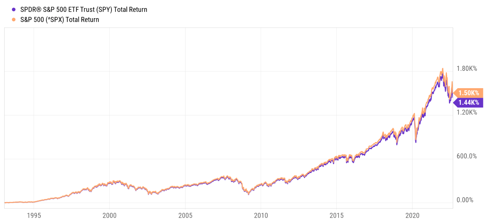
And thanks to its long history (it was launched in January 1993), it provides more than three decades of data publicly and is easily accessible to most investors. And from the following chart, you can see that despite issues like fees, dividends, and tracking errors, its price followed the index closely in the long term. Since its inception in 1993, the S&P 500 Index returned 1440%, and the SPY fund returned 1500%. The difference is only 60% after more than three decades of accumulation, translating into about 0.1% per year. Given this extremely small discrepancy, I will use S&P 500 or SPY data, whichever comes more convenient, in the rest of the analysis.
Source: Seeking Alpha
Ambiguity of the GDP and GDI data
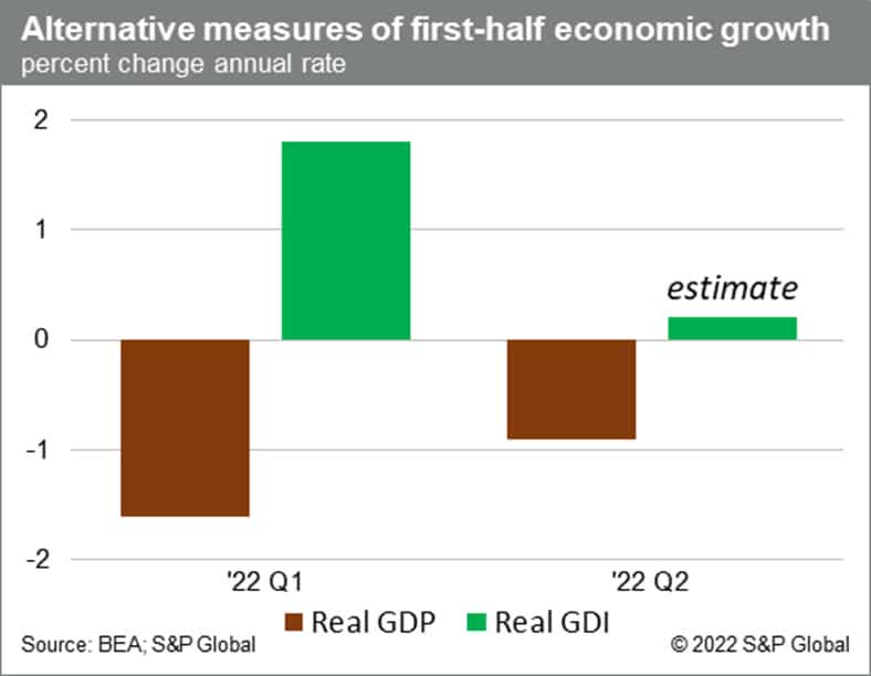
The Bureau of Economic Analysis (“BEA”) reported in July that U.S. economic output as measured by GDP shrank for two consecutive quarters in the first half of this year. To wit, real GDP fell by 0.9% in Q2, following a 1.6% decline in Q1. Two consecutive quarters of negative GDP growth meet the popular (though not official) definition of a recession. And then new data released since then, especially the GDI data, sent a different signal as you can see from the chart below. As measured by GDI, the economy expanded by about 1.8% in Q1 and is estimated to expand by another 0.1% in Q2.
A bit of background on GDP and GDI. They’re both common measures of economic output (even though GDP is more often talked about). And in theory, they should be equal because they measure the economy from two equivalent ends – for every $1 person A spent on a certain good or service, person A would be making $1. GDP reflects person A’s spending on the transaction, while GDI reflects person B’s income of the same transaction.
However, there’s always statistical error because the datasets and data sources used to compute GDI and GDP are different. Thus far this year, the statistical error has not been unusually large quantitatively but also different directionally as seen in the chart. And one of the main causes is the highly inflationary environment we are experiencing now.
Given such ambiguity, I do not see reasons for investors to panic because of the GDP data. The economy might be far away from a recession (and closer to stagnation). Furthermore, as aforementioned, even if contracting GDP data is conclusive and unambiguous, it won’t be too helpful for investment decisions because it’s a binary signal.
And so is the inverted yield curve signal as we will discuss next.
Source: BEA and S&P Global
Limitations of yield curve signal and alternatives
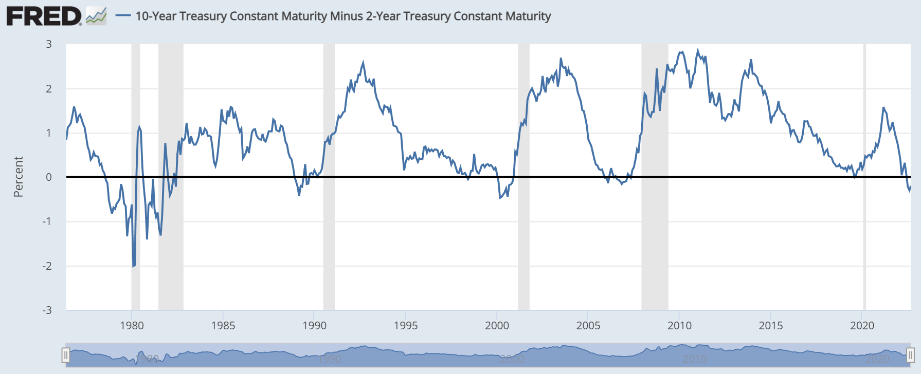
Most investors are familiar with the dreaded yield curve inversion as shown below (a plot of the spread between 10-year Treasury rates and 2-year Treasury rates). At first glance, you can see that since the 1970s, there were six recessions (highlighted by the great bars). And all six had been preceded by a yield curve inversion. So, the success rate of this signal is 100% in the past 50-plus years. And this dreaded inversion has happened repeatedly in the past few months. The yield curve inverted briefly back in April 2022 as the 10-year Treasury rates dipped below the 2-year Treasury rates briefly (so brief that you can barely see it in the following chart). Then the inversion occurred in earnest in early July shortly after the Fed announced its intention to continue its hawkish plan. The spread between 10-year Treasury rates and two-year Treasury rates has remained negative since July 5, reached a bottom of almost -0.5%, and currently stands at -0.20%.
Source: FRED
Given the popularity of the yield-curved signal and hence the heightened anxiety we’ve seen among our members, we feel timely to point out the limitations too. As detailed in an earlier article:
- The sample size of past recessions is too limited to be statistically significant. As mentioned above, there were only 6 recessions in the past 50-plus years. Expanding the timeframe broader, there were 19 noteworthy recessions throughout U.S. history.
- The signal does not always work. There had been both false positives and false negatives even among the limited sample set. Some recessions happened without a preceding signal, and vice versa.
- The signal does not tell you when a recession would happen. Many times, the equity market has staged substantial rallies after the signal occurs for an extended period of time. In the long term, missing out on such rallies hurts more than avoiding the recessions (even if you indeed manage to do so).
Finally and most importantly, just like the GDP signal, the signal is binary. As such, it offers little actionable guidance. Investors cannot go all-out of equity because the yield spread dipped below zero (like in April) and then come back to equity when the yield spread surfaces above zero a few days later.
Investors need a signal that provides more granularity. And we will describe two simple ones that you can obtain from publicly available data immediately below.
Alternative signal No. 1
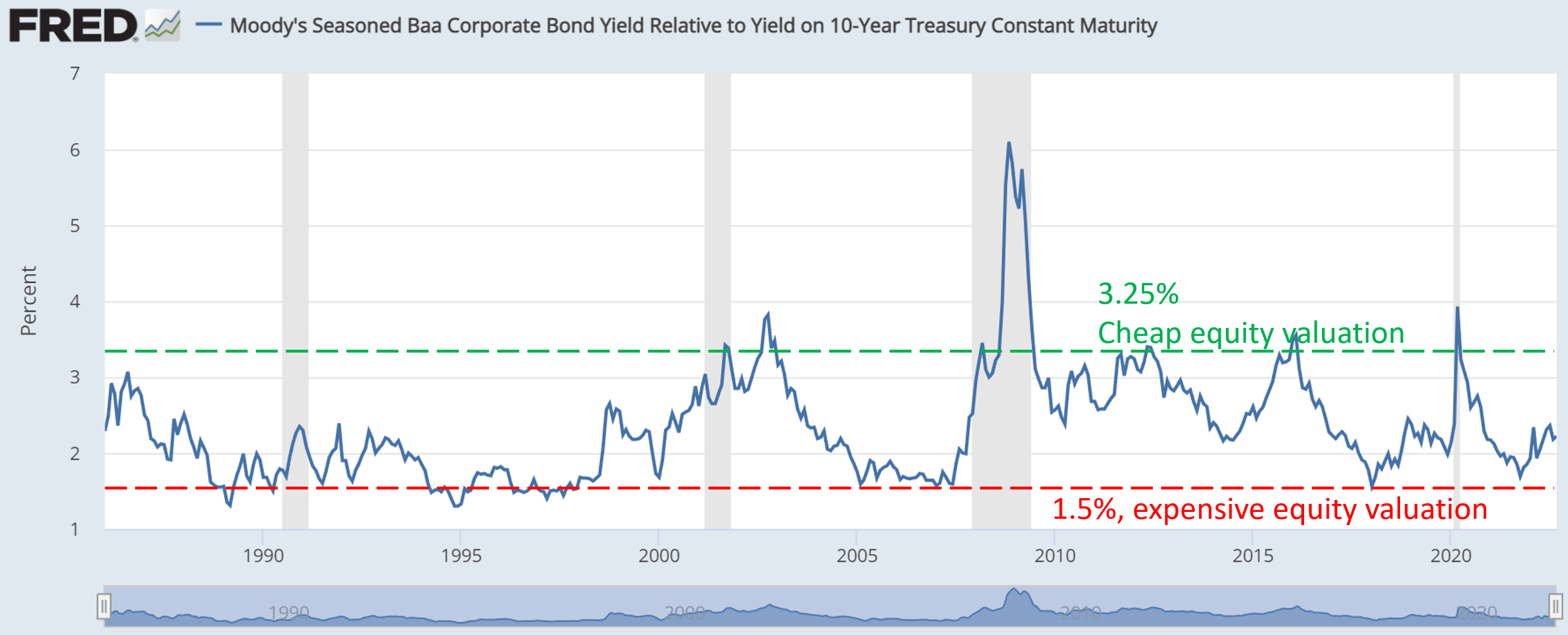
The first easy signal involves the yield spread between BAA corporate bond and risk-free rates such as the 10-year Treasury rates as shown below. Such yield spread tells how the market prices corporate bonds (which is a reliable indication of equity valuation) relative to risk-free rates. And since the bond market usually sniffs out problems more sensitively, this signal provides a more accurate indicator. The yield spread has been consistently tractable within a range of about 1.5% to 3.0% in the long term and thus provides investors with the granularity they need. It doesn’t only tell you whether equity is expensive or not. It tells you the degree of its overvaluation or undervaluation, so you can fine-tune your equity exposure.
Currently, the BAA yield is about 2.2% above 10-year rates. And the long-term historical average is around 2.34%. So the current yield spread between the BAA yield and treasury yields is a bit below the historical average (i.e., equity is a bit towards the more expensive spectrum). But the premium is totally within the normal range of historical oscillations, and I see no reason to panic.
Source: FRED
Alternative signal No. 2
The next signal is based on the yield spread between SPY and risk-free interest rates. As detailed in our earlier article:
- The common PE or Price/cash flow multiples provide partial and even misleading information due to the differences between accounting earnings and owners’ earnings.
- Dividends provide a backdoor to quickly estimate the owners’ earnings. Dividends are the most reliable financial information and least open to interpretation.
- The dividend yield spread (“YS”) is based on a timeless intuition. No matter how times change, the risk-free rate serves as the gravity on all asset valuations and consequently, the spread always provides a measurement of the risk premium investors are paying relative to risk-free rates.
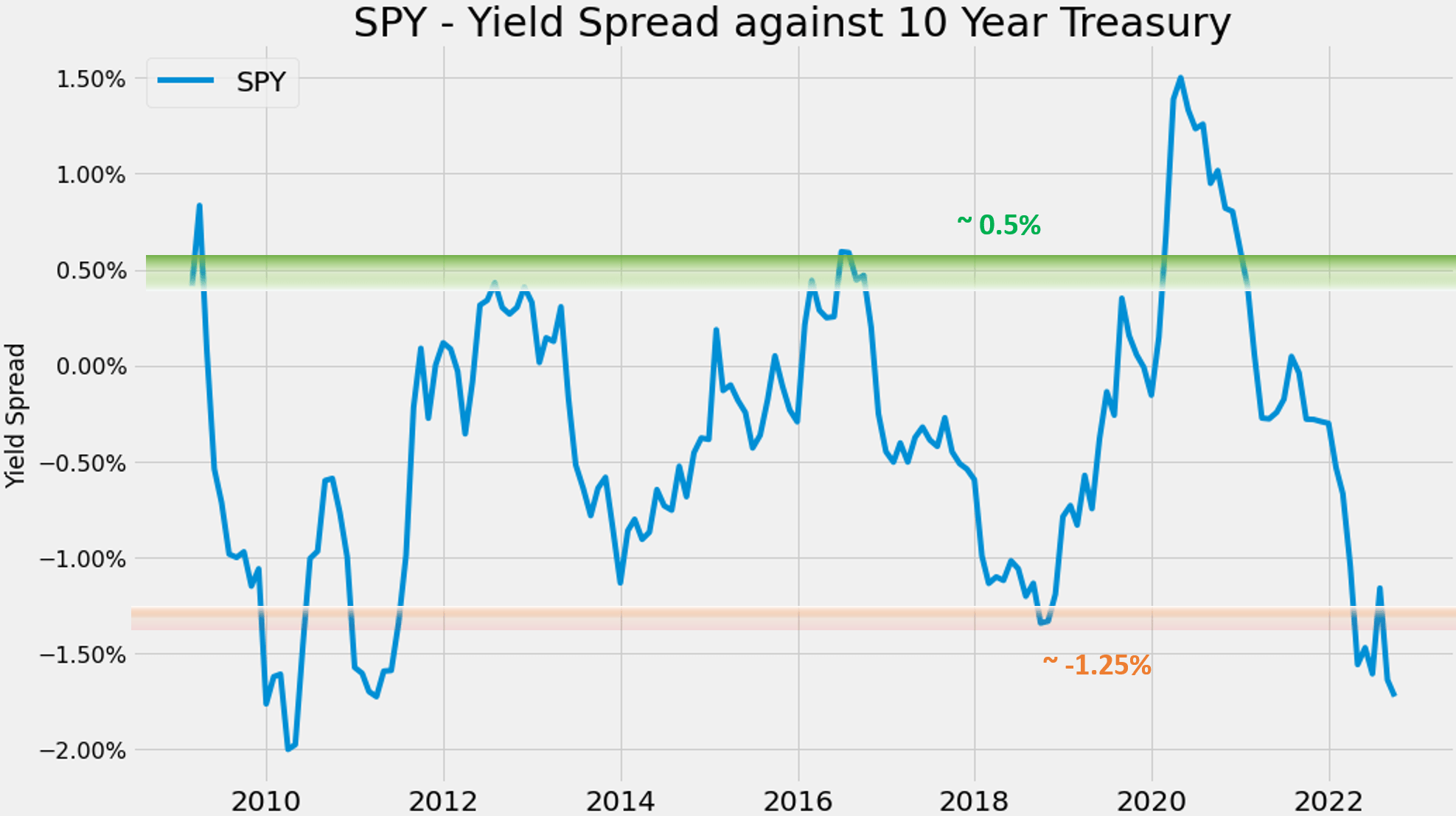
The following chart shows the yield spread between SPY against the 10-year Treasury since the 2008 recession. As you can see, its yield spread has been range-bound and tractable again also in the long term. The yield spread has been fluctuating within a stable range between 0.5% to -1.25% most of the time. And the spread only spiked substantially above 0.5% during recessions such as during 2008 and more recently 2020.
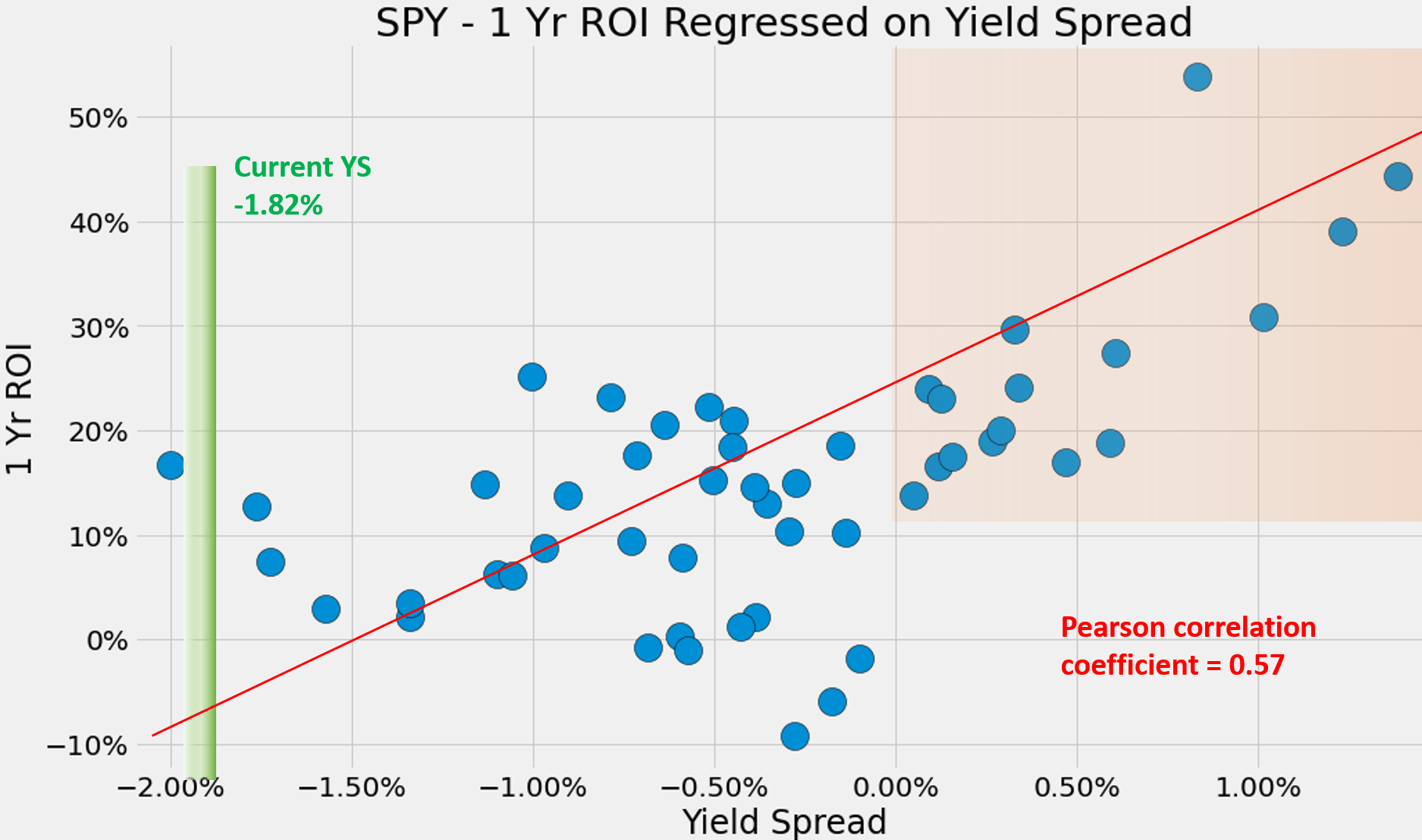
Against this background, the current yield spread is concerning. It’s at a negative 1.86% (1.46% TTM dividend yield from SPY – 3.32% of yield from the 10-year treasury rates). This is the thinnest level in more than a decade as seen. Such a thin level of yield spread does signal substantial valuation risks ahead because short-term returns are closely correlated with the yield spread. The next chart shows the one-year total return on SPY (including price appreciation and dividend) regressed on yield spreads. There’s a clear positive correlation, and the Pearson correlation coefficient is 0.57. Particularly as shown in the orange box, when the spread is near the upper range of about 0.0% or higher as mentioned above, the total returns in the next year have been all positive and very large (all above 10% and ranges up to ~40%+).
Because of the thin spread, I’m more on the cautious side in terms of equity exposure (as to be elaborated on next when I describe our action plan). But before we close this section, I want to reiterate that this simple spread signal is non-binary. It also provides the varying degrees of shades that investors can use to adjust their equity-bond ratio.
Source: Author
Source: Author
Our action plan
Our action plan consists of a few simple decision points. Only three in total really. First, how much cash to hold? Second, for the capital to be deployed, what’s the equity-to-bond ratio that we should maintain? And third, should we use leverage, and if so, how much?
The second decision point is based on the BAA and SPY yield spread discussed above, and the third decision point is based on S&P 500 valuation and market volatility. I have detailed the methods for both in earlier writing and won’t elaborate anymore here.
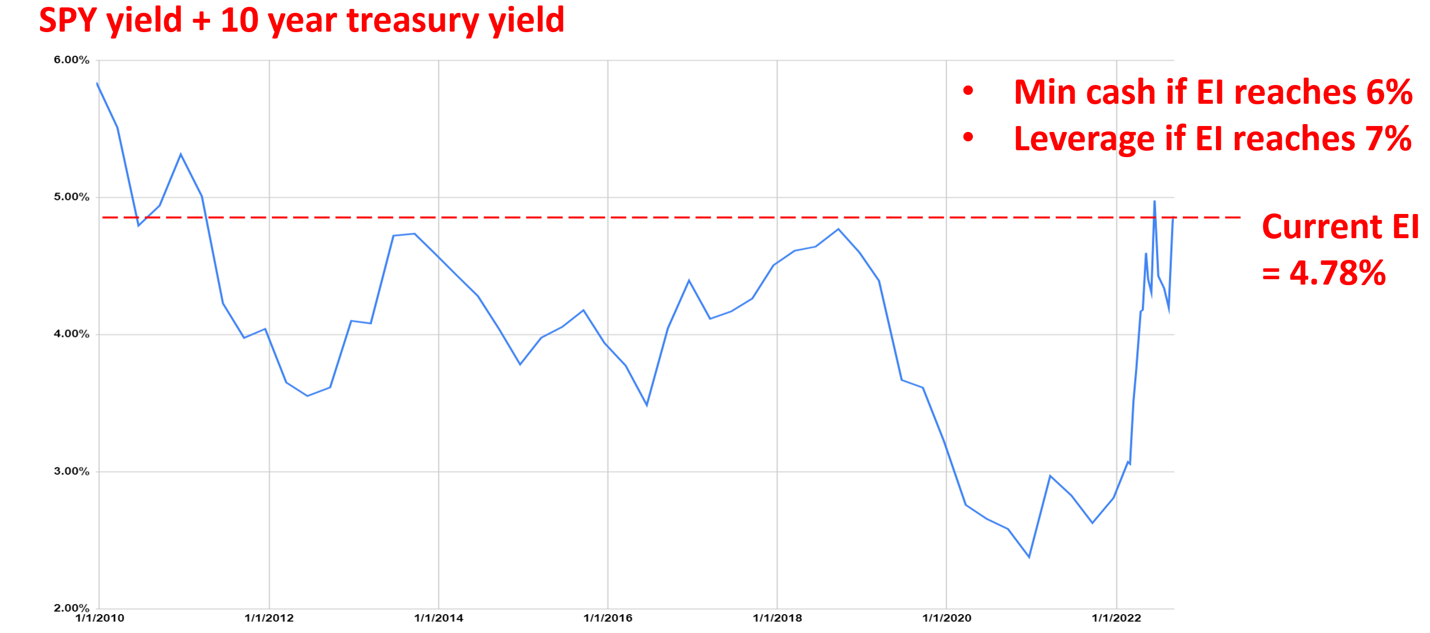
Here, I will just focus on the first decision point based on a simple exposure index (“EI”) derived from SPY data. The underlying idea here is simple. The EI is defined as the summation of stock yield and bond yield, thus providing an overall measure of the opportunity cost of holding cash. If the EI becomes higher, I will reduce cash because I could earn a higher yield either from bonds, or equity, or both. And vice versa.
Against this background, you can see that the current EI is quite attractive. The EI has been in a range between about 2.5% to 5.5% since 2010. And an EI of 5% was reached three times only since then: In 2010 and 2011 when both equity and bonds were quite attractive. The current EI of 4.78% (a dividend yield of 1.46% from SPY plus a 10-year treasury rate of 3.32%) is very close to this attractive level. And as a result, we’re holding only about 4% cash (more on this later) currently. And going forward, we will closely monitor the EI (together with the yield spreads mentioned above and also market volatility).
Going forward, the key trigger points for us are:
- When the EI reaches 6.0%, the highest level since 2010, we will further reduce our cash reserve to a minimal and increase our position either in bonds, or equity, or both.
- And when the EI reaches 7.0%, which is the EI reached during the 2008 Great Recession, we will start increasing our leverage
Source: Author
Final thoughts and other risks
Let me close by repeating Mark Twain, “What gets us into trouble is not what we don’t know. It’s what we know for sure that just ain’t so.” I feel this quote really captures the dangers of applying the popular inverted curve signal and the GDP contracting signals under current market conditions. Both signals, as popular and as dreaded as they are, are at best ambiguous at this point. And ultimately, even without the ambiguity, they are binary and do not provide the granularity investors need.
A few alternative signals are described, which are all intuitive, simple, and non-binary. The current SPY yield spread is at a negative 1.86% relative to the 10-year Treasury, the thinnest level in a decade, and signals large equity valuation risk. On the positive side, the BAA yield is about 2.2% above 10-year rates, within the normal range. And finally, the EI is at 4.78%, near the highest level in a decade and signaling a high opportunity cost of holding cash.
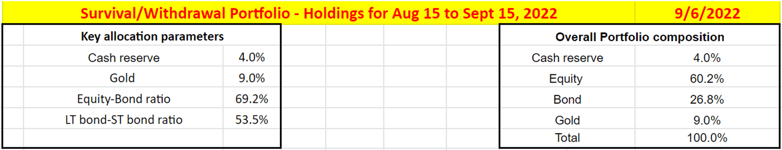
All told, I see no need to panic. And I am not activating our “recession allocation model” yet. I’m still following our business-as-usual allocation as shown in the chart below. I’m currently holding about 4% cash, keeping an equity-to-bond ratio of 69.2%, and also allocating 9% to gold as detailed in our blog article (and I will periodically update my allocations changes there too).
Source: Author
Finally, risks. Any discussion of S&P 500 and SPY is almost by default a discussion of the overall equity market or the overall economy. Hence all discussions here are subject to all the ongoing macroscopic and geopolitical risks which have been discussed by other SA authors plenty of times already. Here, I would just point out the volatility risk in the near term. Volatility (represented by the VIX index) decreased from the 35 levels in mid-June to a bottom of below 20 in mid-August. It then surged back to about 27.5 after the recent Fed’s hawkish announcement. A VIX of 27.5 is above the 90% percentile of its historical levels. And both backtest results and our own experiences have shown that high volatilities are bad for equity performance, especially leveraged equity exposure. My view is that the current high level of volatility could persist into the near future due to high inflation and stress on the housing and mortgage market.
Be the first to comment