

John M Lund Photography Inc/DigitalVision via Getty Images
I am assigning the Invesco QQQ ETF (NASDAQ:QQQ) a negative risk/reward rating based on its single stock and sector concentration risk, a heightened risk of valuation multiple contraction across much of the portfolio, and its decidedly bearish technical backdrop.
Risk/Reward Rating: Negative
On the doorstep of Q1 2022 earnings reports, I downloaded consensus earnings and sales estimates for each company in the Invesco QQQ ETF (a proxy for the Nasdaq-100 index) to construct a baseline for reviewing each company as the year unfolds. The consensus estimates for each company were obtained from Seeking Alpha. My intent was not to analyze and write up the QQQ, but to find attractive risk/reward opportunities amongst the top Nasdaq stocks.
Like most investors I knew that the fund was concentrated, however, it was nevertheless shocking to breakdown and look at the degree of concentration in the portfolio. As an investment professional of 26 years, I have found that we can often get caught up in the day-to-day details and noise of the market and thus risk missing the forest for the trees. This risk can become especially acute following major bull market moves, the length of which can foster complacency and recency bias amongst even the most experienced investors.
Risks
The following table displays the sector weightings of the QQQ and compares them to that of the broad stock market represented by the SPDR S&P 500 Trust ETF (NYSE: SPY). I have highlighted in blue those sectors for which the QQQ has an extreme overweighting compared to the broad market. Of note, the three sectors that are overweighted in the QQQ account for 83% of the total portfolio value.
Source: State Street. Created by Brian Kapp, stoxdox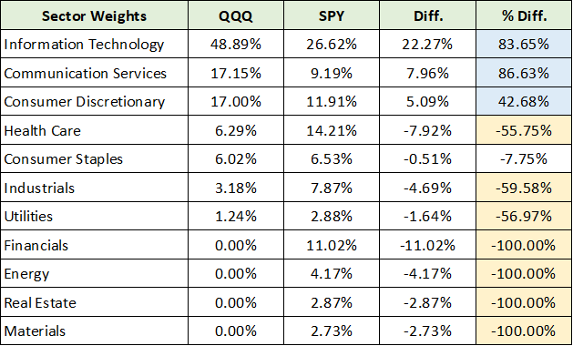
I have highlighted in yellow those sectors for which the QQQ has an extreme underweighting compared to the broad market averages. While the Nasdaq composite is well known as a technology-heavy index, it is incredible that the Nasdaq-100 index offers zero exposure to four of the eleven primary economic sectors and marginal exposure to three of the eleven primary economic sectors.
As an innovation-centric index, it is equally incredible that the QQQs have 56% less exposure to the healthcare sector compared to the S&P 500 index. This fact alone hints at the possibility that the Nasdaq-100 index may no longer serve as an efficient vehicle for exposure to the leading growth and new innovation opportunities.
In addition, looking out over the coming decade there is likely to be incredible innovation across the materials, energy, and industrial sectors. The fact that the QQQs have zero or marginal exposure to these future innovation sectors supports the thesis that the Nasdaq-100 may no longer offer the growth exposure that many investors have historically sought when investing in the QQQs.
Risk: Single Stock Concentration
The postulation that the QQQs may no longer represent an efficient vehicle for investment in new innovation or exceptional growth opportunities is further supported when looking at the top holdings of the fund. The following table displays the top seven holdings of the QQQs and compares their weighting to that within the SPY or S&P 500 index. I have highlighted the total weighting in both index funds for ease of comparison.
Created by Brian Kapp, stoxdox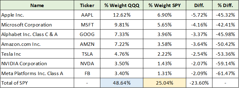
Incredibly, the top seven holdings represent roughly half of the QQQ portfolio. It should be noted that the 25% weighting of the seven companies in the S&P 500 index is historically extreme in its own right. These are seven of the world’s largest market cap companies, with five in the trillion dollar plus market cap club and some in the $2 to $3 trillion neighborhood. To expect these companies to continue to grow at rates commensurate with the expectations of growth investors, let alone innovation investors, is a tall order.
Risk: Valuation Multiple Compression
To evaluate the risk/reward potential of these top holdings, I reviewed the valuation of each relative to consensus earnings estimates for the current year, which is displayed in the 22’ PE column in the table below. Please note that this column could reflect fiscal year 2022 or 2023 depending on the company. The Wgt. PE and Wgt. EPS % columns display the QQQ portfolio weighting for each company across each metric or the contribution of each company to the portfolio-wide PE and portfolio-wide EPS growth.
Created by Brian Kapp, stoxdox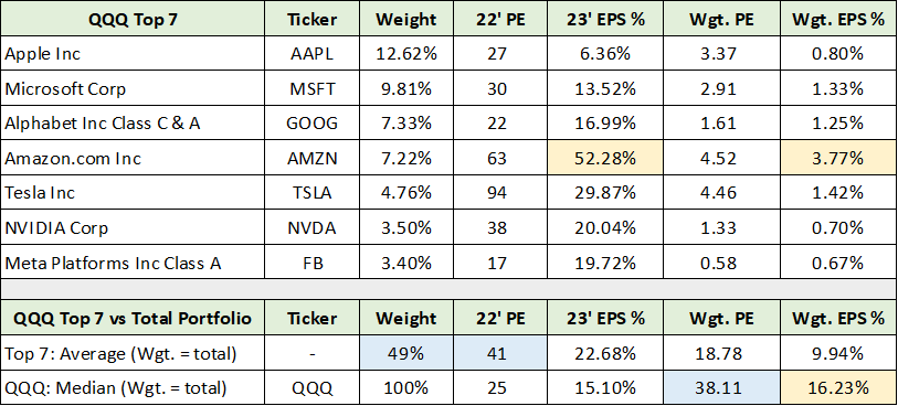
The critical summary data is highlighted in blue. The weight of the seven largest holdings is 49% with an average PE multiple of 41. The weighted PE of the full QQQ portfolio (all 101 stocks) is 38x current year earnings estimates. Please note that the yellow highlighted cells represent peculiarities of Amazon (NASDAQ: AMZN) in respect to 2023 growth estimates.
Essentially, Amazon’s earnings are expected to plunge in 2022 and thus the unusual 52% growth expected for 2023. I adjust the expected QQQ portfolio earnings growth for 2023 by removing this distortion and using Amazon’s expected 2-year annualized earnings growth rate from 2021 to 2023, which is projected to be 6.58% per year. This adjustment has the effect of reducing the QQQ portfolio expected earnings growth in 2023 from 19.52% to 16.23%, which is highlighted in the lower right-hand corner of the above table.
Heightened Risk: Top 5
From a pure valuation perspective, five of the top seven holdings carry a heightened risk of valuation multiple compression. This is the case when viewed through the lens of absolute valuation multiples and in relation to expected growth rates into 2023. The following table contains the summary data for these five companies. The Amazon 23’ EPS % and Wgt. EPS % columns reflect the adjustments mentioned above.
Created by Brian Kapp, stoxdox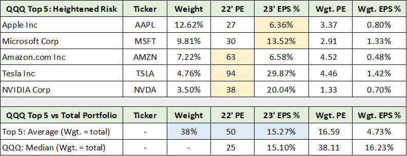
I have highlighted in blue the key summary data points. The top five companies that represent heightened risk have an average PE of 50 and an average expected earnings growth rate of 15% for 2023, while comprising 38% of the total QQQ portfolio. Please keep in mind that these are all great companies and that I am speaking only to the heightened risks to their valuations.
In the upper section of the table, I have highlighted in yellow the dominant risk factor for each. Apple (NASDAQ: AAPL) and Microsoft (NASDAQ: MSFT) have heightened growth risks in relation to their valuations. Amazon, Tesla (NASDAQ: TSLA), and NVIDIA (NASDAQ: NVDA) have more extreme absolute valuation risk in addition to relative growth risks in light of the valuations. Because these top stocks are widely held and have been the most successful companies of the recent bull market, providing a brief overview of the heightened risk for two provides color that can be extrapolated more broadly to the QQQ portfolio.
Heightened Risk Example: Amazon
I assigned a negative risk/reward rating to Amazon in my last report which was published on 10-14-21. The primary factors for this rating were its elevated valuation, the risk that analyst estimates were too high, and the possibility of Amazon entering a historically low return investment cycle.
The following two tables were compiled from consensus earnings and sales estimates for Amazon provided by Seeking Alpha. Consensus estimates for earnings and sales as of 4-18-22 are displayed in the upper section of each table and those as of 10-12-21 are displayed in the middle section of each table. The lower section of each table summarizes the change in consensus estimates since my last report.
Source: Seeking Alpha. Created by Brian Kapp, stoxdox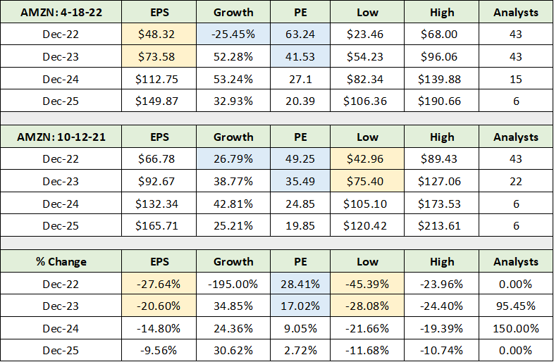
In the consensus earnings table above, I have highlighted in yellow the key earnings estimate data. Notice that the consensus EPS estimates for 2022 and 2023 as of 4-18-22 are now in line with the lowest analyst estimates as of 10-12-21. The consensus earnings estimates for 2022 and 2023 have fallen 28% and 21%, respectively. Interestingly, the low analyst estimate has collapsed by 45% for 2022 and 28% for 2023. Given the recent trend toward the low end of estimates, there is a distinct possibility that estimates for Amazon have not reached a bottom.
I have highlighted in blue the valuation data and expected growth rate for 2022 during both time periods. The swing from 27% growth expected on 10-12-21 to -25% contraction on 4-18-22 for the 2022 EPS estimate is incredible for a company the size of Amazon. Interestingly, Amazon’s stock price is down only 6% since my last report in the face of these massive downward revisions. The reason for the lack of response from Amazon’s stock price is due to the valuation multiple expanding from 49x 2022 earnings estimates to 63x.
The lack of sustainable downside reaction from Amazon’s share price can also be explained by sales estimates holding up very well compared to earnings estimates. Amazon has a history of heavy cyclical investments driving earnings lower temporarily, followed by a return to earnings growth. The following table displays consensus sales estimates with a similar highlighting scheme as was used above for earnings.
Source: Seeking Alpha. Created by Brian Kapp, stoxdox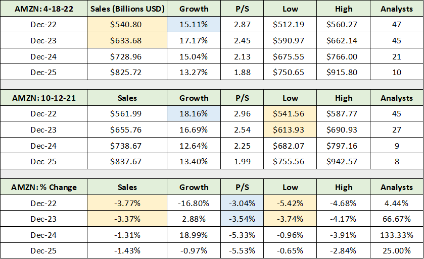
I have highlighted in blue the change in sales growth estimates since 10-12-21. The consensus sales growth estimate has been marginally reduced from 18% to 15% for 2022. In my last report, I highlighted unseasonably soft sales growth as pointing toward the potential for a material reversion to the mean for Amazon’s sales following the massive COVID boost. From the above estimates, we can say that the market remains highly confident in Amazon’s sales growth potential in 2022 and that no material reversion to the mean is expected.
This is important as evidenced by Netflix’s (NASDAQ: NFLX) disappointing results on 4-19-22 and subsequent 36% price drop. Netflix is now expecting its user base to contract in the near term, which shocked the market. As some may be aware, Netflix is a large customer of Amazon and runs its services using Amazon’s AWS. The Netflix earnings report is a negative read through for sales at Amazon’s AWS division which accounts for 59% of Amazon’s operating income.
Interestingly, when I last reported on Netflix in July 2021, I assigned a negative risk/reward rating largely based on the coming COVID hangover or reversion to the mean, in addition to its then elevated valuation. A remarkably similar setup now faces Amazon, if less extreme.
In summary, there is growing evidence that Amazon’s AWS customers are facing a reversion to the mean post-COVID. This points toward a heightened risk that Amazon too will revert to the mean leaving consensus sales estimates at risk of disappointment. If sales in fact mean revert and disappoint, the 63x PE on 2022 estimates will expand even higher as earnings estimates will need to be further reduced.
Heightened Risk Example: Apple
The second example of the heightened risk of multiple contraction is Apple, which accounts for over 12% of the QQQ. No one would suggest that Apple is not a great company; however, Microsoft was viewed in the identical light at the 2000 market peak and saw its stock price crushed and become dead money for 13 years. Given the stage of the economic cycle, the greatest risk facing Apple’s shares is its reliance on hardware sales. The following table was compiled from Apple’s 2021 10-K filed with the SEC and displays the company’s sales by category and geography. I have highlighted the key data points.
Created by Brian Kapp, stoxdox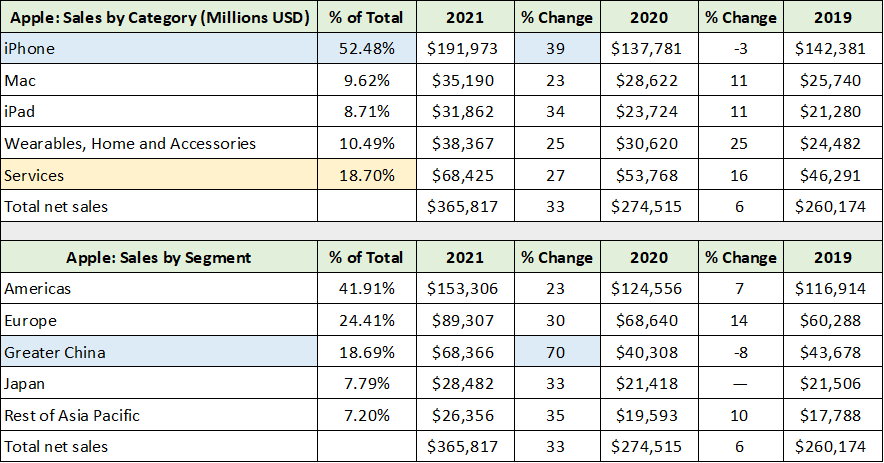
Notice that Services account for only 19% of Apple’s sales (highlighted in yellow). 81% of Apple’s sales are hardware dependent. From an industry perspective, hardware sales have a history of becoming quite cyclical once a product matures. To return to the 2000 analogy, Dell (NYSE: DELL) and HP (NYSE: HPQ) were the hardware growth stocks of the day, riding the personal computer adoption cycle to a bull market peak in 2000. Like Microsoft, they too lost a substantial portion of their value and were dead money for the following decade plus.
Given the maturity of the smart phone market and that the iPhone represents 52% of Apple’s sales, hardware cyclicality and the lack of industry unit volume growth carry considerable risks. Amplifying this natural cyclical risk is the recent COVID boom which sent total sales higher by 33% in fiscal 2021. The following table compiled from Apple’s income statement (provided by Seeking Alpha) places the COVID spike in context. I have highlighted in blue Apple’s largest growth years and in yellow the remaining mediocre sales growth years over the past decade.
Source: Seeking Alpha. Created by Brian Kapp, stoxdox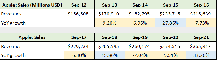
Two-thirds of the years experienced poor sales growth (highlighted in yellow). Importantly, following the two prior sales growth spurts, Apple experienced a sales contraction the following year which was then followed by mid-single digit sales growth the next. The 33% spike in 2021 is highly likely to follow a similar trend. The added maturity of Apple’s core products in conjunction with the unusually strong COVID spike in fiscal year 2021, sets the stage for what could be an unusually weak fiscal 2022 and 2023. The following table from Seeking Alpha displays the consensus earnings and sales estimates for Apple.
Source: Seeking Alpha. Created by Brian Kapp, stoxdox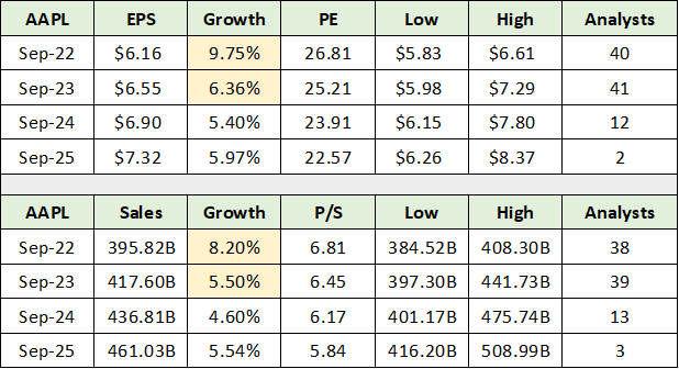
I have highlighted the periods of greatest disappointment risk. While mid-single digits sales growth generally follows historical trends, the market does not currently foresee a sales contraction in Apple’s future. This is unusual from the perspective of Apple’s historical cyclicality.
Additionally, one would expect cyclicality to pick up or become more amplified as Apple’s largest product is much more mature than during prior cycles. For example, a double-digit total sales decline in the coming years would certainly fit well within the historical pattern given the extreme COVID spike and maturing product line. If this were to occur in 2022 or 2023, earnings estimates are likely to be materially too high. This is especially the case when combined with increasing cost pressures given the new inflationary environment.
QQQs: A 2-Portfolio View
Now that we have covered the half of the QQQ portfolio that is invested in seven stocks, it is time to look at the whole portfolio. As above, I found it useful to breakdown the QQQ portfolio into two baskets of stocks: those with heightened risk and those with more market-like risk.
I separated the portfolio first along pure quantitative lines. Those with a PE > 25 or a PEG ratio > 2 were placed in the potentially heightened risk camp leaving the rest in the potential market risk camp. PEG stands for PE-to-growth and is calculated as 22’PE/23’ EPS % from the tables herein. I then reviewed each stock quantitatively and qualitatively using my familiarity with each and my experience to make a final judgement as to which list or portfolio each stock should be placed in.
Please note that I do not use PEG statistics generally, however, the concept underlying the statistic is rock solid and underlies investment analysis. I find the PEG ratio to be an excellent tool for doing a preliminary sort of larger stock data sets.
In the end, 44 companies in the QQQ settled into the Heightened Risk category while 57 made it to the Market Risk category. A full company list and summary statistics for each category is provided at the end of this section for those interested. In those tables, please note that the yellow highlighted cells represent companies for which my most recent report carried a negative risk/reward rating while the blue highlighted cells represent positive risk/reward rating reports.
A summary of each portfolio or category is displayed in the following table. The upper portion of the table summarizes the Heightened Risk portfolio which accounts for 58% of the value of the QQQs, and the lower section summarizes the Market Risk portfolio. I have highlighted the key data points from each for ease of contrast. At the portfolio level, the median statistics are more meaningful than the average as they better reflect the central tendency of the portfolios and remove outlier effects.
Created by Brian Kapp, stoxdox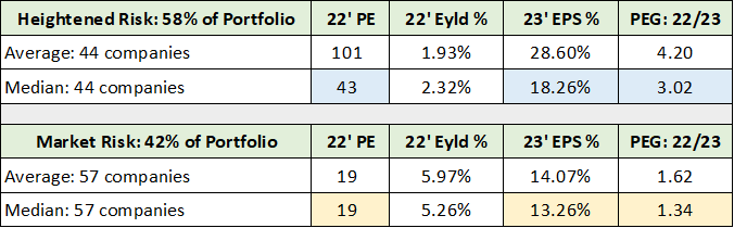
Notice that the 2-portfolio view of the QQQs produces two distinct portfolio types. Most investors would consider the 42% of the portfolio invested in the Market Risk category to be quite reasonably priced at 19x earnings, assuming that 13% earnings growth is sustainable. On the other hand, the vast majority of seasoned investors would view the 58% of the portfolio invested in the Heightened Risk category to be quite generous, if not extreme. The PEG ratio does a good job in capturing the essence of the extreme valuation of the Heightened Risk portfolio at 3x compared to 1.34x for the Market Risk portfolio.
Heightened Risk Portfolio
Created by Brian Kapp, stoxdox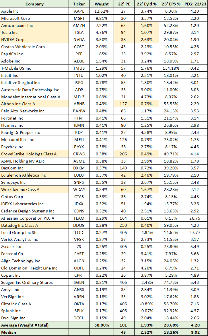
Market Risk Portfolio
Created by Brian Kapp, stoxdox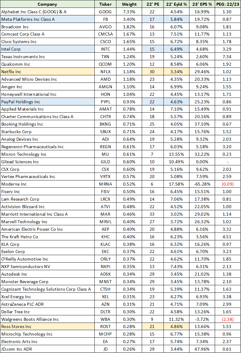
Potential Return Spectrum
The Heightened Risk portfolio trading at 43x earnings for 18% growth represents the primary near-term risk for the QQQs. Multiple compression is likely to occur as the vast majority of investors would favor paying 19x earnings for 13% growth given the similar growth profiles. This is especially the case when factoring in the uncertainty of future growth rates compared to the certainty of current valuations. Netflix presents an excellent case in point.
The Netflix earnings release on 4-19-22 and its subsequent 36% price decline highlight the added downside leverage that occurs when a heightened valuation meets declining growth estimates. The earnings contraction becomes amplified by the multiple compression. Interestingly, Netflix had a PEG of 1 leading into the report which highlights the weakness of relying heavily on PEG ratios. I decided to keep Netflix in the Market Risk category even though my last report was a negative risk/reward rating.
In the following table I display what I view as reasonable multiple correction scenarios for the Heightened Risk category, which is 58% of the QQQ portfolio. I combine this with a rather optimistic scenario for the Market Risk category, which is 42% of the portfolio. Each category or portfolio is always assumed to grow its earnings at the 2023 consensus earnings growth forecasts of 13.26% and 18.26%, respectively. In other words, these scenarios ignore adverse growth developments over the next five years, as was the case with Netflix, and displays only multiple contraction for 58% of the portfolio.
The Market Risk side of the portfolio is assumed to grow by 13.26% every year. For the Heightened Risk side of the portfolio, I assume the PE multiple contracts to 19 in year 2. Then I assume the multiple contracts to 20, 25 and 30 in year 1, respectively. The following table summarizes how the QQQs would perform under these four scenarios. The first row displays the price performance of the QQQs as of the year of the multiple contraction. I view this range of possibilities as likely over a 1-to-2-year time frame.
Created by Brian Kapp, stoxdox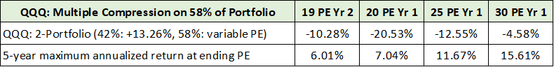
Technicals
The bearish technical backdrop fully supports a downside test of the lower end of the range in the table above over the nearer term. If in fact this test occurs, it is likely to result from a combination of growth disappointment and multiple compression. The 5-year weekly chart below best captures the essence of the technical backdrop. I have denoted the key weekly support levels with green lines and the key monthly support levels with blue lines.
QQQ 5-year weekly chart (Created by Brian Kapp using a chart from Barchart.com)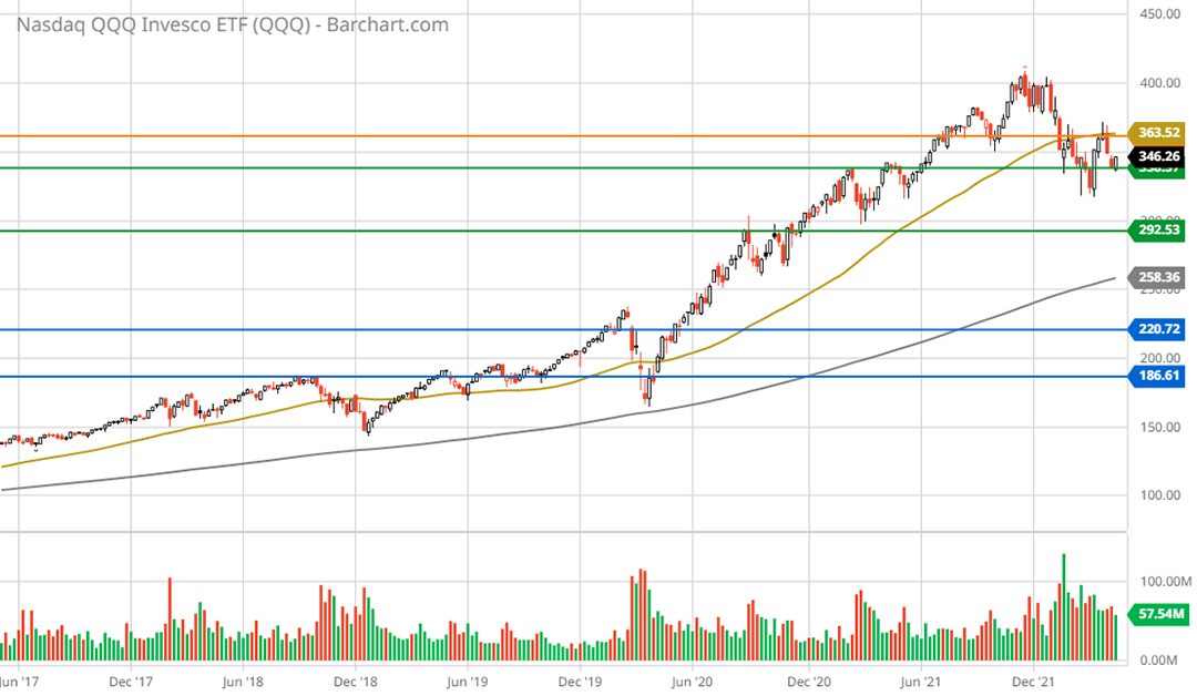
The lower green line looks highly likely to be tested given the current weekly downtrend which was confirmed by the breaking of prior lows established in Q4 2021. This prior low is represented by the orange line which is now resistance as was evidenced by the rejection at this zone in late March and early April 2022. A test of the lower weekly support level represents -16% downside and is midway between the two middle multiple compression scenarios in the table above.
A downside test of the first monthly support line is not out of the question if a Netflix-like scenario for consumer demand and a reversion to the pre-COVID growth rate mean play out. This would represent -36% downside potential and would be a retest of the pre-COVID highs. The 2-year daily chart below provides a closer look.
QQQ 2-year daily chart (Created by Brian Kapp using a chart from Barchart.com)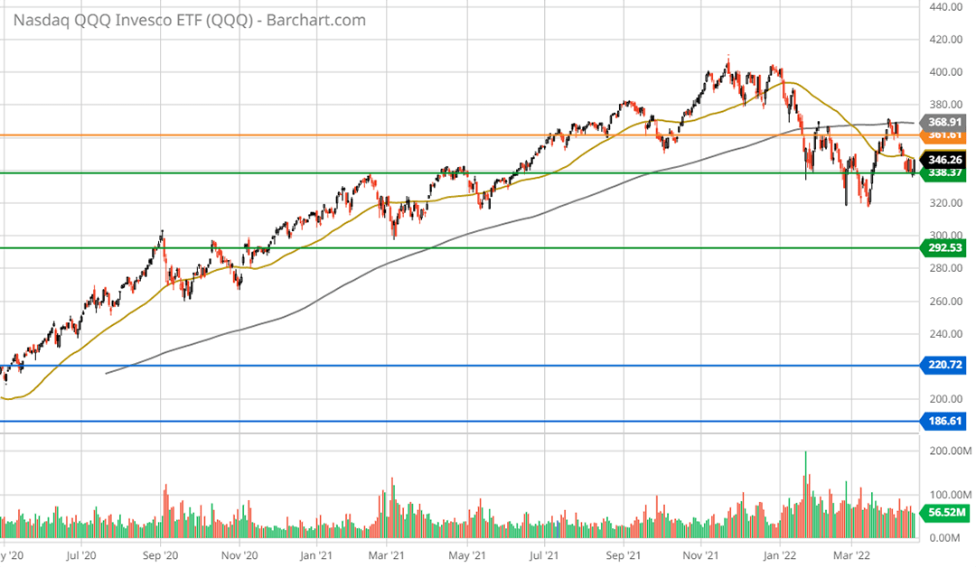
Notice that a death cross occurred recently with the gold line (the 50-day moving average) crossing beneath the grey line (the 200-day moving average). This bearish signal fully supports a test of the lower key weekly support level which would be a test of the September 2020 interim “blowoff” top. A test of the pre-COVID highs is likely to require a consumer-led recession which, while becoming more likely, is not yet the base case. The final monthly chart places the situation in the most important context, the long-term trend.
QQQ max monthly chart (Created by Brian Kapp using a chart from Barchart.com)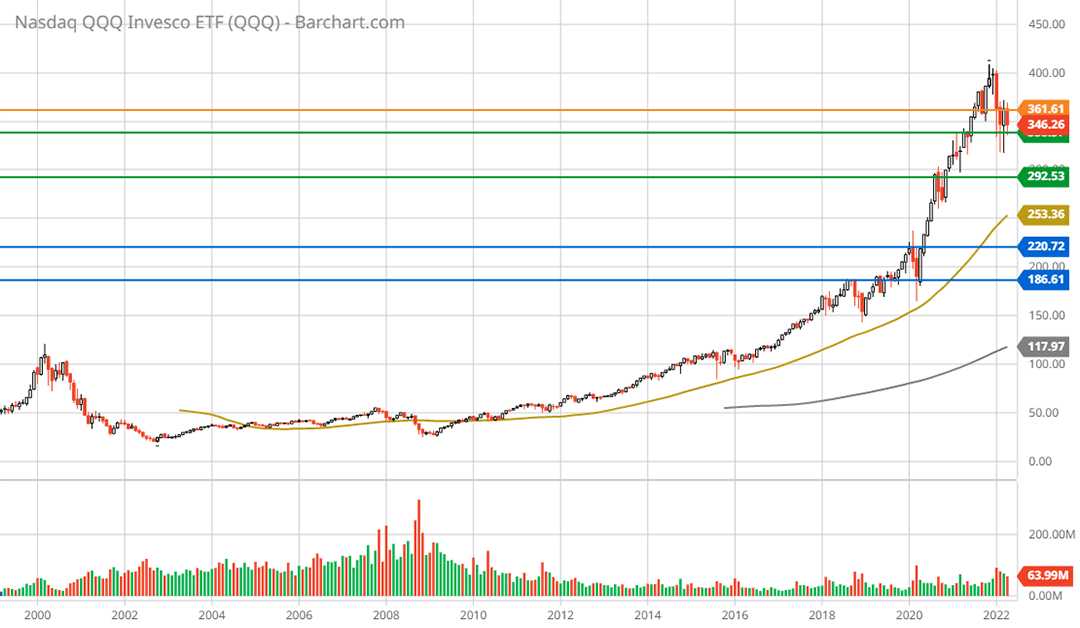
All one can say when looking at the long-term chart of the QQQs is curb your enthusiasm.
Summary
The Invesco QQQ ETF is filled with the greatest success stories of the past decade plus. So much so that the top seven companies alone account for half of the portfolio value, while only three economic sectors account for a full 83% of the portfolio. With historically extreme valuations in place alongside more muted growth prospects, the risk/reward asymmetry is aligned with the technical trend to the downside.
Be the first to comment