

blackdovfx
This monthly article series shows a dashboard with aggregate industry metrics in technology and communication services. It may also serve as a top-down analysis of sector ETFs like the Vanguard Information Technology Index ETF (VGT), the Technology Select Sector SPDR ETF (XLK), and the iShares U.S. Technology ETF (NYSEARCA:IYW), whose largest holdings are used to calculate these metrics.
Shortcut
The next two paragraphs in italic describe the dashboard methodology. They are necessary for new readers to understand the metrics. If you are used to this series or if you are short of time, you can skip them and go to the charts.
Base Metrics
I calculate the median value of five fundamental ratios for each industry: Earnings Yield (“EY”), Sales Yield (“SY”), Free Cash Flow Yield (“FY”), Return on Equity (“ROE”), Gross Margin (“GM”). The reference universe includes large companies in the U.S. stock market. The five base metrics are calculated on trailing 12 months. For all of them, higher is better. EY, SY and FY are medians of the inverse of Price/Earnings, Price/Sales and Price/Free Cash Flow. They are better for statistical studies than price-to-something ratios, which are unusable or non available when the “something” is close to zero or negative (for example, companies with negative earnings). I also look at two momentum metrics for each group: the median monthly return (RetM) and the median annual return (RetY).
I prefer medians to averages because a median splits a set in a good half and a bad half. A capital-weighted average is skewed by extreme values and the largest companies. My metrics are designed for stock-picking rather than index investing.
Value and Quality Scores
I calculate historical baselines for all metrics. They are noted respectively EYh, SYh, FYh, ROEh, GMh, and they are calculated as the averages on a look-back period of 11 years. For example, the value of EYh for hardware in the table below is the 11-year average of the median Earnings Yield in hardware companies.
The Value Score (“VS”) is defined as the average difference in % between the three valuation ratios (EY, SY, FY) and their baselines (EYh, SYh, FYh). The same way, the Quality Score (“QS”) is the average difference between the two quality ratios (ROE, GM) and their baselines (ROEh, GMh).
The scores are in percentage points. VS may be interpreted as the percentage of undervaluation or overvaluation relative to the baseline (positive is good, negative is bad). This interpretation must be taken with caution: the baseline is an arbitrary reference, not a supposed fair value. The formula assumes that the three valuation metrics are of equal importance.
Current data
The next table shows the metrics and scores as of last week’s closing. Columns stand for all the data named and defined above.
|
VS |
QS |
EY |
SY |
FY |
ROE |
GM |
EYh |
SYh |
FYh |
ROEh |
GMh |
RetM |
RetY |
|
|
Hardware |
0.68 |
-24.11 |
0.0486 |
1.3221 |
0.0111 |
4.36 |
38.46 |
0.0363 |
0.9393 |
0.0405 |
7.31 |
41.75 |
-3.65% |
-19.82% |
|
Comm. Equip. |
-38.59 |
3.39 |
0.0272 |
0.1818 |
0.0132 |
18.72 |
56.05 |
0.0314 |
0.2780 |
0.0410 |
15.76 |
63.67 |
5.97% |
-5.30% |
|
Entertainment |
-29.01 |
-34.98 |
0.0143 |
0.6507 |
0.0141 |
6.42 |
41.99 |
0.0489 |
0.4441 |
0.0379 |
17.17 |
45.32 |
-1.33% |
-24.86% |
|
Electronic Equip. |
-24.01 |
19.91 |
0.0395 |
0.6493 |
0.0224 |
17.04 |
38.68 |
0.0432 |
0.8076 |
0.0399 |
12.98 |
35.65 |
0.04% |
-8.15% |
|
Software |
-25.23 |
-5.85 |
0.0221 |
0.1199 |
0.0272 |
16.39 |
82.46 |
0.0269 |
0.1737 |
0.0372 |
17.72 |
86.04 |
0.53% |
-35.41% |
|
Telecom |
-16.38 |
-8.56 |
0.0410 |
0.8628 |
0.0098 |
10.06 |
57.14 |
0.0501 |
0.6527 |
0.0266 |
11.78 |
58.59 |
-7.82% |
-41.75% |
|
Semiconductors |
2.04 |
17.20 |
0.0555 |
0.2348 |
0.0327 |
31.75 |
62.55 |
0.0466 |
0.2474 |
0.0355 |
23.72 |
62.23 |
1.98% |
-28.38% |
|
IT Services |
-23.75 |
9.54 |
0.0342 |
0.2215 |
0.0241 |
33.04 |
50.26 |
0.0386 |
0.3300 |
0.0330 |
25.73 |
55.41 |
0.44% |
-23.36% |
Value And Quality chart
The next chart plots the Value and Quality Scores by industry (higher is better).
Value and quality in technology ( Chart: author; data: Portfolio123)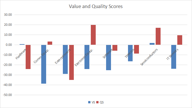
Evolution since last month
Value and quality scores have significantly deteriorated in hardware.
Value and quality variation (Chart: author; data: Portfolio123)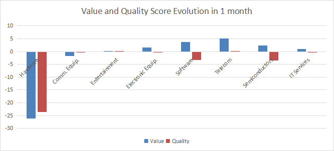
Momentum
The next chart plots momentum data.
Momentum in technology (Chart: author; data: Portfolio123)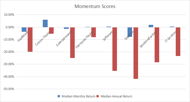
Interpretation
The most attractive industry in technology and communication is semiconductors. It is close to the historical baseline in valuation, and far above it in quality. Other subsectors are overvalued by 16% to 39% relative to 11-year averages. Overvaluation may be partly justified by a good quality score for electronic equipment, and to a lesser extent for IT services. Entertainment is the less attractive subsector, with both scores stuck far in negative territory for many months.
Focus on IYW
The iShares U.S. Technology ETF (IYW) has been tracking the Dow Jones U.S. Technology Capped Index since 5/15/2000. It has a total expense ratio of 0.39%, which is significantly higher than other passive index ETFs like VGT and XLK (0.10%). IYW holdings are capital-weighted with a capping methodology: the weight of any single issuer is limited to a maximum of 22.50%, and the aggregate weight of constituents exceeding 4.50% of the index is limited to a maximum of 45%. These conditions are assessed quarterly.
As of writing, the fund has 146 holdings. The three heaviest companies are Microsoft (MSFT), Apple (AAPL), and Alphabet (GOOG, GOOGL): they weigh between 9.5% and 18% each, and almost 44% together. Other constituents are under 6%. The next table lists the top 10 companies with growth and valuation ratios (these are the top 11 holdings as I have grouped Alphabet’s two stock series). Their aggregate weight is about 64%.
|
Ticker |
Name |
Weight% |
EPS growth %TTM |
P/E TTM |
P/E fwd |
Yield% |
|
Apple, Inc. |
18.08 |
8.83 |
23.47 |
23.12 |
0.64 |
|
|
Microsoft Corp. |
16.14 |
3.73 |
27.72 |
27.03 |
1.06 |
|
|
Alphabet, Inc. |
9.5 |
-4.28 |
19.13 |
20.09 |
0 |
|
|
NVIDIA Corp. |
5.49 |
-27.50 |
75.19 |
54.09 |
0.09 |
|
|
Meta Platforms, Inc. |
3.55 |
-25.05 |
11.58 |
13.36 |
0 |
|
|
Broadcom, Inc. |
3.15 |
75.49 |
21.82 |
14.16 |
3.20 |
|
|
Texas Instruments Inc. |
2.25 |
22.53 |
18.41 |
18.95 |
2.82 |
|
|
Adobe, Inc. |
2.22 |
-16.14 |
33.50 |
24.95 |
0 |
|
|
QUALCOMM, Inc. |
1.89 |
44.53 |
10.70 |
11.77 |
2.46 |
|
|
International Business Machines Corp. |
1.87 |
-74.03 |
109.25 |
16.46 |
4.40 |
Data calculated with Portfolio123
IYW and XLK are very similar regarding annualized return and risk-adjusted performance (Sharpe ratio).
|
Total Return |
Annual. Return |
Drawdown |
Sharpe |
Volatility |
|
|
IYW |
247.84% |
5.68% |
-81.82% |
0.27 |
25.09% |
|
XLK |
272.18% |
6.00% |
-79.65% |
0.29 |
22.97% |
Data calculated with Portfolio123
In summary, IYW is a good product for investors seeking exposure in technology with capped weights for the top names. It holds much more stocks than XLK (currently 146 vs. 75), but it doesn’t make a big difference in annualized return since 2000. XLK is a better choice regarding management fees and liquidity. Investors who want to avoid high weights in the top holdings may prefer the Invesco S&P 500 Equal Weight Technology ETF (RYT).
Dashboard List
I use the first table to calculate value and quality scores. It may also be used in a stock-picking process to check how companies stand among their peers. For example, the EY column tells us that a hardware company with an earnings yield above 0.0486 (or price/earnings below 20.58) is in the better half of the industry regarding this metric. A Dashboard List is sent every month to Quantitative Risk & Value subscribers with the most profitable companies standing in the better half among their peers regarding the three valuation metrics at the same time. Below is an excerpt of the list sent to subscribers several weeks ago based on data available at this time.
|
Kulicke & Soffa Industries, Inc. |
|
|
Thryv Holdings, Inc. |
|
|
Synaptics, Inc. |
|
|
Diodes, Inc. |
|
|
Alpha & Omega Semiconductor Ltd. |
|
|
Gen Digital Inc. |
It is a rotating list with a statistical bias toward excess returns in the long term, not the result of an analysis of each stock.
Be the first to comment