

syahrir maulana/iStock via Getty Images
Thesis
The thesis here is twofold. First, you will see why the small-cap sector is the most attractive market sector right now. And second, we will examine two popular small-cap funds closely, the iShares Core S&P Small-Cap ETF (NYSEARCA:IJR) and the iShares Russell 2000 ETF (NYSEARCA:IWM), and we will show why IJR is the better fund in this space. You will see the key reasons are:
- IWM shows the classical signs of a diworsification compared to IJR: more holdings, worse total return, and worse volatility at the same time.
- Yet IWM is more expensive, both in terms of expense ratios and valuation metrics.
And next, we will elaborate on the details of our thesis.
Market overview: Small-cap most attractive now
The market is going through a turbulent correction because of the mounting macroeconomic risks now. To wit, both IWM and IJR prices have suffered substantial declines. As you can see from the following chart, IJR suffered a total loss of 18.4% YTD and IWM 23.1%. Interestingly and counterintuitively, IJR actually lost less than the large caps (20.8% loss YTD) which is supposed to be “safer” and more stable than small caps.
Seeking Alpha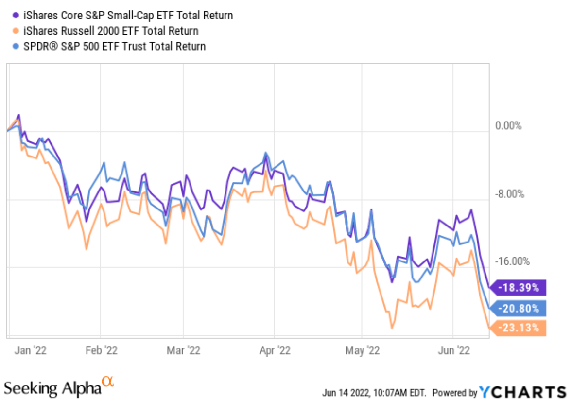
Such corrections have brought the valuation of the small-cap sector to be the most attractive sector right now as you can see from our market dashboard below. Details of the dashboard are in our earlier articles and you are welcome to export/download it via the following link: Market Sector Dashboard. As you can see, the small-caps now feature the largest yield spread Z-score and also the large yield Z-score among all sectors. Also, note that its “largest yield spread Z-score” is still in the negative. It is just the least negative Z-score compared to other sectors (representing a risk relative to the treasury rates as to be detailed later).
Now, after establishing the attractiveness of the small-cap sector, let’s see which specific small-cap fund is better. Is IWM the more attractive one because of the larger correction? Our answer would be “No” as you will see next.
Author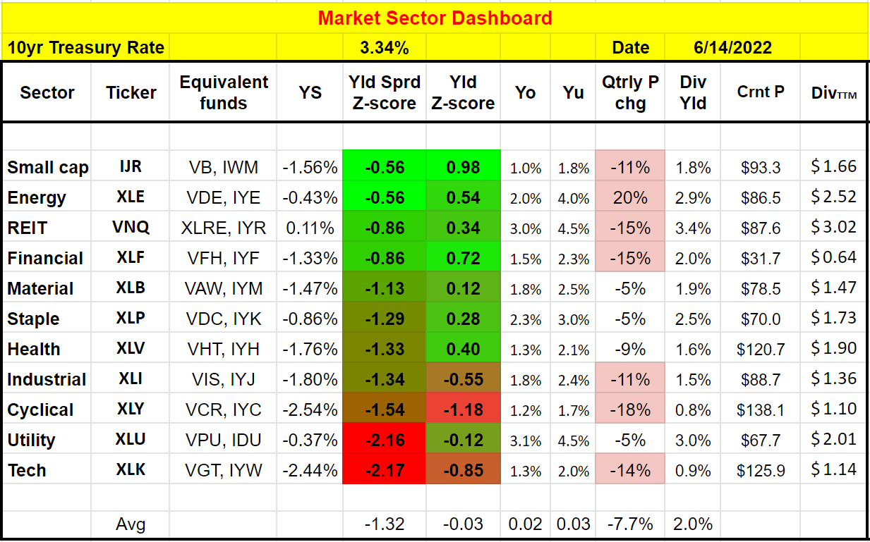
IWM and IJR: Basic information
Just a very brief introduction to these funds in case there are readers new to them. Both are popular iShares funds in the small-cap space. IJR is slightly larger with an AUM of $64B, and IWM is slightly smaller with an AUM of $54B. The more consequential differences are twofold. Firstly, IJR charges a much lower expense ratio of 0.06%, compared to IWM’s 0.19%. And secondly, IJR is based on the S&P SmallCap 600 indexed and holds about 600 stocks. in contrast, IWM is based on the Russell 2000 Index and holds about 2000 stocks.
And we will see the implications of these differences immediately next.
Source:ETF.com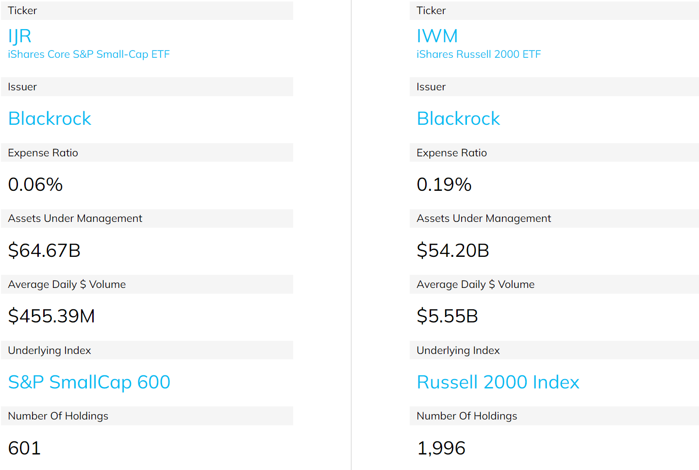
Why IWM is a diworsification?
Despite their difference index differences, many of their holdings overlap. And as a result, their performance closely correlated with each other as you can see from the following chart. Although a closer look reveals the following observations:
- Firstly, IJR delivered better total returns in the long term. Since their inception in 2001, IJR has delivered an annual return of 9.63%, compared to 7.91% from IWM. Such an outperformance, when accumulated over a long period of time, led to a dramatic difference in the total return: more than $20,000 for an initial investment of $10,000.
- Secondly, note that IJR actually suffered lower price volatility than IWM, despite its higher return and fewer holdings. The volatility is lower across the board in terms of standard deviation (18.9% vs 19.7%), worst year performance (-31.5% vs -34.1%), and maximum drawdown (-51.8% vs -52.4%). To me, this is a classical sign of the diworsification nature of IWM: more holdings (about 1400 in this case), yet lower total return and higher volatility.
Source: Portfolio Visualizer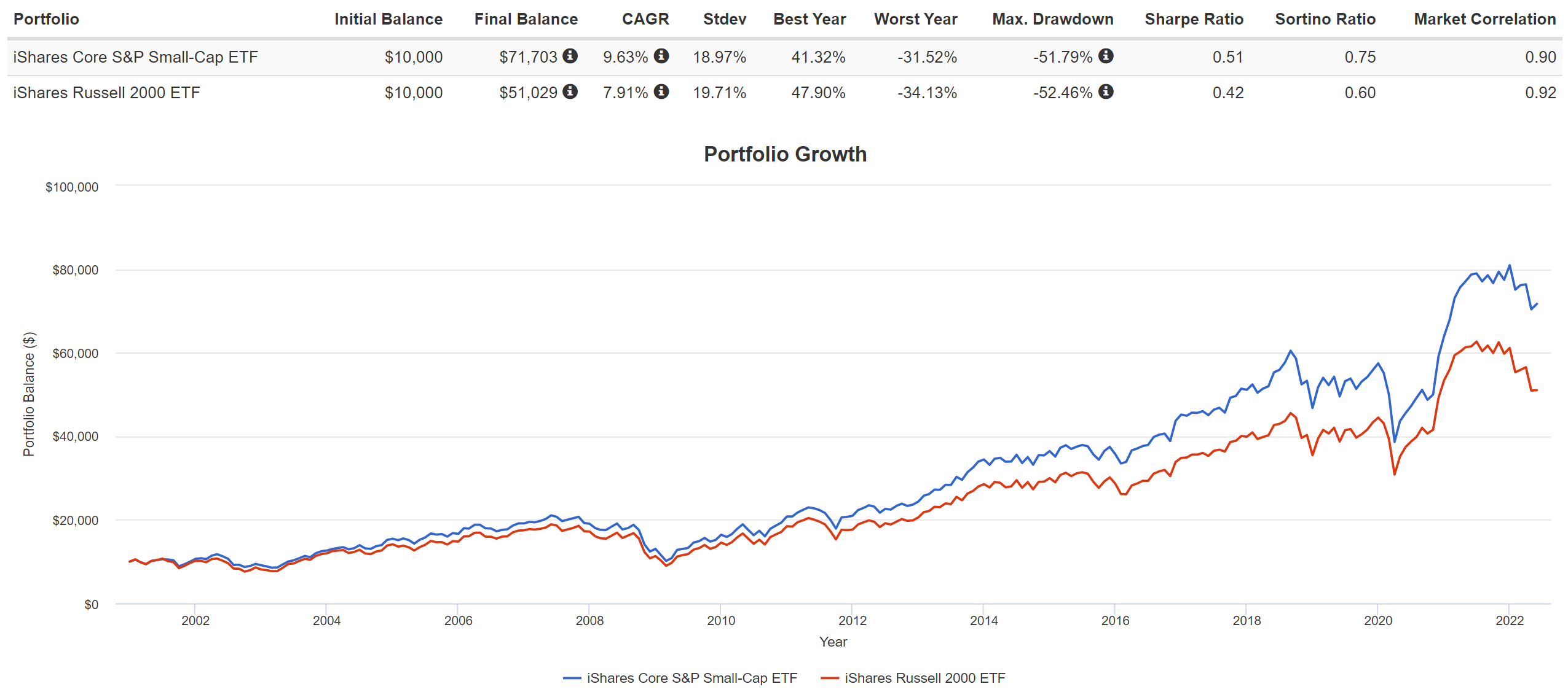
IWM is also more expensive
Yet, IWM is more expensive, both in terms of its expense ratio as aforementioned and also in terms of its valuation. The expense ratio difference (0.19% vs 0.06%) will keep creating a drag of 0.13% per year on IWM performance. At the same time, IWM is also valued more expensively at a fundamental level as you can see from the chart below. These data are taken from iShares website. As of this writing, IJR is priced at 13.55x PE, about a 3% above IWM’s 13.12x PE. I think such a small difference is well within the margin of error of the financial data. In terms of price/book value ratio, IJR is priced at 1.79x, about 8% below IWM, getting bigger and harder to be explained away by the margin of error.
Author based on iShares data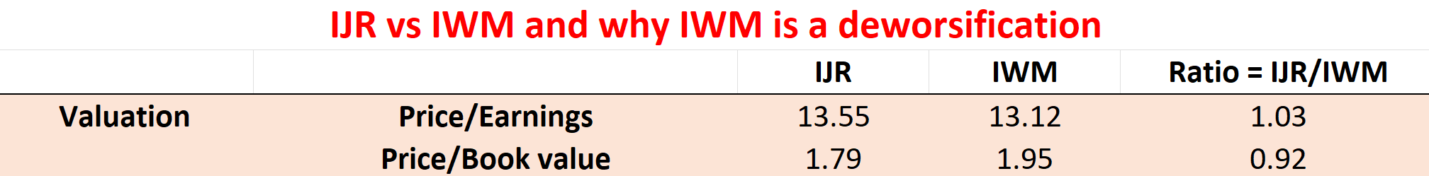
IJR yield spread over IWM is at 10-year peak
An even more important metric to gauge their relative valuation is the yield spread because of the following reasons. Details of the calculation and application of the yield spread have been provided in our earlier article.
- The common PE or Price/cash flow multiples provide partial and even misleading information due to the differences between accounting earnings and owners’ earnings.
- Dividends provide a backdoor to quickly estimate the owners’ earnings. Dividends are the most reliable financial information and least open to interpretation. In investing, we always prefer a simpler method that relies on fewer and unambiguous data points rather than a more complicated method that depends on more ambiguous data points.
- The dividend yield spread (“YS”) is based on a timeless intuition. No matter how times change, the spread ALWAYS provides a measurement of the risk premium investors are paying. The yield spread between two securities always measures their risk premium relative to each other. A large spread provides a higher margin of safety and vice versa.
With this background, the following chart shows the yield spread between IJR and IWM.
As can be seen, the spread fluctuated around a mean of about zero (-0.03% to be exact) in the long term, which makes perfect sense. Both IJR and IWM track the market sector and there is no reason why they should have structural differences in their valuation in the long term. Although that does not mean their valuations cannot fluctuate around the mean over time. And as you can see, IJR was valued more expensively during the first half of the decade as reflected in a negative yield spread. The yield spread reached a bottom of almost negative 0.4% in 2013. Starting in the second half of the decade around 2018, IWM began to enjoy a premium over IJR. And now, as you can see, IWM’s premium has reached its highest level in a decade. Now, IJR yields almost 0.6% above IWM.
Author based on Seeking Alpha data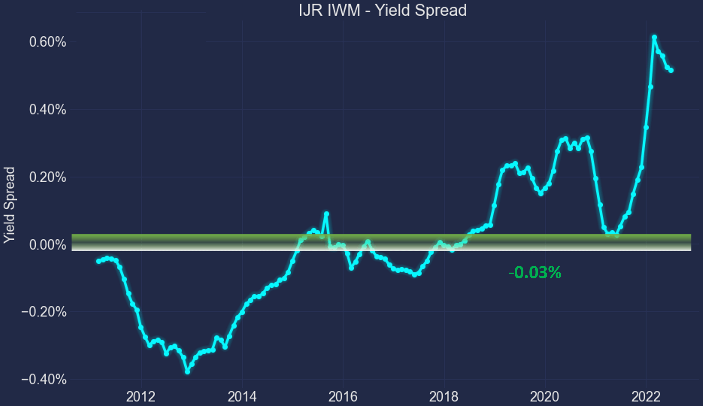
Final thoughts and risks
Amid recent market turmoil, the small-cap sector has become the most attractive sector currently. It now offers the largest dividend yield Z-score of 0.98 and the least negative yield spread Z-score of -0.56. Among two of the most popular small-cap funds, IJR and IWM, our view is that IJR is the clear winner. IWM shows the classical signs of a diworsification compared to IJR: more holdings, yet worse total return, and higher volatility. Furthermore, IWM’s 0.19% expense ratio will keep creating a 0.13% annual drag.
And most importantly, IWM is valued at a substantial premium relative to IJR. It is priced at 1.95x of its book value, about 8% above IJR. In terms of dividend yield spread, its premium over IJR is at the highest level in a decade (IJR currently yields almost 0.6% above IWM while the long-term average is -0.03%).
Finally, risks. As aforementioned, small-cap’s “largest yield spread Z-score” is still in the negative as shown by our Market Sector Dashboard. A negative yield spread Z-score signals risks relative to the treasury rates. Our view is that treasury rates are approaching their long-term targets now. But the rates can always climb more and pressure equity pricing including IJR and IWM. Also, the use of dividend yield spread itself has limitations. As detailed in our earlier article,
Dividend yields do not always reflect business fundamentals due to several factors such as tax law, political climate, the composition of the market index, et al. As a result, we do not directly use the yield spread in our investment or asset allocation decisions. In practice, we first adjust for the above corrections and then use the adjusted yield spread in our investment decision. But the data and approach illustrated here is the first place we check.
Be the first to comment