

GraPro/iStock via Getty Images
Update: Comments on a TPL Announcement(dtd 5/19/21)[1]
On May 16th, Texas Pacific Land Corp. (TPL) made what might appear to be a modest announcement: a strategic alliance with two cryptocurrency mining companies to develop a mining operation on some of TPL’s land. It might easily be disregarded as of little importance — unless one properly appreciates the economic value of the company’s land position, to which investors still pay insufficient attention.
Readers of our quarterly reviews might recall an occasional mention that TPL’s land will ultimately be worth even more than its oil and natural gas royalty interests. That might sound odd, since the earnings are so obviously dominated by its oil and gas royalties. Land, though, unlike almost any other business asset, whether a commercial building or a manufactured product or process, is a perpetuity. Almost anything else wears out, or can become displaced or, in the case of most natural resources, depleted. Even very long-lived resources.
Land must be more valuable, because, in contradistinction, it is a perpetuity. And it can’t be replicated. More than that, it’s an increasingly scarce resource, at least on a per-capita basis, since the world continuously becomes more populous. There will be better-use/higher-value purposes to which some tract or lot can be put. That use might be known or speculated about in the present, or it might not be known until, at some future date, circumstances allow. It is easy to underestimate the value of a very long duration asset, and a perpetuity is the longest.
Investors also tend to not give sufficient credit to the power of management to enhance or create additional value with such an asset. The commercialization of land requires considerable management expertise. This particular transaction involves two other parties that will build and operate up to 60 megawatts of bitcoin mining, which was stated could accommodate up to 2.0 Exahash of operational capacity.
That is quite sizable. As a reference point, Marathon Digital Holdings (MARA), which has a $1.0 billion stock market value, even after a year-to-date decline of 70%, had about 3.6 EH/s of capacity at year-end 2021, though it expects to reach 13.3 EH/s during this calendar year. The TPL venture is expected to begin operations in the fourth quarter of this year.
Where does that much electric power for such a large project come from that quickly? Though not necessarily common knowledge, there is a great deal of both excess energy and produced electric power available in the U.S., at least in geographically or temporally (i.e., hour-of-day) localized ways. One of the two venture partners, Mawson Infrastructure Group (OTCQB:MIGI), establishes mining facilities close to renewable energy sources, using modular, scalable facilities, as opposed to the conventional large, fixed-location data-center type buildings. The other, JAI Energy, specializes in using stranded power assets, flared gas and other sources of excess or ‘wasted’ energy, such as occur when there is insufficient infrastructure or take-away capacity. JAI constructs mobile natural gas-powered generators and mobile mining centers in truck-borne containers.
Much of the power for cryptocurrency mining is now generated by energy that would otherwise be lost, as when electric utilities have excess power during low-demand periods, such as the late-night/early morning hours. These have become very constructive relationships, because crypto mining demand can be uniquely helpful, both to electric utilities and renewable power projects, and in reducing greenhouse gas emissions. Those mutual benefits, and the profit opportunity, though, cannot be fully appreciated without some knowledge of how power generation – in this case, the Texas power grid (ERCOT) – works.
In the joint venture announcement, Mawson Infrastructure announced an intention to participate in “demand response programs” and to evaluate “behind the meter renewable solutions.” “Demand response” is a critical practice for power grid integrity, whereby marginal high-demand power customers are willing to curtail use during periods of peak grid load. As an example, such a user can limit or completely cease power use during an extremely hot summer day, in order to ease the burden on the overall grid. Of course, they will be compensated at the market rate for power generation for doing this, but crypto mining is uniquely able to go offline, and restart with minimal economic consequences. That’s because a cryptocurrency miner that can simply pick up at the next “block” after being powered down. Compare that faculty against a conventional data center (think Cloud – Amazon Web Services, Microsoft Azure) or a heavy HVAC system that take tremendous resources and time to start up and wind down. Thus, these mobile mining operations can both consume excess power during normal periods of electric power redundancy, but also provide a market balancing benefit during periods of grid strain.
“Behind-the-meter” renewables are essentially solar and wind generation facilities that have a direct demand source or customer and do not plug into the broader power grid. In this case, consider a solar facility co-located next to a crypto mining operation, with its power directly connected to the mining facility. Here is where the full loop closes: these facilities reduce power costs for miners during normal (redundant) power supply environments, but allow the renewable energy facility to supplement the grid during periods of extreme grid strain. In this sense crypto miners promote renewable generation that, because of their intermittent periods of production, would be uneconomic without a dedicated buyer.
In the Permian Basin, cryptocurrency mining can make use of flared gas, for instance, converting much of it into an economic asset. There is clearly much scope for such mutually constructive (energy producer, miner, greenhouse gas emissions reduction) activity, whereby miners can convert momentary excess power that would not otherwise be utilized into a permanent financial asset. This faculty of mining has been termed an ‘economic battery.’ It appears that this venture will focus, at least initially, on excess power from the electricity grid. There are large transmission facilities with substations located in Western Texas, one of the types of infrastructure the company has sought to encourage on its surface acreage. Apparently, there is a great deal of electricity moving from this region eastward, but with little offtake demand, such that the excess load (no sunset provision for the law of supply and demand) results in lower electricity pricing than elsewhere in the State.
For TPL specifically, its surface land portfolio consists of 880,000 acres strategically dispersed throughout the Permian Basin. It also owns perpetual gas and oil royalty interests beneath nearly 500,000 acres, equivalent to 23,700 net royalty acres. The “net” in net royalty acres refers to the percentage interest TPL has in a given mineral deposit. For instance, TPL has a 1/128th royalty interest on 85,000 acres (separate from its 1/16th and 1/8th interests on other acreage), which results in 664 net royalty acres. Consider that its oil and gas revenues derive from a very modest portion of its net royalty acres. Only about 12% of the estimated total wells on those 23,700 net royalty acres have been drilled.
The assembly of the requisite quantity of mining trailers and natural gas generators for the project can hardly be expected to occupy more than several acres. Yet, irrespective of precisely how many acres that might be, one can contemplate the ultimate long-term earnings potential from the de minimis, rounding error land usage that enables a 60 MW mining operation. Consistent with its traditional business model, TPL will be taking a net royalty interest in this venture, which requires no capital outlay or operating expense obligations, along with an option to acquire an equity stake.
It bears mentioning, in the context of value creation with a land asset – think of a deal to build a convention center on a previously empty downtown lot – that the value is created when the deal is signed. The value realization does not await the placement of the last girder or pipeline or wire. This announcement in particular is no different. Obviously, if it is economically productive, many more such ventures are likely.
TPL’s Land, Generally
As an aside, there is a different way to think about TPL’s land value. It is an accident of the particulars of GAAP accounting standards in the U.S., that land is held on the balance sheet and not revalued or marked to market each year. In other jurisdictions, the annual changes in land value are accounted for and reflected in earnings. What if TPL’s earnings were to reflect – at least from an investment valuation, if not an accounting, perspective – the ongoing appreciation of its land portfolio? This crypto mining venture is plain evidence of the ability to extract a different type of royalty interest from its land.
TPL provides annual data on the sale and purchase of land, separate from any mineral or royalty interests. It can be quite uneven from year to year. Over 90% of its acreage is grazing land. On the other hand, some small parcels might be priced quite high and not representative of the balance, such as for building lots near El Paso, or for sales to industrial buyers, like E&P or mid-stream pipeline companies. Nevertheless, the pattern of rising values for non-royalty acreage is plain to see:
Land transactions, by year, average approximate value per surface acre:
2021: sold 30 acres, $25,000/acre.
2020: sold 22,160 acres, $721/acre.
2019: sold 21,986 acres, $5,141/acre, including 14,000 in Loving & Reeves Counties at $7,143/acre Bought 21,671 acres (Culberson, Glasscock, Loving and Reeves Counties), $3,434/acre. 2017: sold 11.02 acres, $20,000/acre. 2016: sold 775 acres, $3,803/acre
2015: sold 20,941 acres, $1,080/acre
2014: sold 1,950 acres at $1,897/acre
2013: sold 10,399 acres, $617/acre
From approximately $1,000/acre in the 2013 to 2015 period, large sales in the 2017 to 2021 period were in the $3,500 to $7,000 range, with smaller transactions in the $20,000 range.
A less company-specific, more categorical measure of land values in TPL’s portion of Western Texas is provided by the American Society of Farm Managers and Rural Appraisers, the Texas Chapter of which recently published the 2021 edition of its Texas Rural Land Value Trends. For what they term the TransPecos portion, which encompasses seven counties in the most active drilling areas (such as Loving and Reeves Counties), transactions in “rangeland” were valued at $275 to $640 per acre, whereas Rangeland Special Purpose (such as for compressor stations or tank farms, which is to say industrial use), fell in the $4,000 to $4,500 range.
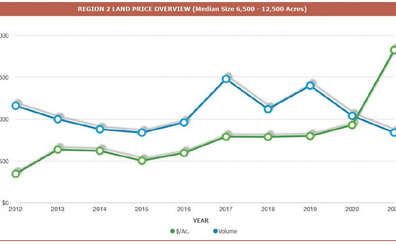
The publication also reports historical trends, with a median price for sales of surface acreage (with a median transaction size of 6,500 to 12,500 acres): this has trended upward from about $400/acre in 2012 to roughly $1,900/acre in 2021. Based on these aggregate figures alone, the land values have been rising at double-digit annualized rates.
Source: American Society of Farm Managers & Rural Appraisers, Texas Chapter, 2021
Simplistically, as an exercise just to test the degree of valuation influence, and using round figures for ease, let’s just say that the TPL surface acreage is worth an average $6,000/acre. The total value for its 880,000 acres would be $5.3 billion, which is one-half of the company’s current $10.6 billion market cap. What if the value of the acreage were to rise by 10%? Inflation is already at 7%-plus, and there is more and more commercial activity in the Permian Basin, including for utility-scale solar and wind projects. The region seems unusually attractive for that use. That would be a value increase of $530 million. If viewed as part of comprehensive earnings, that would double TPL’s total revenues of the last 12 months.
Preface for This Moment of Inflation Confusion. Let’s Not Be Confused.
It’s not easy to engage in a serious discussion about how to prepare for chronic inflation when the eyes and ears don’t concur – when “inflation” is neither mentioned in financial news reports, nor visible in go-to statistics like the CPI. Think back just one year.
It is not much easier when, after there is some conventional statistical evidence of price-level rises, mention is made of inflation but is widely said to be temporary. Think back just half a year.
Oddly, serious discussion gets no easier even when there finally is general acceptance that inflation has arrived. Why? Because despite the idea that stock and bond markets are marvelous forward-looking discounting mechanisms, investors overwhelmingly rely on the generally accepted viewpoint – the consensus opinion – about the future state of things, which is usually more of the same, a continuation of whatever’s been happening. They know how to function under those conditions; there’s a desire to stay anchored to the familiar. Plus, it’s difficult to convincingly gainsay growth stocks while they’re still rising; it’s difficult to persuasively suggest that a departure from the experienced norm is not an aberration, but that it is the experienced norm itself (a 40 year stretch of disinflation and rising valuations, for instance) that is the aberration.
Another impediment is that the more sophisticated commentators become very well versed in what has just occurred (as opposed to what will continue to happen and why). Many can now cite statistics about oil inventories and whether the Strategic Petroleum Reserve releases will help much or not, about how long it might take the car and semiconductor chip manufacturing supply chain issues to resolve, or the proportion of global grain and seed supply that comes from Ukraine.
Yet, you will still not hear about the structural factors that are really behind the current inflation statistics, the ones that might drive 10 or 20 years of sustained, standard-of-living eroding inflation. You see how repetitive this dynamic is – we’ve come all this way, yet remain in the same place, as between independent analysis and the consensus views, working our Groundhog Day way toward the inevitable outcome.
The fearful risk to investors and savers is that a decade of 8% inflation and/or currency debasement – take your pick, they’re paired – more than doubles the price level, the same as losing more than 50% of your savings. What if the inflation rate is greater than that? What if it persists longer than that? Really, there is hardly any risk greater, and no investment topic as deserving, of full attention.
Which is why we’ve been developing and communicating the underlying data for some years now. Why we have not owned most of what was offered in the marketplace and in the major indexes, since they are the most vulnerable to the new era or norm we are currently entering? Why we began to pre-position portfolios a few years ago for an environment such as is visibly developing now, with business models and assets that can be direct beneficiaries of an inflationary environment?
The reason for this interim commentary is that the price level increases have been high enough and sudden enough to quickly become the center of market attention, the Federal Reserve has lately acknowledged what can’t be ignored, and the public discussion has now turned to how “aggressive” the central bank will be in raising interest rates in order to try to stem inflation. Will it be by 0.5% points or 0.75%? There is a natural turn to the renowned inflationary decade of the 1970s, which was finally contained by a draconian increase in interest rates, and many questions along these lines have come up.
Unfortunately, the 1970s lessons will not benefit today’s scenario. Following is compare and contrast review of the current circumstance with that decade, plus an example of exactly how excess money supply growth is inflationary, how it actually increases the price of, for instance, oil. To understand this, is to be ahead of the game.
Differences Between the 1970s Inflationary Era and the Current Inflationary Era
The Limitations of Interest Rate Increases in the 1970s
Although it is frequently asserted that history repeats itself, it is a far less common occurrence than is generally believed, once detailed data is presented. The temptation today is to compare the current inflationary pressures with the inflationary environment of the 1970s. Upon scrutiny, vast differences immediately appear.
One such difference is the level of national debt. The most recent U.S. debt-to-GDP ratio, as of year-end 2021, is 123.39%. Since then, a great deal more debt has been added. We believe, a good estimate of the current ratio might be 125.5%. The official figure for the first quarter of 2022 will be released by the St. Louis Fed at the end of June.
The year-end debt-to-GDP ratios from 1969 to 1980 are as follows in the accompanying table. They might be more than a little surprising.
At the beginning of the 1970s, the U.S. was not very leveraged. The debt-to-GDP ratio at the end of 1969 was 35.46%.[2] In fact, it was generally declining throughout the 1970s. Most scholars label the fourth quarter of 1980 as the end of the inflationary period, while some use the second quarter of 1981, since that represents the maximum monetary stringency applied by the Federal Reserve. In both cases, the debt-to-GDP ratio rounded to 31%.
During the next two non-inflationary decades, the debt-to-GDP ratio increased, reaching 54.25% by the end of 2000. The 100% level was first breached in the fourth quarter of 2012. As late as the fourth quarter of 2019, the ratio was still only 106.94%.
Table 1: U.S. Debt-to-GDP (1969-1980)
| Year | Debt-to-GDP |
| 1969 | 35.46% |
| 1970 | 35.74% |
| 1971 | 35.63% |
| 1972 | 33.74% |
| 1973 | 31.77% |
| 1974 | 30.79% |
| 1975 | 32.73% |
| 1976 | 33.78% |
| 1977 | 33.21% |
| 1978 | 31.86% |
| 1979 | 31.02% |
| 1980 | 31.15% |
Source: Federal Reserve Bank of St. Louis
An obvious lesson of these figures is that the debt-to-GDP ratio can increase for a very prolonged period of time, like the 39 years from 1980 to 2019, without the economy experiencing serious inflationary pressures. Measured by commodity prices, 2020 was clearly deflationary, as a consequence of the impact of the coronavirus pandemic. The inflation commenced in 2021.
As part of this exercise is to compare the 1970s with the current environment, an important question is: what might have altered the non-inflationary trend that persisted from the end of 1980 to the end of 2019?
One obvious answer is the M2 money supply. The St. Louis Fed reports that the M2 money supply on December 29, 1980 was $1.595 trillion. In December 2019, the figure was $15.342 trillion. During this nearly 40-year period, the annualized money supply growth rate was 5.98%. The M2 money supply data series was discontinued on February 1, 2021 and replaced by the M2SL data series. Though it is statistically somewhat dangerous to compare the historical M2 data with the M2SL data, the St. Louis Fed has also recalculated the historical M2 data into M2SL terms.
In December 1969, the U.S. M2SL data shows a money supply of $587.9 billion. A decade later, the December 1979 figure was $1.437 trillion, for an annual growth rate of 9.35%. At that juncture, the money supply was still growing vigorously despite the Fed raising interest rates dramatically to control inflation:
- According to the St. Louis Fed, in May 1977, the federal funds rate was 4.69%.
- By May of 1978, this figure had increased to 7.36%, but inflation did not abate.
- By May 1979, the federal funds rate reached 10.24%, yet inflation still did not abate.
- By March 1980, the federal funds rate was 17.19%. Inflation still did not abate.
- By July 1981, the federal funds rate reached 19.04% and inflation was gradually reduced.
Despite the high and rising federal funds rate during the last few years of this period, the money supply continued to expand:
- In May 1978, the M2SL, calculated in accordance with the current practice, was $1.292 trillion. By May 1979, it had expanded to $1.41 trillion, a one-year increase of 9.13%.
- By March 1980, a ten-month span, the money supply had increased another 6.31%, to $1.499 trillion. This was less than, though not considerably less than, the prior year’s rate of money supply growth, but in two fewer months.
- By July 1981, the money supply had increased to $1.681 trillion. This was a 12.14% increase in a 16-month period – an 8.98% annual rate – not radically different than the preceding time periods.
In other words, the policy tool used by the central bank to control inflation did change the prevailing interest rate, but without significant changes in money supply growth. Over the next ten-year period, ending July 1991, the money supply roughly doubled, to $3.356 trillion. This was an annualized increase of 7.16%.
The Debt-Imposed Limitations on Interest Rate Increases in the 2020s
In 1980, according to usdebtclock.org, the national debt of the U.S. was $874 billion. Every 1%, or 100basis-point, increase in the interest rate would have cost the U.S. Treasury $8.74 billion (0.01 x $874 billion) of incremental debt service each year. That $8.74 billion figure should be viewed in light of its relatively modest size relative to the $535 billion in annual federal spending at that time, and a federal budget deficit of $43.8 billion.
The GDP in 1980 was $2.472 trillion. Accordingly, a 300-basis point increase in interest rates would amount (at 3 x $8.74 billion of additional interest expense for a 1% increase) to slightly more than 1% of U.S. GDP. The U.S. Treasury could have reasonably expected to be able to collect enough taxes to fund such an interest expense increase. Yet, failing this, another 1% of GDP could have been borrowed, if necessary, to fund the additional interest expense.
Extending this idea from federal debt to the totality of U.S. debt in 1980, which is the tabulation of all debts owed by all U.S. residents (that is, including mortgage payments, car loans, etc.), this was $4.387 trillion, or 177% of GDP. An interest rate increase of 300 basis points on this sum would have amounted to $131 billion of additional interest expense, or 5.32% of the 1980 GDP. That is why the Fed’s interest rate increases in 1980 and 1981 caused a deep and painful recession that was nevertheless bearable by the economy, which recovered sharply.
That was the debt–economy–interest rate dynamic then. In contrast, the current national debt is $30.358 trillion[3], while total debt is $89.51 trillion, and the GDP is $24.172 trillion. That means that a 300-basispoint increase in interest rates today would cost the federal government $910 billion in increased debt service, which would be 3% of GDP (versus the 1% that would have resulted in 1980). This is actually a low estimate: since the current budget deficit is in excess of $2.3 trillion, it is readily conceivable that the national debt would approach $33 trillion – another 10% points higher – by the time that, say in one year, interest rates might increase by 300 basis points.
Since the federal government already pays about $428 billion in interest expense,[4] we’re talking about $1.4 trillion in resultant federal interest expense. That by itself would be 5.79% of GDP. Of course, if those higher rates create a recession, GDP would decline, so the ratio would deteriorate further.
But, as in the 1980 example, an interest rate increase does not limit itself to the Federal debt alone. A 300-basis-point rate increase that impacts the total U.S. debt level of $89.5 trillion would cost an incremental $2.68 trillion above the current interest paid. The current interest payments for all forms of debt contracted collectively by all of the residents of the U.S. amount to $3.361 trillion. This implies that the current interest rate on all forms of debt equals 3.76%.
In the 300-basis-point rate increase scenario, total interest expense in the U.S. would be the current $3.361 trillion and an additional $2.68 trillion, for a total of $6.04 trillion. This, too, is probably an underestimate since the total debt is always increasing.
Thus, the question that might be posed is whether or not the U.S. could afford to pay over $6 trillion in interest expense. In a $24 trillion economy, this would require that one-quarter of the GDP be devoted to servicing debt.
Another question that might be posed is whether the U.S. GDP will actually remain at the $24 trillion level in an environment with a 300-basis-point interest rate increase. In a recession, tax payments would likely decline and government social contract obligations would increase. A reduction in government spending is generally considered to exacerbate a recession. In any case, it is difficult to imagine increased government spending as a countervailing force to a recession in the aforementioned circumstance.
In the 1977 to 1981 case, in order to stop inflation, the central bank found it necessary to increase the federal funds rate from 4.69% in May 1977 to 19.04% in July 1981. At our current debt levels, such an interest rate increase is unimaginable. In fact, even a 300-basis point rate increase is difficult to contemplate. Yet, a 300-basis-point fed funds rate increase did not halt inflation at the end of the 1970s.
The magnitude of today’s debt levels appears to greatly reduce the central bank’s monetary policy options. This is the central difference between the prior inflationary period and the current one. If the inflation cannot be controlled by interest rate increases, perhaps it cannot be controlled. The alternative is to control inflation via the money supply, meaning actually reducing the money supply. The last time that was tried was during the Great Depression, and it did not work out as well as the creators of the theory might have hoped.
Entitlement Programs and Oil Prices in an Uncontrolled-Deficit World
Q: How do you factor in the impact of the entitlement programs?
A: We don’t try. The first reason is that those figures are based on certain assumptions around population and life expectancy that we have no way of validating or, secondly and more importantly, relying upon, because even if one knew those things, the eligibility requirements can be altered by Congress. That’s not like debt. If the U.S. government owes a million dollars, that’s a contractual obligation. You could say the U.S. is “obligated” to pay a million dollars in Social Security payments, but it doesn’t really have to pay it. That’s because the law can be changed, or they can change the taxation. For instance, the eligibility age for Social Security could be revised, or it could be means tested. Social Security could even be abolished.
In extremis, it’s merely a social contract, not a contract in the legal sense of the word. It’s an expectation that people have, and while they may be sorely disappointed, the government has the facility of being able to change the qualifications.
If the U.S. were to default on a bond, that’s a very different matter. That’s because the United States relies on debt to fund the government. Default on debt, and you no longer have access to the debt markets, in which case you might not be able to even run the government. That’s a really big problem.
The U.S. federal government, as an example, needs about $6.5 trillion to buy what it needs. It raises about $4 trillion a year in revenue. So, it’s going to have to get to a net two trillion dollars or so from borrowing.
Add in all the state and local governments, then you have, in round numbers, another $3.5 trillion of government spending.
Roughly speaking, then, the three types of governments, federal, state and local, spend in the neighborhood of $10 trillion. The economy, the GDP, is $24 trillion. There’s just no way, no matter how you configure tax laws, that they can collectively extract $10 trillion from a $24 trillion economy. The difference has to be debt funded. That’s number one.
Number two, even if the governments could somehow extract that degree of tax revenue, it would cause a depression, not just a recession, in which case you wouldn’t have a GDP of $24 trillion. It would contract to something less than that. And that initiates a vicious cycle, because the government’s social contractual obligations rise during a recession, because people lose work. The tax base falls and local communities can’t afford police or a fire department or hospitals or schools or ambulances, whatever services they happen to fund. Which, in turn, means the government must look for even more money. It’s not a pretty picture, and that’s a constant in all societies, not just the United States.
What ends up happening? Governments are tempted to do what governments have been doing for many centuries, millennia even. A), borrow money, and then B), create money. They can do this because they have the power of seigniorage, of creating money: they decide what legal tender is. In every society in which a government has had that faculty, there’s not one instance in history when it hasn’t been abused. At the current moment, all you have to do is look at the money supply system. It is being abused.
It is easier to think in terms of commodities. Let’s take oil as an example. You could perform all sorts of analyses: Will the world produce 100 million barrels a day? Or will it be 99 million? Will Saudi Arabia produce 10 million barrels a day? Or will it be 9 million? Those are very interesting exercises. There’s a seeming precision to them, but what are we really talking about, what are the practical boundaries for those estimates? It’s really whether oil production increases by 1% a year or by 2%. Will it be 1.7% or 1.8% a year? That’s what we’re talking about. Now let’s match those bounded estimates to the money supply.
Money functions similarly, except that it is increasing by well in excess of 10% a year. If you believe in the law of supply and demand, then if the world currencies—dollars, euros, yen, pounds or whatever currency you want to use—are collectively increasing at a double-digit rate, while the supply of oil, the number of barrels being produced, is not going to grow at anything like that rate, what do you think is going to happen?
If the supply of oil were to grow even as high as 2% a year, while the supply of currency to pay for it is growing at 12% a year, then the price of oil measured in currency is going to go up. The discussions around inflation and currency debasement would be easier to understand if people said, or could see, that it’s really like a currency exchange rate, except oil versus currency instead of one currency vs. another. The fiat currencies are going to fall in relation to a barrel of oil: much more currency supply circulating every year for each available barrel of oil; more dollars or Euros or yen, but not much more oil.
[1] Texas Pacific Land Corporation (“TPL”) is a large holding across the Firm. It is a top holding in several funds and strategies and the Firm collectively controls greater than 20% of the outstanding shares of the company
[2] St. Louis Federal Reserve
[4] At this writing, the interest expense is already $429 billion. It has actually increased one billion dollars not that many days ago.
Editor’s Note: The summary bullets for this article were chosen by Seeking Alpha editors.
Be the first to comment