

4kodiak/iStock Unreleased via Getty Images
This monthly article series shows a dashboard with aggregate subsector metrics in Consumer Discretionary. It is also a top-down analysis of sector ETFs like the Consumer Discretionary Select Sector SPDR ETF (XLY) and the Fidelity MSCI Consumer Discretionary Index ETF (NYSEARCA:FDIS), whose largest holdings are used to calculate these metrics.
Shortcut
The next few paragraphs in italic describe the dashboard methodology. They are necessary for new readers to understand the metrics. If you are used to this series or if you are short of time, you can skip them and go to the charts.
Base Metrics
I calculate the median value of five fundamental ratios for each subsector: Earnings Yield (“EY”), Sales Yield (“SY”), Free Cash Flow Yield (“FY”), Return on Equity (“ROE”), Gross Margin (“GM”). The reference universe includes large companies in the U.S. stock market. The five base metrics are calculated on trailing 12 months. For all of them, higher is better. EY, SY and FY are medians of the inverse of Price/Earnings, Price/Sales and Price/Free Cash Flow. They are better for statistical studies than price-to-something ratios, which are unusable or non-available when the “something” is close to zero or negative (for example, companies with negative earnings). I also look at two momentum metrics for each group: the median monthly return (RetM) and the median annual return (RetY).
I prefer medians to averages because a median splits a set in a good half and a bad half. A capital-weighted average is skewed by extreme values and the largest companies. My metrics are designed for stock-picking rather than index investing.
Value and Quality Scores
I calculate historical baselines for all metrics. They are noted respectively EYh, SYh, FYh, ROEh, GMh, and they are calculated as the averages on a look-back period of 11 years. For example, the value of EYh for retailing in the table below is the 11-year average of the median Earnings Yield in retail companies.
The Value Score (“VS”) is defined as the average difference in % between the three valuation ratios (EY, SY, FY) and their baselines (EYh, SYh, FYh). The same way, the Quality Score (“QS”) is the average difference between the two quality ratios (ROE, GM) and their baselines (ROEh, GMh).
The scores are in percentage points. VS may be interpreted as the percentage of undervaluation or overvaluation relative to the baseline (positive is good, negative is bad). This interpretation must be taken with caution: the baseline is an arbitrary reference, not a supposed fair value. The formula assumes that the three valuation metrics are of equal importance. A floor of -100 is set for VS and QS when the calculation goes below this value. It may happen when metrics in a subsector are very bad.
Current data
The next table shows the metrics and scores as of last week’s closing. Columns stand for all the data named and defined above.
|
VS |
QS |
EY |
SY |
FY |
ROE |
GM |
EYh |
SYh |
FYh |
ROEh |
GMh |
RetM |
RetY |
|
|
Auto + Components |
-28.13 |
4.55 |
0.0678 |
1.1882 |
0.0117 |
16.48 |
27.30 |
0.0604 |
1.6393 |
0.0379 |
19.35 |
22.04 |
-9.88% |
-26.71% |
|
Durables + Apparel |
75.39 |
26.43 |
0.0930 |
0.8697 |
0.0700 |
29.51 |
42.21 |
0.0505 |
0.6979 |
0.0322 |
18.02 |
47.36 |
-7.84% |
-25.50% |
|
Retailing |
-10.06 |
12.66 |
0.0551 |
0.7295 |
0.0313 |
31.68 |
34.69 |
0.0499 |
0.8948 |
0.0402 |
24.35 |
36.41 |
-5.58% |
-14.54% |
|
Services |
-16.94 |
-14.21 |
0.0193 |
0.3212 |
0.0249 |
11.39 |
33.26 |
0.0345 |
0.4148 |
0.0215 |
14.50 |
35.75 |
-6.22% |
-20.49% |
Value and Quality chart
The next chart plots the Value and Quality Scores by subsector (higher is better).
Value and quality in consumer discretionary (Chart: author; data: Portfolio123)
Evolution since last month
The value score has improved in all subsectors except retailing. Quality has deteriorated in auto and components.
Variations in value and quality (Chart: author; data: Portfolio123)
Momentum
The next chart plots momentum data.
Momentum in consumer discretionary (Chart: author; data: Portfolio123)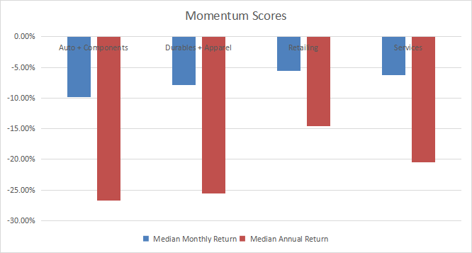
Interpretation
Durables and apparel is the most attractive industry in consumer cyclicals. It is significantly undervalued relative to 11-year averages, and quality is above the baseline. It includes household equipment, leisure products, textile, apparel and luxury goods. Retailing is overvalued by 10% relative to the baseline, and quality is close to the historical average. Auto and components are overvalued by about 28%, and quality is close to the baseline. The services subsector, which includes hotels, restaurants, leisure and diversified services, has improved a lot since the end of pandemic-related lockdowns. It is now moderately below the baseline in both value and quality.
FDIS fast facts
The Fidelity MSCI Consumer Discretionary Index ETF has been tracking the MSCI USA IMI Consumer Discretionary 25/50 Index since 10/21/2013. It has a total expense ratio of 0.08%, which is lower than XLY (0.12%).
The fund has 324 holdings as of writing. The next table shows the top 10 names with basic ratios and dividend yields. Their aggregate weight is 57.8%, with 33.3% in the top two companies. Amazon and Tesla represent 19.47% and 13.83% of the fund’s asset value.
|
Ticker |
Name |
Weight |
EPS growth %TTM |
P/E TTM |
P/E fwd |
Yield% |
|
Amazon.com Inc |
19.47% |
-21.09 |
51.23 |
142.39 |
0 |
|
|
Tesla Inc |
13.83% |
637.63 |
88.24 |
54.47 |
0 |
|
|
Home Depot Inc. |
6.84% |
14.89 |
17.19 |
16.38 |
2.81 |
|
|
McDonald’s Corp |
4.10% |
37.63 |
24.76 |
23.92 |
2.36 |
|
|
NIKE Inc |
3.30% |
78.66 |
28.36 |
29.09 |
1.14 |
|
|
Lowe’s Cos Inc |
2.87% |
33.57 |
14.05 |
12.73 |
2.44 |
|
|
Booking Holdings Inc |
2.02% |
-27.70 |
154.22 |
18.36 |
0 |
|
|
Starbucks Corp |
2.02% |
347.38 |
19.24 |
24.83 |
2.73 |
|
|
Target Corp |
1.70% |
-1.53 |
11.55 |
15.54 |
3.10 |
|
|
TJX Companies Inc |
1.69% |
122.72 |
20.52 |
17.68 |
2.08 |
Ratios: Portfolio123
FDIS has beaten XLY by a short margin of 63 bps in annualized return since inception. It is a bit more volatile and, as a consequence, has a slightly lower Sharpe ratio (risk-adjusted performance).
|
Total Return |
Annual. Return |
Drawdown |
Sharpe |
Volatility |
|
|
FDIS |
151.50% |
11.26% |
-36.96% |
0.69 |
18.60% |
|
XLY |
139.44% |
10.63% |
-35.84% |
0.71 |
17.48% |
Data calculated with Portfolio123
In summary, FDIS is a good product with cheap management fees for investors seeking capital-weighted exposure in consumer cyclicals. It holds 300+ stocks including large, mid- and small caps, whereas XLY has only 61 holdings in large companies. It has outperformed XLY by a short margin since 2013. FDIS looks a good choice for long-term investors, but XLY liquidity makes it a better instrument for tactical allocation and trading. Investors who are concerned by the weights of Amazon and Tesla may prefer the Invesco S&P 500 Equal Weight Consumer Discretionary ETF (RCD).
Dashboard List
I use the first table to calculate value and quality scores. It may also be used in a stock-picking process to check how companies stand among their peers. For example, the EY column tells us that a retail company with an Earnings Yield above 0.0551 (or price/earnings below 18.15) is in the better half of the industry regarding this metric. A Dashboard List is sent every month to Quantitative Risk & Value subscribers with the most profitable companies standing in the better half among their peers regarding the three valuation metrics at the same time. The list below was sent to subscribers several weeks ago based on data available at this time.
|
Bloomin’ Brands Inc |
|
|
Golden Entertainment Inc |
|
|
Dave & Buster’s Entertainment Inc |
|
|
Children’s Place Inc |
|
|
AutoNation Inc |
|
|
Asbury Automotive Group Inc |
|
|
Williams-Sonoma Inc |
|
|
Nordstrom Inc. |
|
|
Macy’s Inc |
|
|
Sally Beauty Holdings Inc |
It is a rotating list with a statistical bias toward excess returns on the long term, not the result of an analysis of each stock.
Be the first to comment