

David McNew/Getty Images News
Thesis
The thesis of this article is twofold:
- The energy sector, represented by the Energy Select Sector SPDR ETF (NYSEARCA:XLE), is currently the most attractively valued sector. As you can see from our following market dashboard (and you are welcome to download it here), both its dividend yield and the yield spread relative to the risk-free rates are at very attractive levels as indicated by the positive Z-scores.
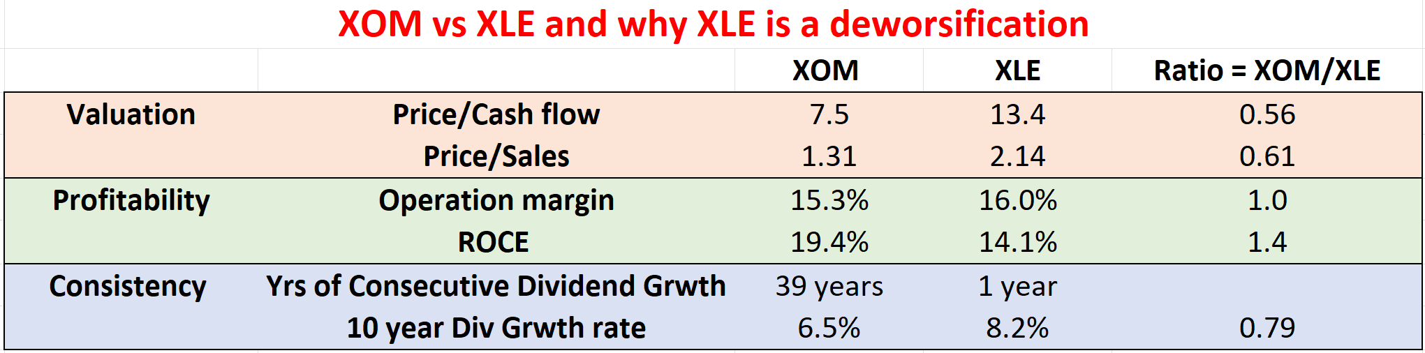
- However, as you can see from the second chart, compared to the sector leader Exxon Mobil (NYSE:XOM), XLE is really a “deworsification.” Exxon Mobil provides superior profitability, consistency, and also valuation over XLE. Particularly, if we use dividends as an approximation for owners’ earning yield, XOM currently provides a yield about 0.93% above XLE, near the thickest level over the past decade. Note that the second chart is based on data provided either from Yahoo Finance or Seeking Alpha before the market open on March 28th. Given the large volatilities these days, these numbers might have changed a bit when you read this article.
We will elaborate on the above points immediately below.
Author Author based on Yahoo Finance and Seeking Alpha data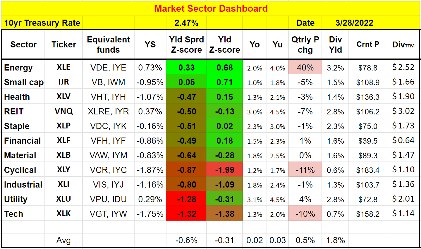
XLE and XOM– the fund and its leader
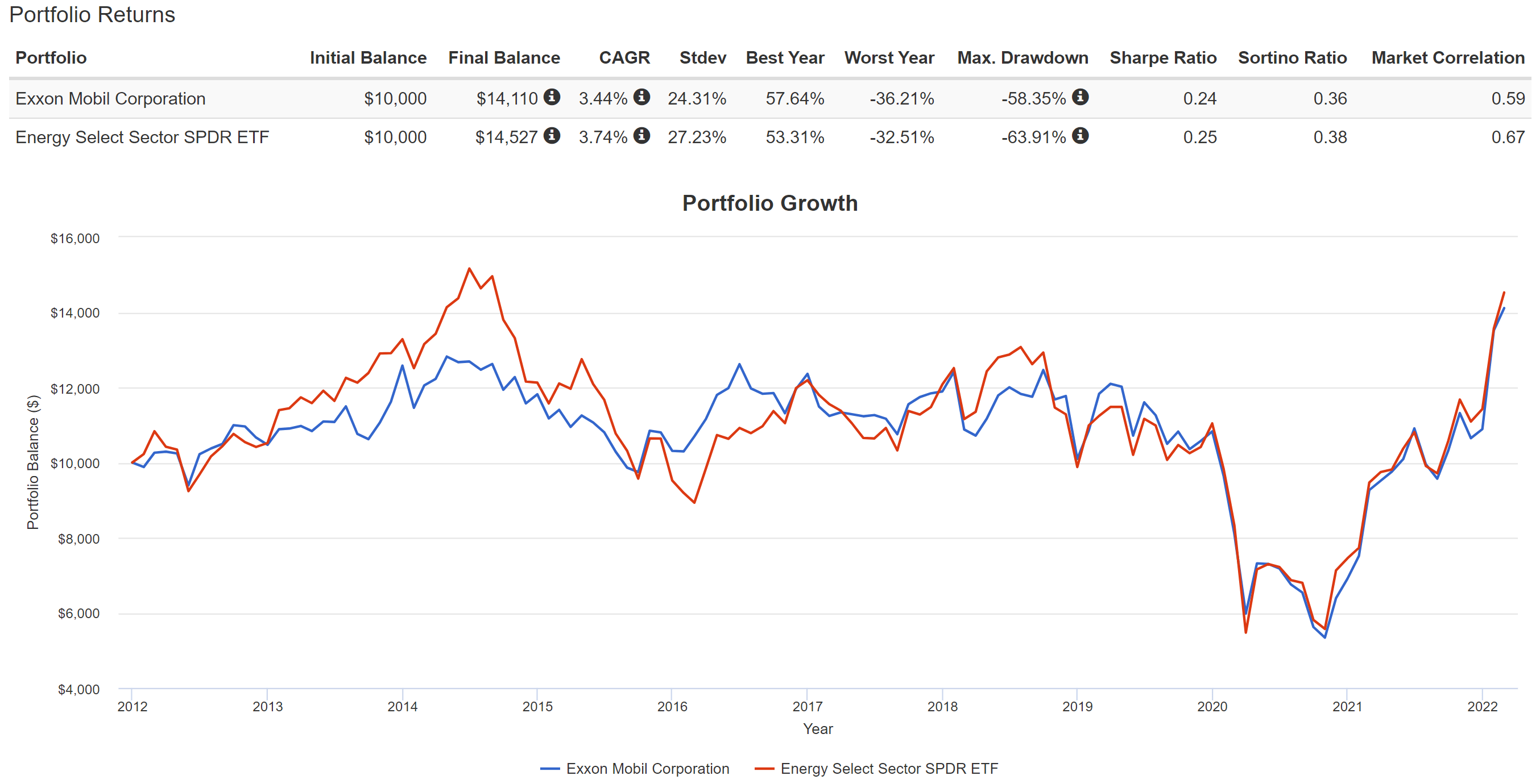
XLE is a popular (probably the most popular) energy fund. It invests in stocks of companies operating across energy sectors as you can see from the chart below. As of this writing, it holds a total of 24 stocks, and XOM is its largest holding, representing almost 23% of the total assets. As a result, the fund performance is closely correlated with the performance of XOM. As you can see in the chart below, in the past ten years, both have delivered almost the same returns and their price actions followed each other pretty closely.
Although note that XOM actually suffered lower price volatility than the fund, in terms of standard deviation, worst year performance, and the especially maximum drawdown. To me, this is a clear sign of the deworsification nature of the fund relative to XOM. Add in this case, the addition of a bunch of extra stocks does not even help with diversification. It actually made the price volatility even higher than holding XOM alone.
Seeking Alpha Source: https://www.portfoliovisualizer.com/backtest-portfolio#analysisResults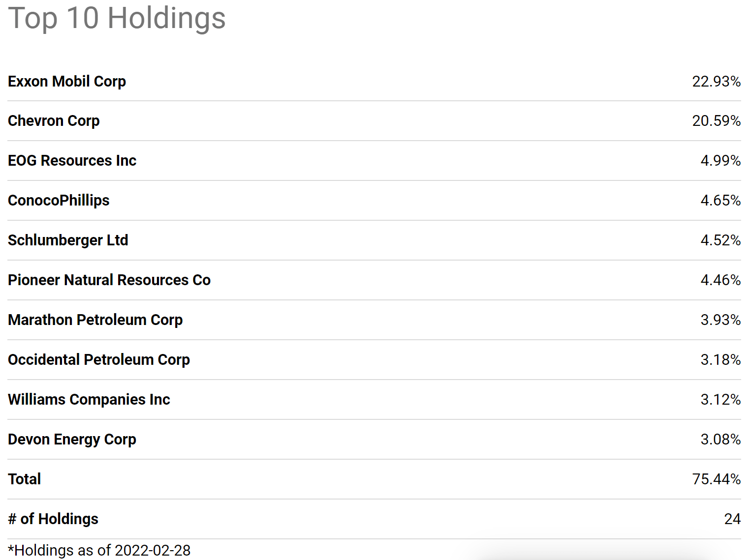
XOM’s superior profitability
The following chart shows XOM’s profitability in terms of ROCE (return on capital employed). The ROCE here is shown based on its quarterly TTM financials. In these calculations, I’ve included the following items as capital actually employed for XOM 1) Working capital, including payables and receivables, 2) Net Property Plant and Equipment, and 3) research and development expenses are also capitalized.
As can be seen, the ROCE of XOM is on average about 13.5%, and it dropped all the way to a bottom of about 6% in 2020 when the COVID pandemic hit. Now, with the worst in the rearview, its profitability has turned a corner and demonstrated a perfect V-shaped recovery. The current ROCE is at a very healthy 19.4%. Not only healthy in absolute terms but also higher than its long-term average by almost 600 basis points (or almost 50% in relative terms).
In contrast, XLE’s profitability is less impressive. As shown in the chart at the beginning, its operation margin is about the same as XOM. But its return on capital employed is much lower. I don’t have the data required to compute XLE’s ROCE. So I just used the return on equity (“ROE”) of the fund as an approximation. And as you can see, its ROE is about 14.1%, very close to XOM’s long-term average of ROCE, which serves as a good sign that ROE is a reasonable approximation for its ROCE.
Author Based on Seeking Alpha data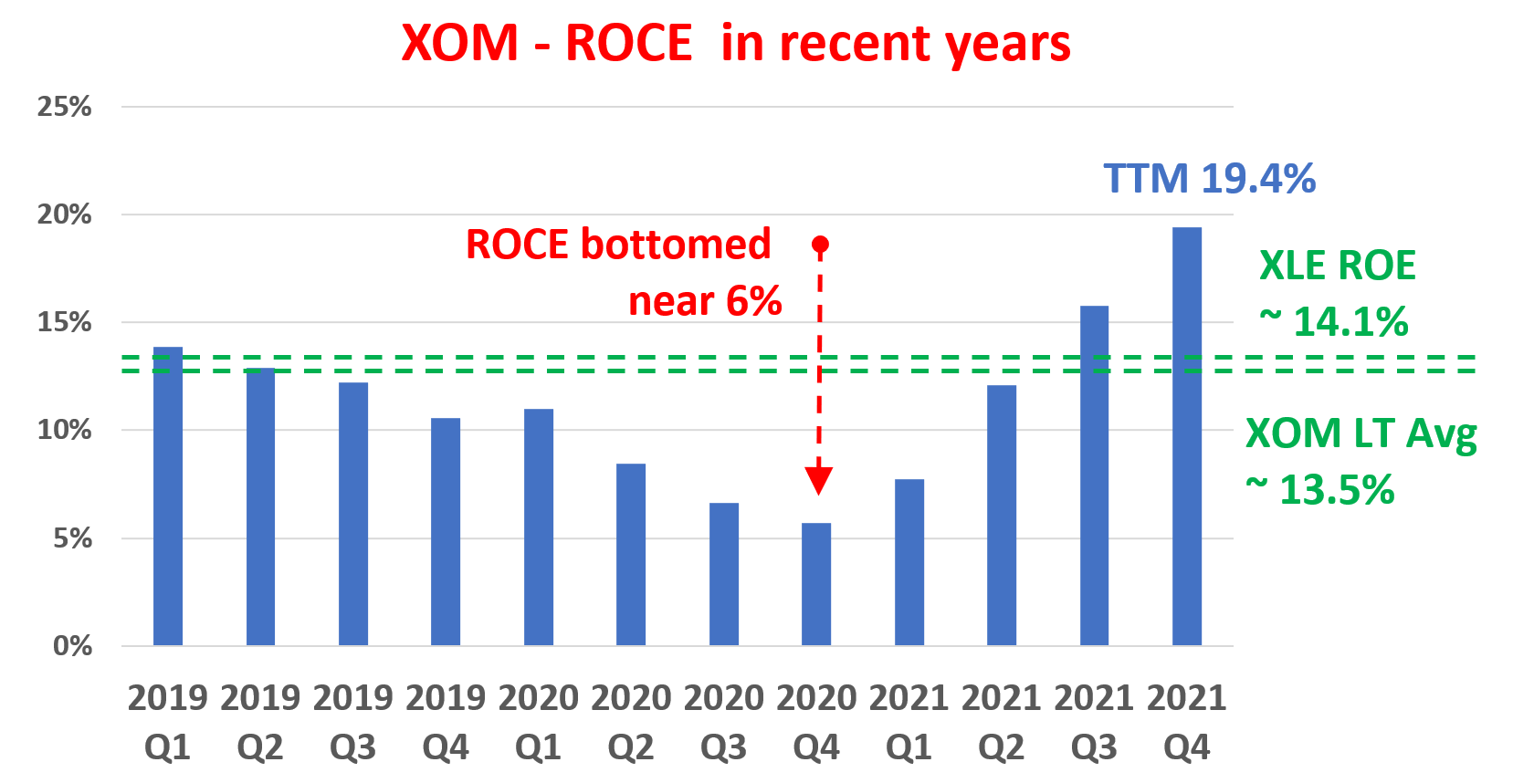
Looking forward, I am expecting XOM’s superiority over the sector to further expand given its scale and integrated business model. Especially, as you can see from the following chart,
- XOM generated $48 billion of cash flow from operating activities in the most recent quarter, the highest level since 2012. Its current break-even oil price is $41 per barrel. With oil prices staying well above XOM’s break-even price, its cash flow is only going to stay at this healthy level or even further improve from here.
- The business had been underinvesting itself in the previous few years. Now as a result of the healthy cash flow, the business has plenty of cash to comfortably cover covering capital investments, debt reduction, and dividends. It has just set annual capital spending through 2027 at $20 billion to $25 billion, a substantial boost from its already whopping $17 billion CAPEX spending last year. Such investment will not only maintain its competitiveness, but also boost growth, and accelerate its new low-carbon business.
- At the same time, the business also reduces structural costs by an additional $1.9 billion, increasing total savings to nearly $5 billion versus 2019. It has also strengthened its balance sheet to pre-pandemic levels by paying down $20 billion in debt – a very wise movement given the rising interest rates and borrowing costs.
- Lastly, it now also has plenty of cash to pursue share repurchases. It has just announced a $10 billion share repurchase program. And as you will see immediately next, its current valuation is very reasonable. And as such, I expect the sizable share repurchase program to be very effective and accreditive for shareholder returns.
XOM investor presentation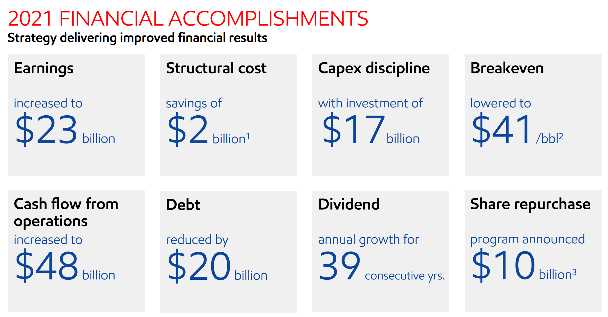
Dividends as a measure of owners’ earnings
Now on to valuation. As mentioned in the second chart at the beginning, despite its superior profitability and scale, XOM is actually substantially undervalued relative to XLE. In terms of price to cash flow multiple or price to sales ratio, XOM is undervalued by about 40% relative to the sector.
Another effective way to evaluate their valuations is by their dividend yield, and an effective way to evaluate their relative valuations is by their dividend yields either relative to each other or relative to the risk-free rates. Details of these concepts and approaches have been provided in our earlier article. Dividends yields and yield spread are what we first check before making any investment decisions. We’ve fortunately had very good success with this approach because of:
- The common PE or Price/cash flow multiples provide partial and even misleading information due to the differences between accounting earnings and owners’ earnings.
- Dividends provide a backdoor to quickly estimate the owners’ earnings. Dividends are the most reliable financial information and least open to interpretation. In investing, we always prefer a simpler method that relies on fewer and unambiguous data points rather than a more complicated method that depends on more ambiguous data points.
- The dividend yield spread (“YS”) is based on a timeless intuition. No matter how times change, the risk-free rate serves as the gravity on all asset valuations and consequently, the spread ALWAYS provides a measurement of the risk premium investors are paying relative to risk-free rates. And similarly, the yield spread between two securities always measures their risk premium relative to each other. A large spread provides a higher margin of safety and vice versa.
Based on the above understanding, the following chart shows the yield spread between XOM and XLE. The dividend yield is calculated using the TTM dividends and based on quarterly averaged prices. As can be seen, the spread is positive most of the time because XOM has consistently paid a higher dividend yield than XLE in the past. Furthermore, you can see that the spread is bounded and tractable most of the time.
The spread has been in the range between about 0% and 1.4% the majority of the time during the past decade. Such a tractable YS suggests that when the spread is near or above 1.4%, XOM is significantly undervalued relative to XLE (i.e., I would trade XLE for XOM). These are times when XOM is severely undervalued relative to XLE – the market is willing to sell XOM at a yield that is 1.4% above the sector. And vice versa.
You can see the screaming buy signal for XOM in early 2021 when the yield spread surged above 2% – and this is why our dashboard and the yield spread are the first things we look at when we make our investment decisions.
As of this writing, the spread is about 0.93%, close to the thicker end of the historical range as you can see, suggesting that XOM is undervalued relative to XLE.
Author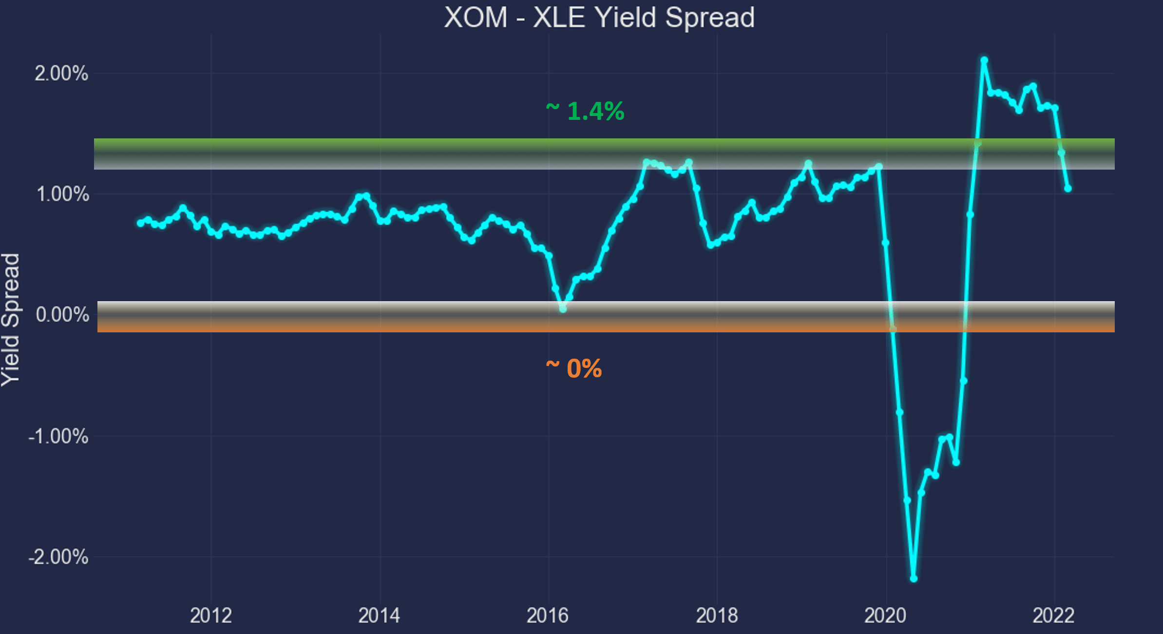
For readers familiar with our analyses, you know that the short-term returns are closely correlated with the yield spread for funds or stocks that have demonstrated stable earning powers and dividends. And as you can see from the chart below, it is also true for XOM and XLE. This chart shows the two-year total return (including price appreciation and dividend) from XOM minus that from XLE when the purchase was made under different yield spreads. In other words, this chart shows the alpha from XOM relative to XLE at different yield spreads. You can see that there is a clear positive trend and the Pearson correlation coefficient is 0.33.
Although the correlation here is not as strong as in the other cases that we’ve written about before. And the major reason here is the volatility of commodity prices such as crude oil and natural gas. These commodity prices are a large contributor to the price actions of XOM and XLE, causing a large degree of randomness. As a sign of such randomness, you can see that even when the YS is large and near its thickest level, XOM did not always deliver a positive alpha over XLE.
Nonetheless, a thicker YS always signals a lower risk of owning XOM relative to XLE. And future returns have been correlated with the YS (although the correlation is at a model level of 0.33).
As of this writing, the yield spread is 0.93%. It is close to the thicker end of the historical spectrum and signals that the valuation of XOM is relatively compressed compared to XLE, corroborating the assessment from the price/cash flow and price/sales analysis above.
Author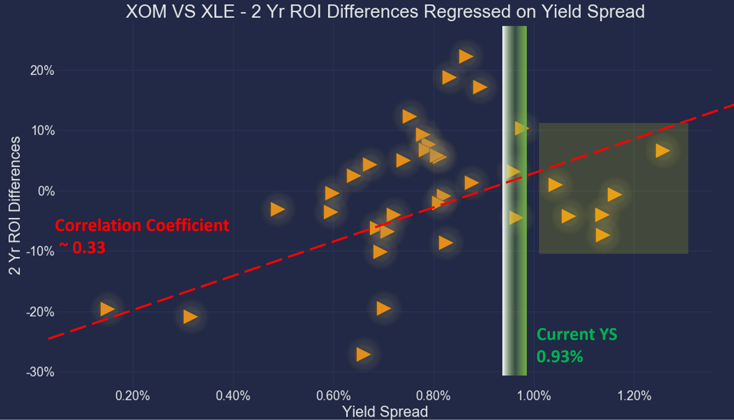
Summary and risks
Investors often face the choice between a sector leader and a sector fund, especially investors who like a top-down approach like us. When looking for stock ideas, we first use a sector dashboard to identify the promising sectors and dive into that sector to research individual stocks.
In the case of the energy sector:
- The energy sector is currently the most attractively valued sector shown by our sector dashboard (and you are welcome to download it here). Represented by XLE, both the dividend yield and the yield spread relative to the risk-free rates are at a very attractive level.
- However, a better choice would be XOM, the leader in this sector. In our view, the XLE fund (or energy sector funds in general), is a deworsification of XOM. In this case, the addition of a bunch of extra stocks probably is even worse than deworsification considering that XLE has actually suffered more severe price volatility and drawdowns than holding XOM alone.
- XOM provides superior profitability, consistency, and also valuation over XLE. In particular, in terms of price to cash flow multiple or price to sales ratio, XOM is undervalued by about 40% relative to the sector. And in terms of YS, XOM provides a dividend yield of about 0.93% above XLE, near the thickest level over the past decade.
Finally, we want to point out the risks of our approach before closing. The risks unique to XOM have been detailed in our earlier writings and won’t be repeated here. Here we want to highlight the risks associated with the energy sector and our general approach described in this article:
- The energy sector faces fundamental challenges in the long term. Climate and environmental concerns are a risk for all of the stocks in the energy sector. Our concerns over climate change and the environment could impact oil and gas production in general. All major energy stocks are often involved in legal disputes with environmental groups, protests, lawsuits, and government regulations.
- The energy sector also faces macroscopic risks now. The Ukraine/Russian conflict is a big near-term uncertainty. The duration and eventual outcomes of the conflict (as with any geopolitical conflict) are totally uncertain. It could generate substantial impacts on both the global overall financial markets and the energy stocks in unpredictable ways.
- Choosing one stock over a sector fund could reduce the deworsification risk, but it could increase concentration risks. In the end, it is a matter of personal investment style and individual belief of what risk is. The argument could be made both ways. You could argue that the probability for ~30 stocks to all fold is significantly lower than the probability for one stock to fold. But you could also argue that the leader stock would be the last one to fall in any given sector.
- Yield spread measures the RELATIVE risk premium and does not guarantee an ABSOLUTE positive return. It is a reliable method to accumulate more of the given securities (whether an equity or bonds) in terms of SHARES, but not in dollar amounts. The dollar amount worth is determined by both how many shares you hold (which the yield spread can help) and their prices (which the yield spread cannot predict).
- Second, as detailed in our earlier article, dividend yields do not always reflect business fundamentals due to several factors such as tax law, political climate, the composition of the market index, et al. As a result, we do not directly use the yield spread in our investment or asset allocation decisions. In practice, we first adjust for the above corrections and then use the adjusted yield spread in our investment decision. But the data and approach illustrated here is the first place we check.
Be the first to comment