

Pgiam/iStock via Getty Images
This article is part of a continuing series of articles (here) on how to use investor buying in ETFs to help determine the direction of the stock market, and specific sectors of it. These articles are about investor sentiment and the measurement of “investor expectations”. Every article will have follow-up articles until the concept behind that original article is complete. This one focuses on the ProShares VIX Short-Term Futures ETF (BATS:VIXY) – a ProShares ETF that goes long the VIX, the CBOE implied volatility index.
VIXY
VIXY is one of numerous ProShares ETF’s that go either long or short the VIX, which is the CBOE implied volatility index. It has 34 million shares outstanding and total assets of $410 million. ProShares says the following about their VIXY ETF:
Investment Objective: ProShares VIX Short-Term Futures ETF seeks investment results, before fees and expenses, that track the performance of the S&P 500 VIX Short-Term Futures Index
Designed for knowledgeable investors:
Who seek to profit from increases in the expected volatility of the S&P 500, as measured by the prices of VIX futures contracts.
Who seek to reduce U.S. equity portfolio risk, since changes in the VIX Short-Term Futures Index have historically been negatively correlated to S&P 500 returns.
It is intended for short-term use; investors should actively manage and monitor their investments, as frequently as daily.
It does not track the performance of the CBOE Volatility Index (VIX) and can be expected to perform very differently from the VIX.
We very much agree with these points.
The Price History of VIXY (Michael McDonald)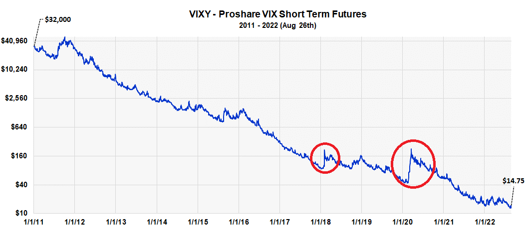
This graph shows the entire price history of VIXY since inception. It started with an adjusted price of $32,000 in 2011 and it’s currently at $14.75. The red circles highlight times when sudden market declines can advance the price from 200% to 400%. Timing these moments, however, is very difficult; one loses money just waiting around.
VIX versus Assets in VIXY (Michael McDonald)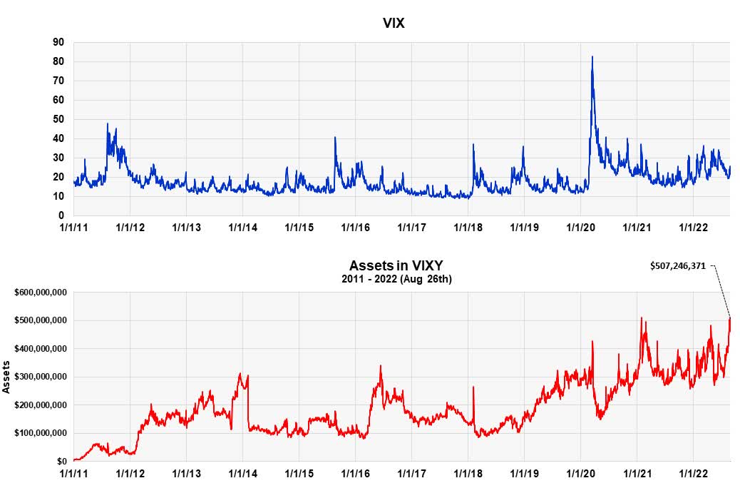
This chart plots the VIX against total assets in VIXY from 2011 to present. I’ve included it to show an important fact; that assets in VIXY have been rising the last two months and are near record levels. This normally indicates a growing number of bearish investors and occurs as stock prices begin a long-term price rise.
In other words, rising assets in VIXY is a positive indicator for higher stock prices. This is also confirmed by average daily buying in VIXY, which is shown in the next graph. Notice the large surges in purchases of VIXY that have historically occurred just prior to major advances in stock prices.
Buying Activity in VIXY and Market Lows (Michael McDonald)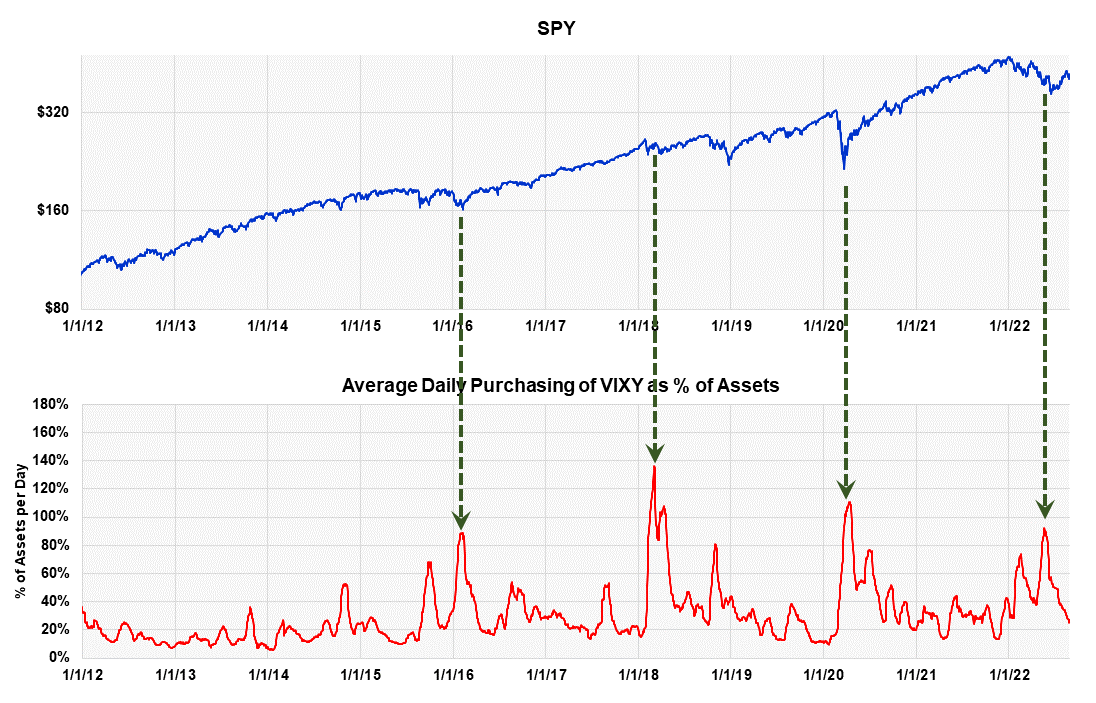
We Still Have Extreme Levels of Bearish Sentiment
Well-tested metrics still show extreme levels of bearish sentiment. This is very important because, while the economic picture is always different during a decline, extremely negative sentiment is the one, common denominator at the end. Many investors don’t know this and get lost in the arguments and alarming economic picture of the moment. Because of this, we are highlighting the data and theory that supports this at the end of every article.
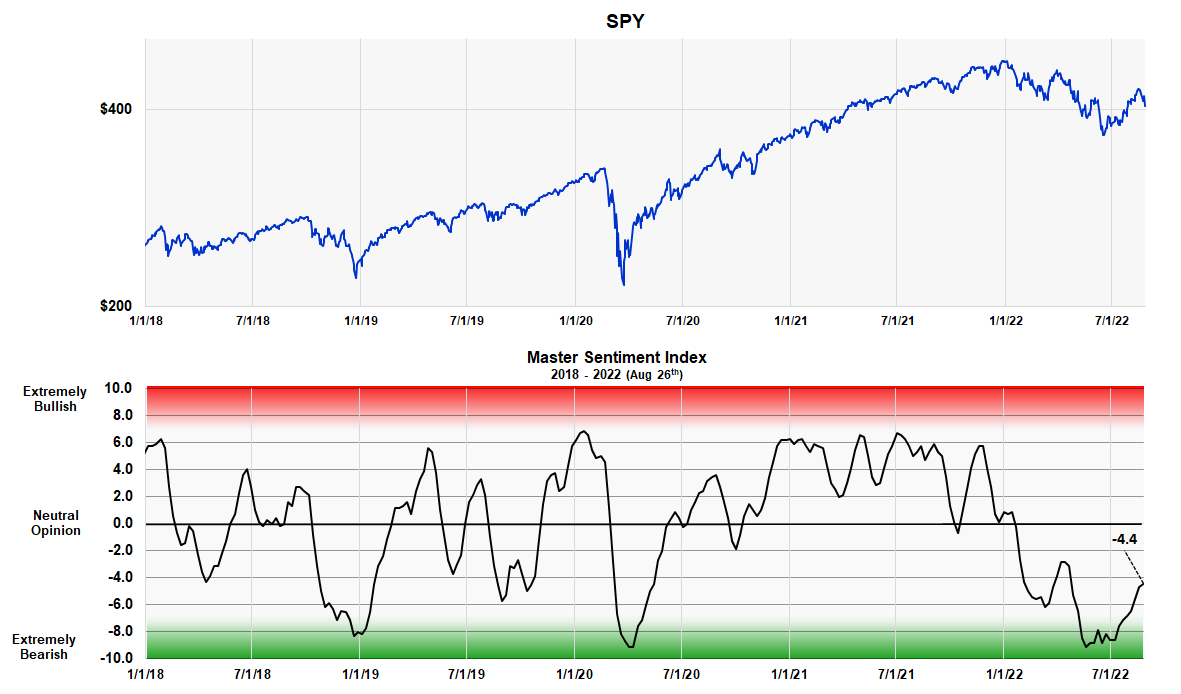
The Master Sentiment Indicator Continues to Point to Higher Stock Prices
We combine seven classic sentiment indicators to form one Master Sentiment Indicator. The seven indictors that make up the composite are:
- The CBOE equity puts and calls ratio
- The CBOE total puts and calls ratio
- The Commitment of Trader data on the E-mini S&P Futures
- The Buying Level in the SH ProShares ETF
- The Exposure Level of the National Association of Active Investment Managers
- The daily Hulbert Stock and Nasdaq Sentiment readings
- The AAII Sentiment Survey
The MSI is designed to locate major market lows. It’s shown in the next two charts – one is a long-term view from 2007, the other starts in 2018 and shows more detail. The indicator is currently -4.4, which is still relatively low after a two-month rally and, in our opinion, points to higher prices.
Long Term Master Sentiment Indicator (Michael McDonald) Shorter Term View of the MSI (Michael McDonald)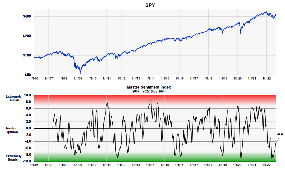
Forming the Master Sentiment Indicator
Combining multiple indicators to form one sentiment indicator is not easy. How do you combine a puts and calls ratio of 1.0 with a 40% Investor’s Intelligence bearish percent? When forming a composite everything has to be mathematically consistent. We accomplished it in the following way.
We took each indicator back as far as history allowed (the smallest time period being 17 years) and determined the range of values that contained the highest 5% of its values. Then we determined the range of values that contained the next highest 5%. This procedure was continued in 5% increments down to the 5% band that contained the smallest values. This activity allowed us to put every indicator on the same 21 range scale which was labeled 10 to -10.
We then added each indicator’s position number (10 to -10), which determines where it is historically, and divided the total by the number of indicators in the composite. Out came a composite number between 10 and -10 that represented the average bracket value of all the sentiment indicators.
The MSI Red and Green Zones
As you can see the MSI oscillates between 10 and -10. The large, grey area in the middle represents periods when there is no extreme opinion. The red area shows when the indicator is getting into the “extremely bullish” range. The lower green band shows when it’s getting into the “extremely bearish” range. There is no sudden demarcation but graduated numbers that shows greater or lesser degrees of sentiment. The chart clearly shows how recent levels compare to readings at major lows over the last 16 years.
The MSI Table
The table shows the ranking of each of the seven components that make up the composite, as well as the composite itself.
MSI and Indicator Component Table (Michael McDonald)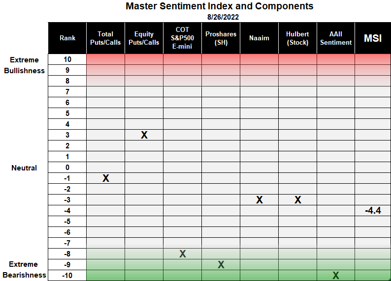
The first column in the table lists the 21 rankings that go from +10 to -10. This is followed by the names of the seven indicators used in the composite with an X showing the current ranking of each. Two of these indicators – the buying of ProShares Short S&P 500 ETF and the short position of asset managers in the S&P 500 E-mini futures – were explained in Seeking Alpha articles (here) and (here).
The final column displays the ranking of the MSI index, which on August 26 was -4.4.
Conclusion
We recommend investors avoid VIXY unless they have a proven track record of correctly timing market declines. But since the market only declines 33% of the time, finding the start of a sudden decline is very difficult. We also don’t think this is the time to time a decline due to our belief the market is ready to begin a major advance.
However, purchasing VIXY at this time to hedge against possible catastrophic events does make sense for a small portion of one’s assets. That’s because the gains versus losses at moments like this are asymmetrical in favor of the downside. We’re specifically thinking of possible catastrophic events coming out of Ukraine. But the position should be terminated as soon as one thinks the event risk has passed.
Be the first to comment