

anyaberkut/iStock via Getty Images
Introduction
I believe there is a disconnect between getting information on a good investment and the next step in purchasing the stock at a reasonable price. I consider fundamental analysis being half the battle and the other half is buying the stock at a low price.
Since I’m retired, I don’t have the time to sit in front of a computer watching price movements each day. The missing link I’ve been searching for was sending a real time trading alert signal directly to my cell phone. With this method I could place a trade anytime while working or playing.
This is what I have created to enhance the probability of being a successful high yield investor. Over the years, I’ve been publishing articles explaining my POT (Portfolio Online Tracker) and now developed the software to include the TEA (Trading Email Alert) system. I call the system TEA/POT and personally use the application each and every day the market is open. For more information on the TEA/POT application please refer to this post.
In this article I’ll review my current positions and how they performed during the 2021 year. I have changed my investment strategy to only purchase shares when the alignment of multiple signals confirms the trade. At that point I have the option to buy or sell the stock. I explain more of this method further down in this article.
High Yield Performance
Holdings to start the 2022 year:
- BDCs – (FDUS), (GBDC), (GSBD), (TSLX), (HTGC), (TPVG), (CSWC), (ARCC)
- mREITs – (STWD), (BXMT), (BRMK), (PMT)
- CEFs – (PDI), (RCS), (GOF), (DSL), (OPP), (GHY), (EAD), (PTY), (PFL)
Chart-1
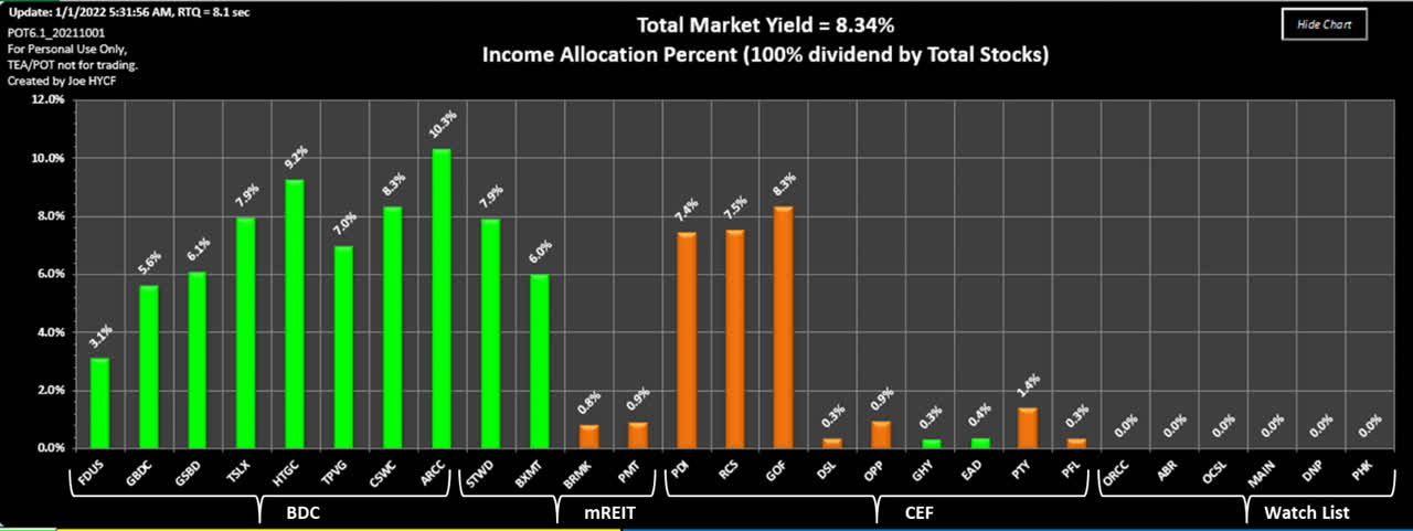
Source; Authors TEA/POT software
As can be shown from the chart above, the majority of my income is derived from the BDC (Business Development Company) section of my portfolio. The 8 stocks are solid holdings I intent to hold long term and account for approximately 57% of my dividend income. They survived the 2020 bear market with flying colors.
The two stocks STWD and BXMT are commercial mREITs (mortgage real estate investment trusts) I also consider solid holdings. I’ve added two residential mREITs BRMK and PMT using the TEA/POT strategy. The total mREITs contribute about 17% of my dividend income.
The three CEFs (Closed End Funds) PDI, RCS and GOF are long term holdings that contribute high percentages to my dividends. I’ll continue to add shares when I get buy alerts. The six remaining CEFs I have purchased using the TEA/POT strategy. The CEFs contribute about 26% of my dividend income.
The last set of stocks I’ve added to my portfolio tracker is considered my “Watch List” group. Not sure If I’ll add them to my income portfolio but wanted to observe how they perform over time. My watch list can grow as I become interested in more income producing investments.
Chart-2
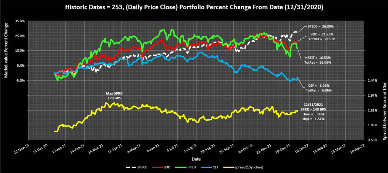
Source; Authors TEA/POT software
The chart above shows how the stocks in my current portfolio performed against the S&P 500. The 2021 year is considered a recovery year where asset prices were very oversold and a reasonable bounce was expected.
- The S&P 500 price increased almost 27% last year.
- The BDCs advanced 21% in price, but adding dividends advanced 31%.
- The mREITs increased 16% with dividends increased 26%.
- The CEFs declined 3%, with dividends increased almost 7%.
Notice I also track the spread between the 10-year and the 3-month, I expect this rate spread to tighten when the Fed begins increasing overnight lending rates. It’s been a long time since we had inflation and how fast the Fed takes action will determine this markets direction.
Trading Strategy
The chart below shows a visual representation of my Buy-Low and Sell-High strategy. The yellow boxes on the chart represent the areas where Emails are sent directly to my cell phone in real-time of any potential Overbought or Oversold stocks.
I’m currently using this strategy when the market is open. The TEA/POT calculates the RSI (Relative Strength Index), a price momentum indicator. It also calculates the price Z-score that tells the investor how many standard deviations price is from the mean. Please see Appendix A at the end of this article to explain how the indicators are calculated.
Chart-3
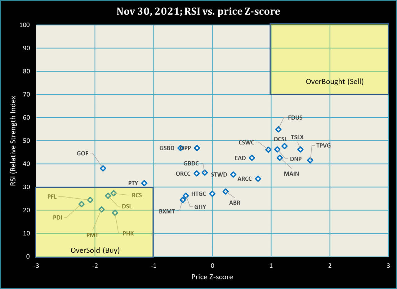
Source: Chart created by Author
Chart-3 above shows the stocks in my portfolio on November 30th, 2021 during a market decline. General market declines are excellent for adding shares to anyone’s portfolio since fundamentals are thrown out the window.
The parameters for sending a Trade-Email-Alert signal are the following:
- Oversold, RSI less than 30 and Z-score is less than -1.
- Overbought, RSI above 70 and Z-score is greater than +1.
- When in the Oversold region (lower left side of the chart), price is typically below the 50 dma (day moving average) and below the 200 dma, see actual Emails below.
- When in the Overbought region (upper right side of the chart), price is typically above the 50 dma and above the 200 dma.
Figure-1
The following two Emails were sent when the market just opened on both days about 4 months apart. Having patience is a key asset when waiting for price extremes.
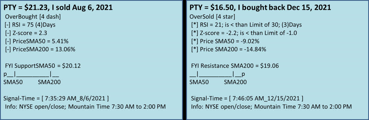
Source: Author’s TEA/POT software
On August 6th, 2021 I received this Email telling me of a potential selling point at $21.23 for PTY. It indicates “OverBought [4 dash]” as all four indicators confirm an overbought-signal.
- RSI = 75, trigger level set at 70 or above.
- Z-score 2.3 (very high above the price-mean)
- Price above the 50 dma by 5.41%
- Price above the 200 dma by 13.06%.
Also notice the “FYI SupportSMA50 = $20.12”, this is the support level at the 50 sma. The SMA indicates Simple Moving Average, and the “P” shows price being well above the moving averages. Also notice the “Signal-Time” showing this Email was sent 5 minutes after the market opened.
On December 15th, 2021, I received this Email telling me it might be a good time to get back into PTY at a price of $16.50. I wanted to own PTY, so I placed an order and picked up some shares. Notice the “OverSold [4 star]” below the price, this indicates all 4 parameters are in agreement the stock is oversold.
I’m not sure about you but selling high and buying low for PTY yielded a price difference of over $4.70 that makes up for lost dividends during the 4 months I was out of the stock.
Conclusion
I’m still a high yield income investor and changed my strategy from Buy-And-Hold to Trade-And-Hold. I developed and experimented with this software last year and made some changes to provide trade recommendations while the market is open.
I have a surplus PC sitting in my closet running all week and the application turns on while the market is open and sends me trading alerts no matter where I am in the country.
As for my portfolio I will be using this trading method moving forward in 2022 and adding to my income shares. I believe fundamental analysis is the first step in building a portfolio but is only the first half of the equation. The second half is getting good entry points based on the psychology (emotions and behaviors) of market fear and greed.
Appendix A, TEA/POT Indicators Explained
I have outlined the following Buy/Sell signals used by the TEA/POT application.
RSI (Relative Strength Index)
The RSI number goes from 0 to 100 indicating oversold and overbought conditions. Every price quote taken during the day re-calculates the RSI level and notifies the investor of any meaningful change.
A good definition is from Investopedia: “The relative strength index [RSI] is a momentum indicator used in technical analysis that measures the magnitude of recent price changes to evaluate overbought or oversold conditions in the price of a stock or other asset. The RSI is displayed as an oscillator (a line graph that moves between two extremes) and can have a reading from 0 to 100.”
Oversold and Overbought trigger points are user selectable in the POT application and initiate an email notification.
An RSI of less than or equal to 30 is suggested as oversold. This provides a quick evaluation of a possible purchase.
An RSI over 70 indicates the stock may be overbought and a possible trimming is in order.
Z-score, Price Standard Deviation
The diagram in Figure-1 demonstrates a normal distribution of data values. They can represent any dataset sorted from minimum to maximum. For the Z-score calculation I use one year’s worth of price data.
The percentage in Figure-1 is a range, based on the dataset of prices for each individual stock. To interpret a normal distribution in Figure-1 the stock’s price will remain in the blue shaded area 68.2% of the time within +-1 standard deviation. Visually you can see that when the Z-score becomes more negative, the price is entering an oversold condition.
Figure-1; bell curve
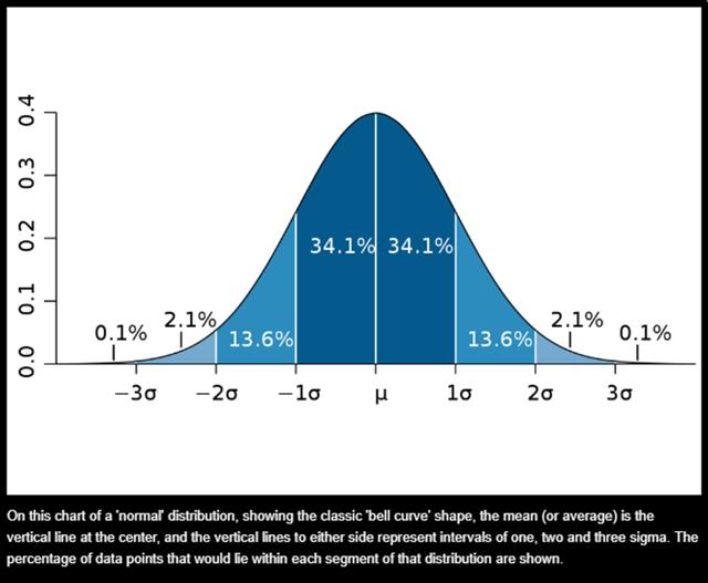
Source: MIT News
It must be noted the data representing price is not an absolute normal distribution, because price is very volatile. We can still use price representing a normal distribution that allows comparative results with other stocks. A single daily stock quote gives a good indication where price fits on the bell curve range.
When looking at the bell curve Figure-1 diagram, the center value is the price mean. The calculated Z-score can vary above and below the mean to tell us how far away from the mean price has moved when receiving a quote. For my trigger point I use “-1” to signal an alert telling me the price has deviated from the mean. The larger the negative value, the greater the chances for a possible purchase after examining the rest of the technical parameters.
50 SMA and 200 SMA (Simple Moving Average)
An explanation is outlined by Investopedia, using Moving averages to detect directional changes:
“Another strategy is to apply two moving averages to a chart: one longer and one shorter. When the shorter-term MA crosses above the longer-term MA, it’s a buy signal, as it indicates that the trend is shifting up. This is known as a golden cross.” Right arrow in the chart.
“Meanwhile, when the shorter-term MA crosses below the longer-term MA, it’s a sell signal, as it indicates that the trend is shifting down. This is known as a dead/death cross.” Left arrow in the chart.
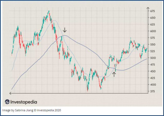
Source: Investopedia
Left arrow indicates the 50-day SMA just went below the 200 day SMA, (death cross). Right arrow indicates the 50-day SMA went above the 200-day SMA (golden cross).
Both signals indicate a change in direction.
Be the first to comment