

David Silverman/Getty Images News
It’s only when the tide goes out that you learn who’s been swimming naked. – Warren Buffett
Written by Sam Kovacs
Introduction
Beating the market.
Is it not why we’re all here?
Why bother reading hundreds of Seeking Alpha articles and news items if it was to turn around and put all your money in an S&P 500 Index fund?
Of course, it is easier said than done. Many investors lost their shirt in 2022, as they were overexposed to stocks which were overvalued.
Therein lies an important lesson about performance: momentum works until it doesn’t.
Investors pile money into hot stocks, hoping for the crazy gains to get crazier.
And usually they do, until it becomes unsustainable, and a good thing goes bad, then the bad thing gets worse.
Cathie Wood’s ARK Innovation Fund (ARKK) is the classical example of this.
Below is a chart showing 8-year performance of the fund versus the S&P 500 (SPY).
ARKK VS SPY (Dividend Freedom Tribe)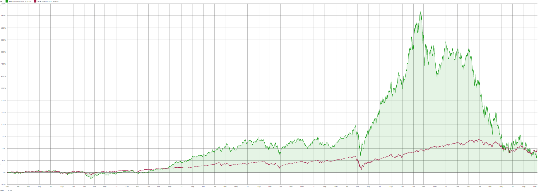
While at times the performance was incredibly higher than the S&P 500, it has come crashing down with incredible force, and erased all the surplus gains for the fund over the period.
The problem of course, comes from investors that piled into the fund in 2020 and 2021.
In March 2021, I wrote of “The Demise Of Growth Investing“. I got roasted in the comments… big time.
However, since then the fund is down another 72%. No that’s not a typo. 7.2% would have been bad enough, but it is down 72%!
Eek.
But that is what happens when you buy high and sell low.
The problem is that investors usually don’t know what is “high” and what is “low”…
How to Beat The Market
Robert & I have been refining our dividend investing system over the years.
We have an edge over most retails investors in that we have built amazing tech which helps us be better investors.
I’ve always believed in the idea that we “shape our tools and then our tools shape us”.
And we realized a long time ago, that parts of the market go in favor and others out of favor, for no good reason.
When you’re investing for your retirement, but the market is driven by looking two to four quarters ahead, there are going to be divergences from long-term value.
Sometimes entire sectors go in or out of favor, as we saw energy stocks dumped during the pandemic, and tech stocks mooned. We’ve seen the healthcare sector do extremely well in the past few months, and consumer discretionary do awful this year.
Sometimes it is individual stocks within a sector that go up or down.
If you buy them low and sell them high, you do well. But how do you do that?
High quality dividend stocks tend to yield within a certain range.
Look at Home Depot (HD) for example.
During the past decade, it has yielded between 1.59% and 3.95% depending on days.
But the core 50% of the time, it has yielded between 2% and 2.35%, with a median yield of 2.13%.
We have created MAD Charts to visually display this. When a stock is trading in the red band, it is trading in its historically overvalued range. When it is in the deep blue, it is the historically undervalued range. When it is trading at its 10-year median yield, it is between the pink and light blue areas.
HD MAD Chart (Dividend Freedom Tribe)
We wrote an entire guide about MAD Charts here.
Using these, you have the first piece of the puzzle to finding stocks when they are cheap, and knowing when to offload them.
But how do you know that you’re not buying a stock which is a value trap?
This is where discernment comes in and you need to consider future growth and industry outlook, management’s shareholder friendliness, and any other curveball that comes your way.
It is something which does require expertise, and is the reason why Robert, myself, and our team, offer our Dividend Freedom Tribe service, to assist individual investors in pursuit of their retirement dreams.
Applying our motto of “buy low, sell high, get paid to wait”, all 3 of our model portfolios are beating the S&P 500 by at least 35% during the past two years.
DFT portfolio vs S&P 500 (Dividend Freedom Tribe)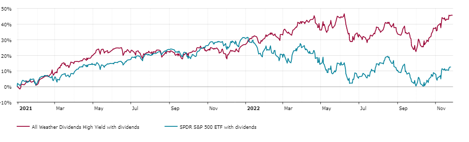
The chart above shows the performance of our High Yield portfolio vs the S&P 500 during the past two years. It’s our worst performing portfolio.
There is a lot more to beating the markets, but if you exit overvalued positions and buy undervalued ones, focusing on quality companies only, you’ll come out on top.
With that out of the way, here are 2 stocks you should sell, and 2 replacements in the same sectors, for you to boost your income, and your results.
Sell Exxon, Buy Suncor
We got in the game with Exxon (XOM) quite late relative to our other energy bets.
We started building our position in March 2021, at a price of $54.
Exxon just closed at $109.5. The stock has doubled since we bought it.
But we’ve been gradually exiting the position since it hit $80.
We tend to both enter and exit positions gradually, as to profit from the trend while “locking in” gains.
So we sold a small part of our position at $80. Then we sold some more at $99.
At the current price, we believe it is time to close out our Exxon position.
Looking at the MAD Chart below, you’ll see Exxon is entering overvalued territory. It hasn’t yielded less than now since 2014.
XOM MAD Chart (Dividend Freedom Tribe)
Exxon currently yields 3.3% which is somewhat below its 10-year median of 3.8%.
Could Exxon go up more? Sure. If it returned to its market highs relative to its dividend, it could go all the way up to $150. But there is no margin of safety embedded into the current price, which means that you’re investing with unnecessary risks.
Furthermore, Exxon has grown its dividend at a 4.8% CAGR over the past decade, but this has declined to a 3.4% CAGR over the past 5 years.
It is unlikely that Exxon will grow the dividend at more than a 3% to 4% annual rate over the next decade. The current yield doesn’t justify the growth potential, and as such investors should consider selling it.
But what to do with proceeds of the sale?
Well, you could invest it in Suncor (SU), one of Canada’s major integrated oil producers.
Unlike XOM, SU cut its dividend during the pandemic, but has quickly brought it back up to pre-pandemic levels and beyond.
SU MAD Chart (Dividend Freedom Tribe)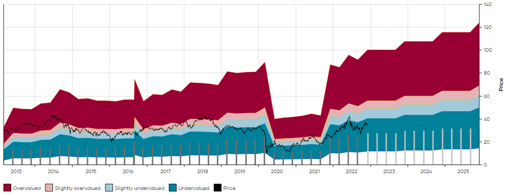
As a Canadian stock listed on the US exchange, the strong dollar has been pulling the stock’s price back, which might just be the opportunity we need.
During the past 10 years, SU has yielded a median 3.2%. It would make sense that it yields less than XOM in normal times, as it has grown its dividend at an 11.5% CAGR during the past decade, more than double XOM’s growth rate.
But it currently yields 4.57%, which is not only significantly more than XOM’s dividend but is also significantly more than its historical yield.
One could easily argue that in the current environment, Suncor should revert to its historical yield.
This would offer 40% upside from the current price.
So on one end you have XOM, which if it reverts to its median yield would lose 15% of its value, and SU which would gain 40%.
That is the definition of building a margin of safety into your investments.
What’s more, excluding the effect of capital gains tax, switching the two stocks would increase your income by 40%.
Even if you had a very low cost basis on XOM like we did, and had to pay hefty capital gain taxes on the position, you’d still end up increasing your income with the switch.
It’s common sense at this point.
Sell Merck, Buy Medtronic
Merck’s (MRK) stock has gone vertical.
This is usually not a good thing as it shows excessive optimism.
Merck is up 45% in the 10 months since we added it to our model portfolios.
Just 3 weeks ago, in a note to members of the Dividend Freedom Tribe, I said:
Given that the company is going to declare their next dividend hike within the next 3 weeks, I’m tempted to wait before selling and decide whether to push the sell above slightly.
Here is how I’ll approach the situation:
- If the dividend increase is less than 7%: Sell 1/4 of MRK as long as price is still above $95.
- If dividend increase is above 7%: Sell 1/4 of MRK if price reaches $105.
Let’s keep in mind that the $100 mark is an ATH for MRK, and also provides significant psychological resistance. If it successfully breaches the level, and we get a generous increase, the stock could go on a very nice run from here, potentially as high as $120.
I’m on the sidelines, waiting for news to hit. It’s easier to wait it out when you’re getting paid to wait.
Merck hasn’t yet declared its next dividend, although this should be happening any day. Yet in such a short period of time, suggesting members wait has paid off with an extra 8% in gains.
But now it has reached $108, which is beyond my sell point if MRK increased its dividend generously.
It is now a good time to sell at least 1/4 of your MRK position.
As you can see in the chart below, the current yield of 2.5% places MRK in historically overvalued territory.
MRK MAD Chart (Dividend Freedom Tribe)
A return to the 10Y median yield of 3.12% would imply 24% downside.
While operationally MRK has been great, this is now reflecting in the price as investors have bid up most healthcare stocks as the sector is viewed as defensive in this uncertain environment.
But not all healthcare stocks are doing great. Some are even doing extremely badly.
Medtronic (MDT) comes to mind.
And note that we don’t always get the bottom. In fact, we rarely buy right at the bottom and we rarely sell at the top.
We believe it is more important to buy close enough to the bottom, and sell close enough to the top.
And to ease in and out of positions, to further mitigate risk.
We suggested members start initiating a position in MDT two weeks ago.
Since then, the stock is down 7%, as it reported revenue below what analysts expected.
Selling MRK now and replacing it with MDT makes sense though.
MDT is a stock which has been paying a growing dividend for decades. It has a seasoned management team which is extremely shareholder friendly and knows what it is doing.
However, that doesn’t always mean that conditions are great.
After the pandemic, the demand for medical devices has not been what the investing community invested.
This has driven the price of MDT down, and its yield up.
MDT MAD Chart (Dividend Freedom Tribe)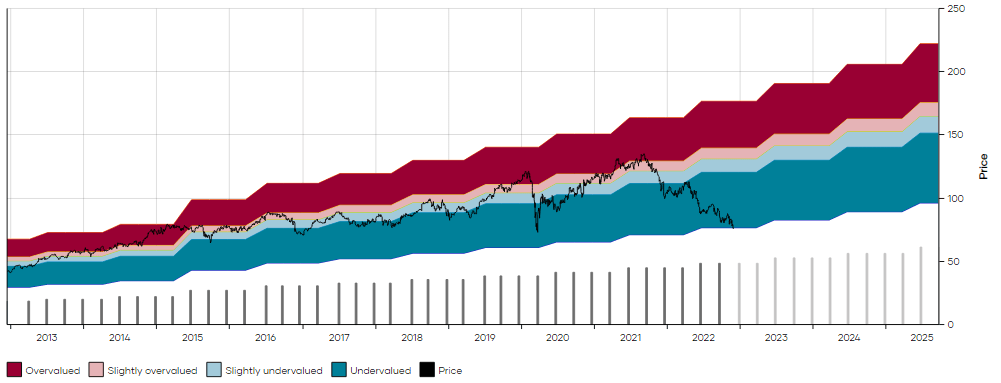
The stock now yields 3.57% vs. a 10-year median of 2%.
While the dividend has grown at 10% per annum during the past decade, we believe that 8% growth is more likely going forward. This suggests that the yield might not be justifiably as low as it historically was. But 3.57% is still too much. A yield of 2.75% to 3% is easily justifiable, and we’re sure when the market has had enough of dumping MDT, the price will correct towards that level at least.
This would suggest 30% upside from current prices.
So you have the option to sell something which yields 2.5% and replace it with something that yields 3.57%, increasing your income by 42% in the process.
Be the first to comment